Archive

District line

The power of 'EalingI’ve gone on before about how, just because something is old, doesn’t mean it automatically has value. There’s no point preserving absolutely everything just for the sake of it. It’s not practical, for one thing. What earthly use would be Underground stations done up to operate like they did in the past, but expected to cope with the volume of passengers in the present?

A lot of what was truly old on the Underground was truly awful, and thank heavens it no longer exists. Traces linger in picture form, and that’s where they belong, as warnings from history.

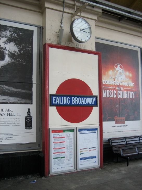
The old roundels at Ealing Broadway are different, though. They’re quite clearly not right, in the sense of not resembling what they would in short order be superseded with. But it’s right they exist, as they’re a reminder of how art and design can evolve for the better. They’re waymarkers on a journey that ends in splendour.

Mark Ovenden dates these as belonging to the first half of the 1910s, a few years before Edward Johnston developed the typeface that led to the present-day roundel being registered as a trademark in 1917.

Two can be found on the District line platforms at Ealing Broadway, and are easy to locate and photograph. Even earlier examples are tucked away in corners of Covent Garden and Caledonian Road.

They’re all a bit ungainly, ill-formed and trying to be grown up: the Underground in adolescence. But they capture a thought process working itself out in the public gaze – one that deserves to be preserved within a 21st century Underground network that continues to work itself out in (almost always) constructive, creative ways.

These roundels are worth keeping for the inspiration they continue to provide today, here, right now. For they aren’t aesthetic dead ends. They’re fascinating stumbles towards genius.

Forget 1940. Rejoice in the Broadway melody of 1915!
http://bit.ly/VRfWVp

Much ReveredMuch of the first incarnation of the Underground, like that of Doctor Who, was enthusiastically wiped from existence by subsequent generations of management bigwigs.

In both cases, I’m not especially sorry. Those traces that survive of either institution reveal a rather overbearing, eccentric style that’s also massively fusty and profoundly inelegant. Only the stuff that lurked slightly out-of-sight was really that good.

Fortunately, unlike Doctor Who, bits of the first incarnation of the Underground don’t keep turning up in someone’s attic or in Zimbabwe.

High Street Kensington was first thrown up in 1868 as an enormous pile of pretension. Victorian railway architecture can be maddeningly inconsistent. How could they get the likes of King’s Cross and St Pancras so right, but something like this so wrong?

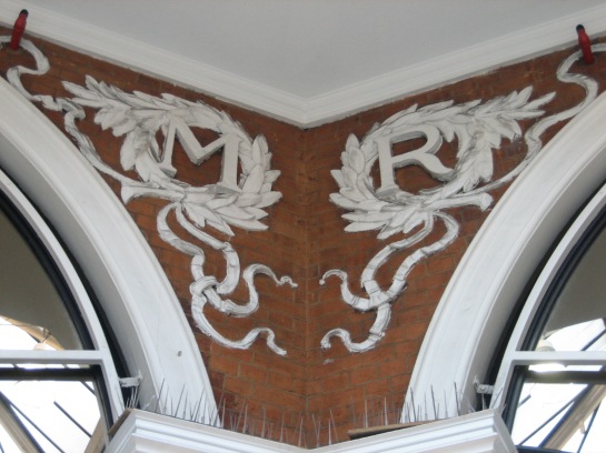
Thankfully it didn’t survive, regenerating in the first decade of the 20th century to become… a shopping arcade. But wait, because just above the entrance to the station, up in the ceiling, are some attractive motifs commemorating the change. Both the Metropolitan (pictured above) and District railways are honoured:

Definitely ReveredAlong with the year of the renovation:

It was a very good yearAnything like this, with the right dosage of peculiarity and charm to catch people’s eye and make them stop and stare, is a good thing. The motifs add a bit of substance to the otherwise wispy atmosphere of the arcade. If even one person has cause to ponder for a moment on the meaning of MR, DR or the significance of 1906, a job of work has been done.

As for the station looking bigger on the inside than the outside… hasn’t the Underground always had plenty of time for relative dimensions in space?

High's treat

Stone meReaching such a propitious milestone as this, the midway point of my quest to list 150 great things about the Underground, demands something grand and bold. I feel I need to rise to the occasion. After all, as Roger Moore said to Jane Seymour, there’s no sense going off half-cocked.

Wait, what?

Public transport cutsYes, that is what you think it is. And you reckon today’s public transport cuts are controversial.

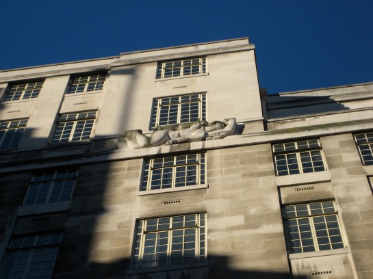
The immense and dazzling edifice that is the headquarters of London Underground at 55 Broadway, sitting astride St James’s Park station, is furnished with a set of equally striking and suitably head-turning sculptures.

Two appear in the photo directly above: in the background, high up on the beautiful facade, is North Wind by Eric Gill; in the foreground, sporting the naked child, Day by Jacob Epstein.

It was Epstein who brought down the censorious hordes of the late 1920s, who in turn almost brought down the visionary helmsman of London Underground himself, Frank Pick. For it was into Pick’s hands that the penis was placed (stop giggling at the back), and who threatened to resign if the public campaign against Epstein’s sculpture found favour with his own superiors.

An inch and a half saved the day (insert your own innuendo here). This was the length of stone Epstein agreed to remove from the naked figure. There is no information available as to how and why this particular length was calculated. Maybe there’s a secret equation used by public institutions to determine genital:scandal ratio.

But perhaps there was a bit of calculated outrage going on here. After all, Epstein’s Day is the sculpture that is most prominently displayed on the outside of 55 Broadway, and therefore the one most likely to catch the public’s eye. Pick, along with Epstein and the architect Charles Holden, must surely have anticipated the furore – and hence the extra publicity.

A total of 10 sculptures appear on the building, the work of an assembly of artists the like of which TV Times would no doubt (and appropriately) have called star-encrusted.

The immensely influential Epstein provided two: Day, and a companion work, Night, that stirred its own respective pot of societal umbrage:

Night workThe other eight sculptures depict the four winds, twice over. The engraver and noted religious sculptor Allan G Wyon supplied one East Wind:

Where there's a wind there's a wayThe other was created by Eric Gill, who also supplied the North Wind shown in the second photo above, and a South Wind.

Eric Aumonier, whose work I chose to begin this blog 75 entries ago, designed the second South Wind, while Alfred Gerrard was responsible for the other North Wind.

The two West Winds were the work of Sam Rabin:

Go, West…and no less a figure than Henry Moore (the sculpture on the left)

The Moore, the merrier

Gerrard’s North Wind is on the right (click to enlarge).

That roll-call of names shows the power that Charles Holden could wield when it came to commissioning major public art for a major public construction.

I’ll return to 55 Broadway again; the building itself more than deserves its own entry. But this particular ensemble of creativity, on such a formidable structure in such a potent location, easily supplies enough tonnage of worth to sit at such a waymarker in my quest.

Despite being one and a half inches shy of what was originally conceived, the 10 sculptures represent the ambition of the Underground as once was, and the legacy it commands and carries onwards into its future.

Plus they’ve allowed me to indulge some ripe double entendre that, unlike some of the other assertions on this blog, would surely stand up in court.