Archive

Northern line

Lest we forget“It was about 8.00pm. I was standing on the platform talking to people when there was a terrific explosion above the station and, at the same time, all the platform lamps ‘arced’, and that put the station into darkness.

“When the station went into darkness panic started; it was a bad panic.

“I said to them: ‘It will be all right, we will have a light on in a few moments.’ But no light came.”*

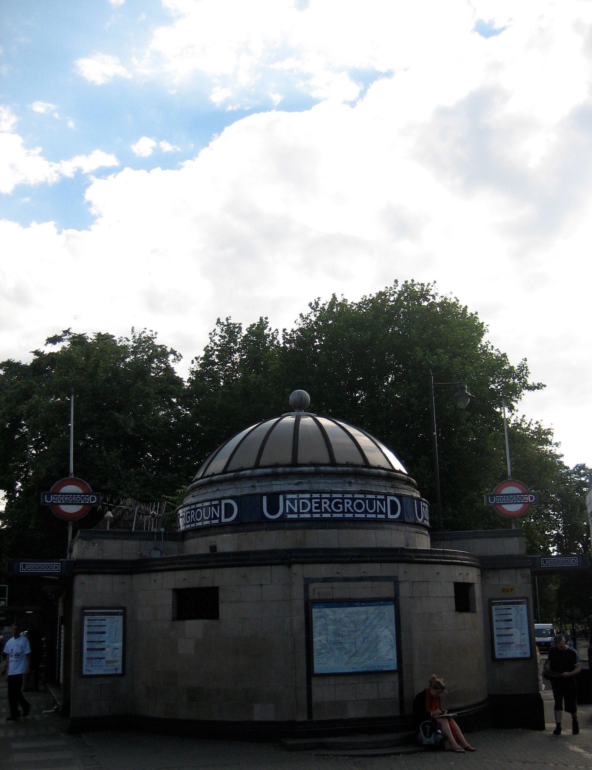
A total of 68 people were killed when a bomb fell outside Balham Underground station on 14 October 1940: 64 members of the public and four staff. The bomb penetrated the surface of the Balham High Road, leaving a crater into which fell an entire London bus. Meanwhile damaged pipes caused water and sewage to flood the railway tunnels, which would take two months to repair.

Just the previous day, a bomb had fallen on Bounds Green station, leaving 19 people dead. On 11 January the following year, Bank station was hit: 56 people were killed.

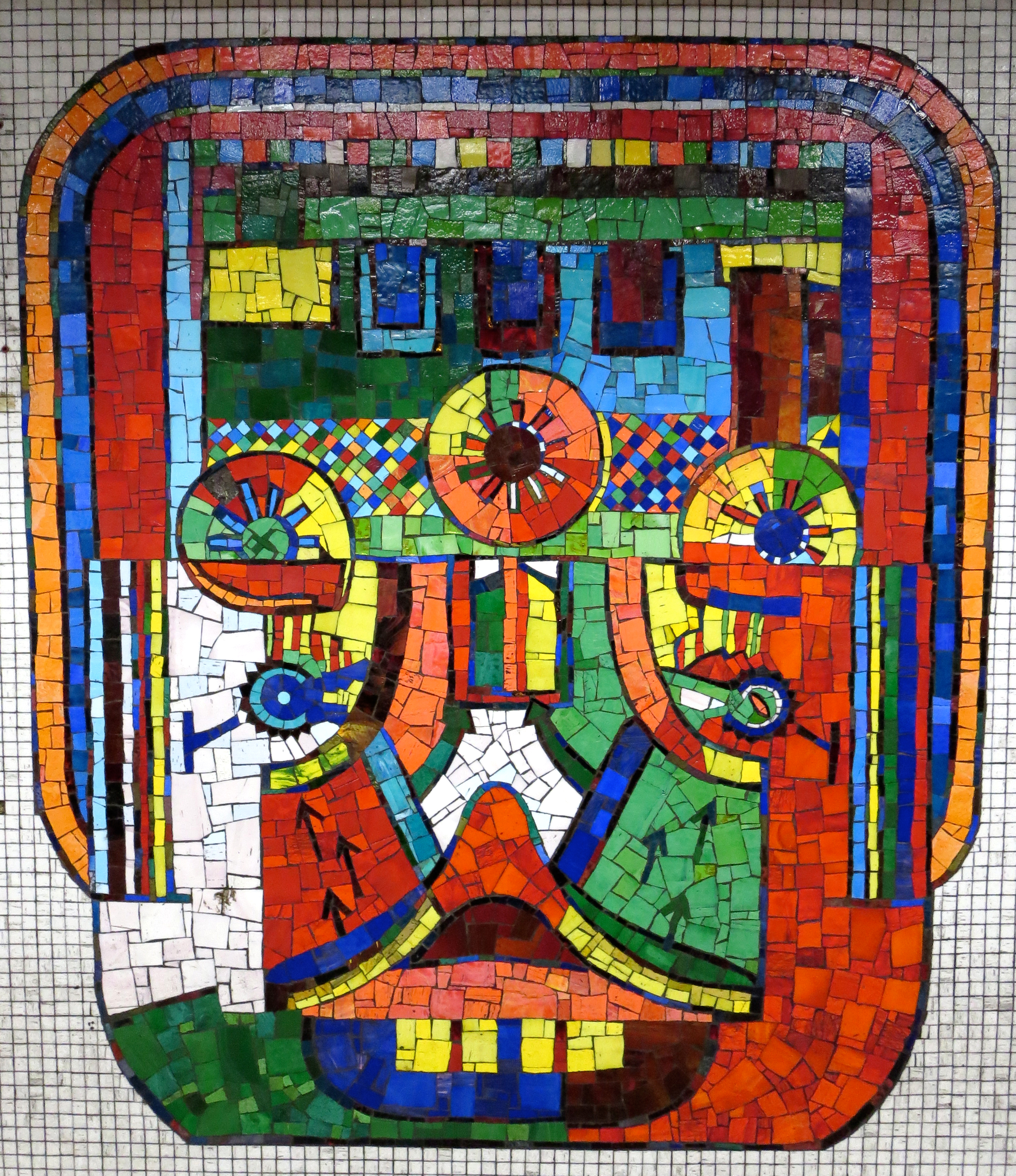
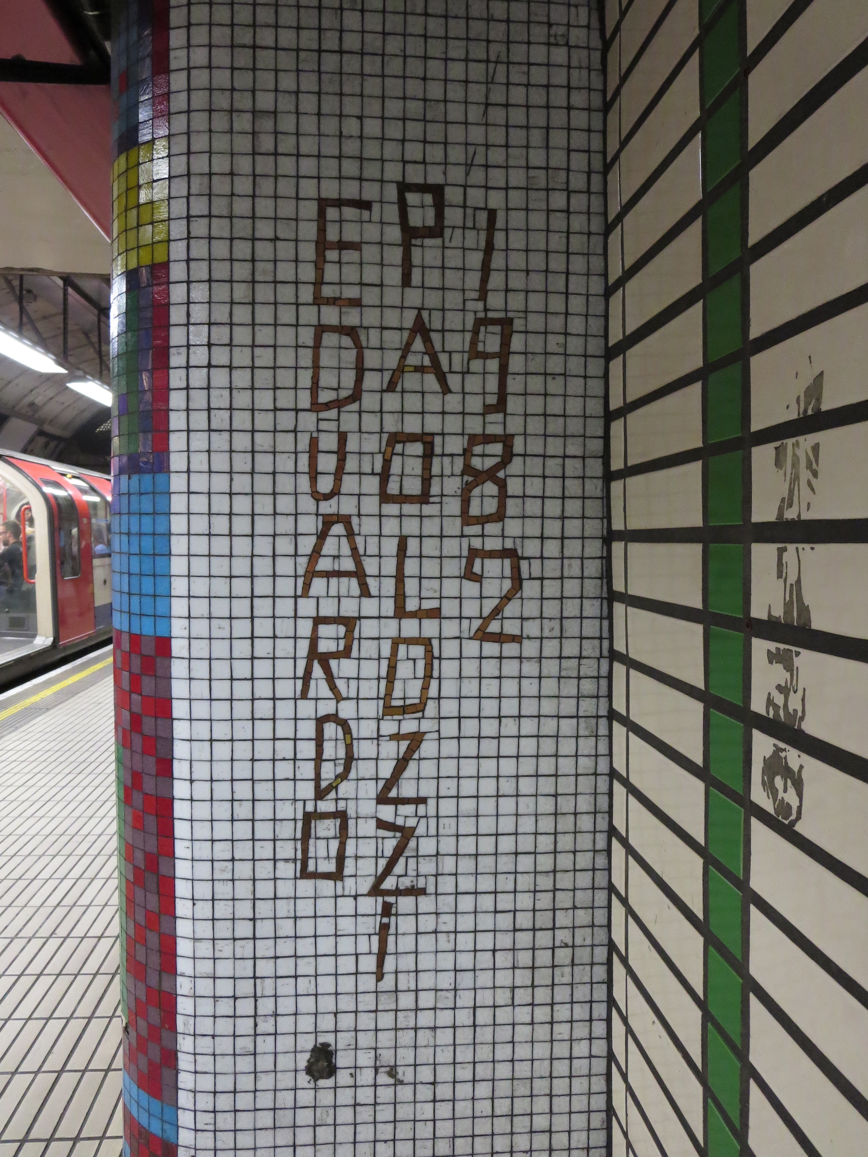
The memorial plaque at Balham is a simple, tasteful tribute to those who lost their lives here during the second world war. It’s just as worthwhile a reminder of the Underground’s history as any number of heritage galas or souvenir dining sets. In fact, it’s the most important and most dignified reminder of all.

(There are other plaques of remembrance at Bounds Green and Bank, though if you manage to find them you’re a more patient and resourceful person than I.)

*from London Carried On by Charles Graves, published by the London Transport Passenger Board in 1947

Colour me smittenNo less a figure than Sir Paul McCartney has links with Tottenham Court Road.

It’s not via his smashing video for the 1986 song Press, which features a bumper crop of Underground locations. Rather, it’s that the same person who designed the cover of the joyless Wings album Red Rose Speedway also designed the joyous mosaics that line this station’s platforms.

Eduardo Paolozzi is the common factor, and I know which of his efforts I prefer. I’m sorry, but a picture of an ex-Beatle with a flower in his gob just cannot compete with the likes of this:

Courting approvalThis must be the most highly-maintained slice of public art on the Underground. That’s not an especially insightful guess; you can see the wear and tear within seconds of arrival. By and large, though, the mosaics are in reassuringly fine shape. Most of them look as ravishing as they must have done on their construction between 1982 and ’84. A great deal of Tottenham Court Road station may be currently in a shocking state, but tens of thousands of tiny chunks of it are not.

And what a delight it is to discover them, having trudged down steps and along corridors that seem longer and dirtier than they really are, ending up in what always seem to be among the hottest deep-level tunnels of all.

Rogue typeface alertThere’s a bit of rogue typeface to be found as well.

Paolozzi was given 1,000 square metres to fill. Not all of this remains intact. The whirling abstract shapes and topical tessellations used to spill up from the platforms, through passageways and escalator wells and into the ticket hall. But as with other voguish trends of the early 80s, they have fallen away – literally, in some cases.

A few of the designs can look a bit like the mouth of a sugary-drink addict. Occasionally you’ll find a tile on the floor. If you’re conscientious you will hand it to a member of staff. If not, you will take it home and put it on top of your chest of drawers, next to that pebble that may or may not have once belonged to the Berlin Wall.

Some areas of the platforms seem to have escaped the current round of modernisation entirely. Welcome to a time before the Docklands Light Railway, when the only interchange at Stratford was with British Rail:

Epping for OngarOther designs draw your eye upwards and on to the ceiling, doing their best to cope with intrusions from cables, signage and a great wodge of plastic:

Courting disasterBut even cut in half or riddled like an asymmetric colander, the mosaics continue to triumph. Anywhere else they might feel garish, seem over-the-top, look fussy and appear unsightly. Down here they are like the sweetest major chord resolving out of the bleakest of cacophonies, or the world’s largest paintbox exploding on to the drabbest canvas.

Welcome to Paolozzi’s everlasting night on the tiles.

It was a very good year

A case of cup-olaThere are a, ahem, coupla’ reasons to visit Clapham Common station.

The first is the single island platform, identical to the one at Clapham North, both of which are the only such layouts still in existence on deep-level Underground lines.

The second is above ground. It’s the intriguingly (some might say dangerously) exotic confection that sits over the main entrance:

Cosmopolitan twitchingsIt’s rare to find the Underground flirting with anything so continental. It’s even rarer to find it getting away with it. Perhaps it’s the logo that’s key. Its reassuring typeface and dash of provincial antiquity  offsets any passing architectural indulgence.

But don’t worry. On encountering the cupola, if you’re prone to suffer from cosmopolitan stirrings, you can always nip on to the nearby common to relieve any tautness.

My cup runneth 'olaThis is the only decent bit of Clapham Common station to break ground. There’s a small, rather lumpen pavilion on the other side of the road that contains another way down to the ticket hall, but it can’t compete with this fey treat.

There’s a faint whiff of Catholic chintz about it. If the pope were to endorse this kind of architecture, his popularity might get another unlikely boost. But given its devoutly secular antecedents, I’m not so sure. Could Francis ‘ford this cupola? I suspect his fellow cardinals would prefer apocalypse – now.

Yet even if this very-late Victorian fancy (c. 1900) doesn’t tickle yours, there’s something hanging inside to twitch even the devoutest of souls:

Arrow right through meCupola? I barely knew her!