Archive

Piccadilly line

Circus topOne of my favourite photographs of the London Underground was taken on New Year’s Eve, 1962.

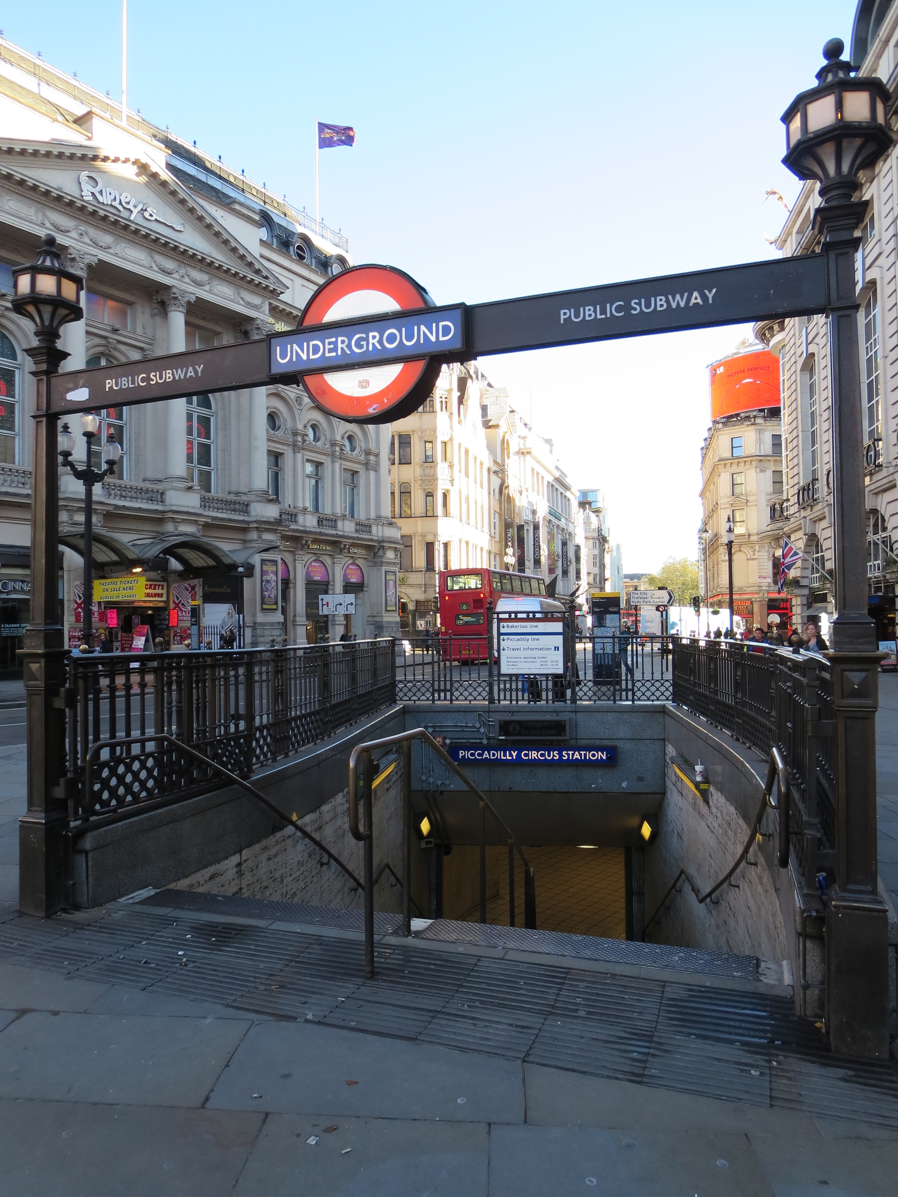
It doesn’t feature any trains or tunnels. There are no platforms, escalators or booking halls to be seen. It doesn’t even include a station. Instead, it shows a group of people standing by one of the subway entrances to Piccadilly Circus, balloons and cigarettes in hand, wrapped up in coats, hats and boots, waiting for something to happen. Around them, all is snow and slush and electric lights and excitement. The Swan & Edgar department store rears up behind, by now well into its dotage but still a commanding presence. And somewhere down below, oblivious to all of this, ignorant even of the turning of the year, the Underground goes about its business.

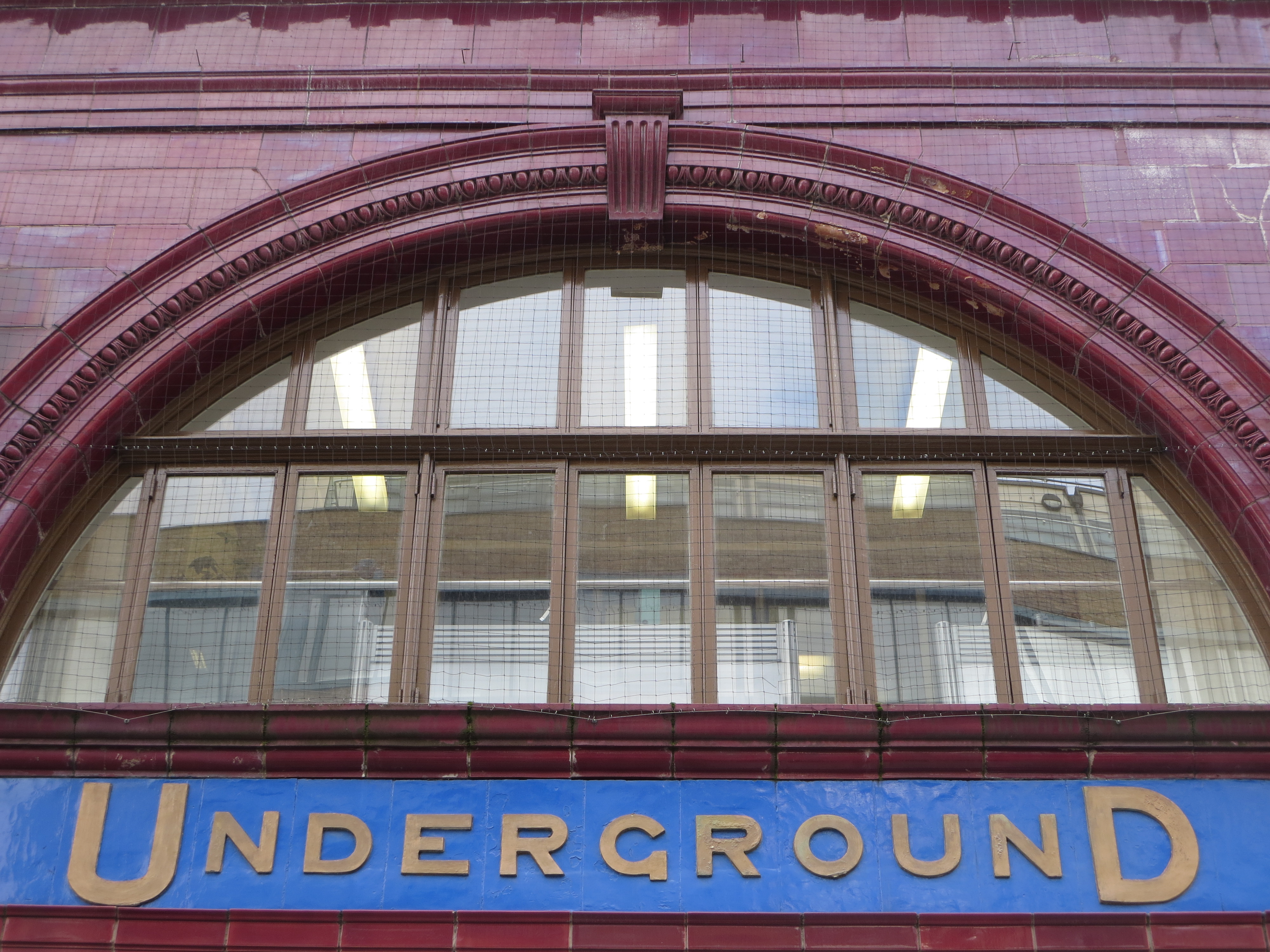
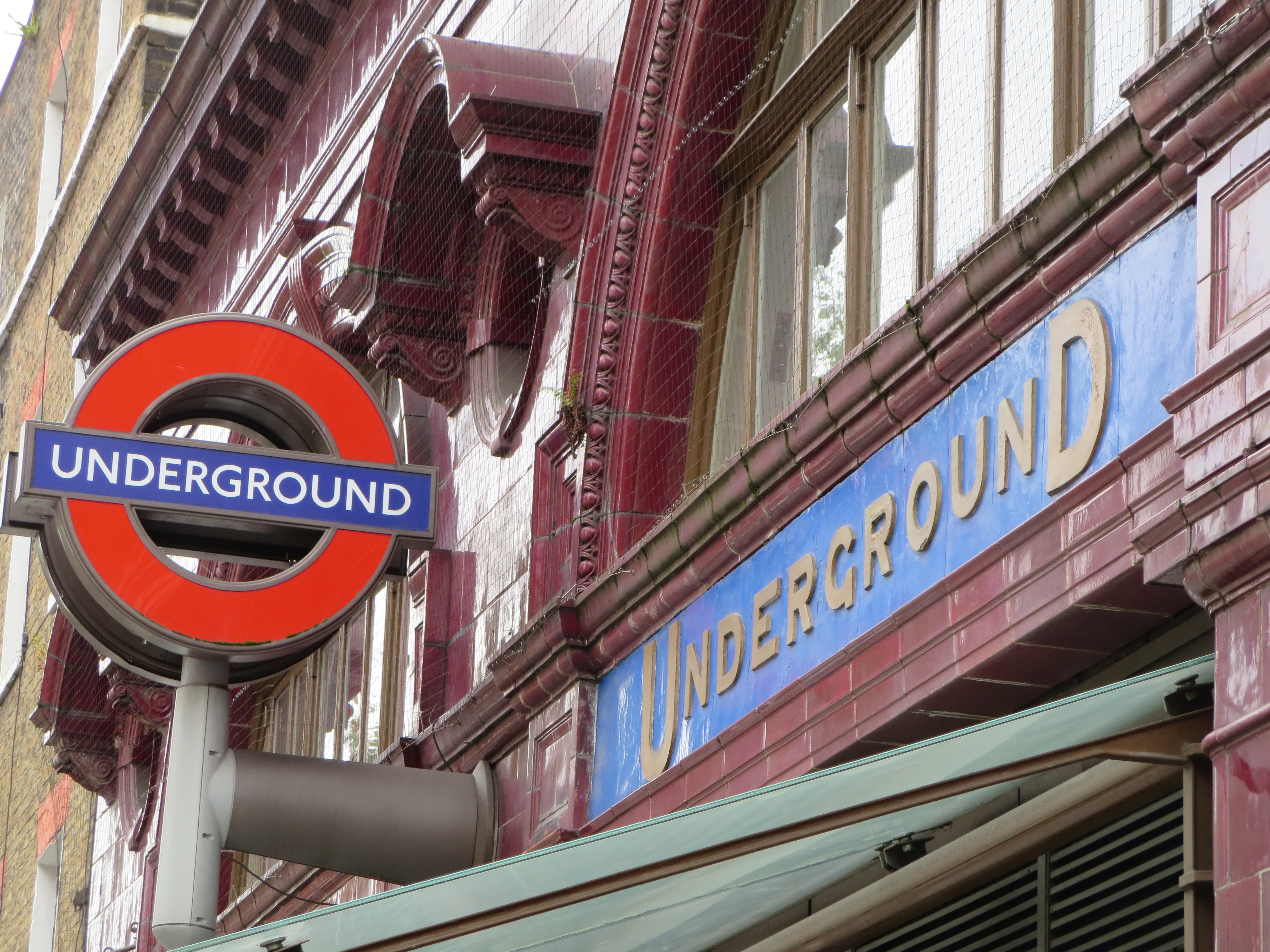
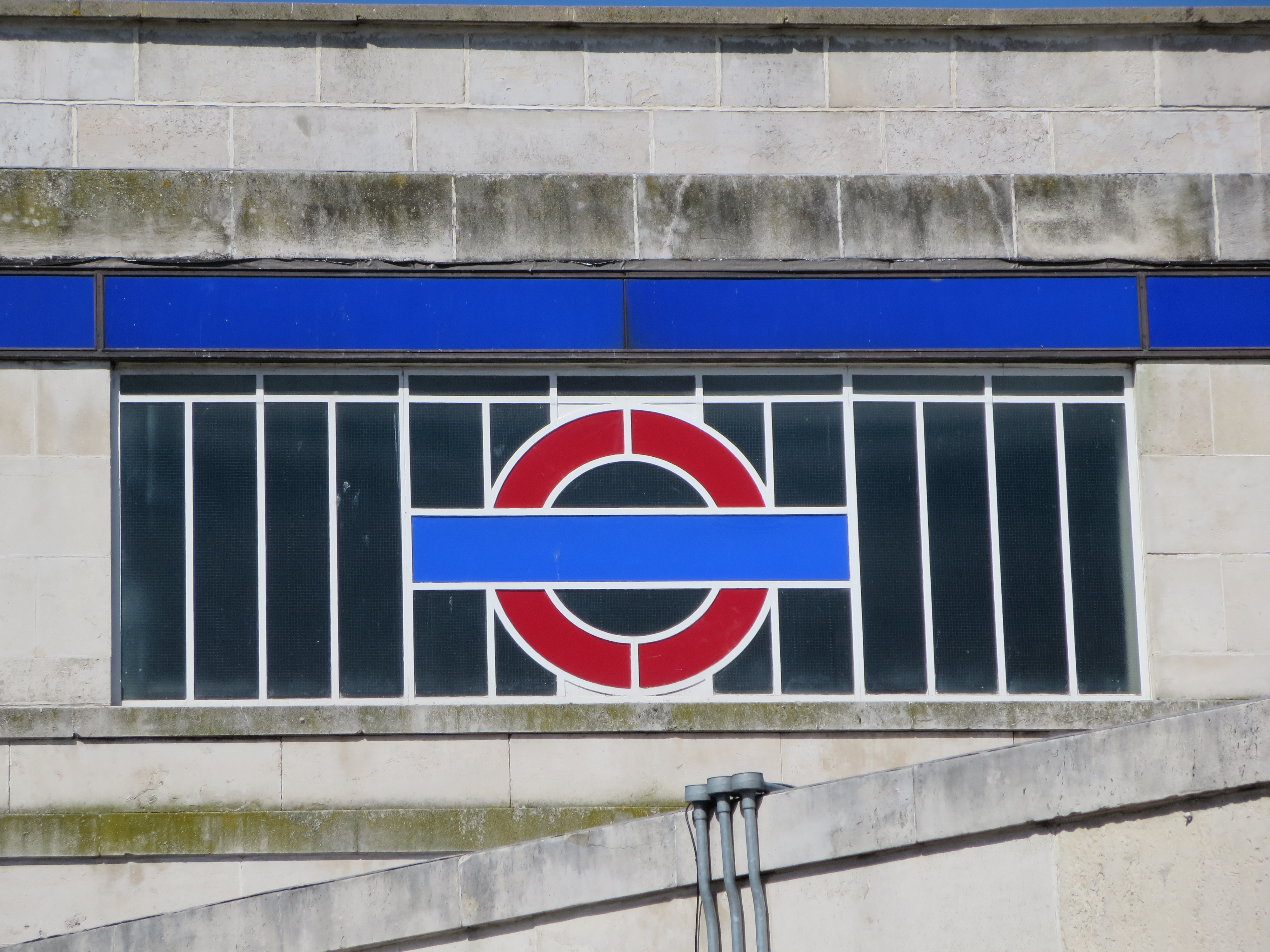
The photograph, which I’ve uploaded here, was taken by Edwin Sampson, whose work appeared in a number of newspapers in the early 1960s. It doesn’t look particularly posed or staged; it could almost be a snapshot caught on camera by a tourist or passer-by. Yet it bears the traces of a professional. You can tell this from the way the scene is lit so beautifully, but so casually. The Underground roundel and ornamental balustrades look particularly gorgeous. They feel almost on a par with the Christmas decorations. They’re certainly of equal elegance.

Monochrome is a wonderful leveller. While it reduces contrasts, it also raises everyday objects to the same status as the exceptional. The subway entrance is the star of Sampson’s photograph; the balloons and fairy lights and handsome loiterers form part of the supporting cast.

Piccadilly palare
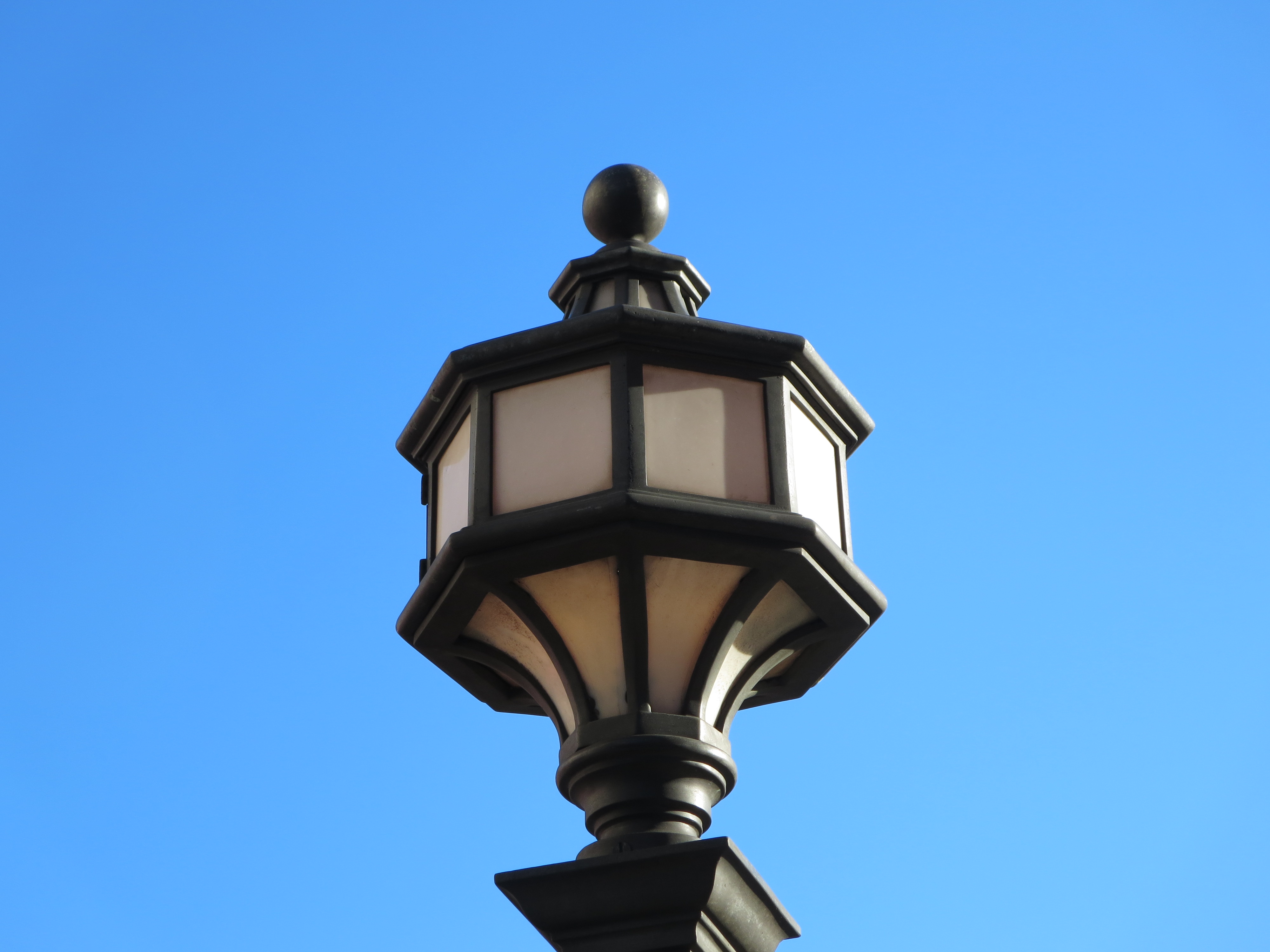
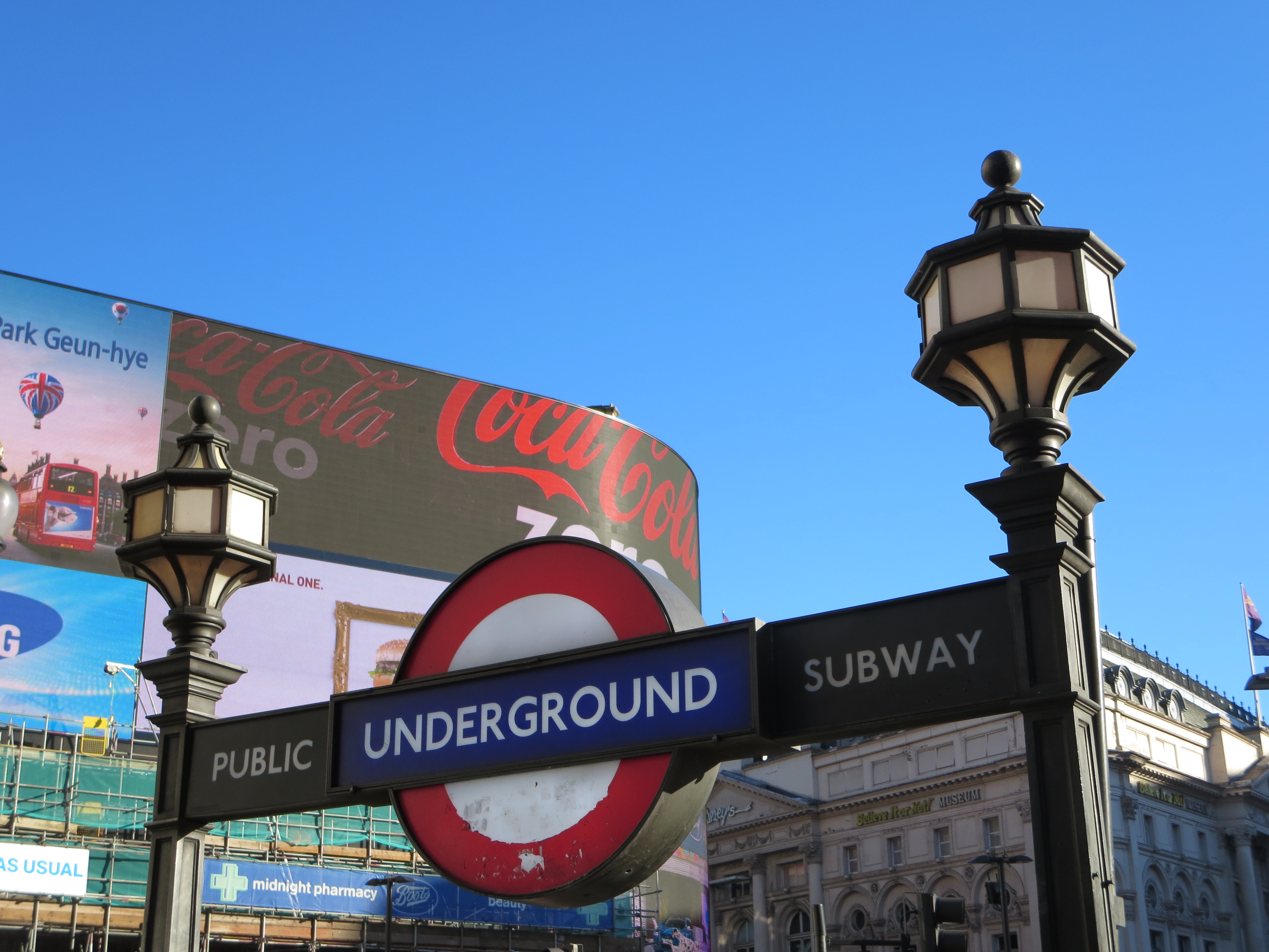
Today, the entrances still look almost as good as they did half a century ago, though daylight and colour shows up rough edges and shabby hues that can be hidden in a black-and-white photograph. The lampposts are bearing up the best. The roundels have become targets for stickers and adhesive calling cards, which even when removed leave a nasty residue.

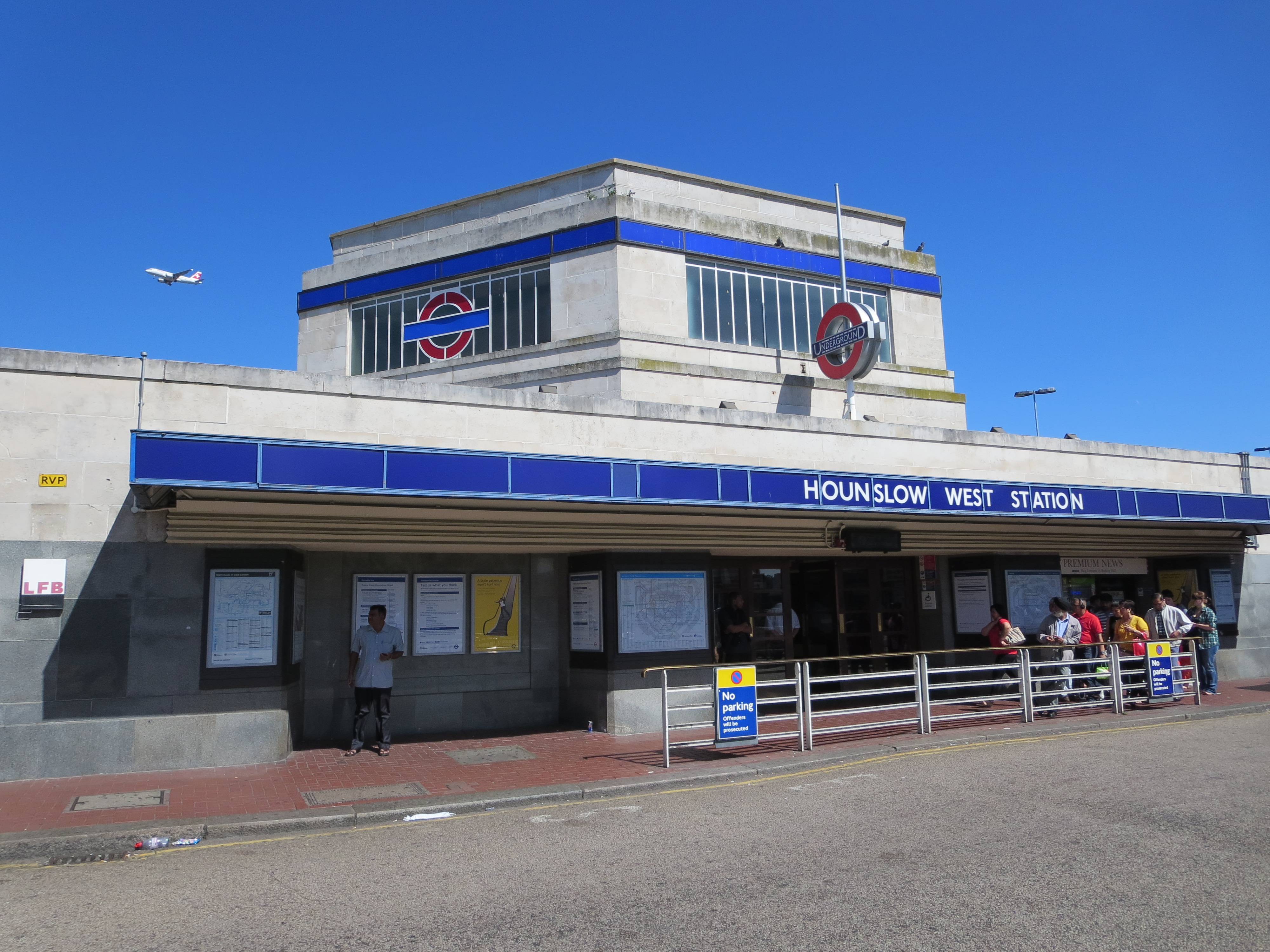
It goes without saying the rest of Piccadilly Circus has changed. There is more sprawl and less subtlety; greater pretension and nowhere near the same reticence. But then the same goes for most of central London. It’s just a question of adjusting your expectations. You can still mooch moodily by Underground subway entrances – so long as you don’t mind doing it next to cacophonous traffic or alongside gutters full of free newspapers and discarded Big Bus Tour ponchos.

When the day comes I finally sit down and write that musical about the Underground I’ve been mulling over for about 20 years, these particular subways will be one of the key locations, along with the steps at Wembley Park, the escalator at Canary Wharf and the whole of Gants Hill. Until then I’ll continue to gaze wistfully at the graceful furnishings with their evocations of make-believe days and frosty nights, and dream of Piccadilly palare between me and the boys in my gang.

...in which case I'm doomed

Capital effortThere are several of these sprinkled around London, but the one at Russell Square is particularly well-preserved and prominent. Embedded in Leslie Green’s stubbornly perfunctory and visually peakish facade, the logo radiates freshness and imagination like sunlight sneaking through a crack in the Berlin Wall. An interloper from the drawing board of a visionary rather than a functionary, it can’t help but catch and retain the eye.

What is it that makes, that made, this logo so potent, so intriguing?

Its antiquity, for starters. It has a quality of being ancient, of hailing from the far distant past. Yet it’s hard to tell from how far back it belongs. This gives it a flavour of mystery as well as heritage. Could it be before or after the war? And which war? Is it even the 20th century?

There’s also something a bit exotic about it. It’s a typeface that doesn’t feel instinctively native to the UK. Where has it come from? Where has it gone to? It’s not passed into the common lexicon. You won’t find it adorning anything new – or anything relatively new either.

But above all, it’s enormously alluring. This is a typeface to fall in love with. It knows it’s attractive, but lets you know in a coy rather than charmless fashion, which just makes it all the more irresistible. Forget having your name in lights. How about having your name in these particular sans-serif capitals?

It’s also a typeface to fall in love under.  A first swoon beneath this kind of sign? There’s little that could be more provincially sentimental.

Facts, rather than fancy, reveal that as with most exotica, the logo blazed brightly for a period, then fell out of favour sharply. Thankfully it gave way not to something worse, but something even better. Father and son eye each other warily outside Russell Square, positioned at right angles in a way that flatters neither. But then neither belongs next to the other. It’s like putting two Dr Whos in the same show and expecting double the fun.

Facts also reveal that the typeface does indeed date from before the war – but the first world war, not the second, and therefore more of a veteran than its slightly futurist style suggests. It’s as old as 1908, the year the Underground got tired of the 20th century breathing down its neck and decided it needed a trademark. But the network ended up not only conceiving its own logo but its own emotion. For here was where the romance of the Underground first spluttered into existence – a romance that continues to this day.

Jousting typefaces

HeptangleI don’t know much about geometry, but I know what I like.

Nonagons, meh. Decagons: too much. Pengatons? They don’t go far enough. A heptagon, however, is a tangle that I’m very happy to get into.

It’s the heppest of all polygons. It has just the right number of sides to allow mathematics to appear beautiful. When you hold one in your hand – in the guise of a 20 or 50 pence piece – it just feels right. Not overdone or underdone. Not fussily complicated or disappointingly sparse. Just right.

And when you get to see one that’s large enough to walk all the way round… well, you know that something is right.

Go, West!The feast of heptagons inside Hounslow West station is toasted on the outside by something of equal majesty. There are hardly any buildings in London that have these alluring dimensions. There are hardly any in the UK, for that matter. Are seven-sided shapes really considered so unruly and disruptive as to be sent to the back of architectural class? Or told to go and stand down the other end of the corridor – in this instance, almost the very end of the Piccadilly line?

No matter. At least this one exists, and in such fine fettle. The building lets slip discreet pulses of flair in all of its seven directions. In bright sunshine it sparkles. In grey rain it beckons and reassures. And its colours strike at your heart no matter what the climate. This is style and symmetry of a hugely rare but high order.

Race you round the sides. First one back gets to peek through the round(el) window.

Through the round(el) window