Archive

Zone 5

HeptangleI don’t know much about geometry, but I know what I like.

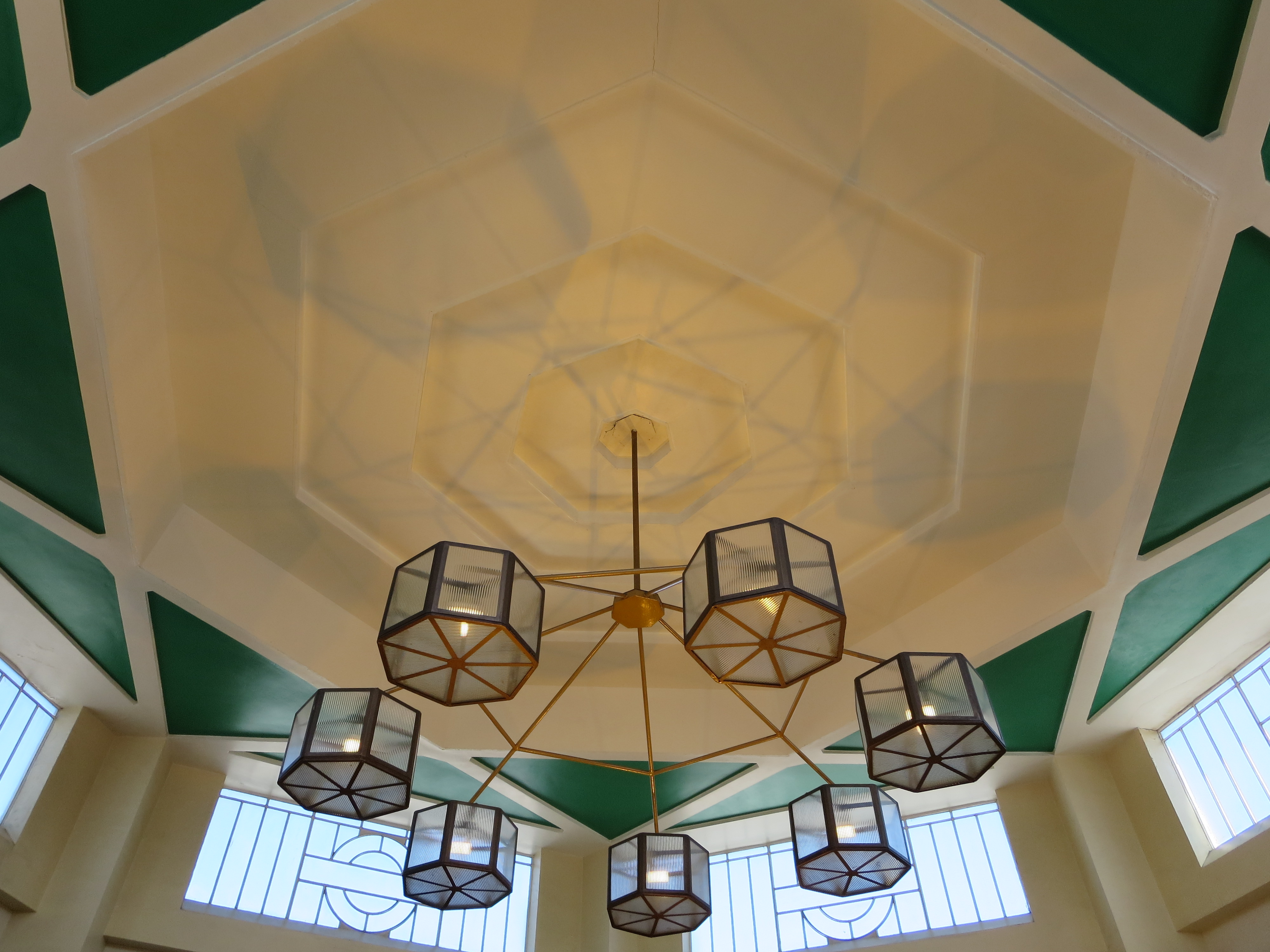
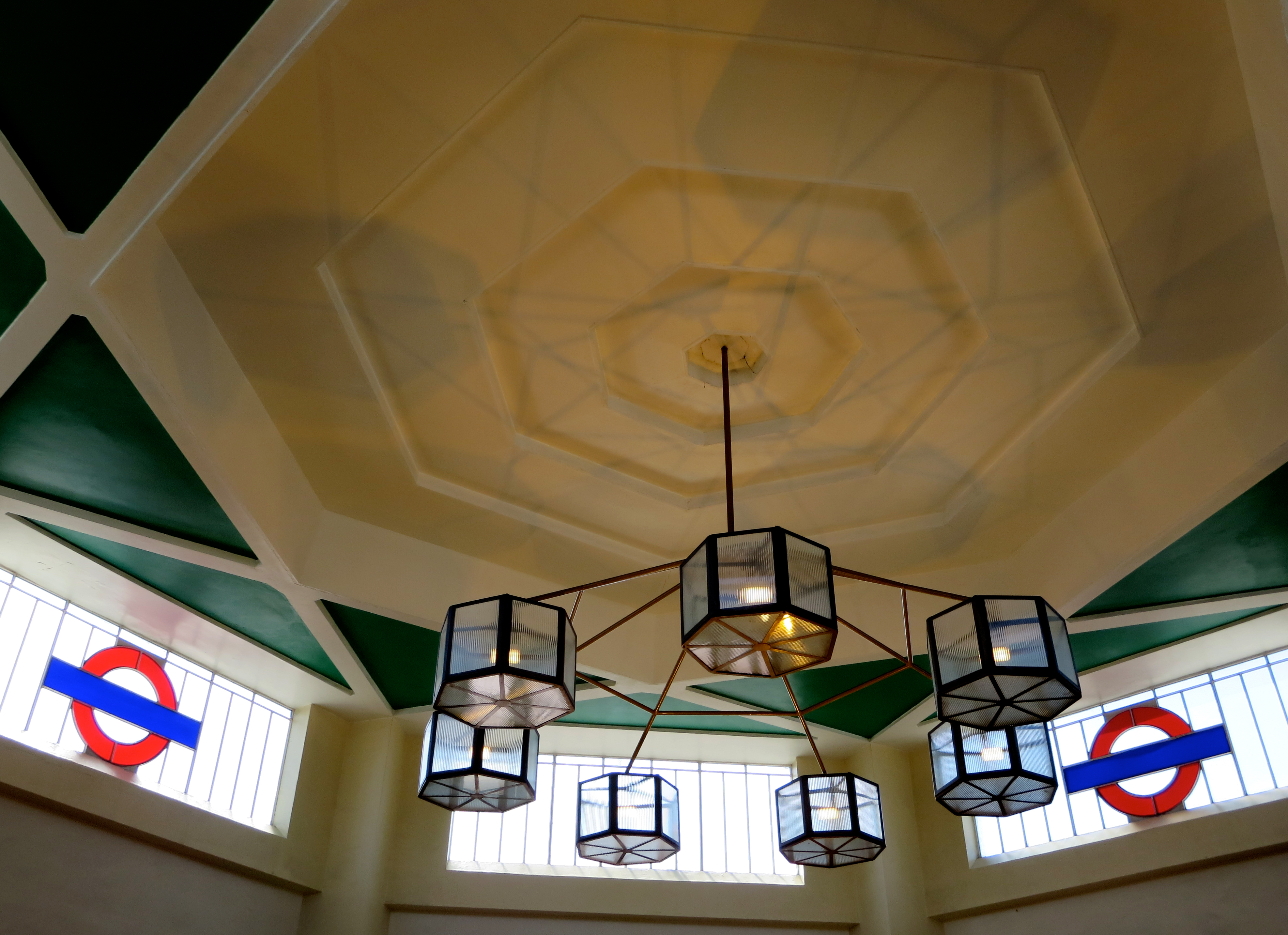
Nonagons, meh. Decagons: too much. Pengatons? They don’t go far enough. A heptagon, however, is a tangle that I’m very happy to get into.

It’s the heppest of all polygons. It has just the right number of sides to allow mathematics to appear beautiful. When you hold one in your hand – in the guise of a 20 or 50 pence piece – it just feels right. Not overdone or underdone. Not fussily complicated or disappointingly sparse. Just right.

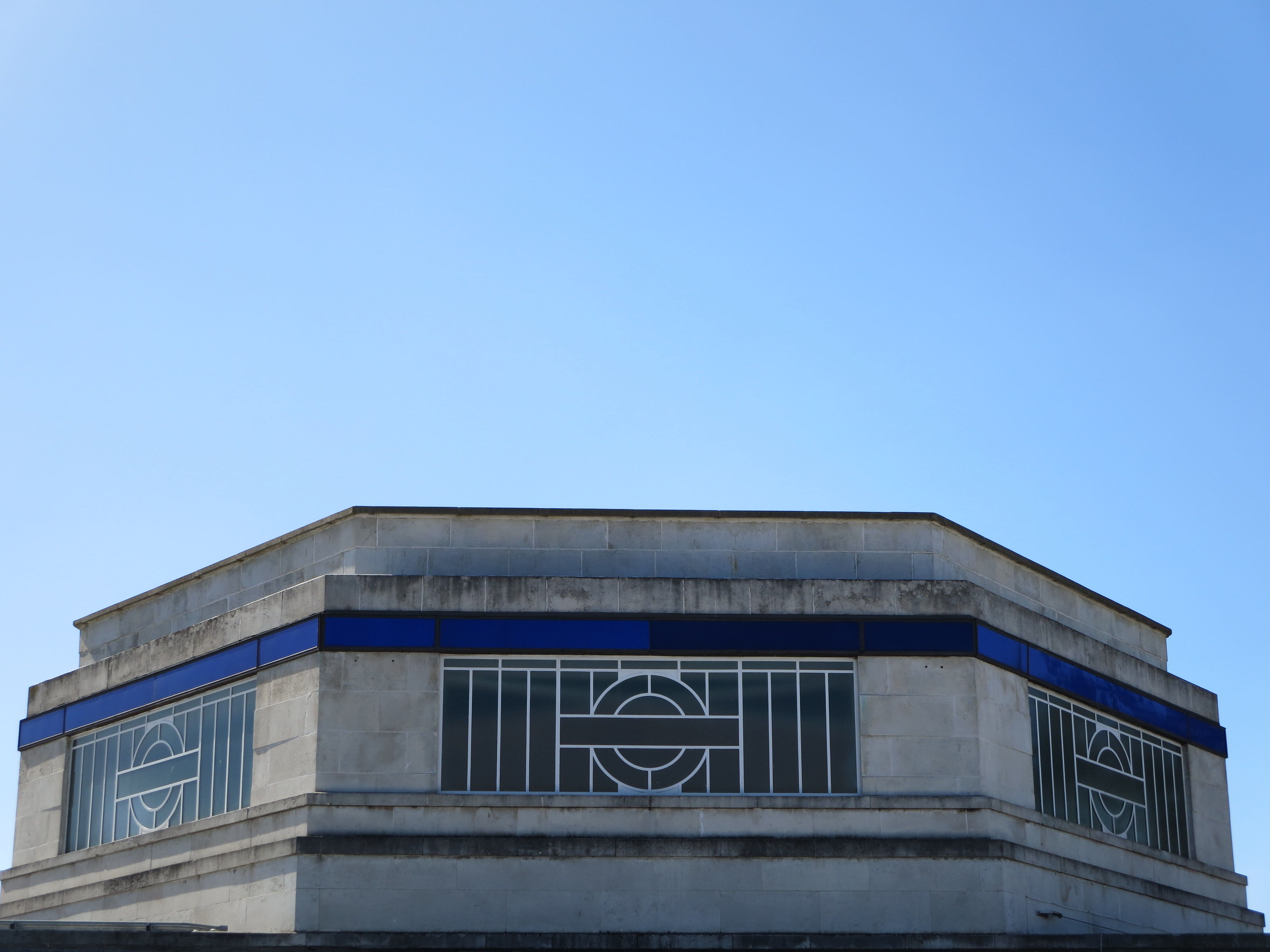
And when you get to see one that’s large enough to walk all the way round… well, you know that something is right.

Go, West!
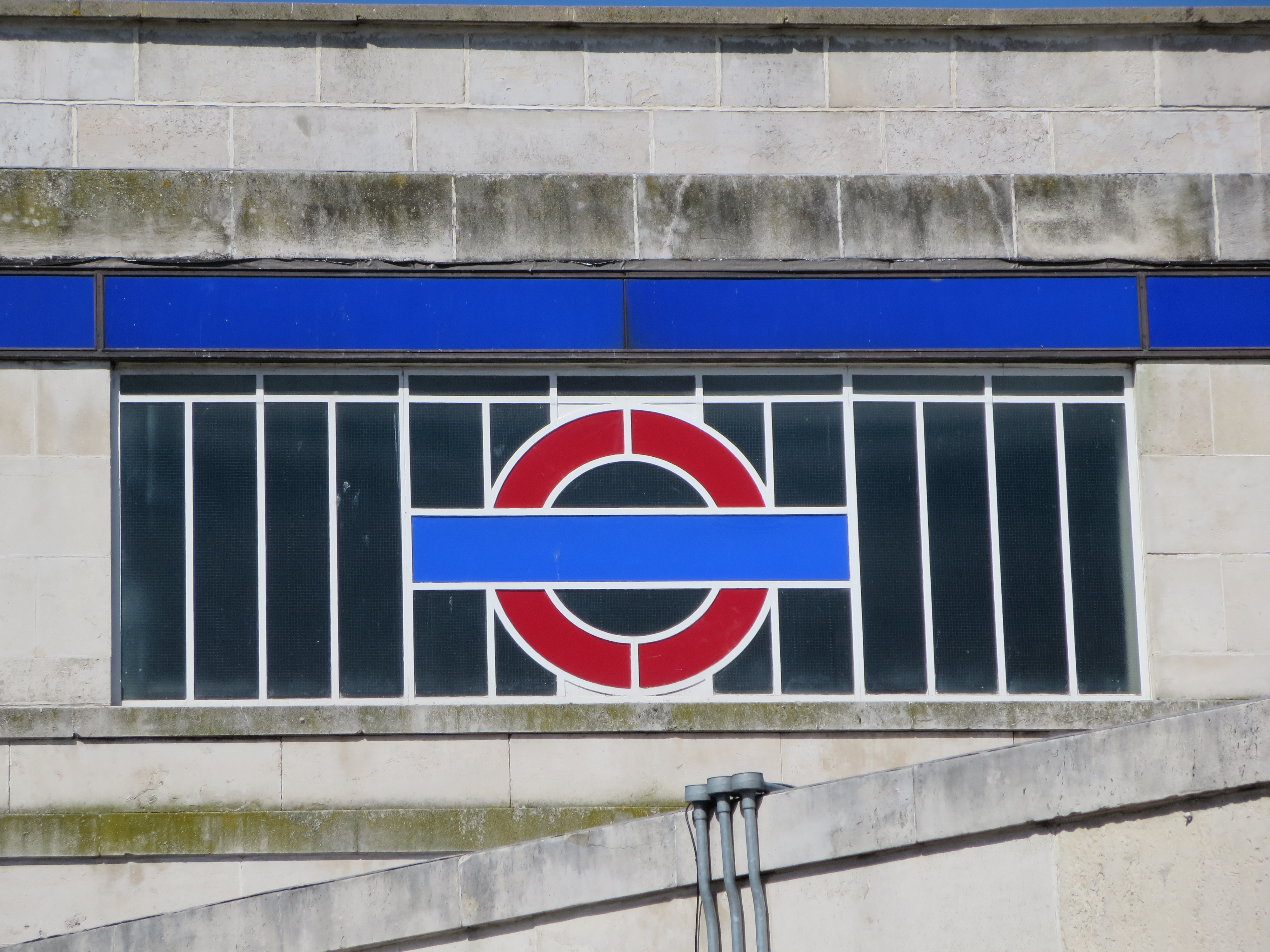
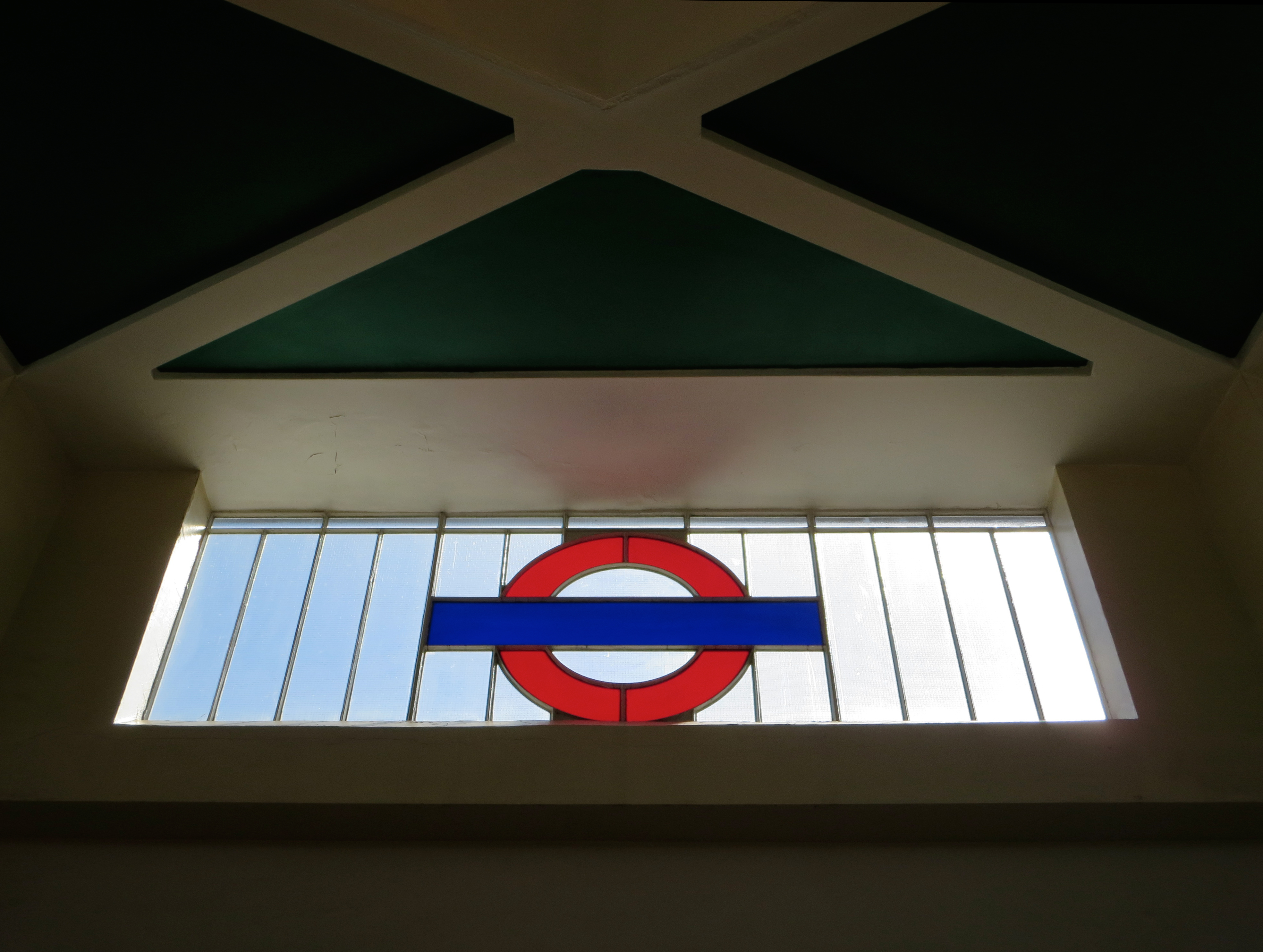
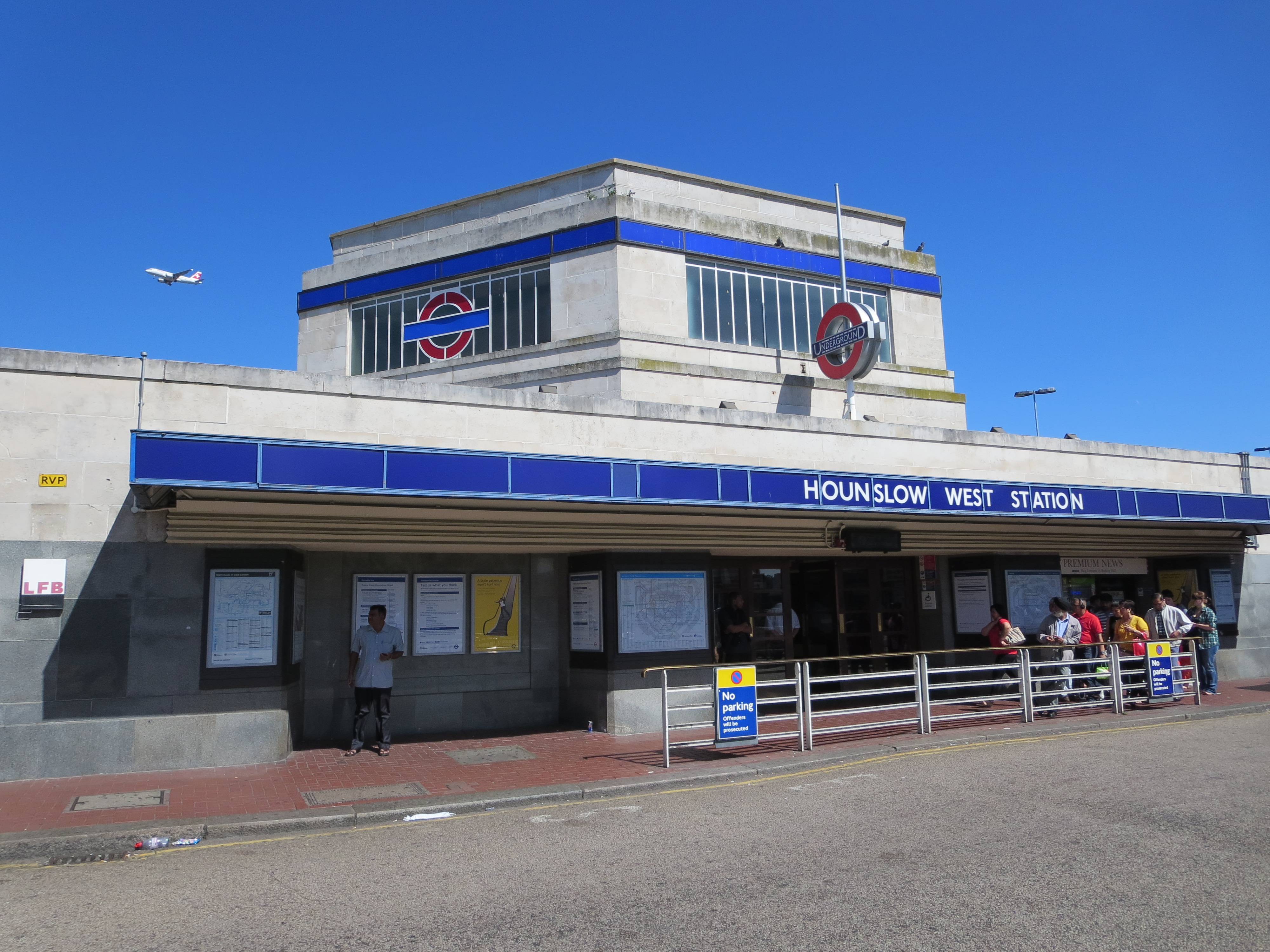
The feast of heptagons inside Hounslow West station is toasted on the outside by something of equal majesty. There are hardly any buildings in London that have these alluring dimensions. There are hardly any in the UK, for that matter. Are seven-sided shapes really considered so unruly and disruptive as to be sent to the back of architectural class? Or told to go and stand down the other end of the corridor – in this instance, almost the very end of the Piccadilly line?

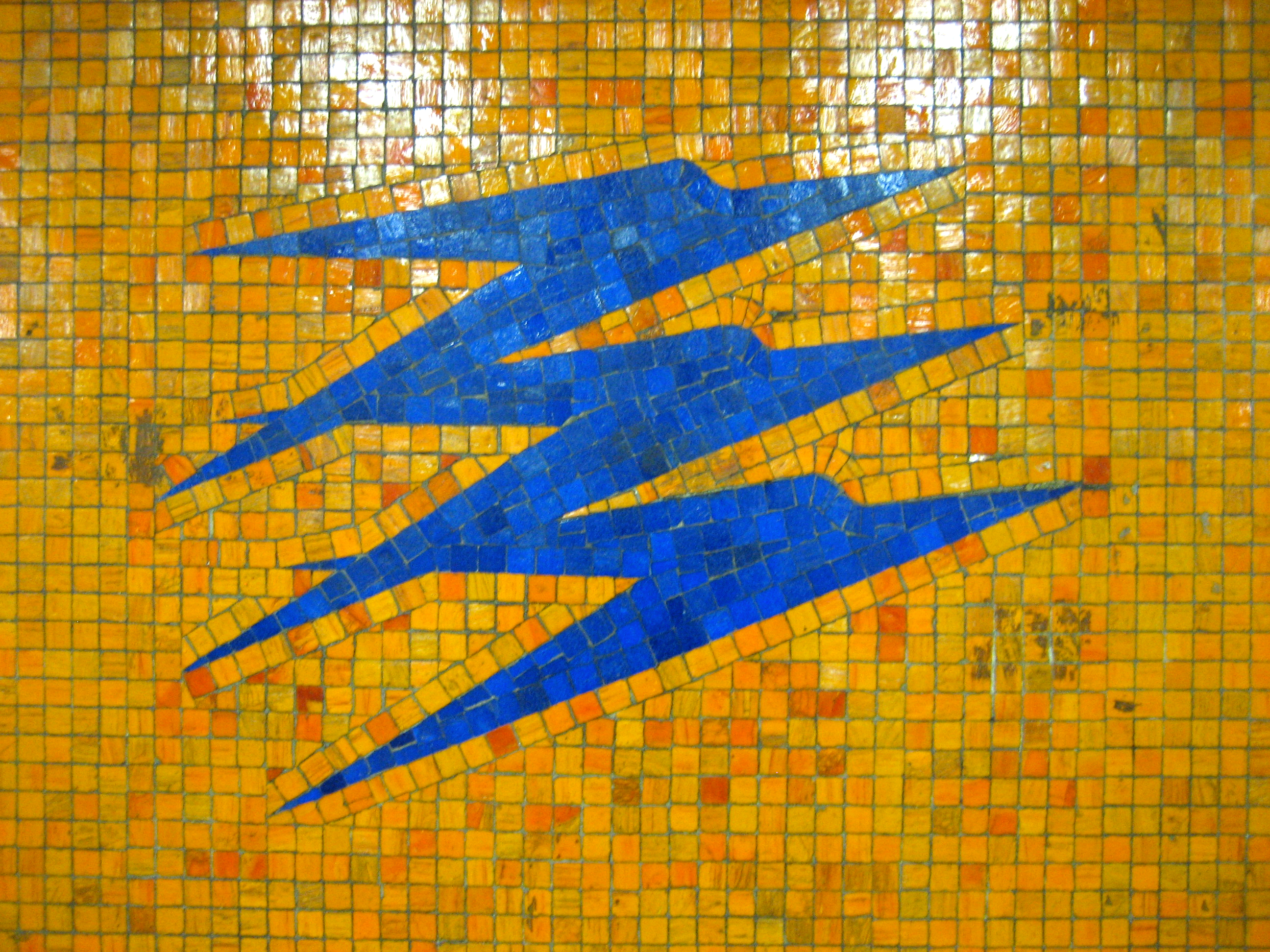
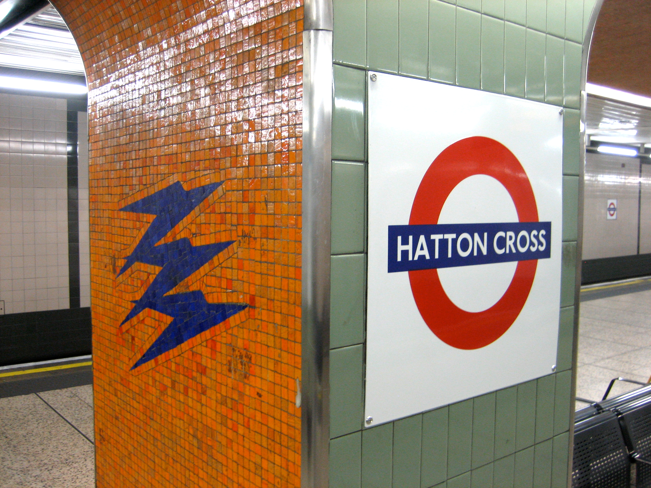
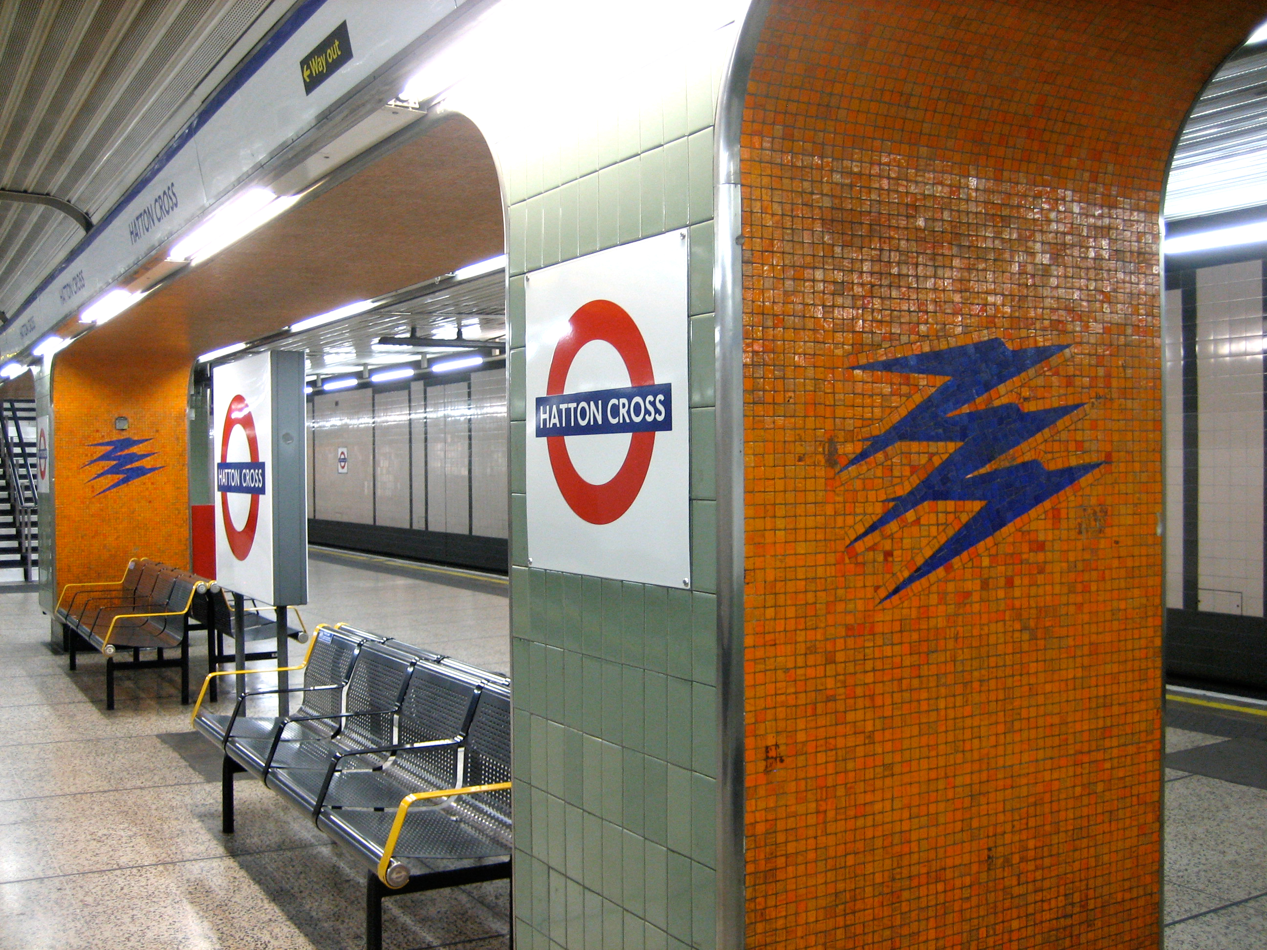
No matter. At least this one exists, and in such fine fettle. The building lets slip discreet pulses of flair in all of its seven directions. In bright sunshine it sparkles. In grey rain it beckons and reassures. And its colours strike at your heart no matter what the climate. This is style and symmetry of a hugely rare but high order.

Race you round the sides. First one back gets to peek through the round(el) window.

Through the round(el) window

The power of sevenYou can find beauty through scale on the Underground: noisy, powerful treats, things that soar and sparkle and make great play of doing an awfully marvellous job over an awfully marvellous area. But you can also find beauty through delicacy, where it’s not so much the size that dazzles but the details. Where less is more.

The interior of the ticket hall at Hounslow West is a bountiful treasure trove of detail. Its contents reward both the passing glance and the lingering stare. From the concept of the design to the hue of the fittings, it’s adorable – to the 128.5714286th degree.

A visit ought to be on the curriculum of every GCSE Maths and Design student, regardless of what any education secretary thinks of these kinds of buildings.

Heaps of enjoymentLight, geometry, colour, architecture, iconography, upholstery and style: the seven pillars of this heptagonal hall of wonder.

Two more Hs were involved in its creation: Holden (Charles) and Heaps (Stanley) worked together in a rare collaboration on the station, which opened in July 1931 – the same month as Sudbury Town. What a feast for the eyes of Piccadilly line passengers.

It’s as much the interaction of all the different features as the concept itself that makes this place so enchanting. There must be dozens of heptagons in total, in both two and three dimensions, which jostle and jive alongside each other as if at a polygon-themed disco. The bright blues and reds of the roundels offset exquisitely the muted tones of the walls and ceiling, and are as gorgeous as any jewel to be found in Hatton Garden. And just look at those shadows:

Hip-tagonalCould the exterior of Hounslow West possibly match the bewitching poise of its interior? You know the answer to that question. And it merits a separate blog entry to boot.

Hatton patternFor a long time I was baffled by the opening line of the Beatles’ Back in the USSR. “Flew in from Miami Beach BOAC.” What did those letters mean? Were they some kind of code? A bit of 1960s polari?

I decided it was an in-joke of the era, a teasingly exotic hangover from a time of impenetrably trendy goings-on, but one that added a potent twist to what I still think is one of the most exciting opening 30 seconds to any song on any album ever.

Many years later I realised it was a reference to the British Overseas Airways Corporation. But this just made the song even better. Then later still I realised I’d been oblivious to a second salute to the BOAC, in an equally unexpected place:

Cross purposesIt is the old British Overseas Airways Corporation logo, and it is gorgeous.

Speedbird, to give it its thrillingly imagine-what-the-future-will-be-like name, used to be emblazoned all over aeroplanes until British Airways was privatised in the early 1980s (coincidentally, around the same time I would have first heard Back in the USSR).

Since then it’s been revised and adapted and generally messed around with so as to become virtually unrecognisable. Not that I’d ever be close enough to spot it, given my fear of flying. Indeed, even being at Hatton Cross, one stop along from the first of the Heathrow stations, gave me the jitters. Although this might have been more down to the questioning looks I was getting from waiting passengers.

You’re encouraged to change trains at Hatton Cross to get your desired connection to terminals 1, 2, 3, 4 or 5. As such the platforms play host to much anxious watch-checking and ticket-consulting. Maybe these bold and colourful streaks of futurism provide a welcome distraction. They can certainly calm the nerves of the most aerophobic of souls.

Planes: perfectly fine when turned into a two-tone mosaic on a pillar. Just don’t send me up inside one, or there’ll be more than a paper bag on my knee.

Hatton: Lust for Glory