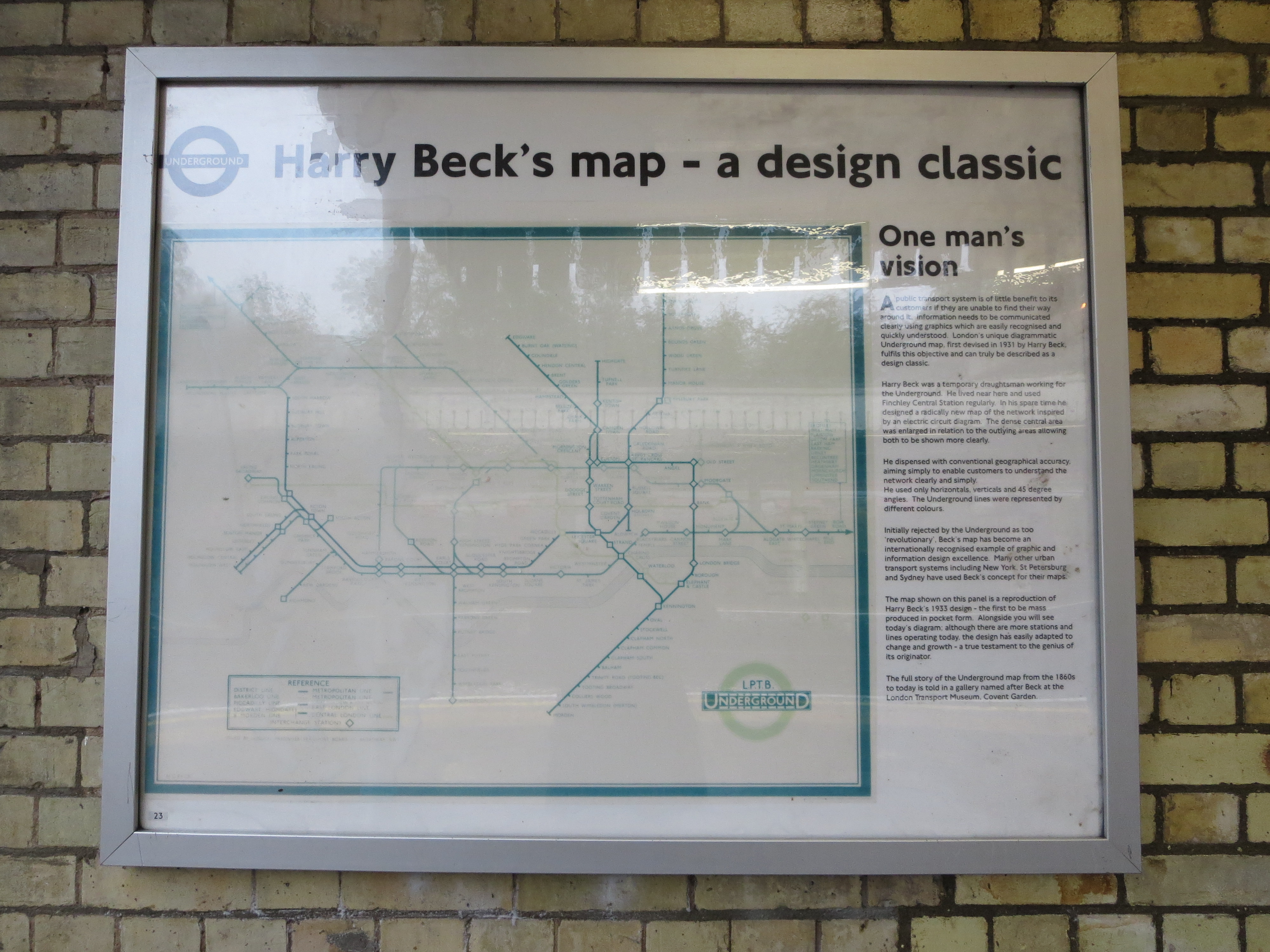
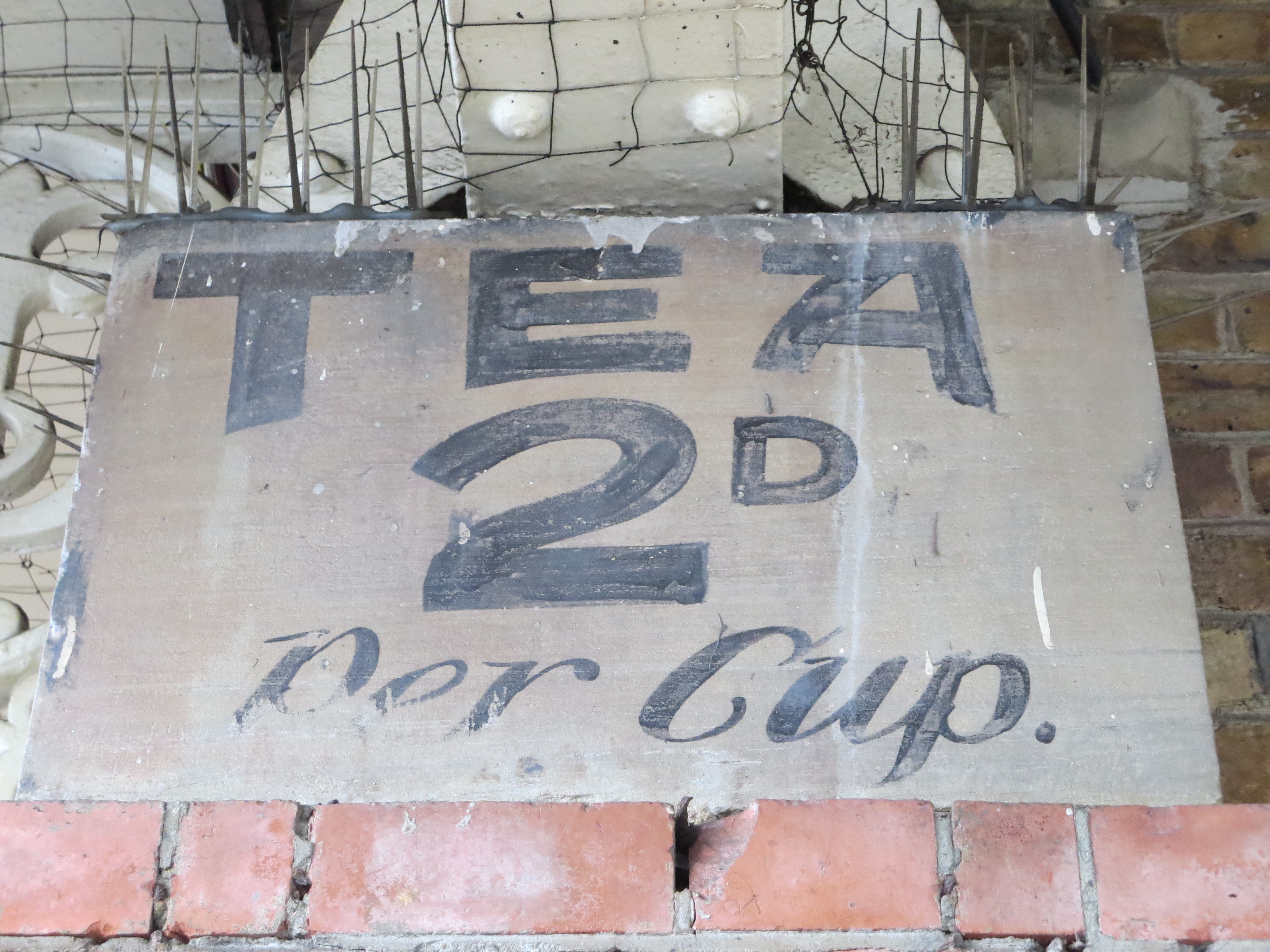
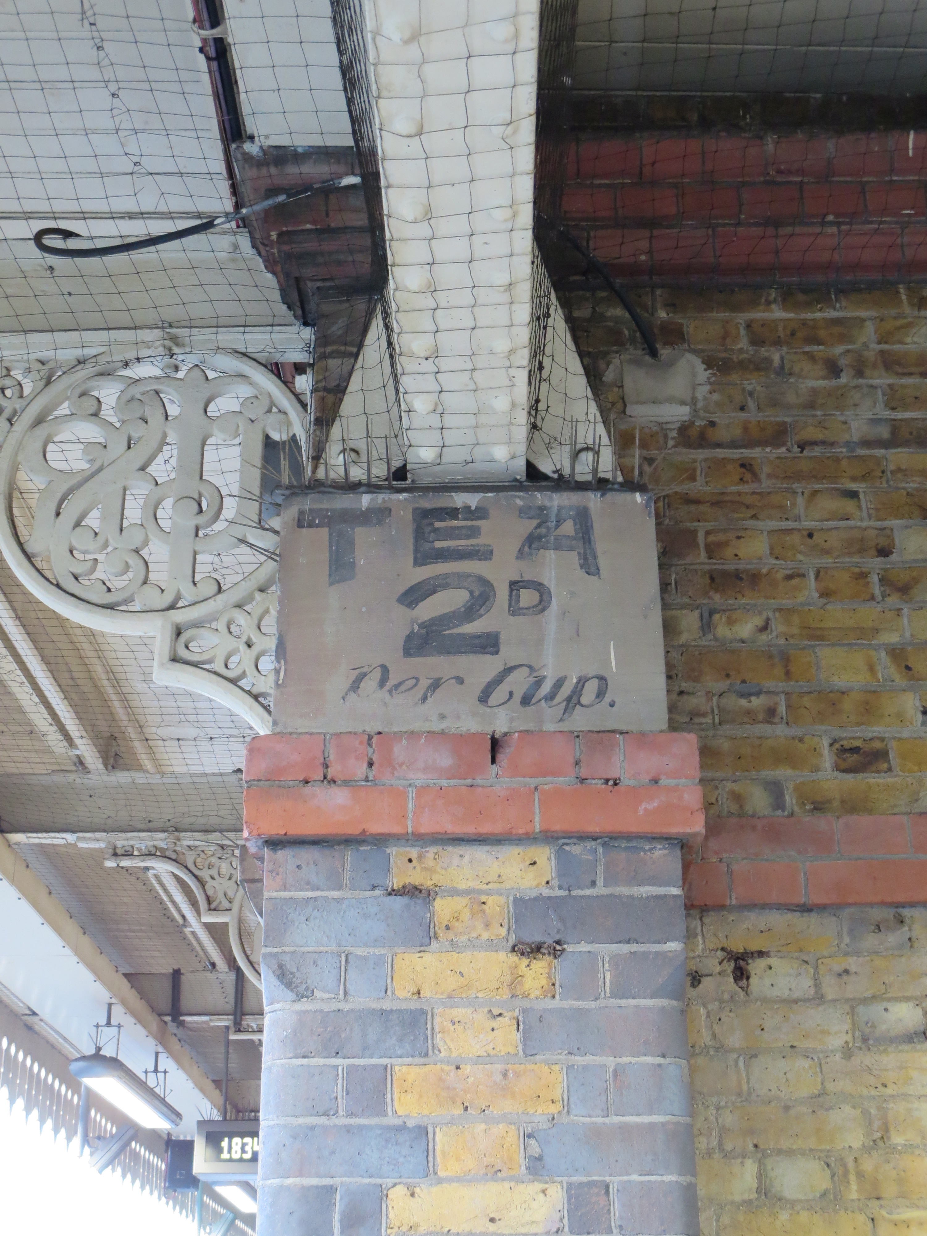
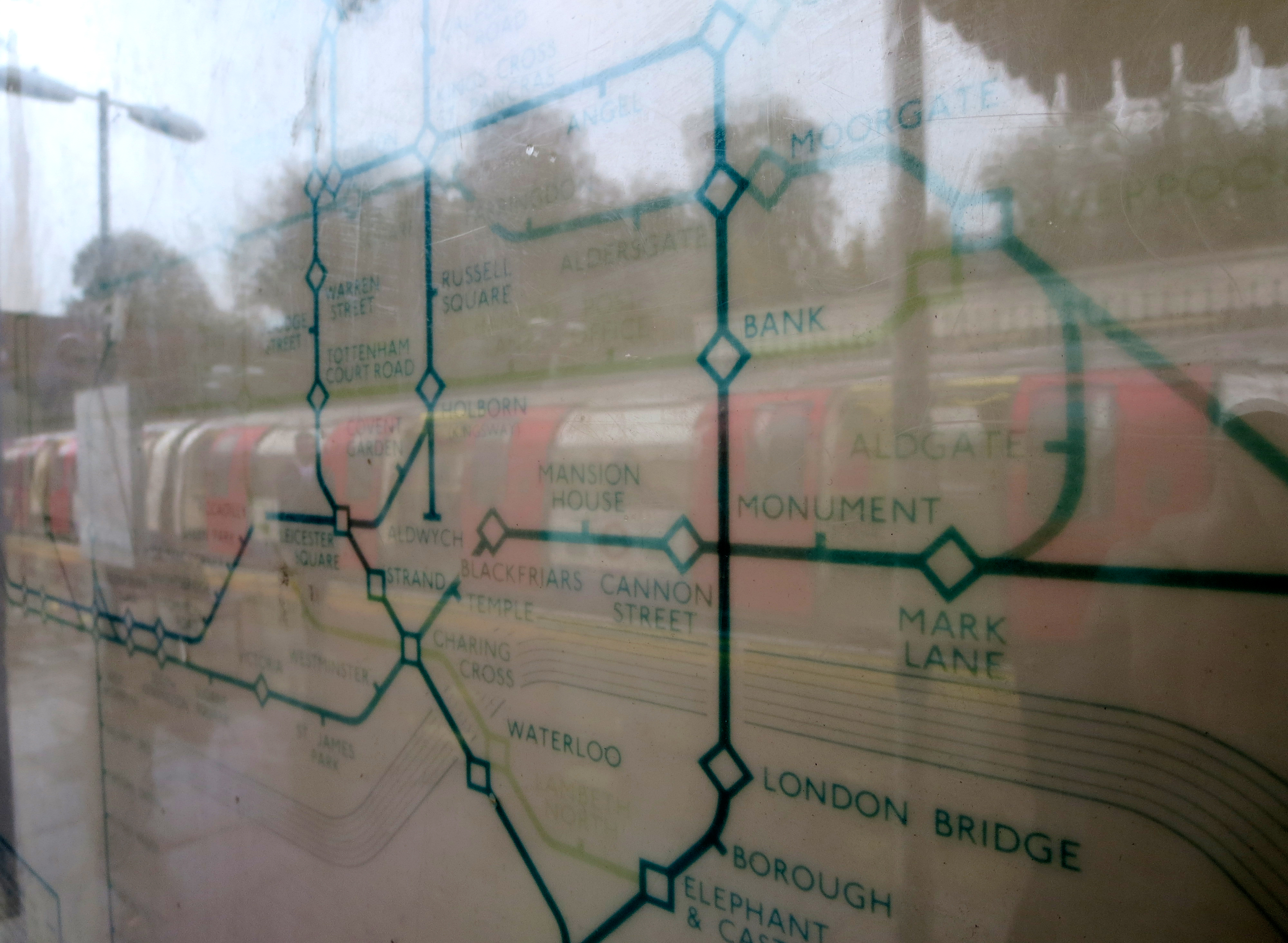
 Stuck behind a filthy piece of perspex, its colours sapped by years of direct sunlight, the edges frayed, the lettering fading, mounted in such a way as to defy a decent photograph, and shoved in a nook of a platform where hardly anyone stands, is the world’s most recognisable, widely-distributed and influential piece of public art.
Pedants will say it isn’t a map, it’s a diagram; different pedants will say it isn’t even a diagram, it’s a schematic; conciliators will refer to it a topological hybrid; the rest of us are happy to make do with calling it one of the greatest designs of the 20th century.
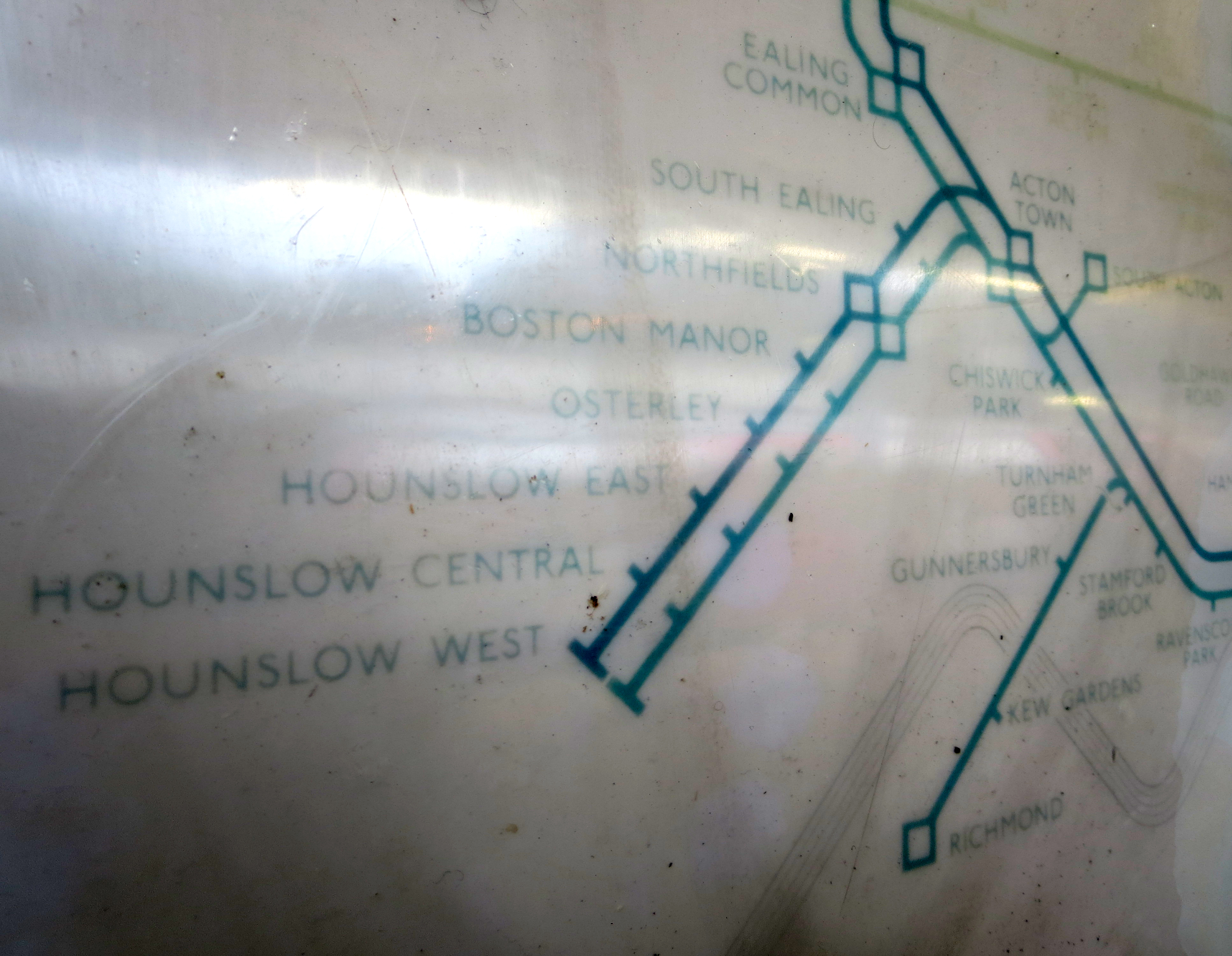 It deserves better treatment than the kind meted out at Finchley Central. And for the most part, Harry Beck’s map usually gets it. Go to the London Transport Museum, or look through any of the dozens of histories of the Underground, to see its story told in glorious, vivid detail. Pick up any map of the Underground produced since 1933 for more evidence, both of how to evolve and enhance Beck’s work constructively, and how to try and wreck it. Luckily the latter never succeeds, at least not for long.
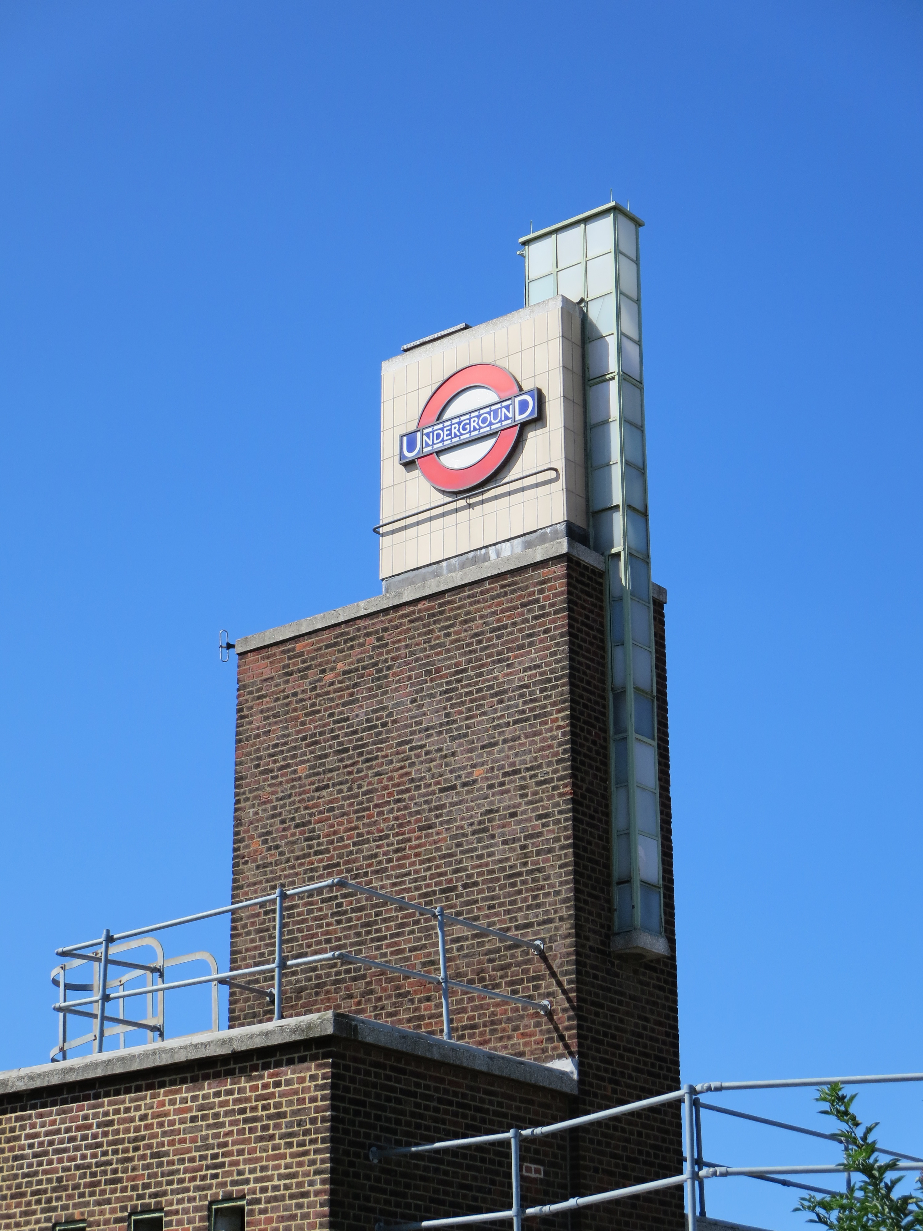
Beck spent a period of his life living in Finchley, coincidentally just round the corner from where I am sitting typing these words. His nearest station was West Finchley, but for some reason Finchley Central is the place that plays host both to this besmirched copy of his masterpiece, and also to a rather tersely-worded plaque:
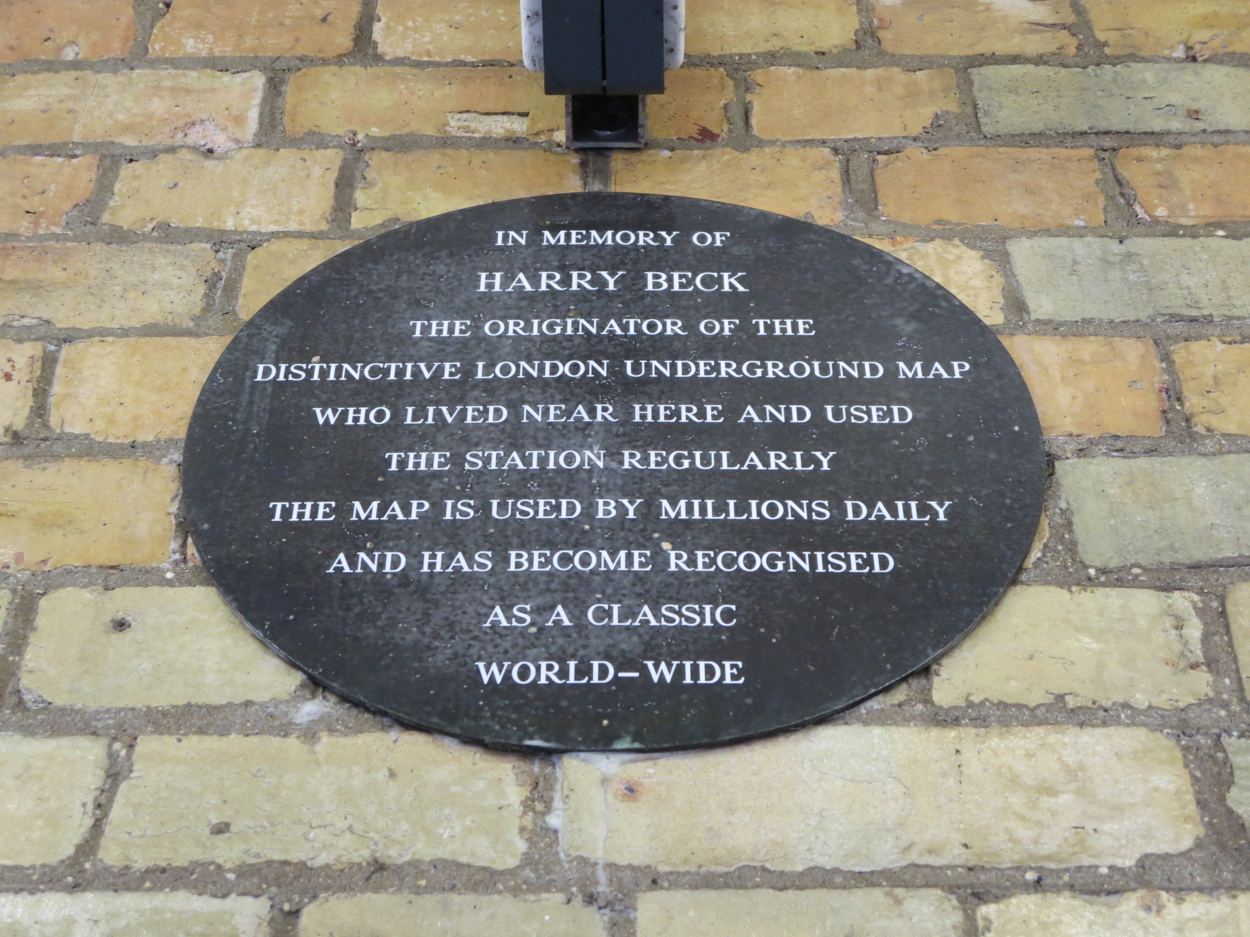 I’ve passed through the station roughly twice a day for the last six years. I can’t recall ever seeing someone admiring either the map or the plaque. This is a shame, but I’m not going to hold it against the entire rest of the world (that particular list is quite long enough already).
Besides, the rest of the world – or at least most of it – now conceives of London only in the way Harry Beck reordered it, and that is tribute enough. Thousands of people can draw the Underground map from memory, correctly naming every station. Millions of people shut their eyes at night to find an imprint of the map filed somewhere in their subconscious. And billions of people know of the map and its beguiling symmetry, its soothing rationality, its universal hues.
Theorists will say it commodifies London. Publicists will say it sells London. I say it is London – and always will be.