Archive

Signs

Tuppence a bagHere’s one of the smallest things to make it into the 150, but one of the sweetest. It’s on the westbound platform at East Ham, high up near the canopy, perpendicular to the tracks.

A cultural historian would be able to take a good guess at its age, likewise a scholar of advertising typography. Just when was tea tuppence a bag (tuppence, tuppence, tuppence a bag*)? Not since the war, certainly. There’s been a station at East Ham since 1858, though the ticket hall is Edwardian. My guess is the sign hails from sometime between 1902, when the District line first came this way, and 1936, when the Metropolitan arrived. It was painted to promote an adjoining cafe, long since vanished – as has this kind of gorgeous lettering, tea shops in general, and the notion that putting “d” after a number is not a reference to a boy band.

Something that can be more accurately dated is the LTSR ironwork to the left of the sign. That’s the London, Tilbury and Southend Railway, by whom the station was built in the 1850s. Back then the idea of buying tea from a person on a platform would have been morally scandalous. One had it served to one, thank you very much, and you’ll mind your manners for saying so.

Pillar of wisdom*Possibly the saddest song about London ever written
This-a-wayI’ve been a bit sniffy on this blog about the Underground stations designed by Leslie Green.

They’re the ones with the dark red exteriors made up of hundreds of glazed terracotta blocks. There are dozens of them around the city, and you’re bound to encounter a few of them on even the most fleeting of visits to London. Which is precisely why I have a bit of a problem with Green. To sum up what I’ve discussed before, if you’ve seen one of them, you don’t really need to bother with any others. The differences are superficial rather than significant, prompted by expediency rather than imagination.

Sometimes, however, a variety of riches can be found inside one of Green’s otherwise character-less creations.

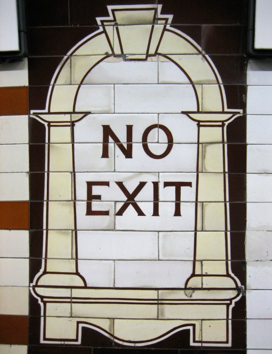
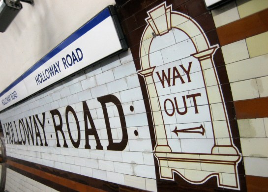
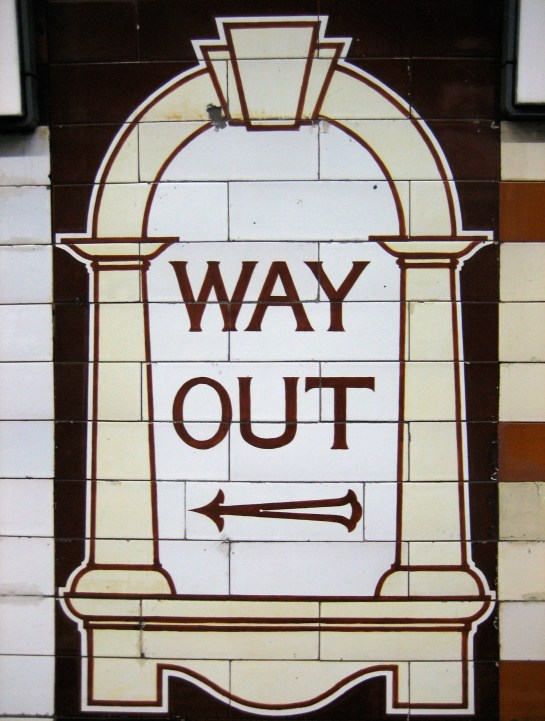
Holloway Road has a good collection of his signature work for the interior of an Underground station. Both platforms were given a long-overdue refurbishment in the late noughties, which certainly benefited the tiling. Green’s trademark ‘Way Out’ and ‘No Exit’ designs for the walls of the platforms look in a pretty good state, considering they were first put up in 1906:

Well, obviouslyBut for once, a Leslie Green station is more than the sum of its predictable, rudimentary parts.

As well as those familiar mock signs (based on his design for the ticket windows in the booking hall), Green sprinkles Holloway Road with a bit of glamour: more Cricklewood than Hollywood, as Ernie Wise would say, but still rather beguiling.

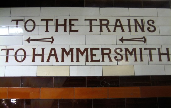
There are very swish ‘To The Trains’ signs in the little passageways between the adjacent platforms:

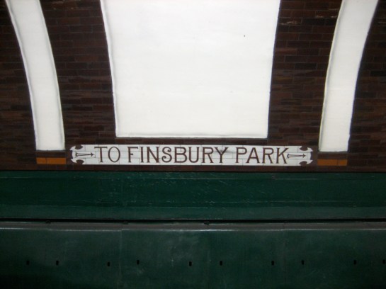
To the trains!And there’s a much larger treat in the shape of the track-side wall of both platforms, which have been left completely free of advertising.

The effect is to highlight, dramatically and memorably, more of that instantly elegant original signage:

Bare necessitiesI’m not sure how many other places on the Underground can boast such a sparse, yet also so attractive a contrast. I know the effect is much the greater thanks to the majority of stations having these walls absolutely covered with adverts. But even taken by itself this is bold and, certainly for Green, unexpected.

Perhaps I’ve been a little too hard on the old bugalugs. Not a lot, mind. Just a little.

Holler: way!

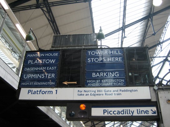
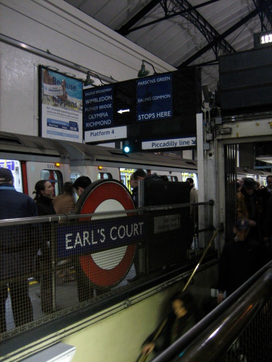
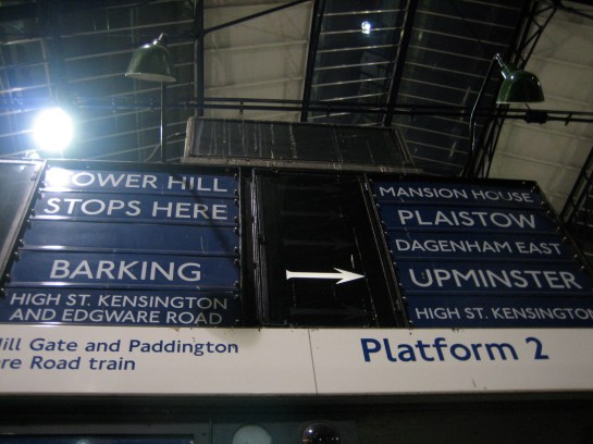
Good news for people wanting to travel ONE STOP ONLYThey’re technologically basic, they’re covered in bird droppings and the font is not as nice-looking as it used to be. But I can’t deny a part of me finds the train destination indicators at Earl’s Court persistently charming.

Choice!They undoubtedly generate and receive an equal amount of ire from the clusters of passengers that gather in disconsolate bunches at their base.

It’s essentially a love-hate relationship. There is the thrill, within seconds of your arrival, at seeing the illuminated arrow pop up next to your desired destination. But there is also the anguish of watching each station except your own flash before your eyes in a seemingly-endless sequence of vindictiveness – especially if you’re waiting for one of the less-serviced options, such as High Street Kensington or Olympia:

Gasp! An Olympia train!Sure, they have the appearance of being anachronistic. But it’s not as if they’re incompetent; they do precisely the job for which they are intended. And it’s not as if they’re redundant; the multitude of destinations available from Earl’s Court’s limited number of platforms requires something along these lines. Better to look functional yet understandable than flash yet incomprehensible.

Besides, they are an unequivocal tribute to and reminder of the vastness of the Underground. To Plaistow or to Parsons Green? Mansion House or Ealing Common? The curious and the carefree are spoiled for choice.

Arrowing