Archive

Designs

Roundel-ramaWelcome to an exclusive peek at the new look of Doctor Who’s Tardis.

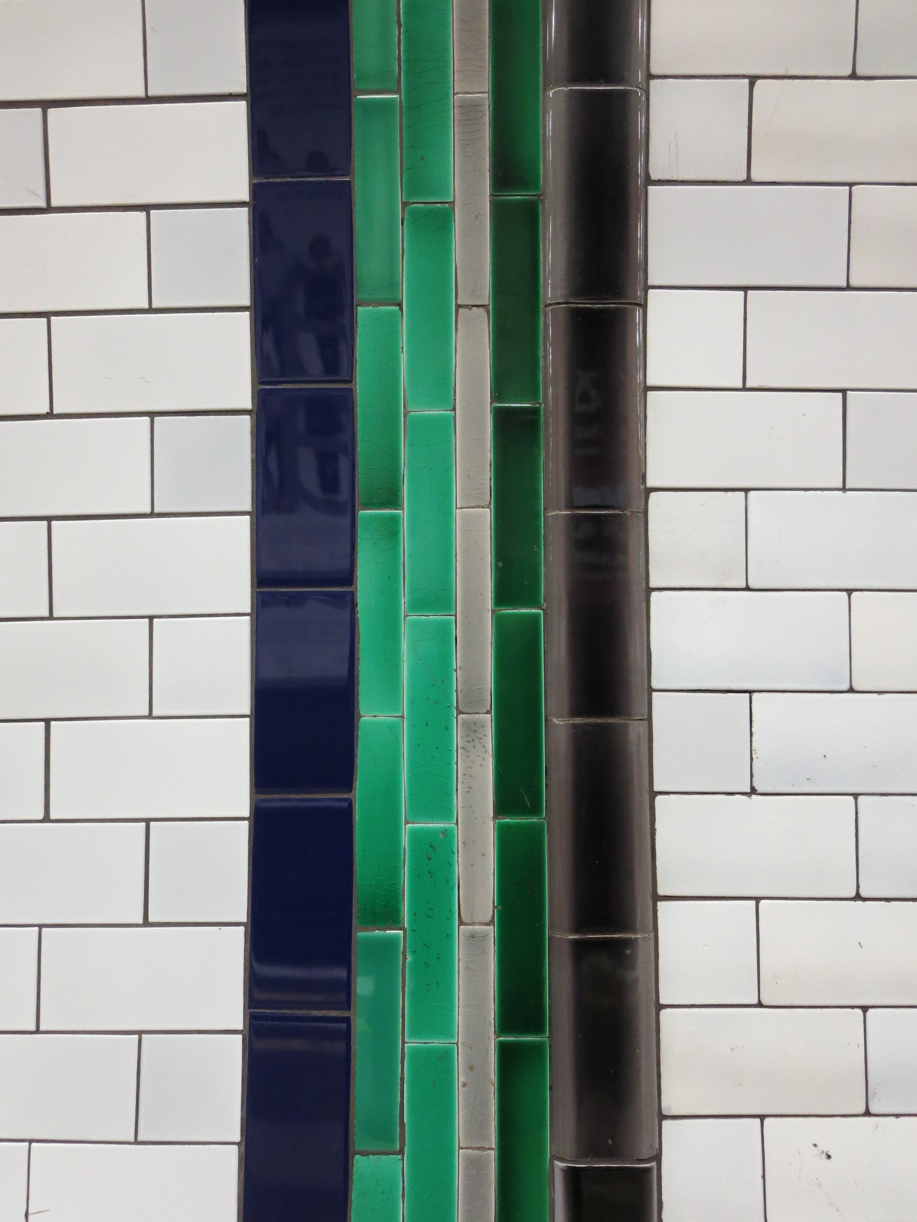
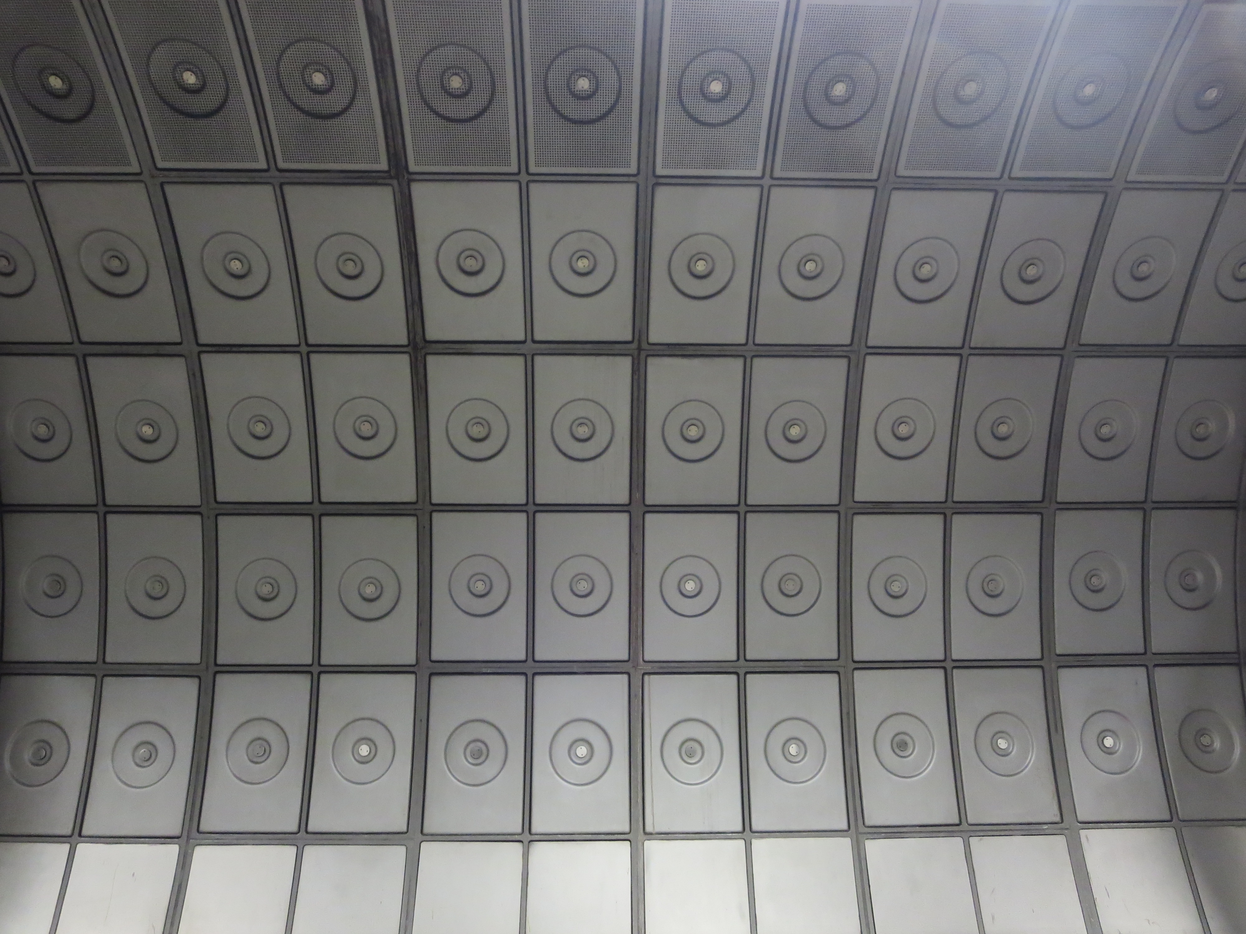
Yes, the roundels are back. All that steam-punk palaver is no more. Gone, the Heath Robinson-esque detritus and “charming” eccentricities. In their place, gorgeous steel curves, glittering symmetry and a hefty dollop of polish.

Well, you can but dream. Is it wrong to wander down the palatial pipes that connect the Jubilee line with the rest of Waterloo station and imagine you’re inside what people from the 20th century thought people in the 30th century might like? To draw a straight line in your mind from the most futuristic slice of the Underground all the way to the next millennium, with only the odd diversion to make way for the unexpected arrival of the Thames flood plain? To for once look forward fondly, instead of back wistfully?

This way to tomorrow
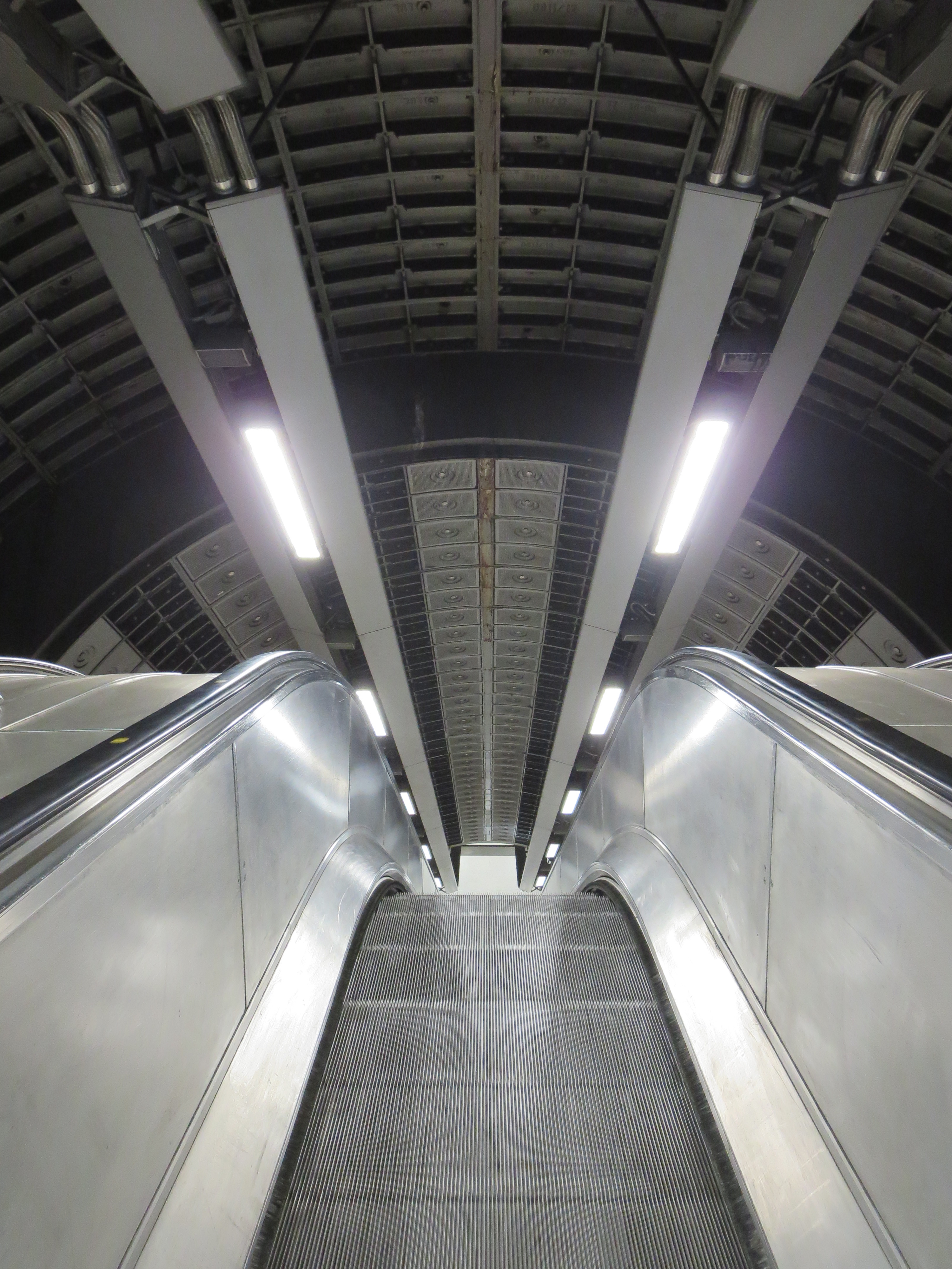
Tubular balls, you might think. And granted, you either love the shimmering fancies of this most modern of modernisations, or you probably loathe it. Grey can be a beautiful colour, but only if artfully deployed. When it’s there by default, it usually shouldn’t. But when it’s there by design, it’s a bit of a revelation. The stout walkways and nifty passages at Waterloo are one of the unexpected triumphs of the Jubilee line extension.

Unexpected, because Waterloo comes with the baggage of over 100 years of existence. It wasn’t magicked into being from scratch like your Southwarks or North Greenwichs. It laboured long under associations with congestion and gloom and long, long treks to get to the platforms. It still does, for many. But here’s why an encounter with its youngest, freshest offspring feels more like a joy than a chore. It is still, over a decade on from its opening, thrumming with the shock of the new.

Glide on time
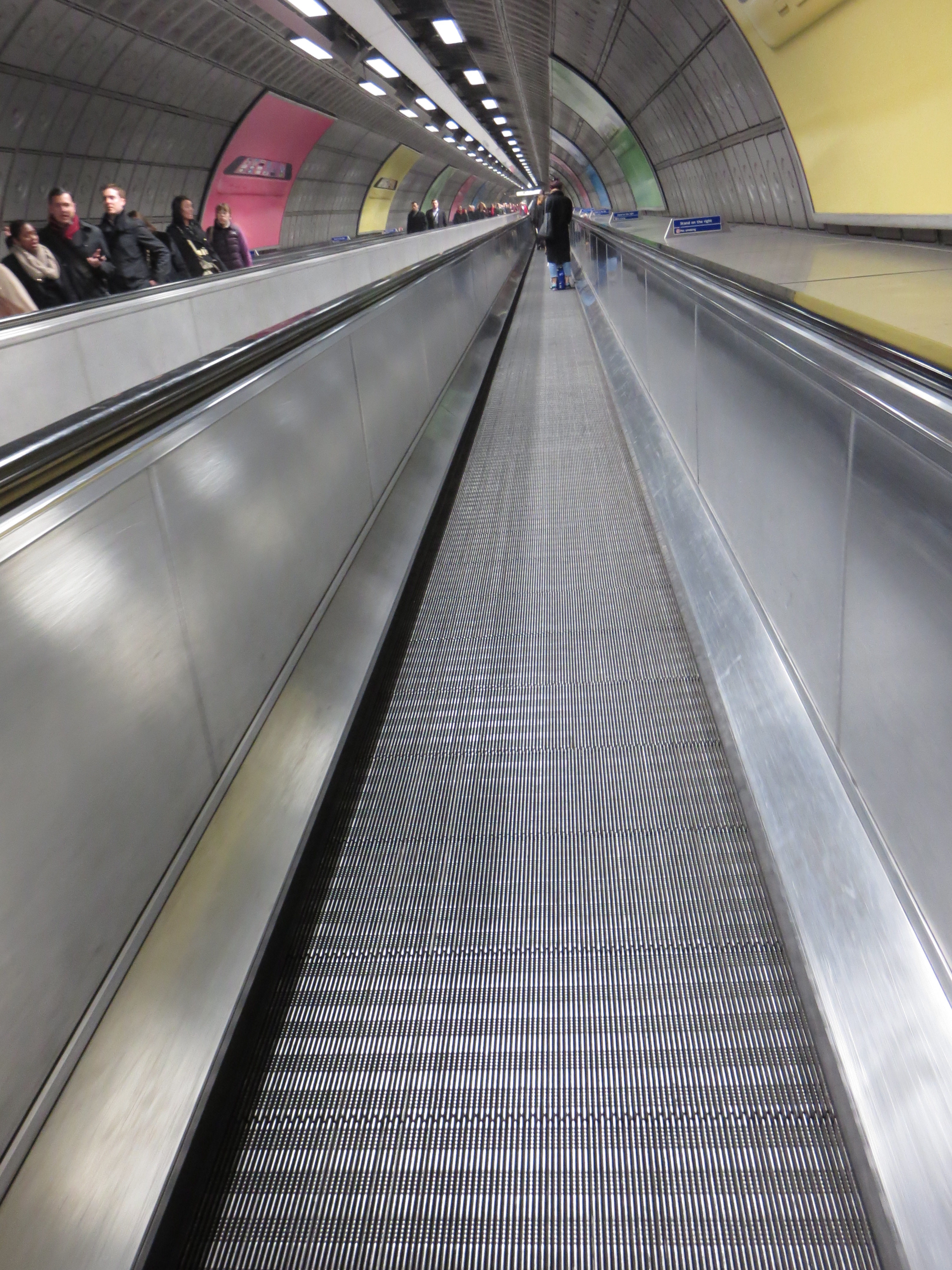
Heavens, there’s even a travelator. And there’s only one other to be found on the whole Underground (which is also ace, naturally). What more of a beguiling gimmicky gesture towards modernity do you possibly need?

Take a stroll along this gleaming cylinder of motion, that seems to have tumbled through time from some point that’s always just beyond tomorrow. We should feel flattered merely to have the chance to pass through such a convenience of wonder. This is what public infrastructure can be like if trust is placed in someone dubbed the Medici of London Transport.

This is what the Underground can still be like.

Colour me smittenWhen the balloon goes up and it’s time to head down to the air-raid shelter beneath Clapham South station, one of the last things we’ll see are colours. Rows and rows of gleaming colours, snaking along the walls of the platforms, full of a lustre that is unexpected for something so deep underground. The choice of colours is particularly affecting: nothing gaudy, or luminous, or poorly co-ordinated. Instead, stoical RGB basics that even the vaguely colour-blind can tell apart. And I should know.

Tiles of wonderIf the tiles are originals, then they date from 1926 and are in very fine condition. Clapham South was the curtain-raiser for the extension of the Northern line and then, as now, is the first treat for passengers venturing towards Balham, Gateway to the South.

If they aren’t originals, they don’t look it. The taste and the elegance feels authentically inter-war. It’s like walking through Balfour or Baldwin’s bathroom. For me their linear design beats the more scattergun styles you can see at stations along the Piccadilly line. These tiles radiate refinement, neatness, and above all order. If, apocalypse pending, they were to be my last glimpses of the artistry of human race, I wouldn’t mind.

The Common touch

Capital effortThere are several of these sprinkled around London, but the one at Russell Square is particularly well-preserved and prominent. Embedded in Leslie Green’s stubbornly perfunctory and visually peakish facade, the logo radiates freshness and imagination like sunlight sneaking through a crack in the Berlin Wall. An interloper from the drawing board of a visionary rather than a functionary, it can’t help but catch and retain the eye.

What is it that makes, that made, this logo so potent, so intriguing?

Its antiquity, for starters. It has a quality of being ancient, of hailing from the far distant past. Yet it’s hard to tell from how far back it belongs. This gives it a flavour of mystery as well as heritage. Could it be before or after the war? And which war? Is it even the 20th century?

There’s also something a bit exotic about it. It’s a typeface that doesn’t feel instinctively native to the UK. Where has it come from? Where has it gone to? It’s not passed into the common lexicon. You won’t find it adorning anything new – or anything relatively new either.

But above all, it’s enormously alluring. This is a typeface to fall in love with. It knows it’s attractive, but lets you know in a coy rather than charmless fashion, which just makes it all the more irresistible. Forget having your name in lights. How about having your name in these particular sans-serif capitals?

It’s also a typeface to fall in love under.  A first swoon beneath this kind of sign? There’s little that could be more provincially sentimental.

Facts, rather than fancy, reveal that as with most exotica, the logo blazed brightly for a period, then fell out of favour sharply. Thankfully it gave way not to something worse, but something even better. Father and son eye each other warily outside Russell Square, positioned at right angles in a way that flatters neither. But then neither belongs next to the other. It’s like putting two Dr Whos in the same show and expecting double the fun.

Facts also reveal that the typeface does indeed date from before the war – but the first world war, not the second, and therefore more of a veteran than its slightly futurist style suggests. It’s as old as 1908, the year the Underground got tired of the 20th century breathing down its neck and decided it needed a trademark. But the network ended up not only conceiving its own logo but its own emotion. For here was where the romance of the Underground first spluttered into existence – a romance that continues to this day.

Jousting typefaces