Archive

Designs

Arch encounter
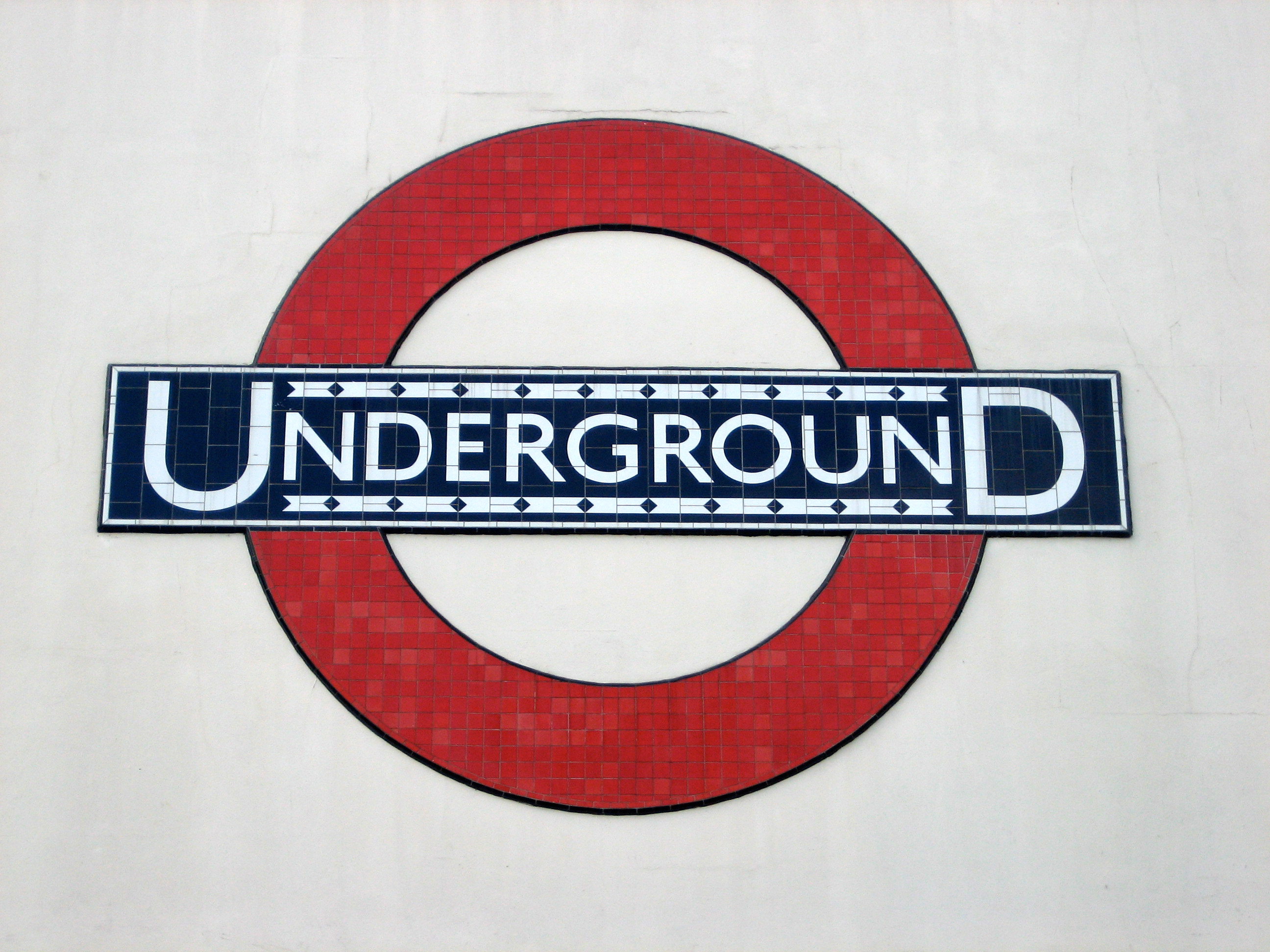
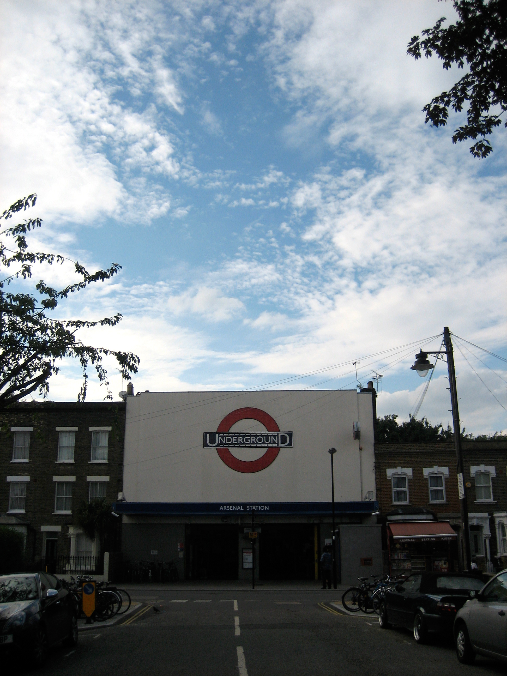
Underground stations within Zone 1 sometimes feel like they’re trying to over-compensate for being among the busiest locations in London. Platform art doesn’t so much speak as scream at passengers, demanding rather than asking to be noticed. The more crowded the venue, the less subtle the design.

The Jubilee line platforms at Bond Street are a good example. Giant gift-wrapped boxes line the walls, bludgeoning you about the head with their garish colours. If you fancy being attacked by a metaphor while waiting for a train, this is the place to go.

Leicester Square is another offender. Think of all the possibilities for decorating the interior of a station that is associated [adopts Nicholas Parsons voice] not just here in the UK but around the world with the magic and allure of the silver screen: celluloid icons, perhaps, or recreations of famous scenes, locations, even title sequences. Step on to its platforms, however, and all you see are a load of perforations meant to look like the edges of film strips. It’s like going to the cinema expecting to see Billy Liar only to find yourself watching Liar Liar.

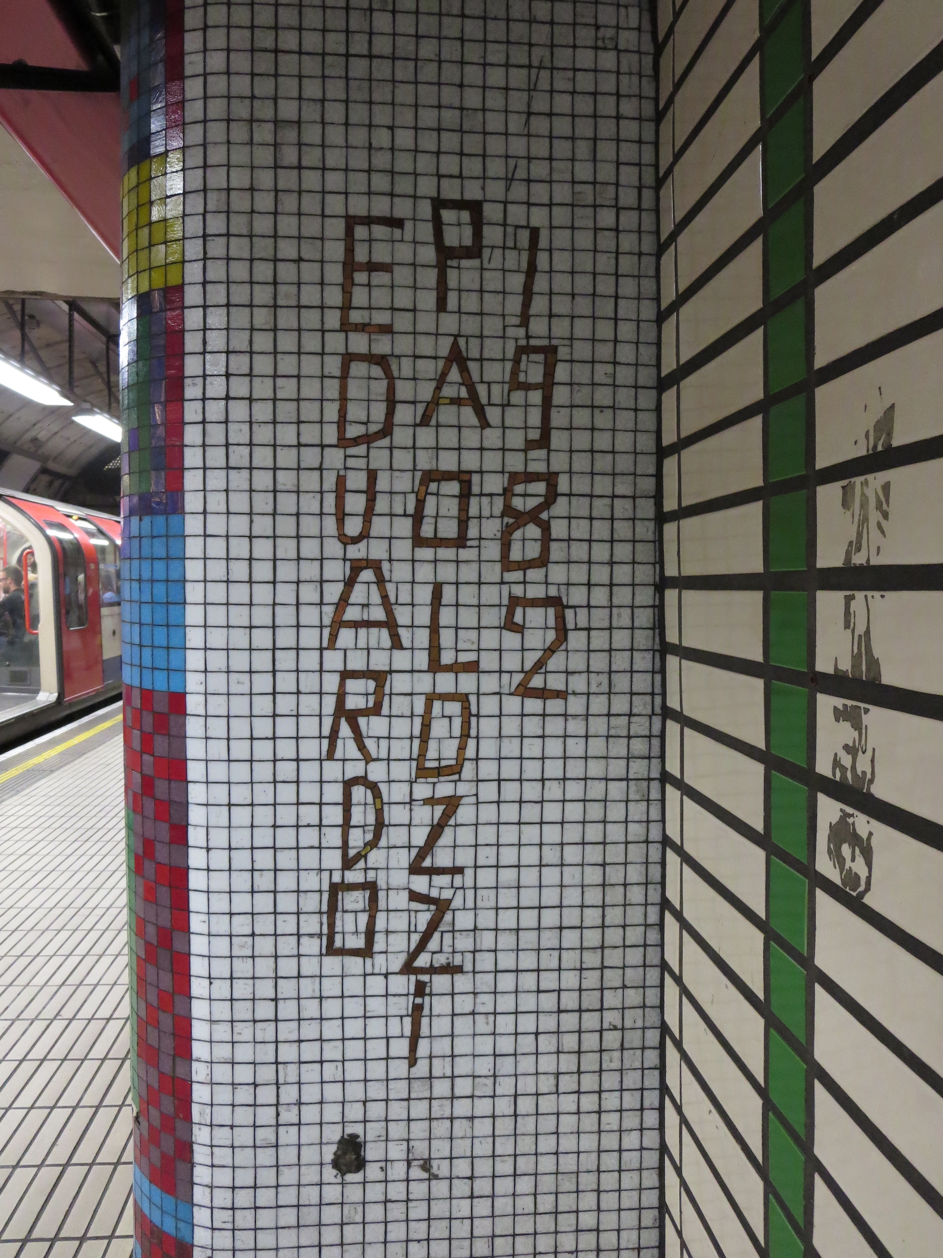
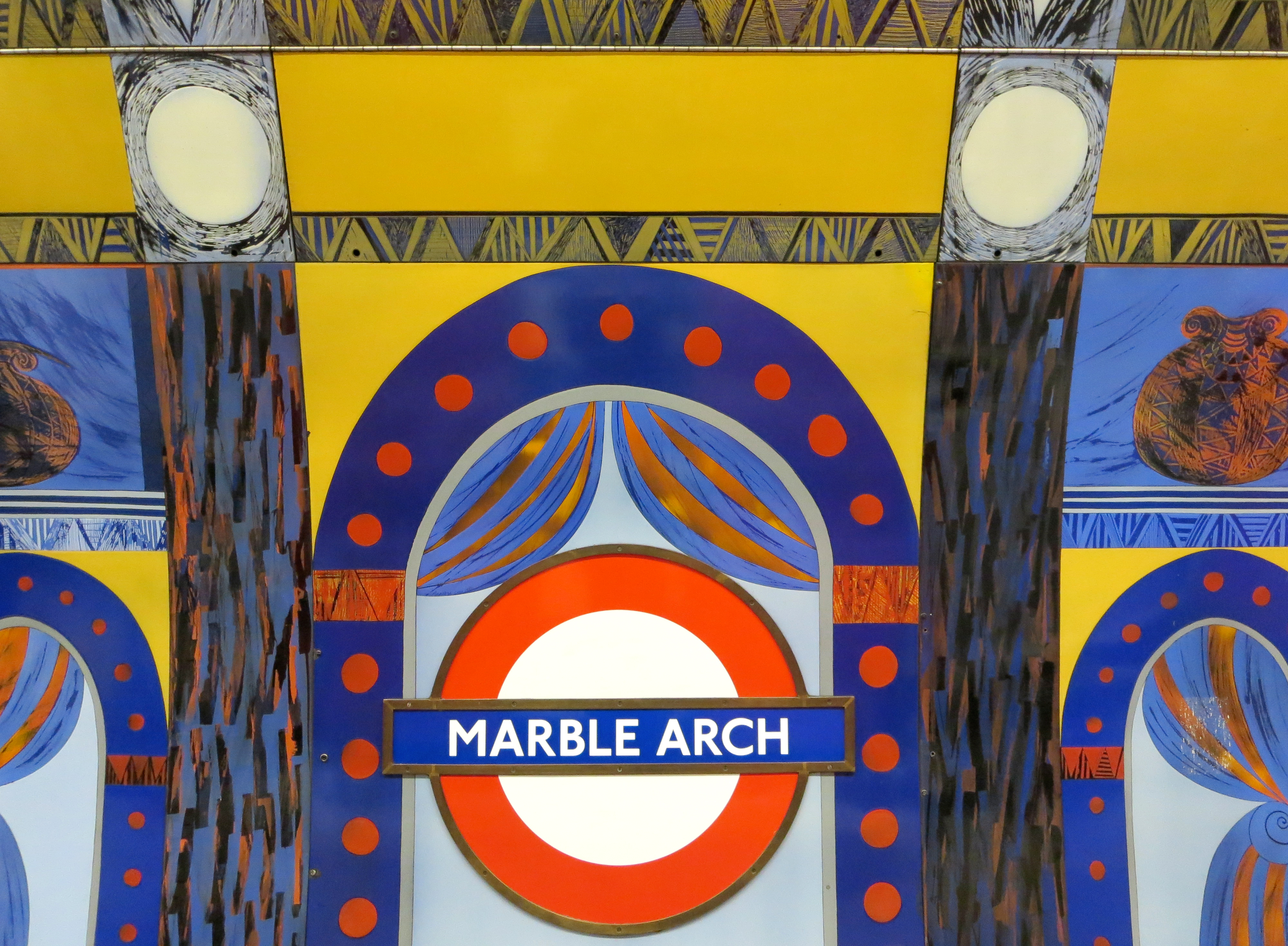
If you must saddle a station with some kind of visual play on words, at least try and do it with a bit of flair. Like here:

Marble marvels
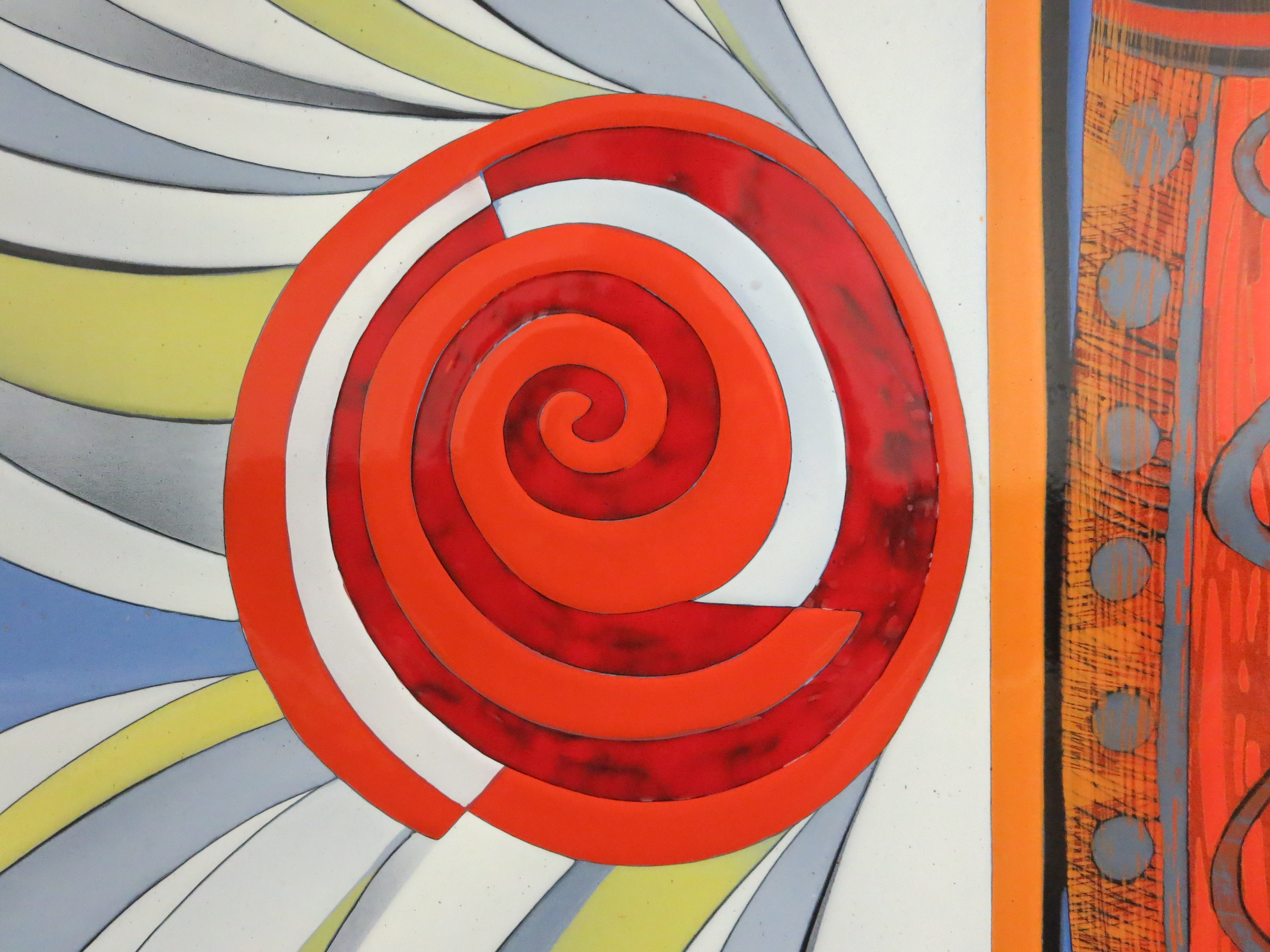
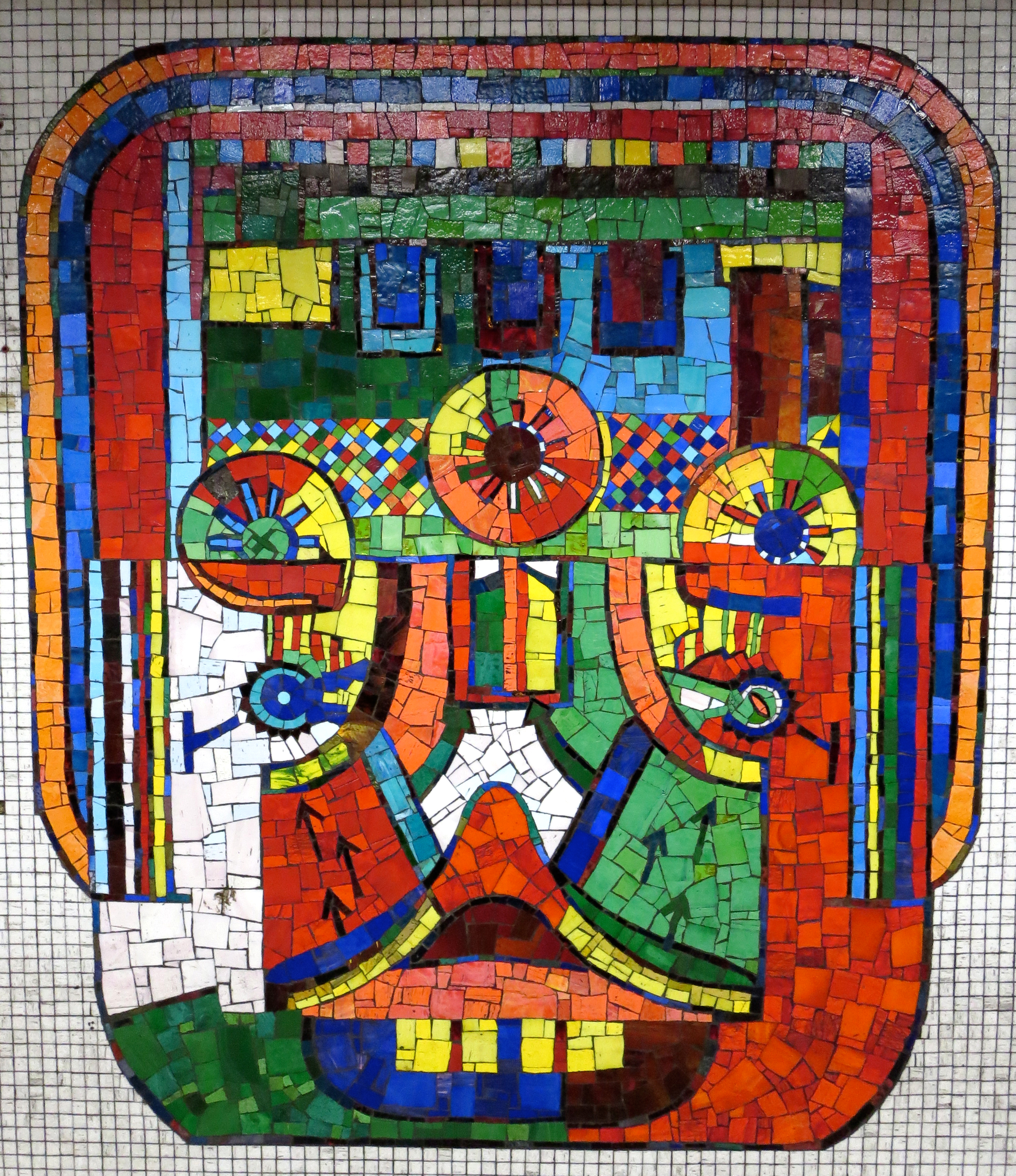
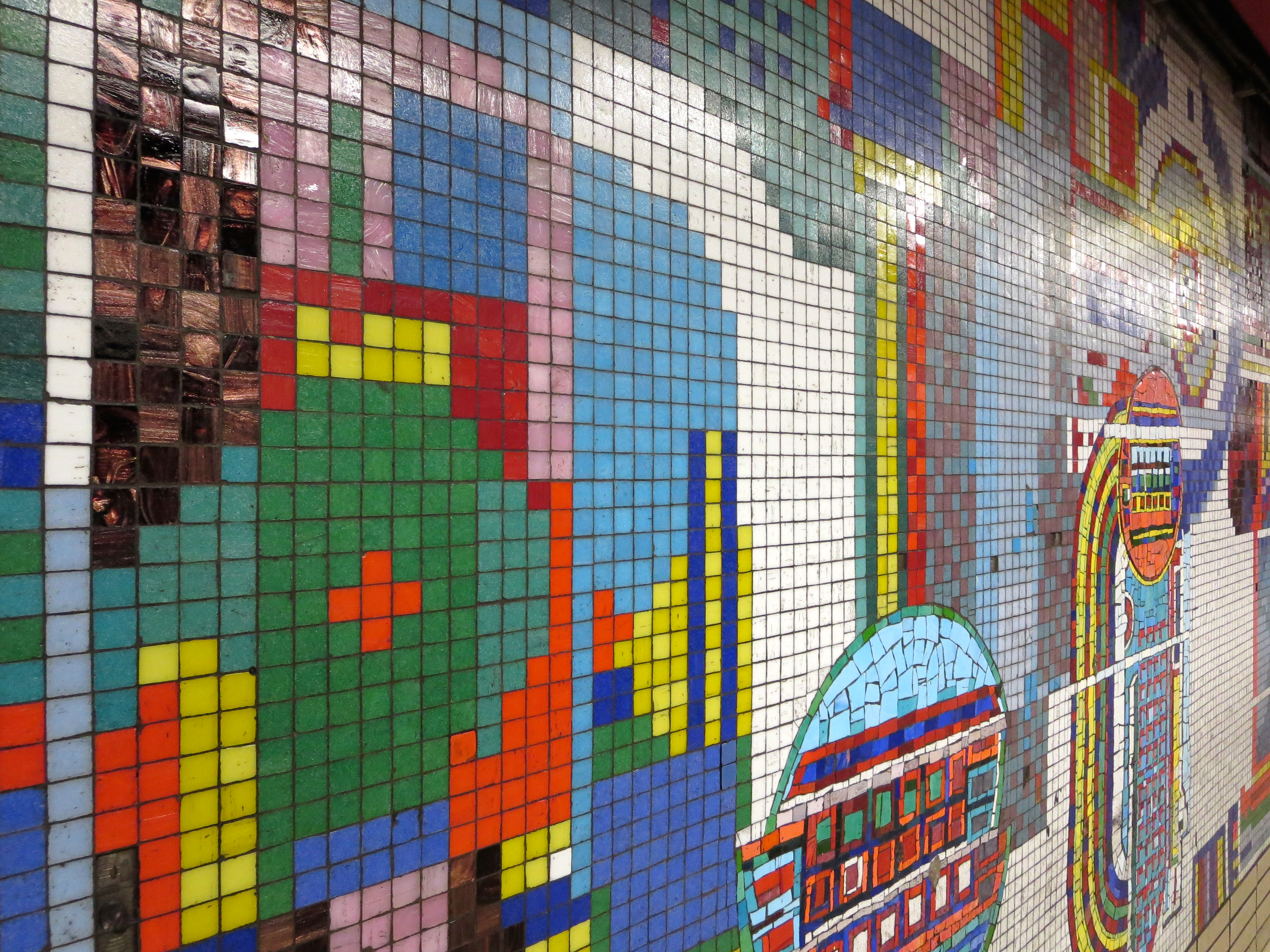
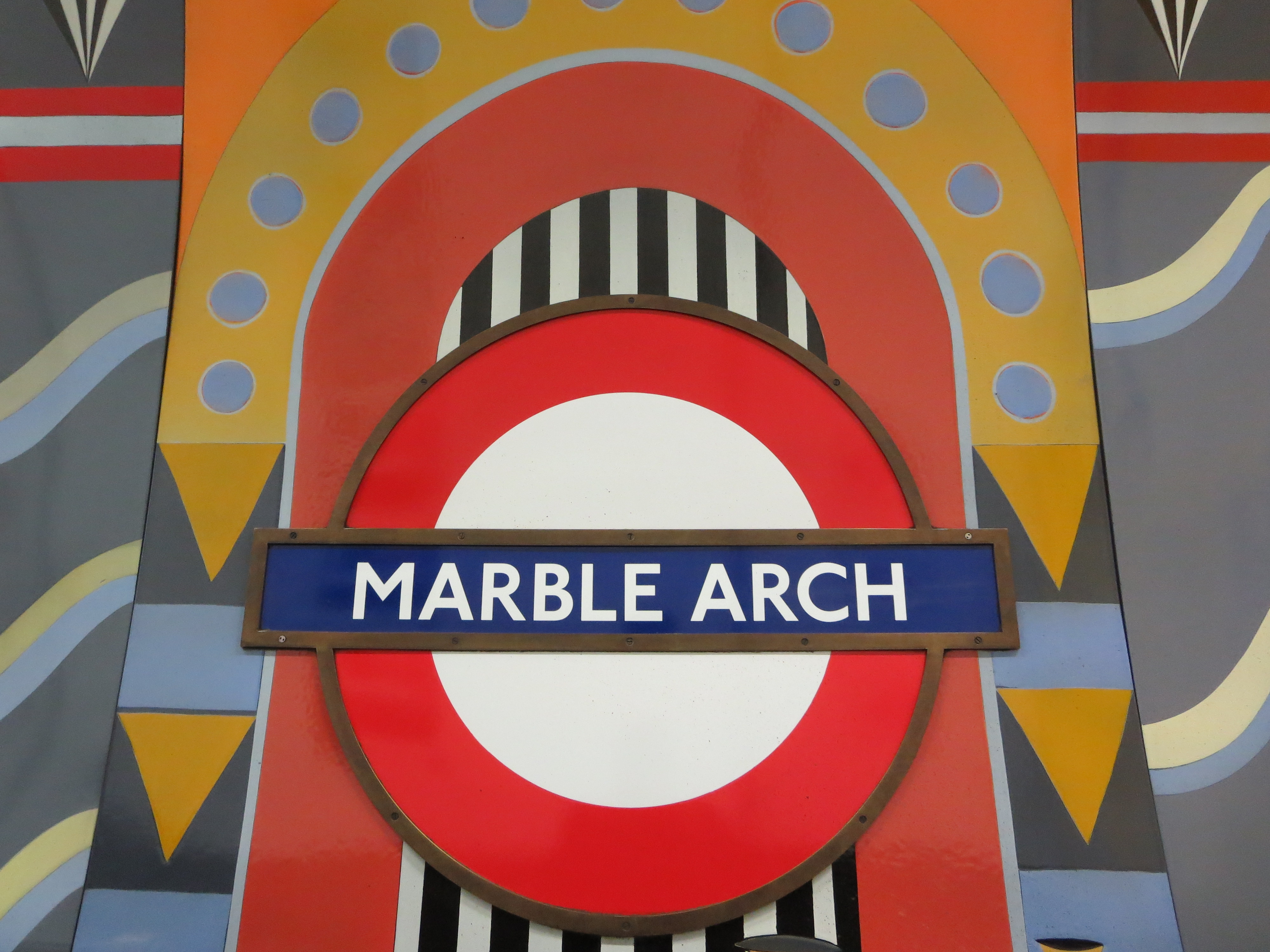
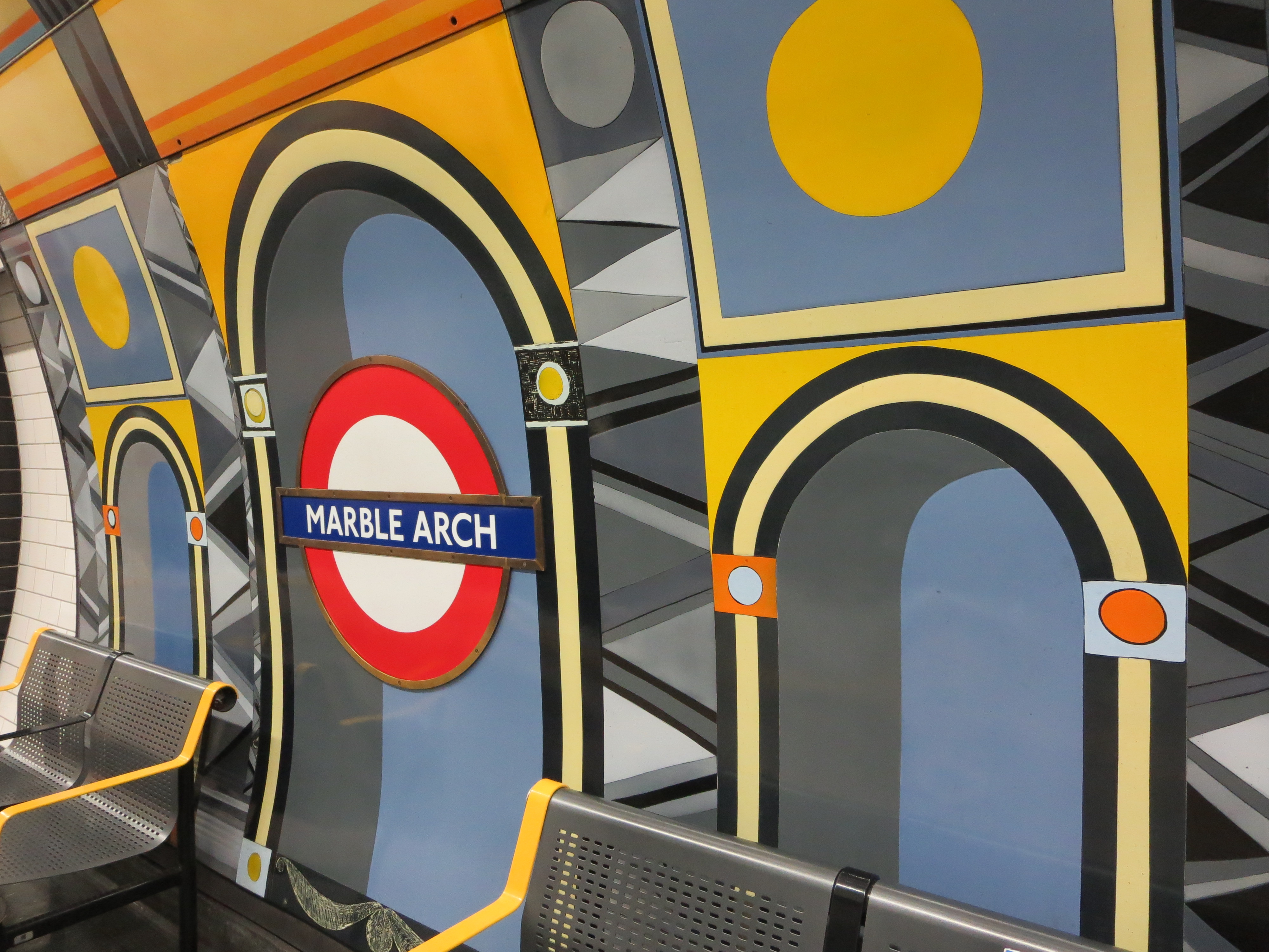
The coloured panels were created by Annabel Grey, who was also responsible for the glorious mosaics at Finsbury Park.

Here she worked with huge chunks of vitreous enamel, which were then attached to steel sheets and bolted to the walls. There are 17 in total, each 12ft by 10ft, and they took nearly two years to complete.

This shouldn’t sound surprising when you learn every bit of the artwork was hand-sprayed. Each pattern was etched when the paint was dry, then fired and cooled before the next pattern could be added. I wonder how long it took to do those film strips.

What a Grey dayI also wonder how well these fillips of colour fare against the desultory concerns of a million people on the move.

I’m glad they continue to survive. They hail from the 1980s, a period that only the tasteless like to brand “the decade that taste forgot”. Yes, they may at times remind you of the coat worn by Colin Baker in Doctor Who. But unlike that costume, and indeed that entire era in the show’s history, these designs have subtlety. And it’s a subtlety that encourages both inspection and introspection: the watchwords of the Underground.

Like a circle in a spiral

Colour me smittenNo less a figure than Sir Paul McCartney has links with Tottenham Court Road.

It’s not via his smashing video for the 1986 song Press, which features a bumper crop of Underground locations. Rather, it’s that the same person who designed the cover of the joyless Wings album Red Rose Speedway also designed the joyous mosaics that line this station’s platforms.

Eduardo Paolozzi is the common factor, and I know which of his efforts I prefer. I’m sorry, but a picture of an ex-Beatle with a flower in his gob just cannot compete with the likes of this:

Courting approvalThis must be the most highly-maintained slice of public art on the Underground. That’s not an especially insightful guess; you can see the wear and tear within seconds of arrival. By and large, though, the mosaics are in reassuringly fine shape. Most of them look as ravishing as they must have done on their construction between 1982 and ’84. A great deal of Tottenham Court Road station may be currently in a shocking state, but tens of thousands of tiny chunks of it are not.

And what a delight it is to discover them, having trudged down steps and along corridors that seem longer and dirtier than they really are, ending up in what always seem to be among the hottest deep-level tunnels of all.

Rogue typeface alertThere’s a bit of rogue typeface to be found as well.

Paolozzi was given 1,000 square metres to fill. Not all of this remains intact. The whirling abstract shapes and topical tessellations used to spill up from the platforms, through passageways and escalator wells and into the ticket hall. But as with other voguish trends of the early 80s, they have fallen away – literally, in some cases.

A few of the designs can look a bit like the mouth of a sugary-drink addict. Occasionally you’ll find a tile on the floor. If you’re conscientious you will hand it to a member of staff. If not, you will take it home and put it on top of your chest of drawers, next to that pebble that may or may not have once belonged to the Berlin Wall.

Some areas of the platforms seem to have escaped the current round of modernisation entirely. Welcome to a time before the Docklands Light Railway, when the only interchange at Stratford was with British Rail:

Epping for OngarOther designs draw your eye upwards and on to the ceiling, doing their best to cope with intrusions from cables, signage and a great wodge of plastic:

Courting disasterBut even cut in half or riddled like an asymmetric colander, the mosaics continue to triumph. Anywhere else they might feel garish, seem over-the-top, look fussy and appear unsightly. Down here they are like the sweetest major chord resolving out of the bleakest of cacophonies, or the world’s largest paintbox exploding on to the drabbest canvas.

Welcome to Paolozzi’s everlasting night on the tiles.

It was a very good year

No, you're not going to get any arse jokes hereI don’t know much about football, but I know what I like. And that’s a new rule that means goalposts get moved an inch wider apart for every minute of extra time until someone scores. Oh, and teams should be able to bring an additional person on to the pitch, again for each minute of extra time. Basically I’d like to see pitches with ginormo-sized goals and about 50 players. Perhaps this music could be played at the same time.

You think these suggestions would make a mockery of the beautiful game? It’s SURELY no more of a joke than having players [finger-pointing rant alert!] earn more in an hour than I do in a year, or something like that. Sigh.

Anyway, what I really really like about football is there’s an Underground station that shares its name with one of the most famous clubs in the country, and which has a staggeringly beautiful roundel mosaic above its entrance:

Your arse an' allIt’s almost too good to be stuck on the wall of a station in a quiet suburban street along which crowds of people pass at best only once a week.

In fact, it is too good to be stuck here. It deserves to be seen by as many folk as possible, and that’s never going to happen in Highbury, even if the eponymous club became the best in the world on the same day Morrissey decided to move in next door.

The scale of the mosaic would seem perverse and its craftsmanship ostentatious were it not so sense-bubblingly beautiful. It was put up during the glory years of the 1930s (and yes, it’s not often you see that combination of words arranged in that particular sequence). It gains even more points for having replaced yet another of the uber-ubiquitous ox-blood tiled exteriors, of which there are still ox-bloody too many.

If movable goalposts and ever-expanding teams aren’t on the agenda of the next Football Association AGM, can I suggest a works outing to Arsenal station? It’s the closest they’ll get to seeing any true artistry this season.

Join our club