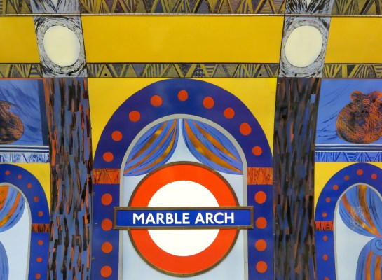
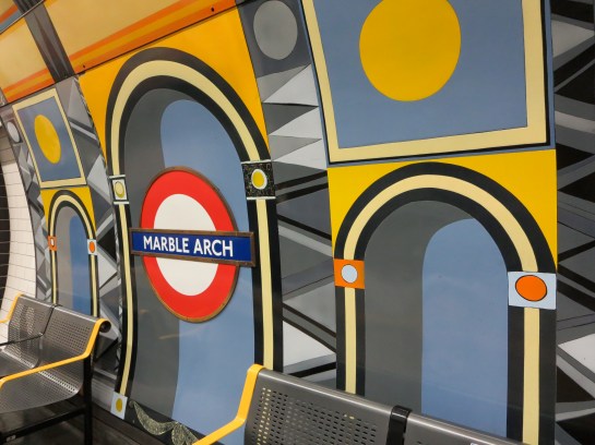
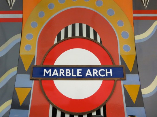
133. The coloured panels at Marble Arch
 Underground stations within Zone 1 sometimes feel like they’re trying to over-compensate for being among the busiest locations in London. Platform art doesn’t so much speak as scream at passengers, demanding rather than asking to be noticed. The more crowded the venue, the less subtle the design.
The Jubilee line platforms at Bond Street are a good example. Giant gift-wrapped boxes line the walls, bludgeoning you about the head with their garish colours. If you fancy being attacked by a metaphor while waiting for a train, this is the place to go.
Leicester Square is another offender. Think of all the possibilities for decorating the interior of a station that is associated [adopts Nicholas Parsons voice] not just here in the UK but around the world with the magic and allure of the silver screen: celluloid icons, perhaps, or recreations of famous scenes, locations, even title sequences. Step on to its platforms, however, and all you see are a load of perforations meant to look like the edges of film strips. It’s like going to the cinema expecting to see Billy Liar only to find yourself watching Liar Liar.
If you must saddle a station with some kind of visual play on words, at least try and do it with a bit of flair. Like here:
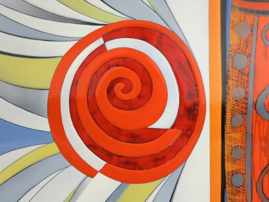
 The coloured panels were created by Annabel Grey, who was also responsible for the glorious mosaics at Finsbury Park.
Here she worked with huge chunks of vitreous enamel, which were then attached to steel sheets and bolted to the walls. There are 17 in total, each 12ft by 10ft, and they took nearly two years to complete.
This shouldn’t sound surprising when you learn every bit of the artwork was hand-sprayed. Each pattern was etched when the paint was dry, then fired and cooled before the next pattern could be added. I wonder how long it took to do those film strips.
 I also wonder how well these fillips of colour fare against the desultory concerns of a million people on the move.
I’m glad they continue to survive. They hail from the 1980s, a period that only the tasteless like to brand “the decade that taste forgot”. Yes, they may at times remind you of the coat worn by Colin Baker in Doctor Who. But unlike that costume, and indeed that entire era in the show’s history, these designs have subtlety. And it’s a subtlety that encourages both inspection and introspection: the watchwords of the Underground.
