Archive

Victoria line

Park life
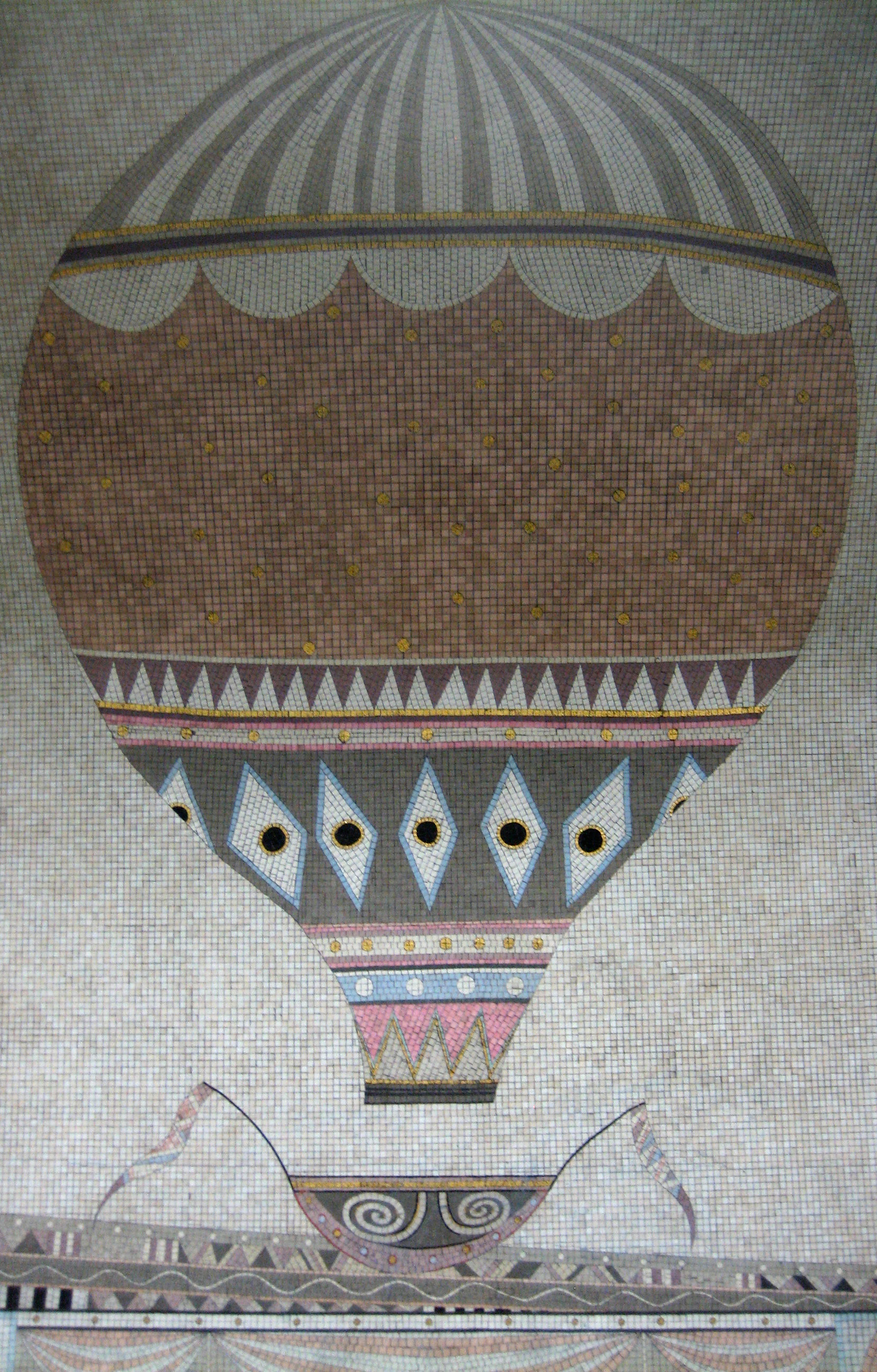
I’m pretty confident this is, and will remain, the youngest thing to appear in my 150.

It’s so new, in fact, that it wasn’t even complete when I began this blog.

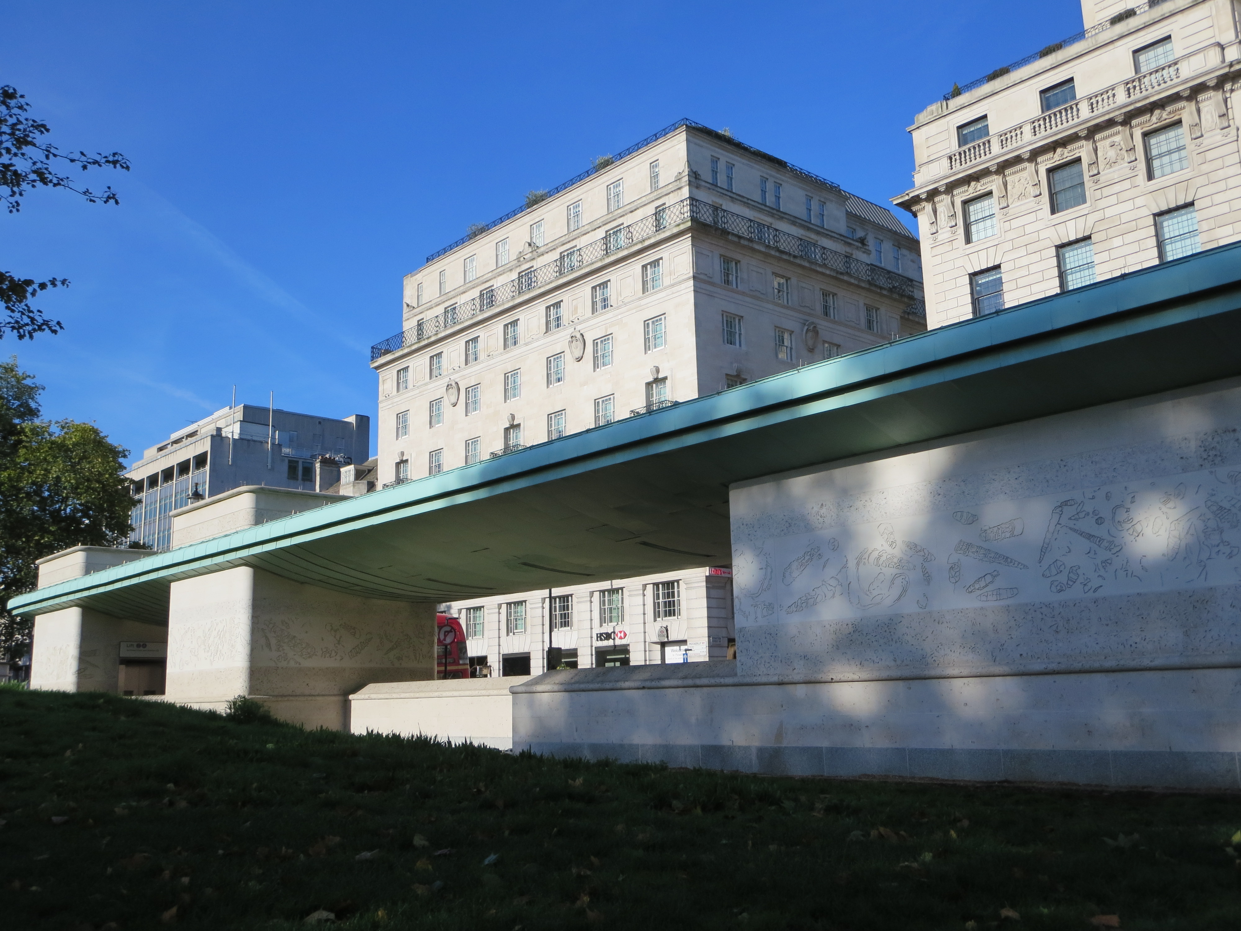
Finishing touches were not added to the redeveloped entrance to Green Park station until a few days before the start of London 2012. I know this for sure, as I walked through it every morning on my way to work.

Those were the best of times, with jovial publicity kiosks, swaggering zil lanes and a thousand magenta signs everywhere you turned. Green Park was one of the Underground interchanges that had been decreed a top hot spot, or possibly a hot top spot, and which was therefore to be avoided if possible throughout the Games. But this turned out to be an exaggeration, or perhaps more accurately a bit of preemptive back-covering. For Green Park station never once seized up, shut down or bowed out during the whole of London 2012.

Its glittering makeover had been concluded with the kind of timing of which Chris Hoy would be proud.

Any Portland in a storm
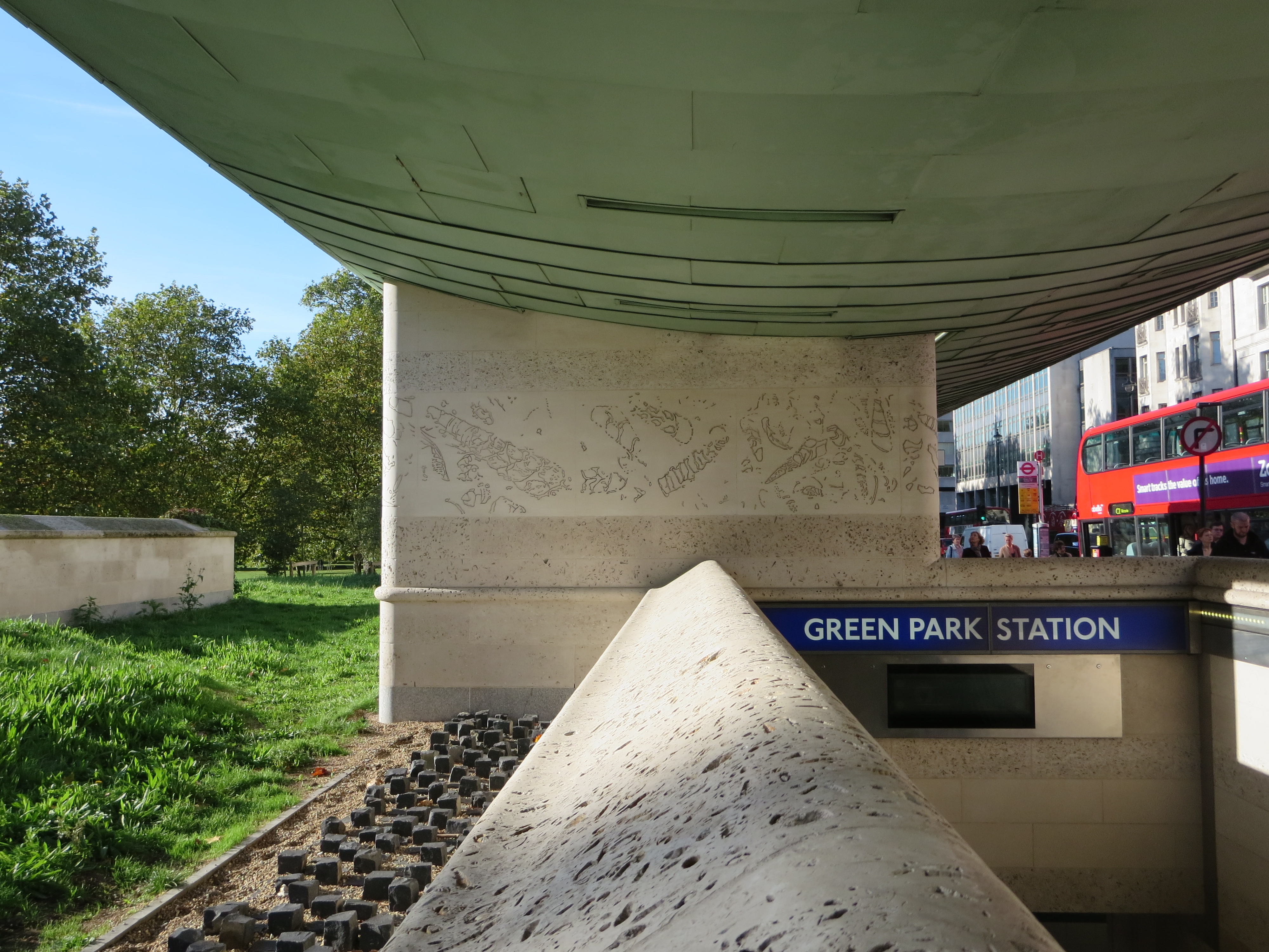
You cannot go wrong with Portland stone. I’ve yet to encounter any building that does not benefit from a coat of the stuff. I’d probably draw the line at a branch of Burger King, but then I’ve already drawn so many lines at Burger King I doubt I’d be able to even see through them for a glimpse of any  cladding.

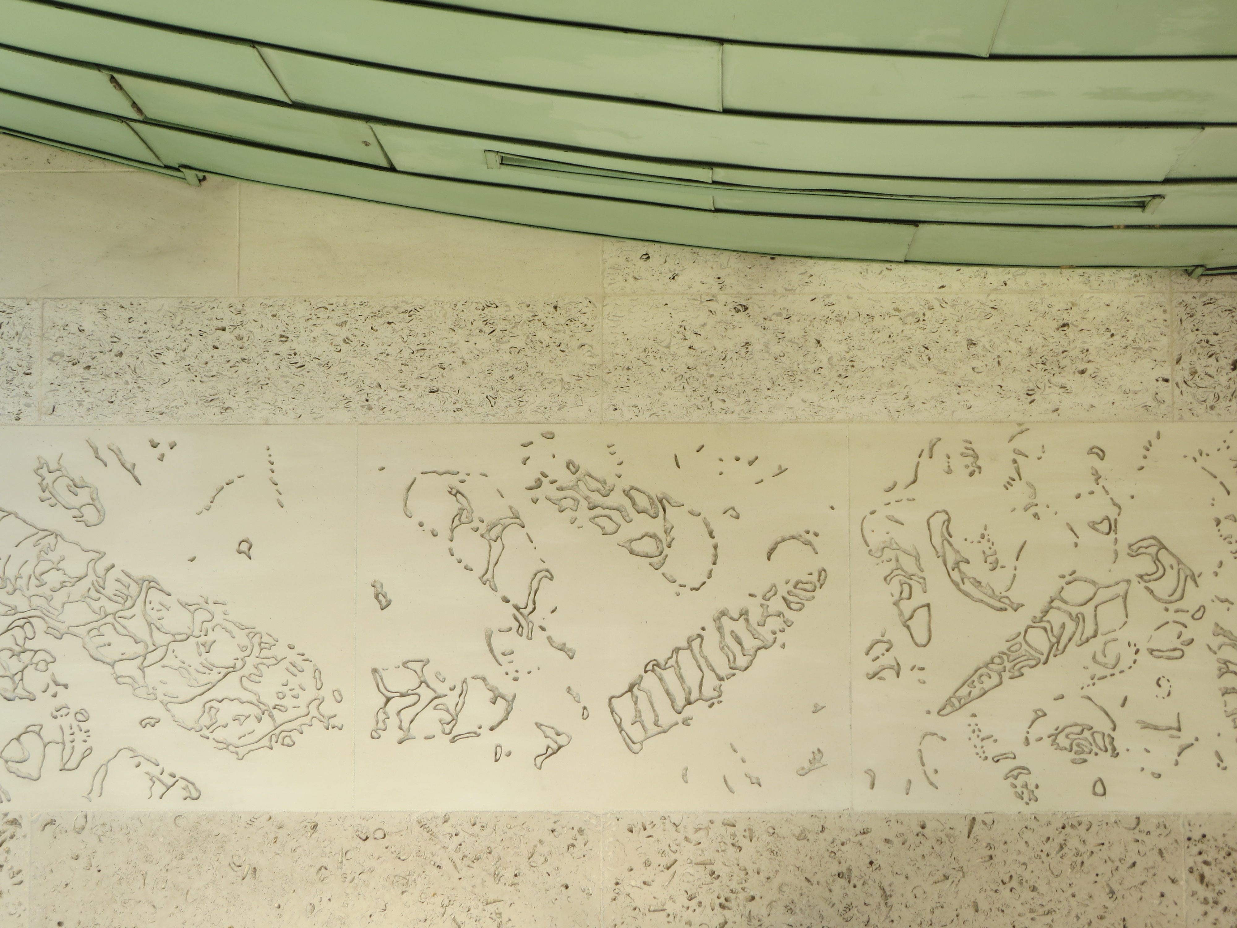
Green Park’s brand new cloak of Portland was turned over to the sculptor John Maine, who created a stunning tapestry of asymmetrical shapes that feel like they are gliding serenely around the whole exterior of the station.

Sea for yourself
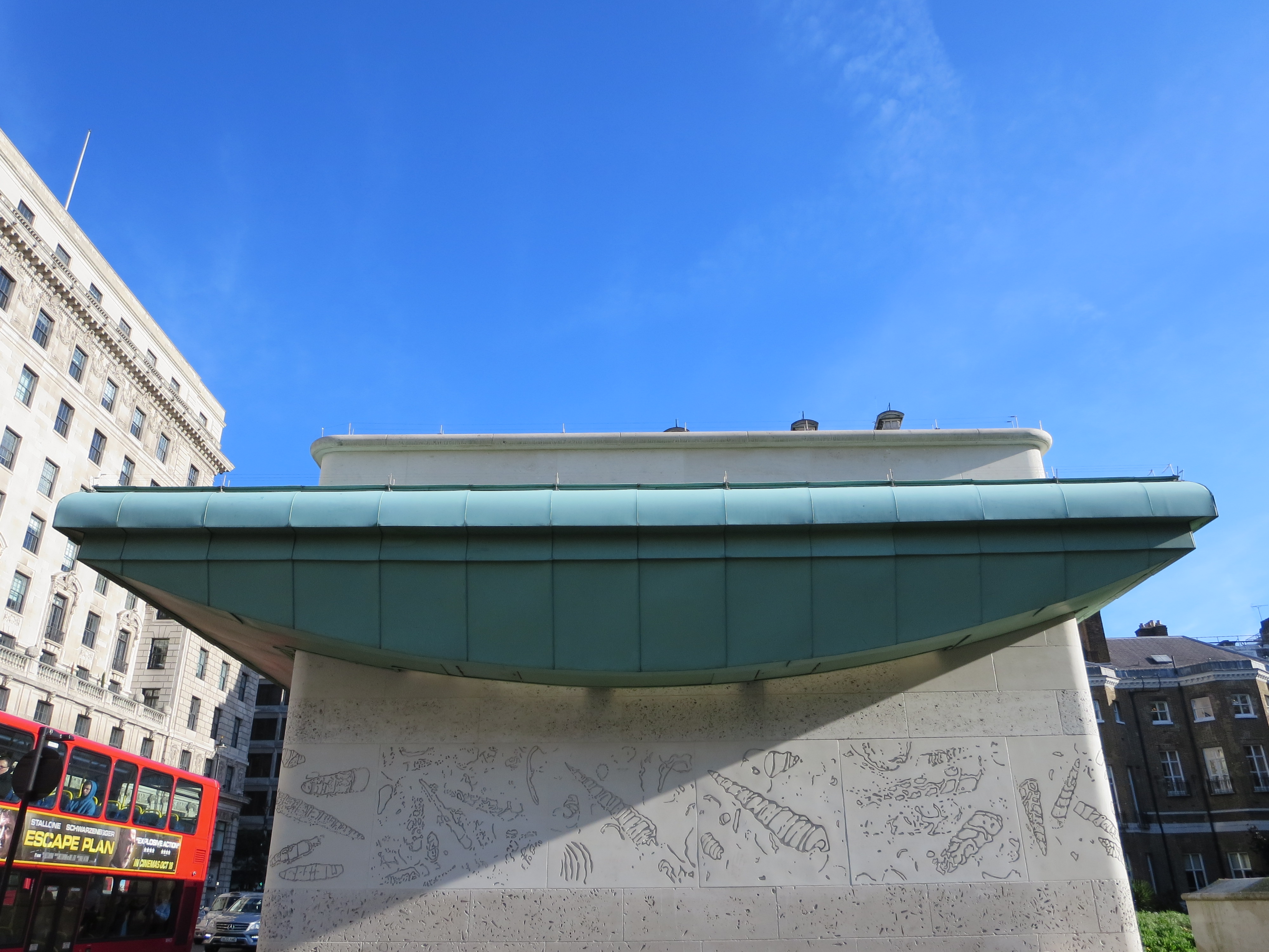
The passing resemblance to fossils is deliberate. The sculptures go by the collective name Sea Strata, and are intended to both call attention to the material in which they have been created, and to the natural world represented by the location with which the station shares its name. I think the artist succeeds more with the former than the latter, but then I’m a sucker for a bit of infrastructure that wears its heart on its sleeve. Especially Portland sleeves.

There are very few Underground stations that seem to want you to touch its walls. Here, the hundreds of undulating patterns and textures positively invite a bit of hands-on exploration. I’ve never seen so many crannies on public view.

What you’ll find inside them is another matter – usually rotting leaf matter, if experience is anything to go by. But at least the sculptures are being noticed. I can’t imagine they competed well against the somewhat more over-stated offerings of London 2012. Now that’s all over, however, the faux fossils can go on doing what real fossils always do best. Existing.

A row of crannies

Warren's treatWarren’s Treat was the name of a novel I almost started writing in my 20s. I thought the title was terribly witty, likewise the idea that everyone in the book would be named after a London-based railway station.

Naturally, I now see that the whole concept was shockingly pretentious and am glad I didn’t have the time, or more correctly the commitment, to get round to doing anything about it. It would also have been a bit too close to this slice of audio horror for comfort.

A much more agreeable application of the station’s name can be found on the walls of the Victoria line platforms:

A maze in graceAlan Fletcher conceived the maze, he of the V&A logo, Penguin book covers, the BP petrol pump and just about every significant example of public British graphic design of the 1960s and 70s.

The “warren” is supposedly possible to navigate in around three minutes. But this does presuppose you have reason to be on the platform for around three minutes, which given the frequency of Victoria line trains isn’t always the case. It’s more suited for idling away gaps in the service, or if you find yourself stuck in the station waiting for a train further up or down the line to sort out a problem with its doors. (Or rather, sort out a passenger who’s created a problem with the doors, usually by TRYING TO ENTER THE CARRIAGE WHEN THEY’RE CLOSING.)

There’s also the additional hazard of someone deciding to sit down right in front of the maze. It’s a little unfortunate that the designs are embedded directly above benches. A woman sat down seconds after I took these photos, and I had to stop myself from scowling (yes, hard to believe).

Yet despite all this I think we can all agree it’s a far more successful manifestation of London transport wordplay than a book with characters such as Rick Mansworth, Colin Dale, the Scottish tearway Cal E. Donian, and the eccentric preacher Canon Bury.

Do not sit here

Up, up and awayIn the March 2013 edition of Creative Review – an issue distinguished by some very notable contributors indeed – the artist Annabel Grey talks about the challenges she faced in realising her ambitious concept for the walls of the southbound Piccadilly line platform at Finsbury Park:

“It got very complicated and mathematical, as there’s an ellipse of a landscape running behind the balloons, and I realised that when you added the spaces between the trackside panels, the landscape would have been about 360 feet high!”

This side upMuch annotation of the tunnel wall ensued, which by the sound of it involved protractors, balls of string and those enormo-sized bits of chalk you now see only in possibly inaccurate recreations of Victorian classrooms.

Grey’s plan was to have the balloons ascend, drift then descend in sequence all the way along the platform – and it works, brilliantly. Starting at the far end, her six magnificent flying machines rise, glide then fall in a perfect union of trigonometry and transportation. It’s a wonderfully uplifting and elevating spectacle for so deep and otherwise lumpen an Underground station.

Up-diddle-up-upI wonder how many people actually a) notice them at all, and b) perceive of each balloon as being part of a bigger design, running the full length of a platform hardly anybody runs the full length of.

But I rather like the fact that the concept is there for you to spot. The balloons flatter you as they flutter past. Their mathematical caper is there to be solved by the witty, not sold to the unwitting. If you miss it, the secret is safe with those who have already resolved the puzzle.

Down-diddle-down-downAs an afterthought, I was intrigued to read that the designs date from what remains, in my head, a barren time for publicly-funded urban transport: the 1980s. Grey and her team were commissioned by London Transport in 1983. They were even allowed to buy up to £15,000 worth of gold mosaic, which represented just one of a whopping 52 different coloured tiles shipped in from Vincenza.

But then I remembered London Transport was still run by the GLC at that point, which itself was run by someone who used and still uses the Underground every day of his life*.

Happy landings*As opposed to riding a bicycle to and from work, thereby never having to meet, mingle with or let alone speak to anyone else.