145. The tiles at Clapham South
 When the balloon goes up and it’s time to head down to the air-raid shelter beneath Clapham South station, one of the last things we’ll see are colours. Rows and rows of gleaming colours, snaking along the walls of the platforms, full of a lustre that is unexpected for something so deep underground. The choice of colours is particularly affecting: nothing gaudy, or luminous, or poorly co-ordinated. Instead, stoical RGB basics that even the vaguely colour-blind can tell apart. And I should know.
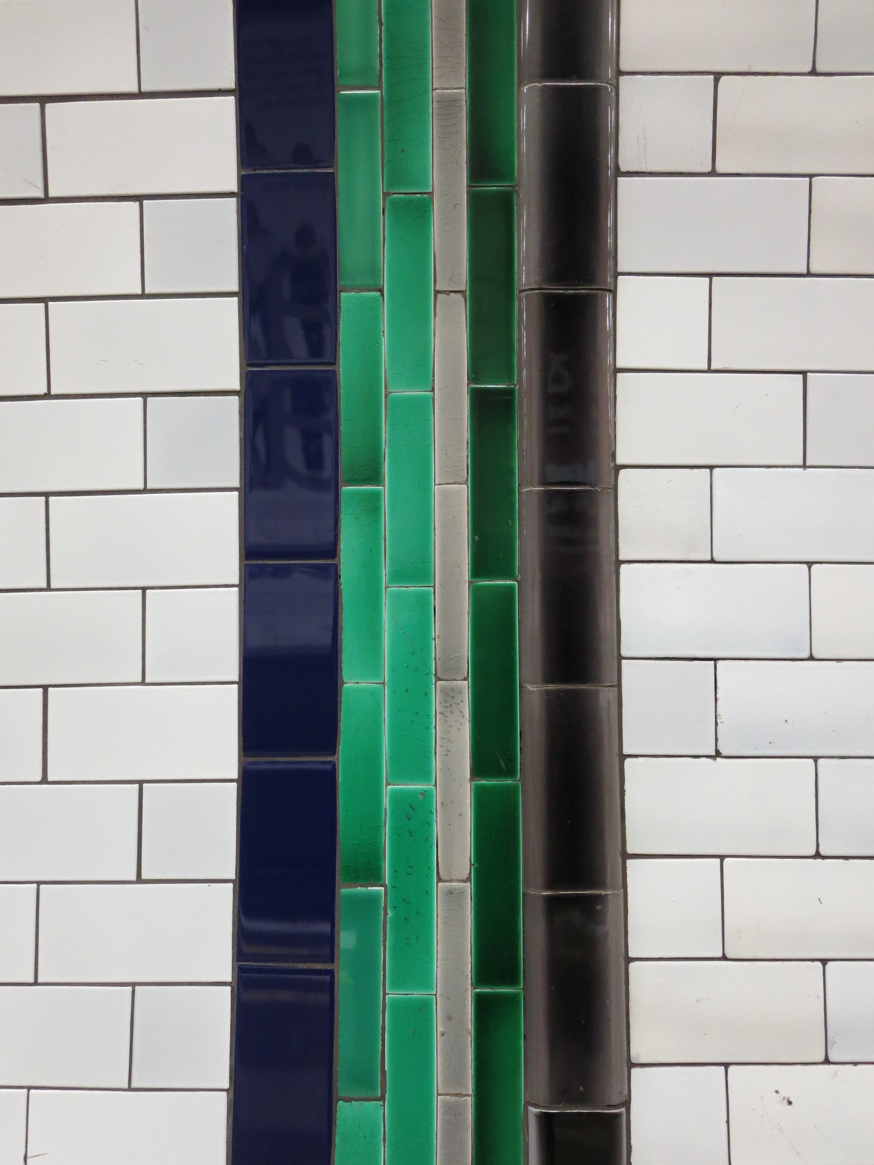 If the tiles are originals, then they date from 1926 and are in very fine condition. Clapham South was the curtain-raiser for the extension of the Northern line and then, as now, is the first treat for passengers venturing towards Balham, Gateway to the South.
If they aren’t originals, they don’t look it. The taste and the elegance feels authentically inter-war. It’s like walking through Balfour or Baldwin’s bathroom. For me their linear design beats the more scattergun styles you can see at stations along the Piccadilly line. These tiles radiate refinement, neatness, and above all order. If, apocalypse pending, they were to be my last glimpses of the artistry of human race, I wouldn’t mind.
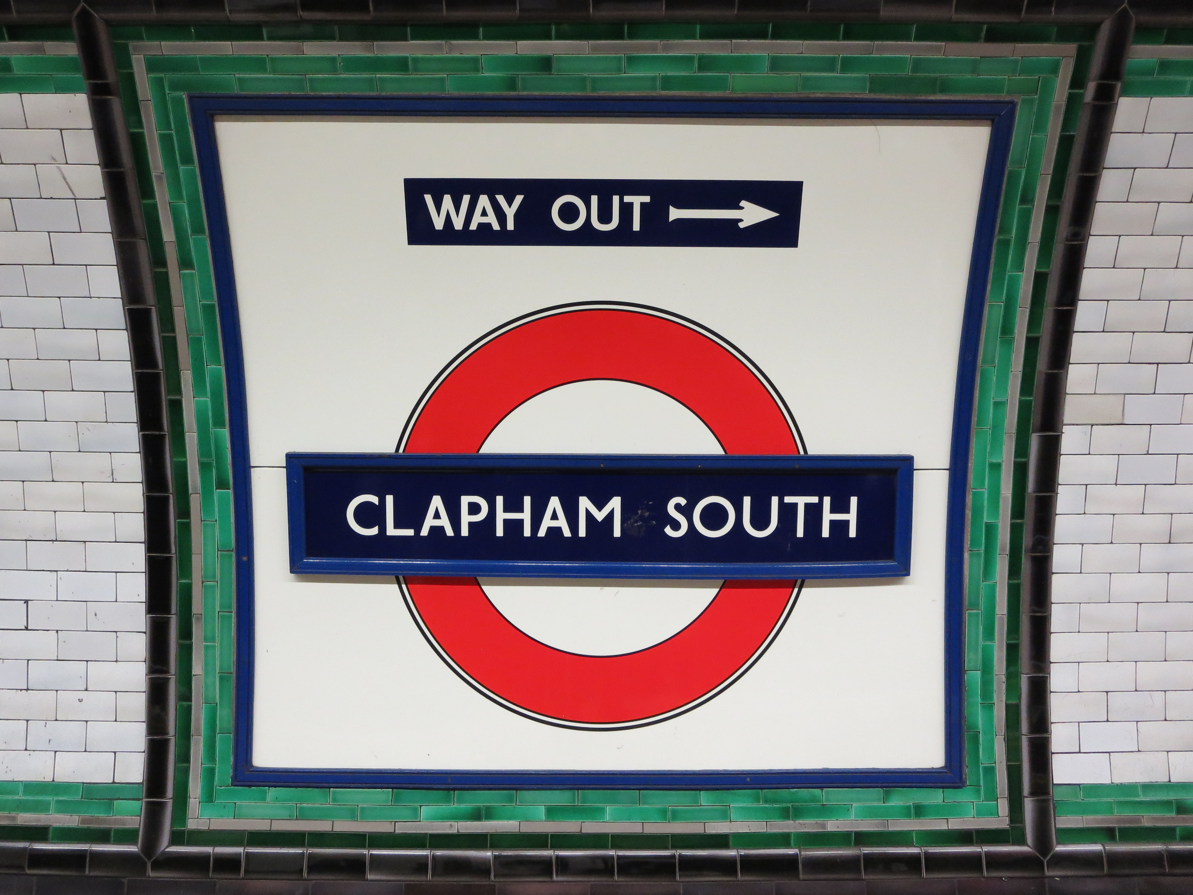

Not just Clapham South, of course, but also Balham down to South Wimbledon. It always feels good when I see those tiles, as I know my station is just a few minutes away.