No less a figure than Sir Paul McCartney has links with Tottenham Court Road.
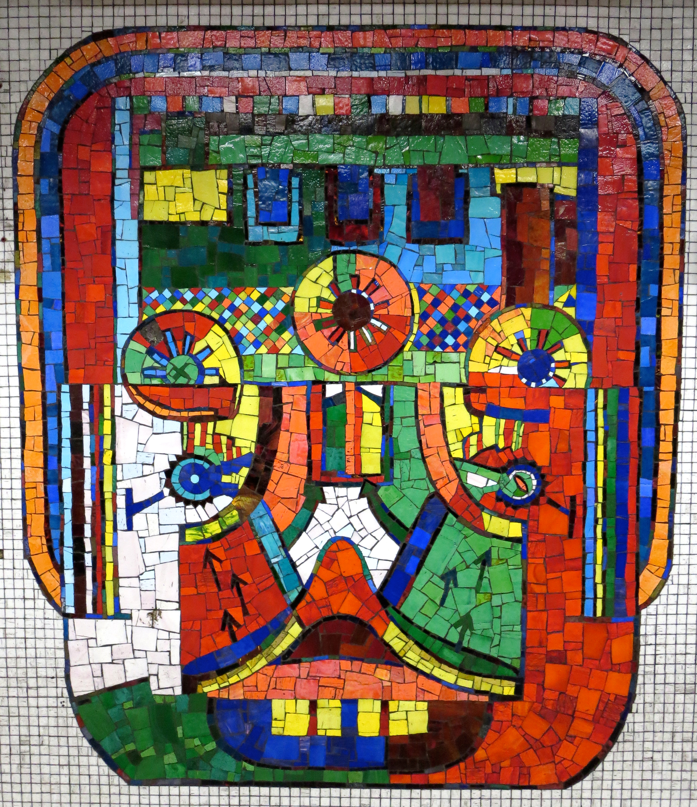
It’s not via his smashing video for the 1986 song Press, which features a bumper crop of Underground locations. Rather, it’s that the same person who designed the cover of the joyless Wings album Red Rose Speedway also designed the joyous mosaics that line this station’s platforms.
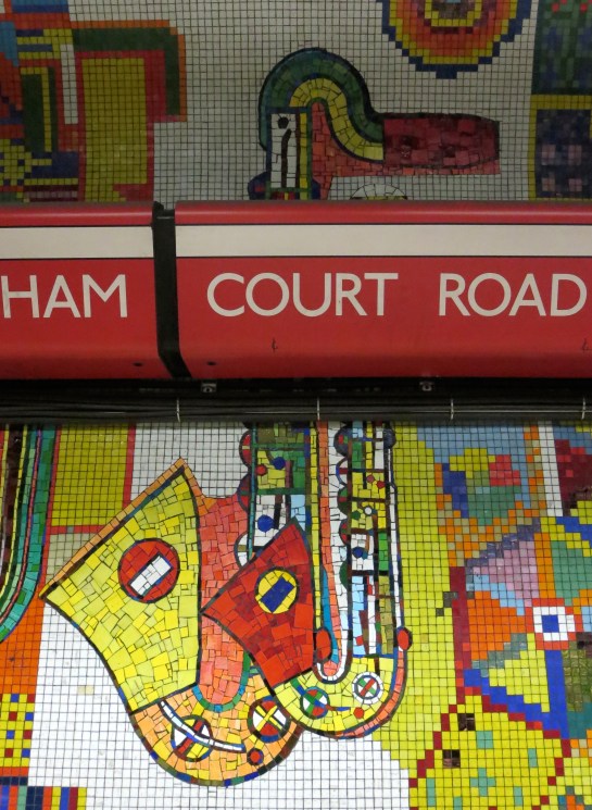
Eduardo Paolozzi is the common factor, and I know which of his efforts I prefer. I’m sorry, but a picture of an ex-Beatle with a flower in his gob just cannot compete with the likes of this:
 This must be the most highly-maintained slice of public art on the Underground. That’s not an especially insightful guess; you can see the wear and tear within seconds of arrival. By and large, though, the mosaics are in reassuringly fine shape. Most of them look as ravishing as they must have done on their construction between 1982 and ’84. A great deal of Tottenham Court Road station may be currently in a shocking state, but tens of thousands of tiny chunks of it are not.
And what a delight it is to discover them, having trudged down steps and along corridors that seem longer and dirtier than they really are, ending up in what always seem to be among the hottest deep-level tunnels of all.
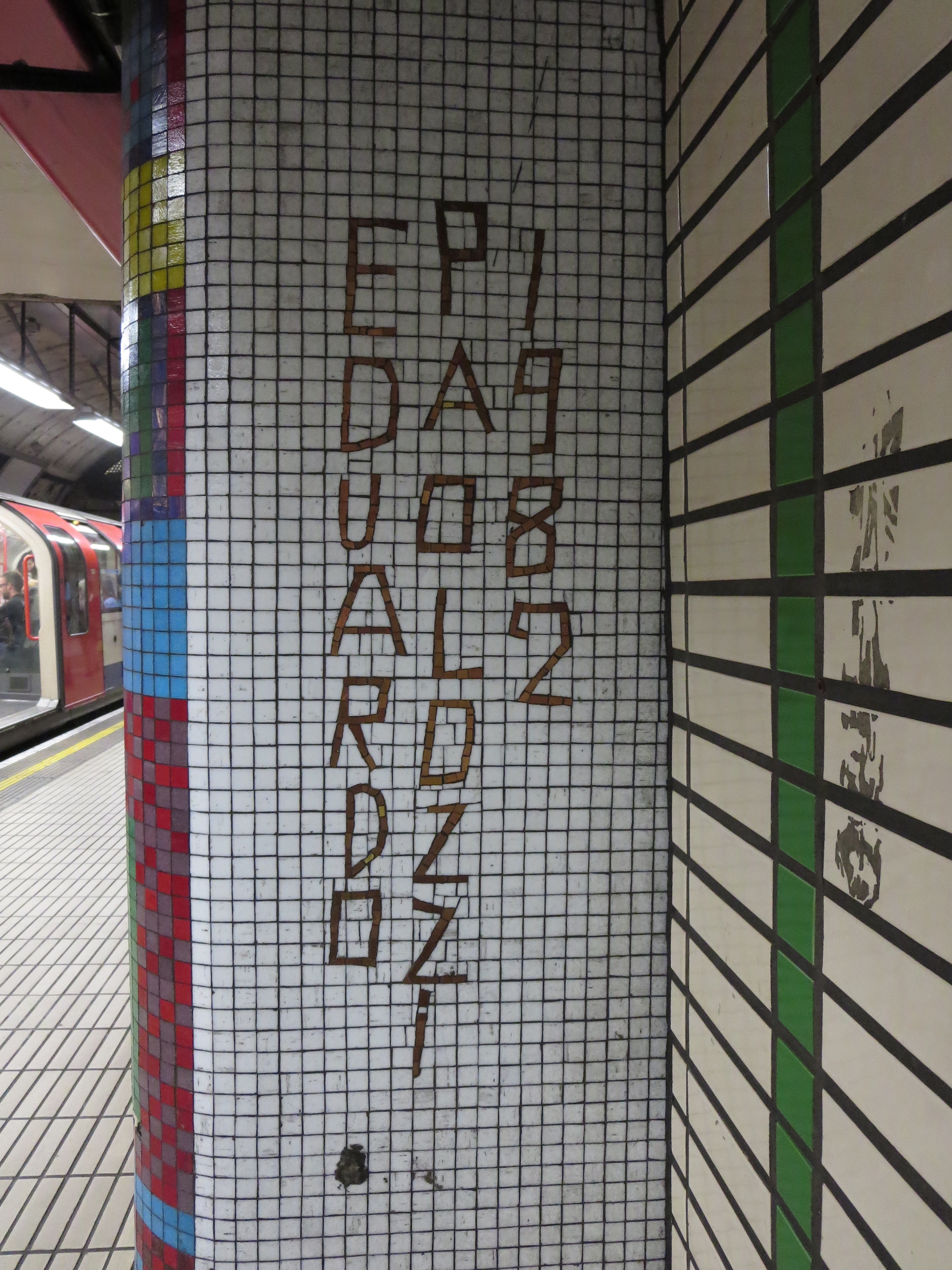
 There’s a bit of rogue typeface to be found as well.
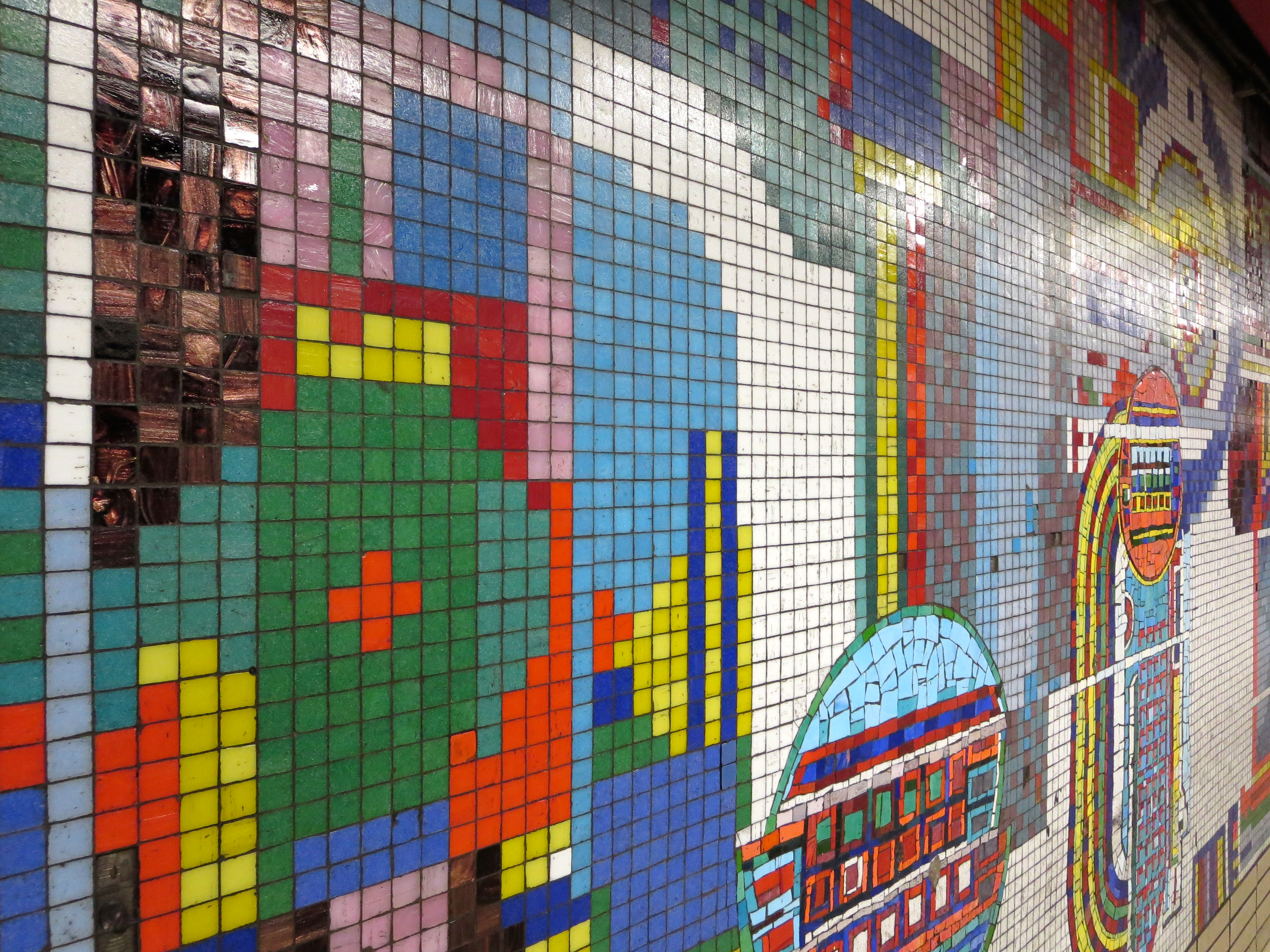
Paolozzi was given 1,000 square metres to fill. Not all of this remains intact. The whirling abstract shapes and topical tessellations used to spill up from the platforms, through passageways and escalator wells and into the ticket hall. But as with other voguish trends of the early 80s, they have fallen away – literally, in some cases.
A few of the designs can look a bit like the mouth of a sugary-drink addict. Occasionally you’ll find a tile on the floor. If you’re conscientious you will hand it to a member of staff. If not, you will take it home and put it on top of your chest of drawers, next to that pebble that may or may not have once belonged to the Berlin Wall.
Some areas of the platforms seem to have escaped the current round of modernisation entirely. Welcome to a time before the Docklands Light Railway, when the only interchange at Stratford was with British Rail:
 Other designs draw your eye upwards and on to the ceiling, doing their best to cope with intrusions from cables, signage and a great wodge of plastic:
 But even cut in half or riddled like an asymmetric colander, the mosaics continue to triumph. Anywhere else they might feel garish, seem over-the-top, look fussy and appear unsightly. Down here they are like the sweetest major chord resolving out of the bleakest of cacophonies, or the world’s largest paintbox exploding on to the drabbest canvas.
Welcome to Paolozzi’s everlasting night on the tiles.

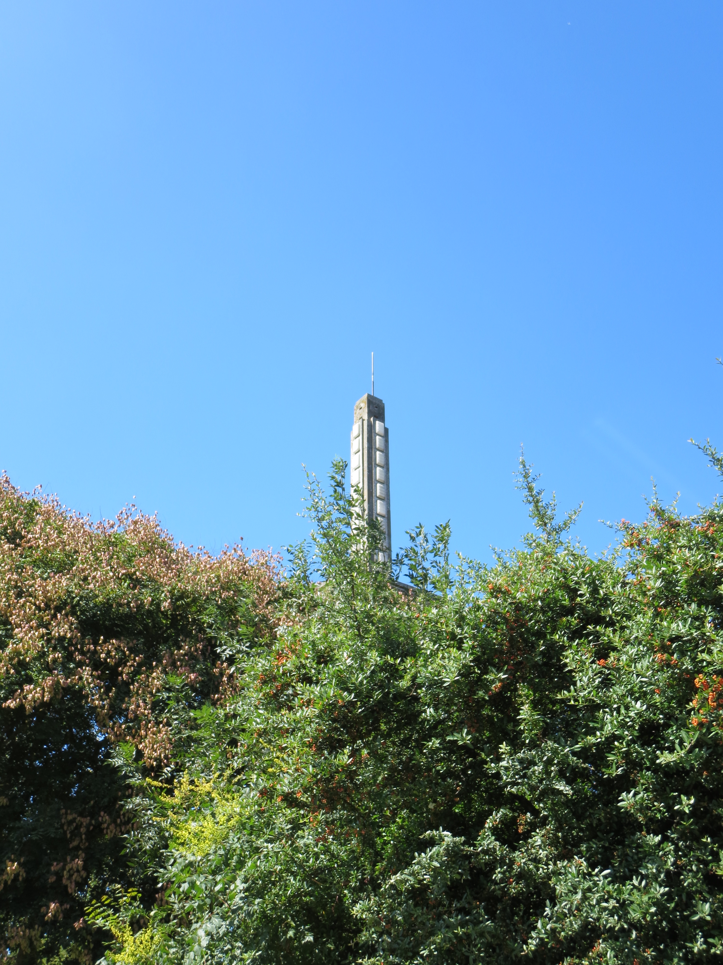
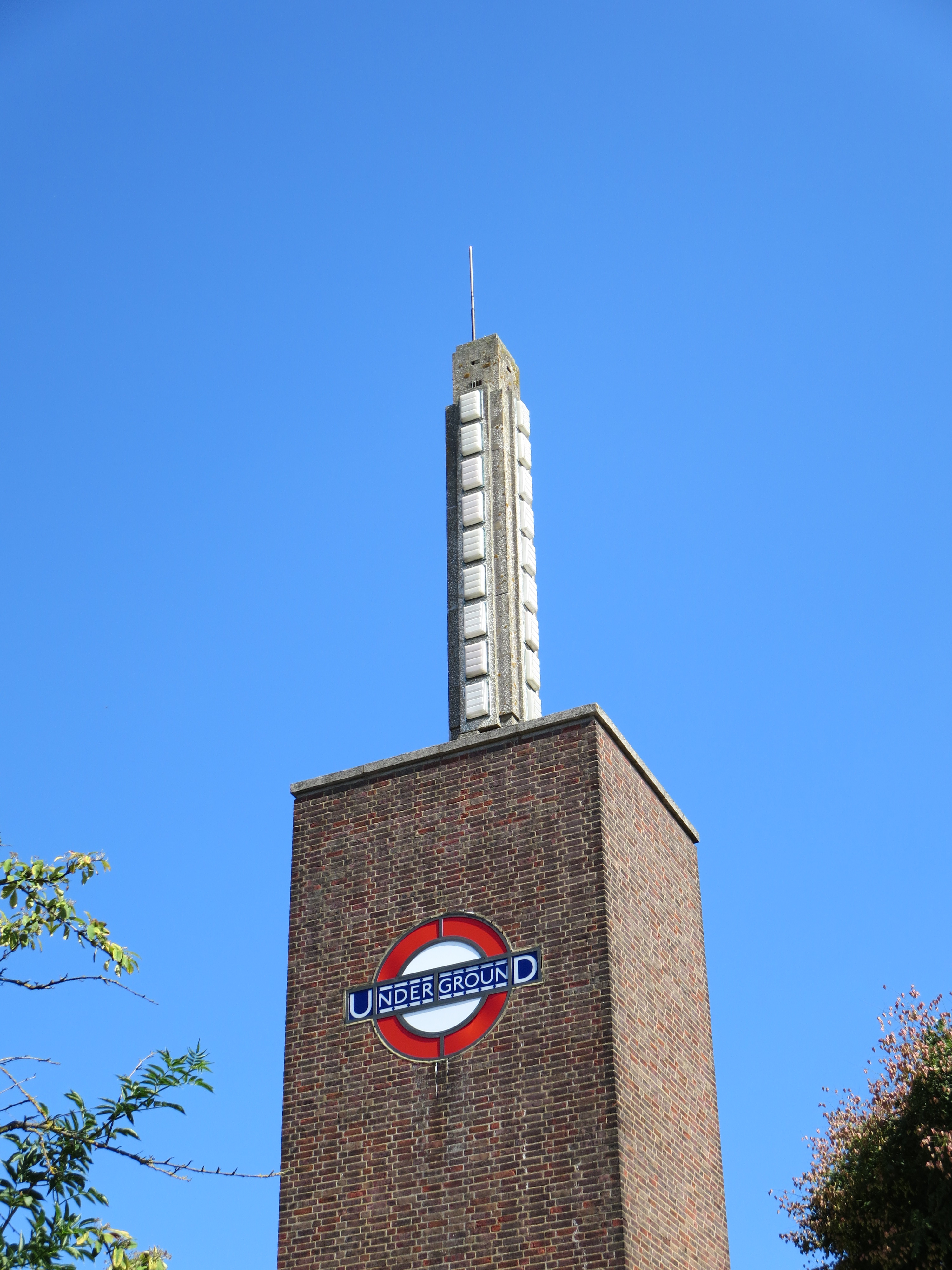
 Here’s one of the smallest things to make it into the 150, but one of the sweetest. It’s on the westbound platform at East Ham, high up near the canopy, perpendicular to the tracks.
 *Possibly the saddest song about London ever written