 I appreciate the interlacing tarmac tendrils of Hanger Lane might not get everyone gyrating with pleasure.
The road network has been branded the scariest of its kind in the country, though I’m not sure something that pre-advertises its risks in such public and self-evident a fashion can be properly blamed for giving you the willies. (Daunting is probably a better label.) There’s a noisy concentration of movement going on, but you can’t say you’re not warned. The grumble and velocity of traffic are palpable thousands of metres before you reach the junction itself.
And then right in the middle of this tombola of motorisation sits an Underground station.
It looks at first sight, from a distance, utterly inaccessible and unloved.
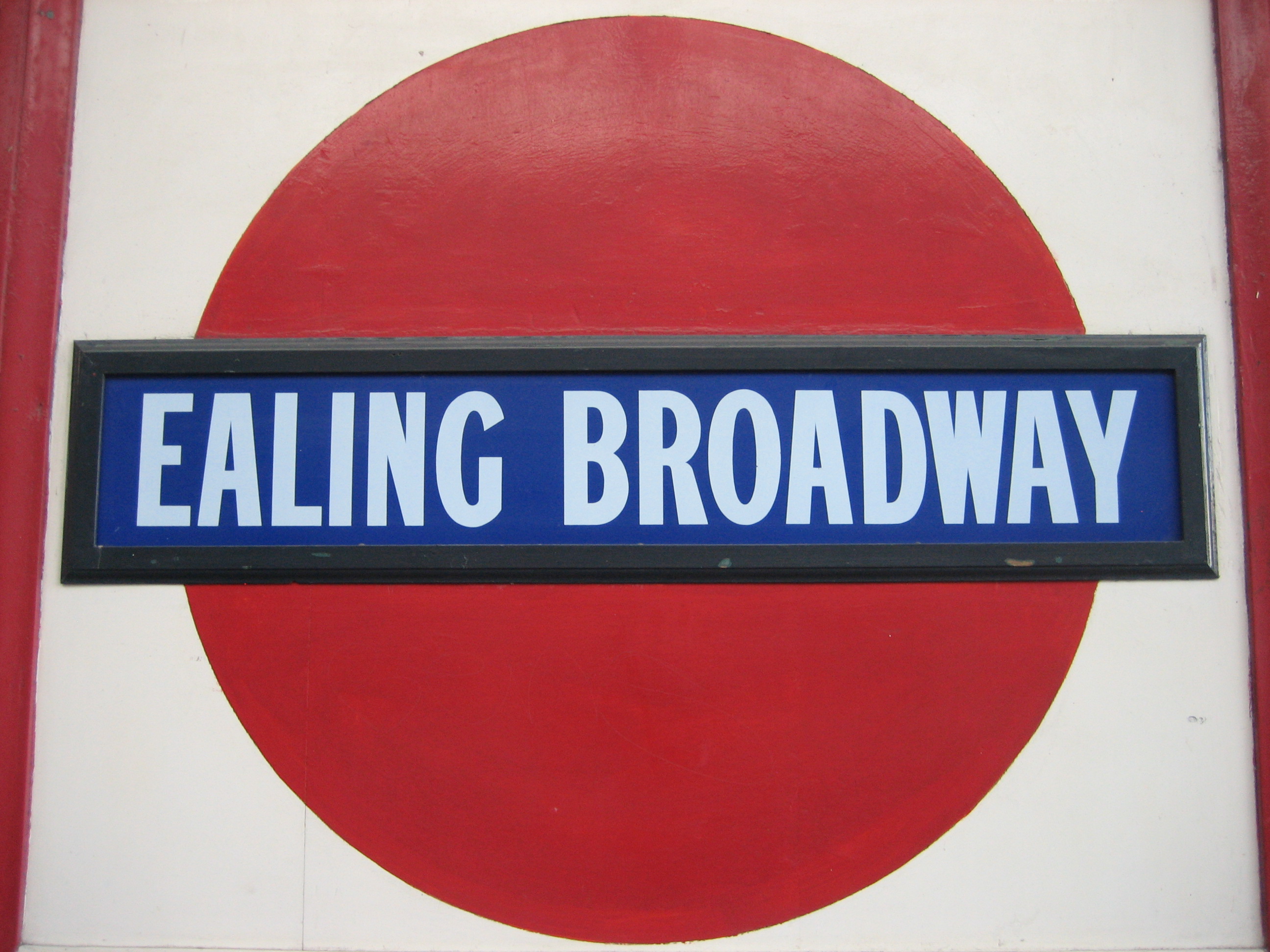
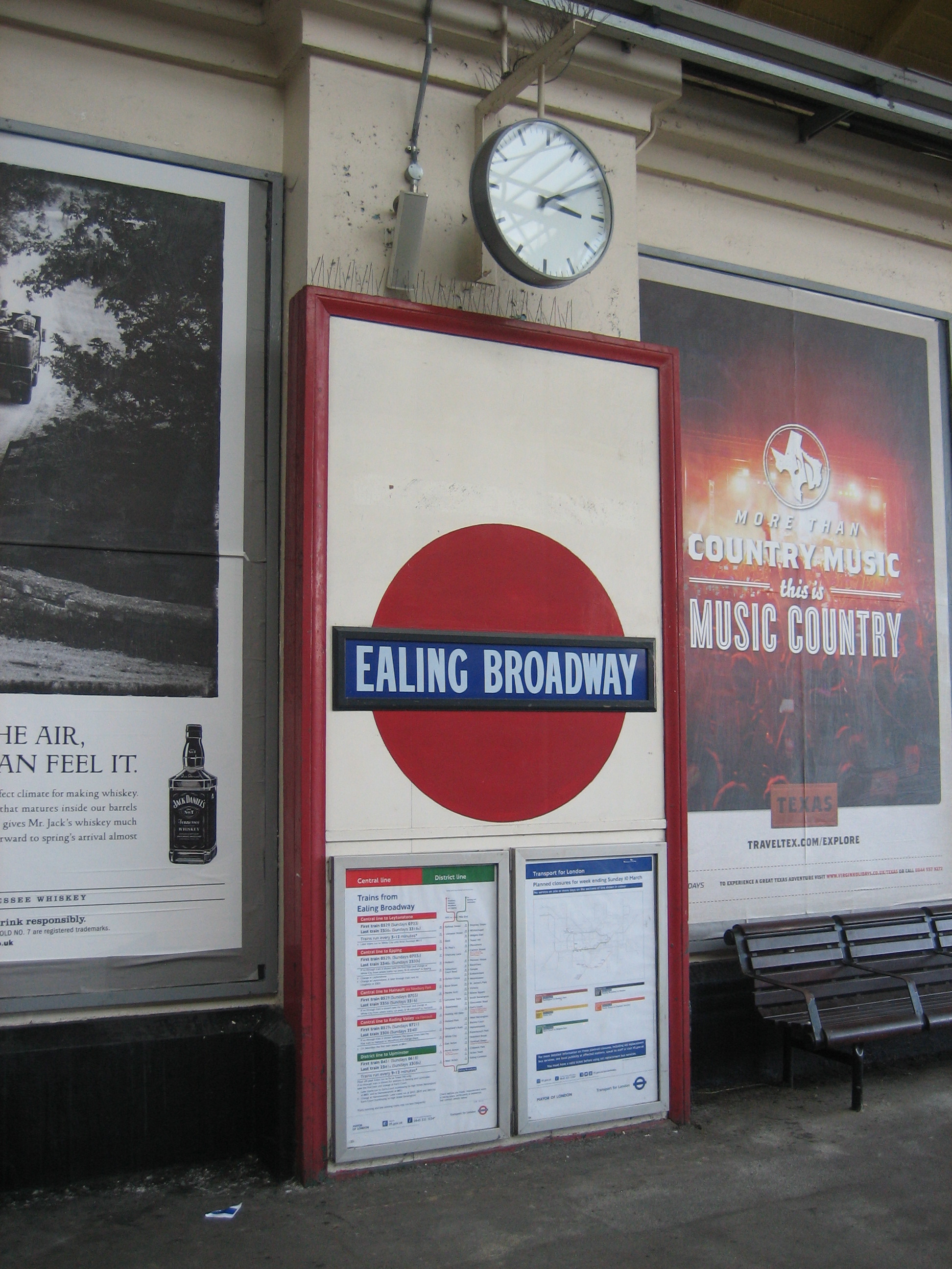
But you should press onwards and nearer, towards the heart of the melee, for you’ll be directed down one of a number of subways, along the walls of which you’ll find a string of pre-gyratory pin-ups.
Like this:
 Representations of the Underground have shaped our perception of the network far more than actual journeys on actual trains. Shapes, symbols and colours have educated and enlightened the country, if not the whole world, since the early 1900s. Most people will never see, let alone ride on, an Underground train. But most people know of the sensation. They know the palette, the aesthetic geography. They know how it must feel.
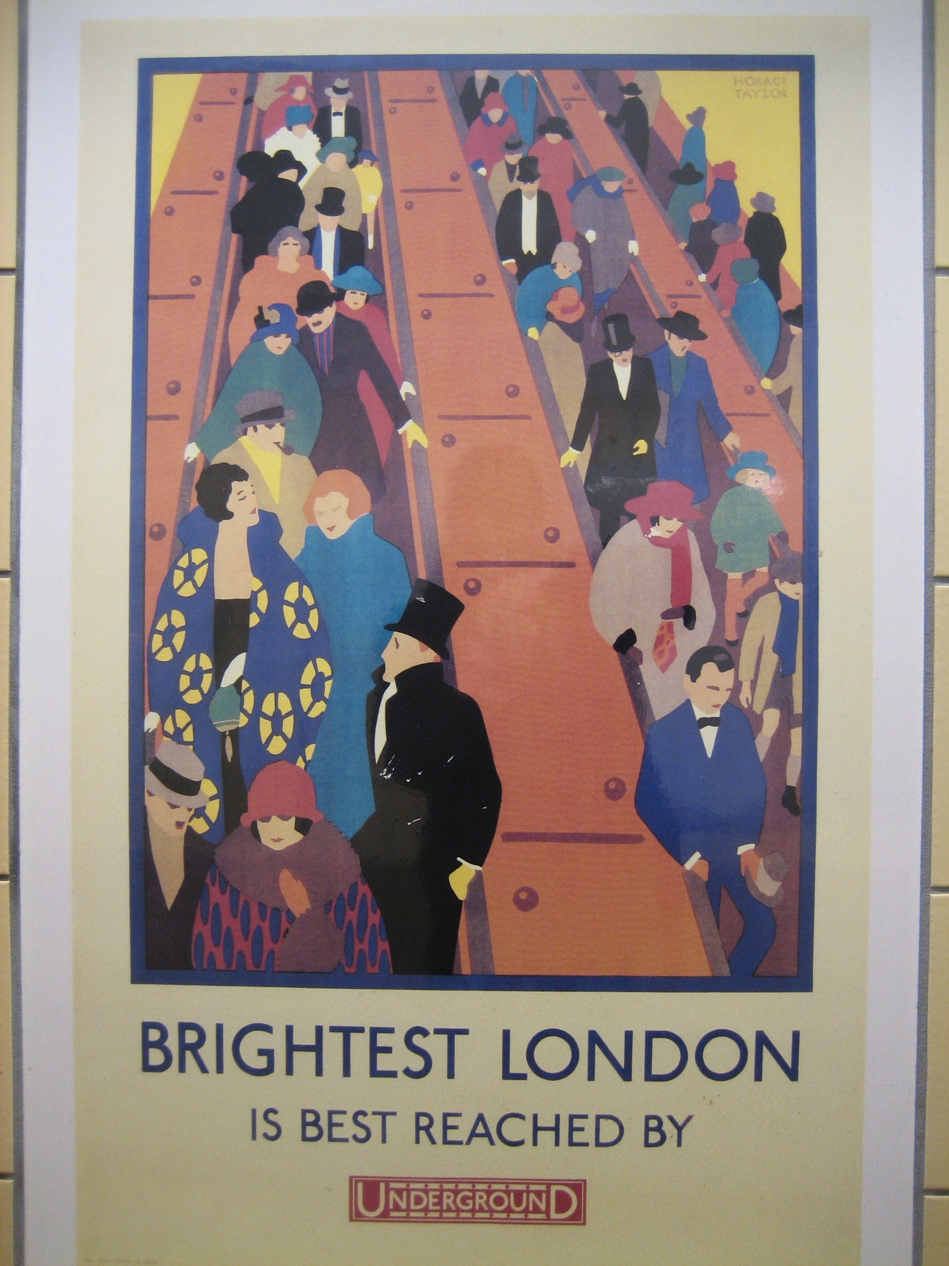
And we have posters to thank for that. Posters that are rightly being commemorated in this 150th anniversary year just as much as the infrastructure.
I think some of them number among the greatest works of art of the 20th century, but then you knew I’d say that. You can see and judge for yourself at Hanger Lane station, where a selection of them stud the underpasses in the form of sensibly wipe-clean tile-based reproductions.
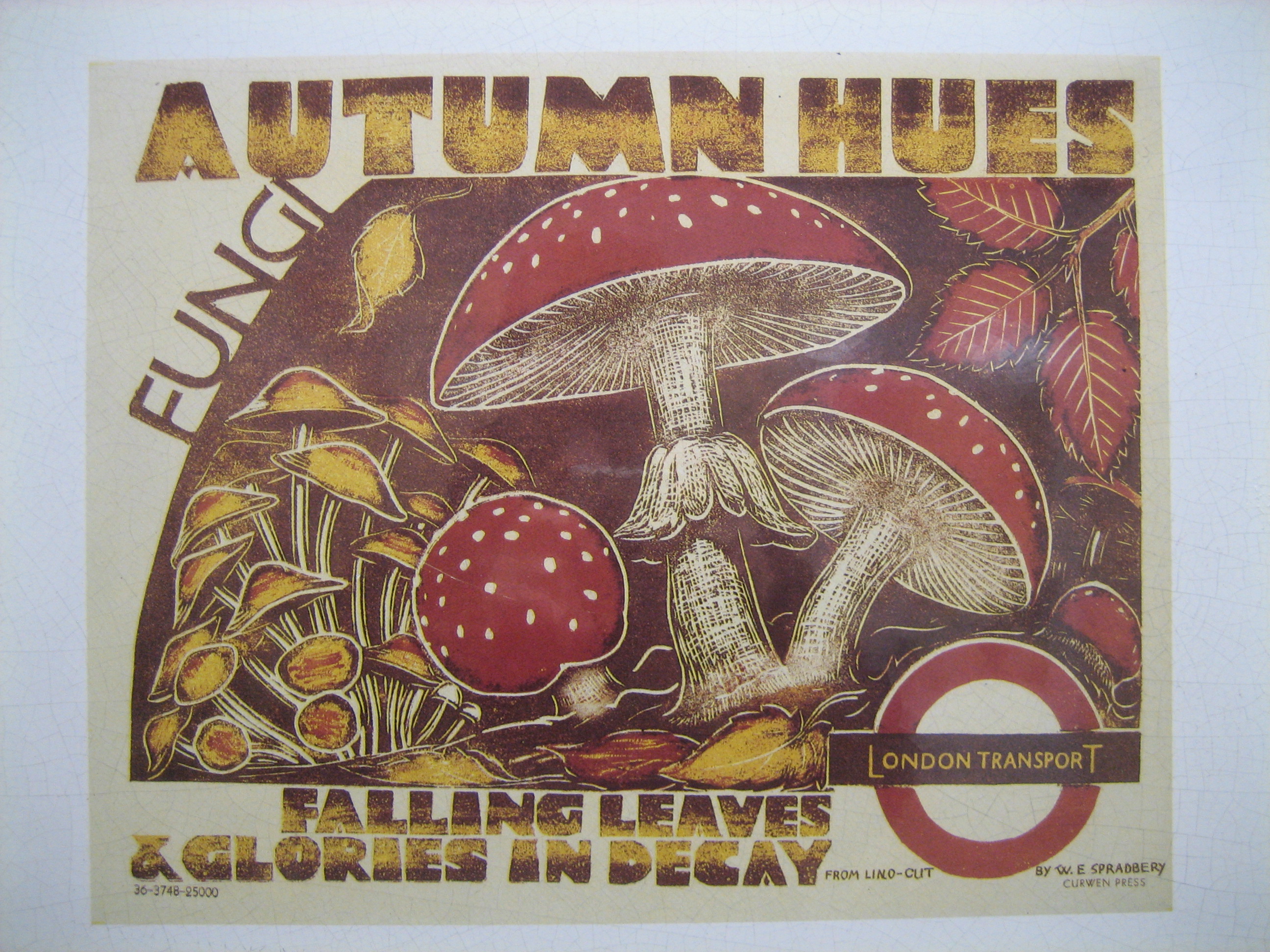
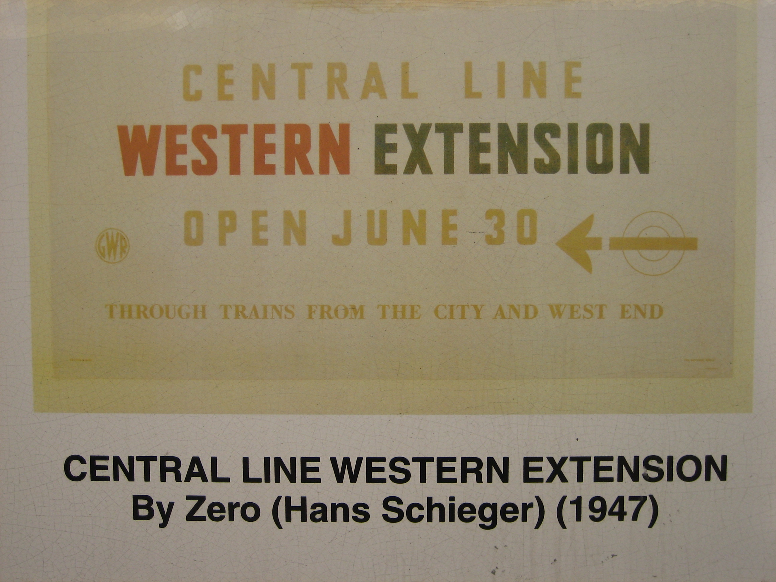 They’re all labelled, giving the artist their proper credit along with the year of publication. And they’re not just the most well-known ones. You’ll find less ubiquitous efforts, like “Autumn Hues” (at the top of this blog), which seems to be promoting easy access to poisonous fungi and “decay”, albeit tastefully drawn.
And befitting the location, there’s a nod to other, cruder modes of transport:
 From a purely selfish point of view, this display allows the likes of me to photograph and reproduce material I suspect TfL and/or the London Transport Museum guards with a roundel-shaped branding iron.
From a more selfless point of view, it’s wonderful that these colourful splashes of heritage continue to have a place in the present, available to all to see, touch and explore: history’s hangers-on at Hanger Lane.