
Archive

District line

Timey-wimeyParked by the eastern entrance to Earl’s Court is something that competes for attention from passers-by with a frozen-yoghurt parlour, a branch of Pret a Manger, and a kiosk selling international newspapers.

When I was there, it was losing to all three.

Like the TV series, it’s a relatively contemporary reimagining of a once ubiquitous staple of everyday life that had ended up somewhat irrelevant and unloved.

Unlike the TV series, it’s seen better days, looks somewhat shabby and could do with sprucing up a bit. The dirt has, however, led to some topical graffiti:
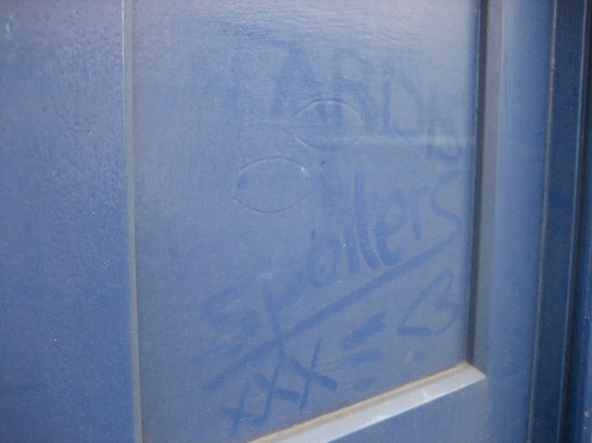
Hello sweetie!You can’t use it to call the police. You can’t even go inside. And those that have the power to do so better not think of lighting up.
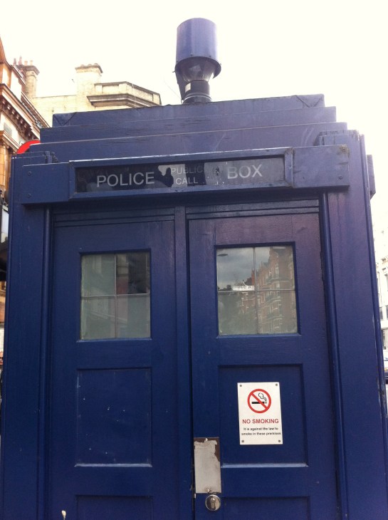
Sterner on the outsideIt’s probably sterner on the outside than the inside.

A thoughtfully-embossed brass panel fixed to the box explains who, where and when:

SpoilersI’m used to being eyed suspiciously while taking photographs outside an Underground station. On this occasion, though, not only did I fail to be eyed at all, I also got the sense of being actively ignored, even shunned. It was as if the twin bodies of the London Underground and Doctor Who had suddenly aligned in such a fashion as to send anybody in close orbit scurrying for less obsessional climes:
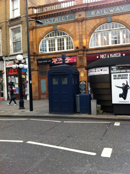
The anoraks have landedEarl’s Court station: change here for the District, Circle, Piccadilly and Gallifrey lines.

Which station makes sailors seasick?These aren’t unique to Turnham Green, but seem to be in much better condition here than elsewhere along the District line.

Should you be at all taken by the shape and the sheen of a good bench, moreover one that incorporates both a crisp slab of signage and half a dozen windows to boot, then the station least beloved by seasick sailors* is the place to be.

There’s a quiet, gentle beauty to such atypically multi-purpose public transport furniture.

Two things are going on here. One is an appreciation of form, and the other is an attention to detail. Each complements the other, and from their marriage emerges the sort of place I’d be happy to sit for half an hour or so, cocooned from other people and the elements, with only my thoughts and a good (but not great) book for company.

Attention has also been paid to how they look as part of the station as a whole.

See how the dashes of white on the columns supporting the roof line up perfectly with the white on either end of the benches:

A bench benchmark The colours in turn mirror those on the roof itself, which is a rather fine piece of architecture in its own right thanks to that intricate threading of wood and metal.

Either tucked up inside or facing them from an adjacent platform, you can’t help but feel these benches have benefited from having that extra bit of thought, even love, put into their construction.

And that feeling is what encourages you again and again to conclude that the Underground is a thing of greatness. For where else is the same care lavished upon somewhere to rest your legs as somewhere to carry millions of people under a giant river four times or 18 metres over a valley?

*An oldie, but a goldie.

Minute precisionI didn’t go looking for these. I found them by accident while searching for something else. As is always the case in such circumstances, their discovery was all the more delightful.

I spotted two of them, though there may be more. One is in the main hall of the Hammersmith station that serves the Piccadilly and District lines. Another is on the westbound District line platform.

I received more than the usual number of inquisitive, not to say menacing, looks from passers-by when taking photos of the clocks, especially the one in the entrance hall.

About faceFunny how, whenever I’m taking these kinds of photographs, a message is “suddenly” broadcast over the station’s public address system reminding passengers to report any “suspicious-looking behaviour”.

If it’s meant to be intimidatory, it works. I always put my camera away and beat a retreat.

By the big handThe clocks are, as the pictures hopefully suggest, completely charming. The colours of the two lines the station serves – Piccadilly (dark blue) and District (green) – form the outer ring, while the 12 hours of the day are denoted by the Underground map symbols for a station and an interchange. So simple, but so effective.

Why the hands of the clock are the colour of the Central line, which runs nowhere near Hammersmith, is another matter… although if it’s been done just to make the whole timepiece look nice, that’s fine with me.