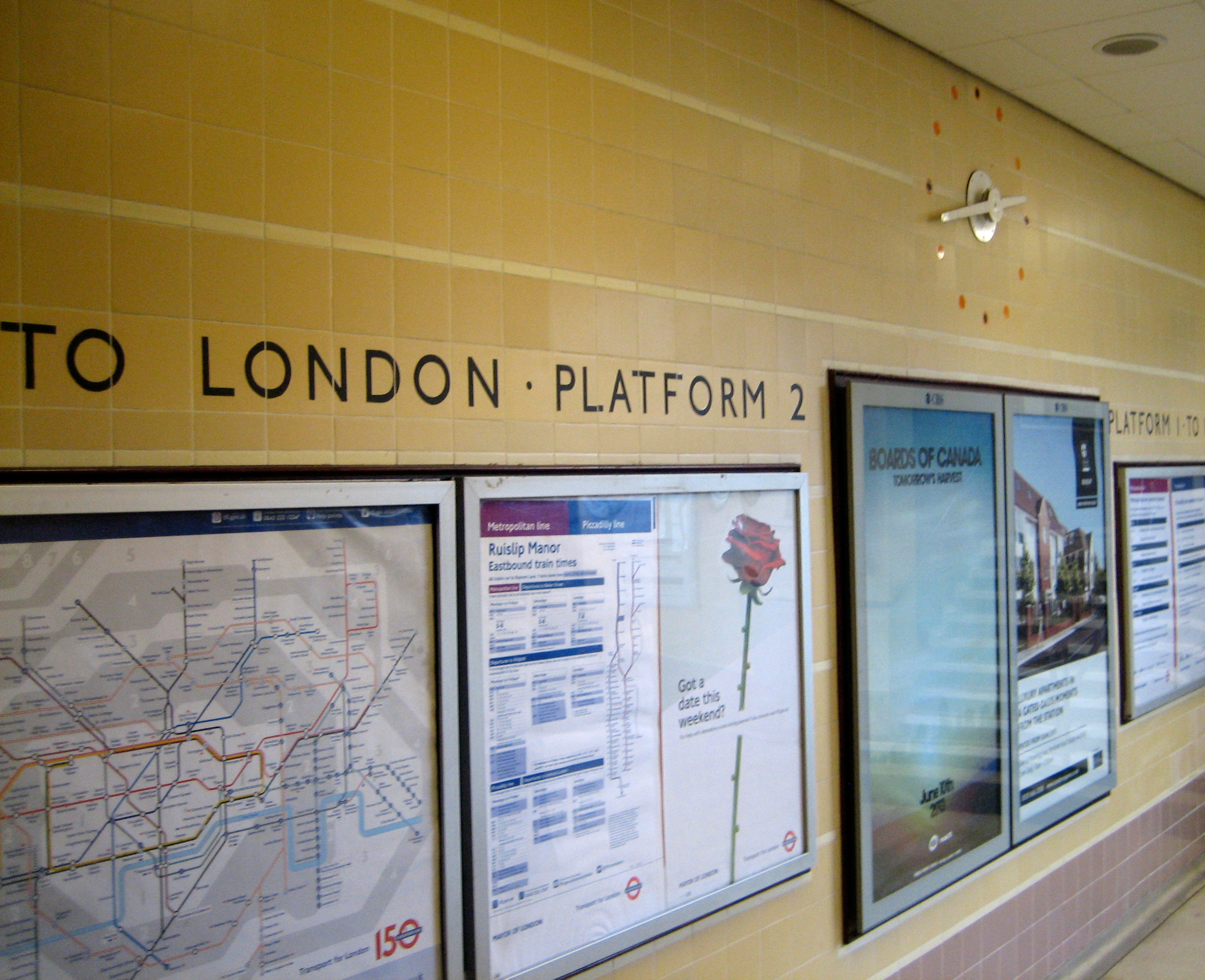
 Having already swooned over the statues on the outside of London Underground’s HQ, I feel any further words of my own can’t possibly do justice to the wonder that is the whole of the building.
So I’ll let other people’s words do that for me.
 “When I realised the full possibilities of this [building’s] cross-shaped plan – good light, short corridors, and a compact centre containing all services, complete with lifts and staircase communicating directly with all four wings… I do not think I was ever more excited.”
– Charles Holden, 1944
 “Charles Holden built embassies of modernism. If you wanted symbolism of a newer world, he was making those shapes against the sky.”
– Peter York, 2013
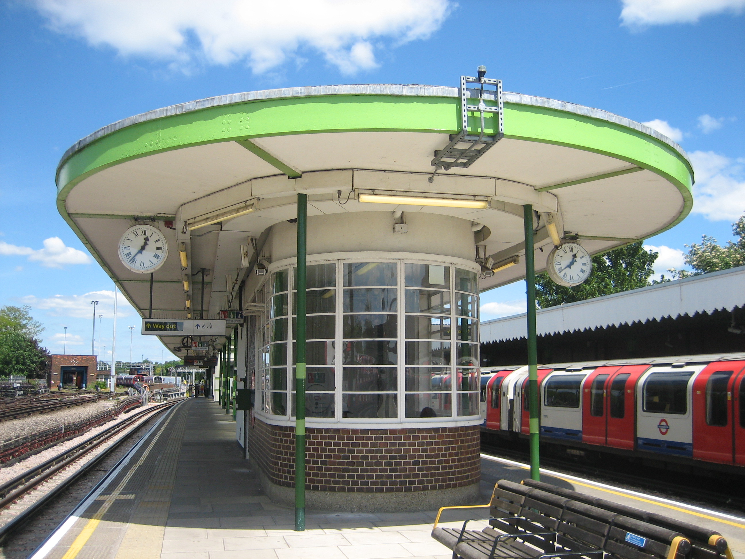
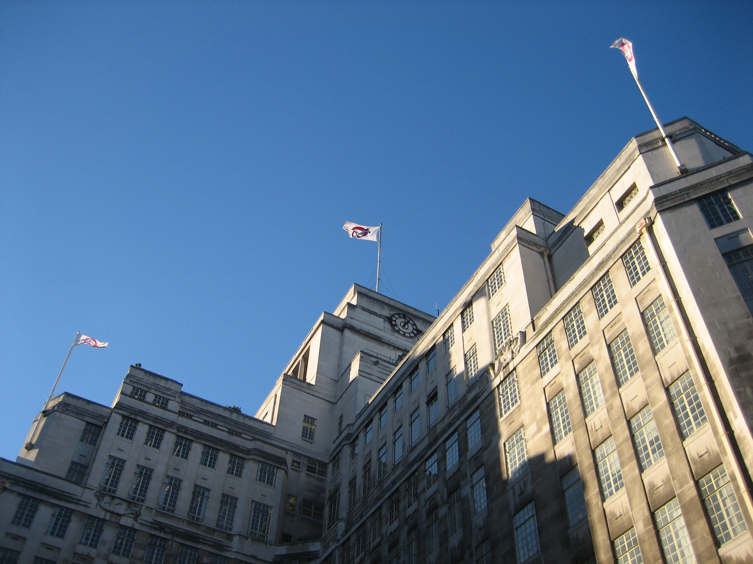
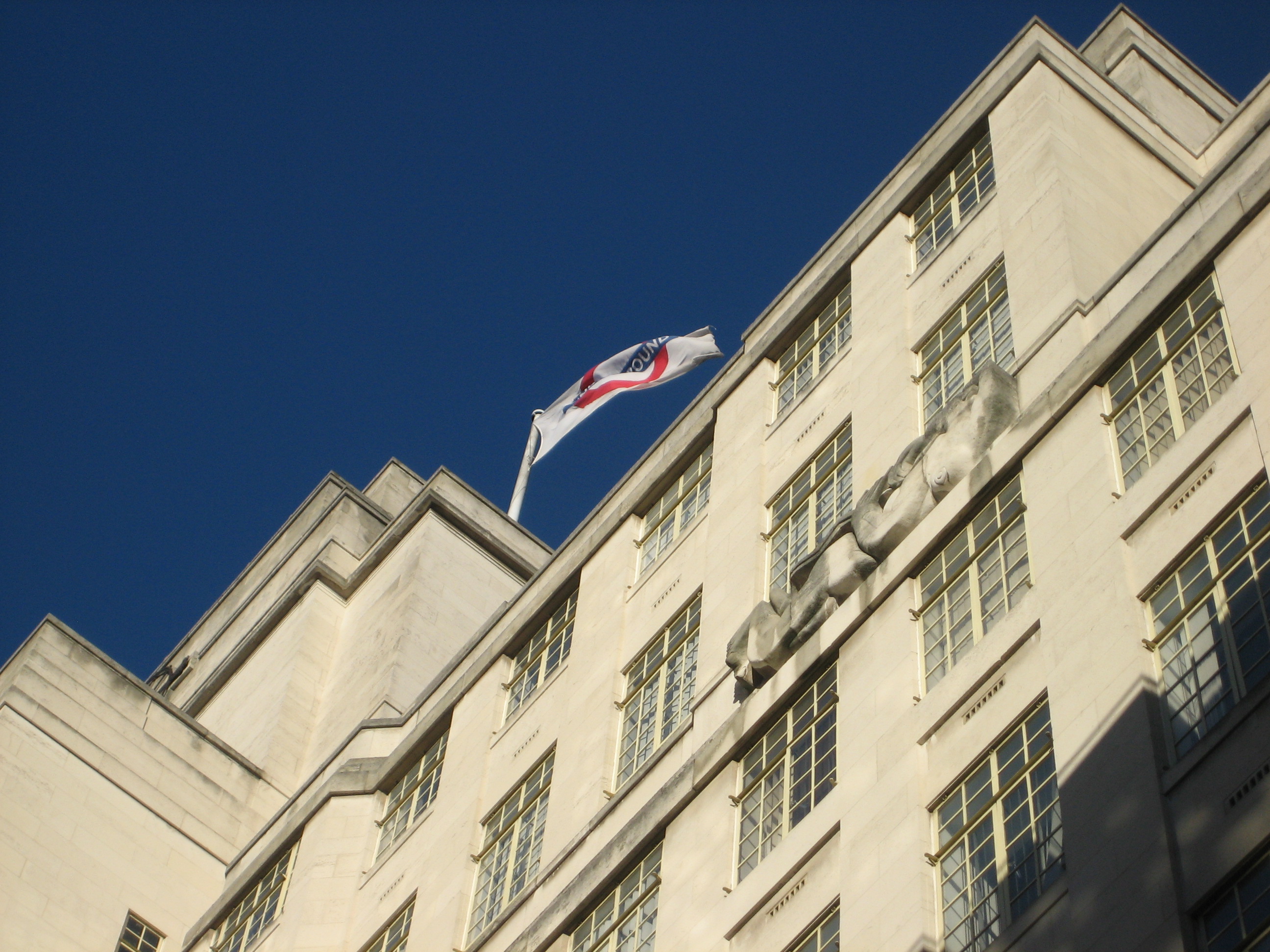
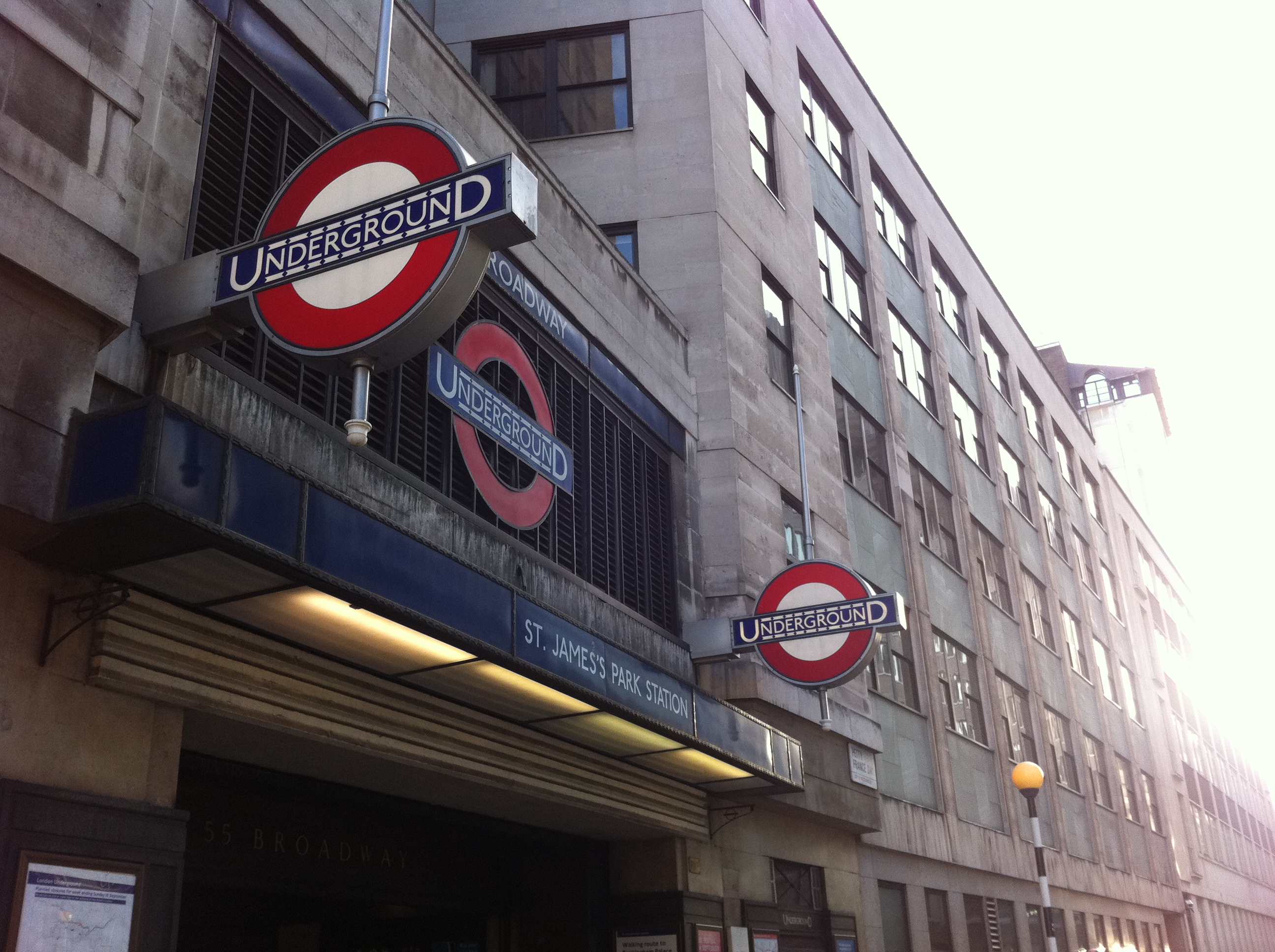
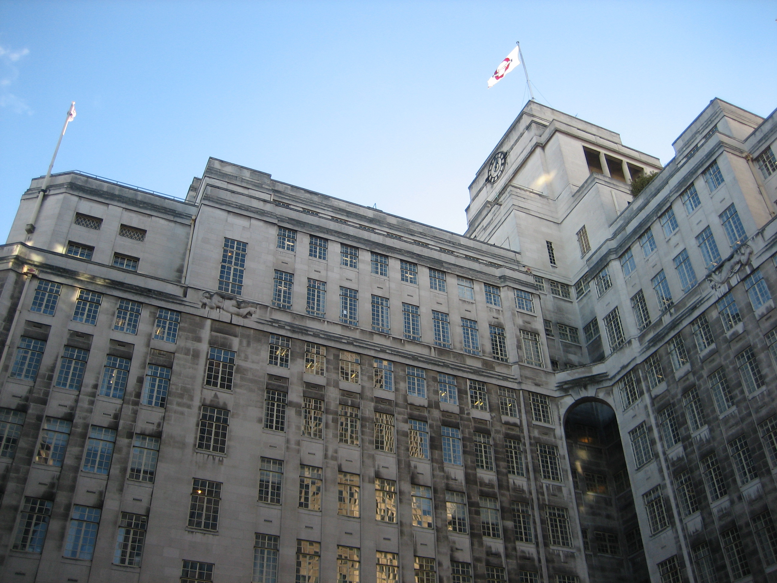
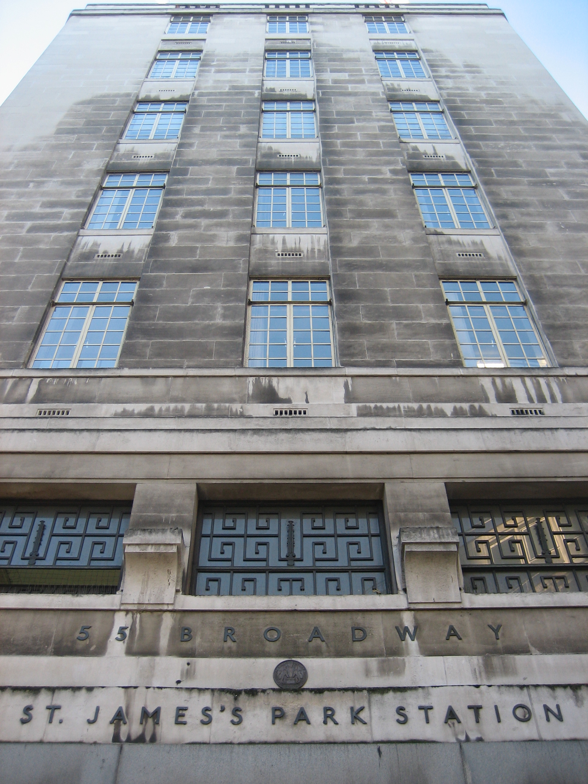 “The building, begun in 1928, was constructed by The Foundation Company and completed in 1930. When finished it had a floor area of 31,000 sq ft. Above the second floor the building had a central tower and four wings, each 48ft wide. The wings necessarily varied in length, the east wing was 100ft, the west was 76ft and the other two were just 60ft. The top of the tower was 176ft above road level, and was surmounted by a 60ft flagstaff.”
– Mike Horne
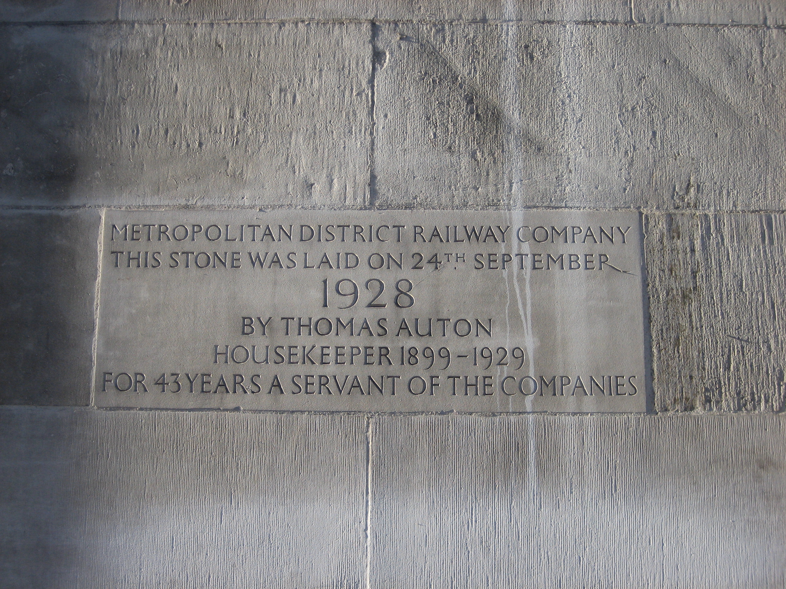
 “Frank Pick [who commissioned the building] was the greatest patron of the arts whom this century has so far produced in England, and indeed the ideal patron of our age.”
– Nikolaus Pevsner, 1968
“The historic home of London Underground is to be converted into expensive flats as part of a drive by transport chiefs to raise more than £1 billion. The Grade I-listed building at 55 Broadway… is unsuitable for a modern office, say bosses. Lower floors will be converted into one-bedroom apartments and the rest will be penthouses. LU boss Mike Brown said: ‘Any development must respect the building’s heritage. We will proceed sensitively.'”
– London Evening Standard, 15 May 2013