Archive

Numbers 76-100

This-a-wayI’ve been a bit sniffy on this blog about the Underground stations designed by Leslie Green.

They’re the ones with the dark red exteriors made up of hundreds of glazed terracotta blocks. There are dozens of them around the city, and you’re bound to encounter a few of them on even the most fleeting of visits to London. Which is precisely why I have a bit of a problem with Green. To sum up what I’ve discussed before, if you’ve seen one of them, you don’t really need to bother with any others. The differences are superficial rather than significant, prompted by expediency rather than imagination.

Sometimes, however, a variety of riches can be found inside one of Green’s otherwise character-less creations.

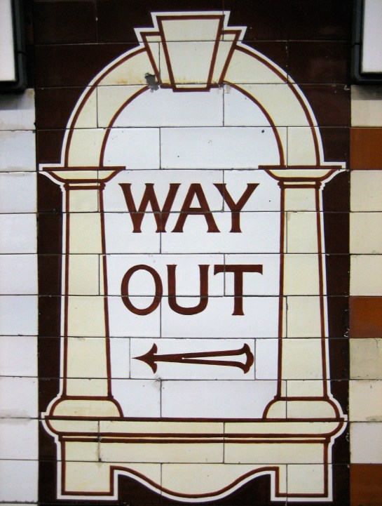
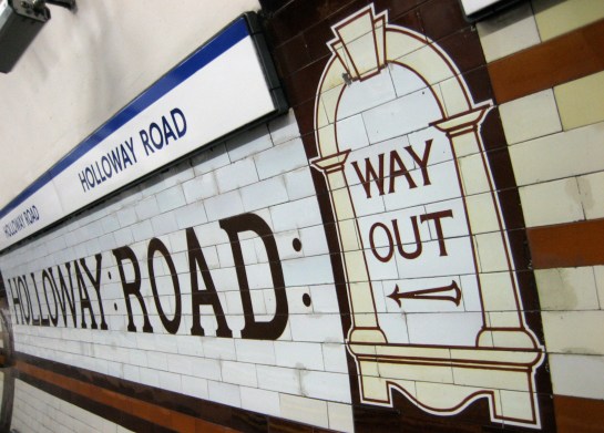
Holloway Road has a good collection of his signature work for the interior of an Underground station. Both platforms were given a long-overdue refurbishment in the late noughties, which certainly benefited the tiling. Green’s trademark ‘Way Out’ and ‘No Exit’ designs for the walls of the platforms look in a pretty good state, considering they were first put up in 1906:
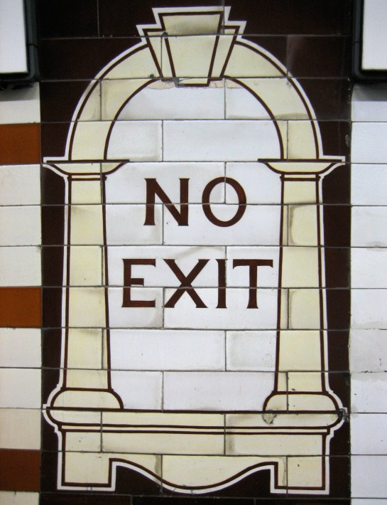
Well, obviouslyBut for once, a Leslie Green station is more than the sum of its predictable, rudimentary parts.

As well as those familiar mock signs (based on his design for the ticket windows in the booking hall), Green sprinkles Holloway Road with a bit of glamour: more Cricklewood than Hollywood, as Ernie Wise would say, but still rather beguiling.

There are very swish ‘To The Trains’ signs in the little passageways between the adjacent platforms:
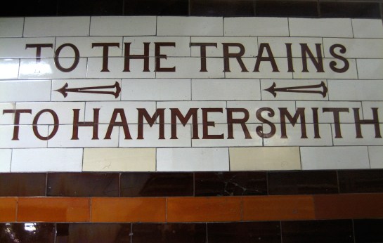
To the trains!And there’s a much larger treat in the shape of the track-side wall of both platforms, which have been left completely free of advertising.

The effect is to highlight, dramatically and memorably, more of that instantly elegant original signage:
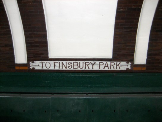
Bare necessitiesI’m not sure how many other places on the Underground can boast such a sparse, yet also so attractive a contrast. I know the effect is much the greater thanks to the majority of stations having these walls absolutely covered with adverts. But even taken by itself this is bold and, certainly for Green, unexpected.

Perhaps I’ve been a little too hard on the old bugalugs. Not a lot, mind. Just a little.
Holler: way!

Canning, you dig it?Here’s an example of how great the Underground can be at commemorating not just its own past accomplishments, but those of other, equally influential giants on whose shoulders London once stood.

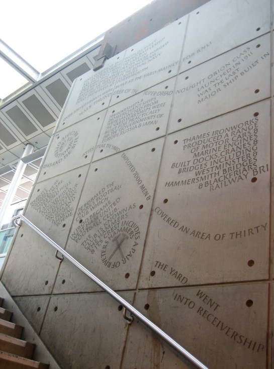
In one corner of Canning Town station rises a memorial that’s vast in both size and significance. Hewn from the iron hull of HMS Warrior, then clad in dozens of concrete panels, each in turn covered with a cascade of calligraphic prose, it is an elegy to an organisation, a trio of industries, and a way of life long gone.

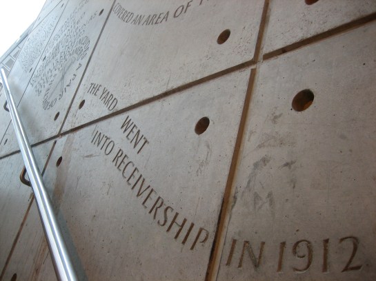
London 0, Hull 4The Thames Ironworks and Shipbuilding Company lived for almost 100 years and died two years before Britain went to war (in part thanks to the threat from someone else’s ironworks and shipbuilding). The First Lord of the Admiralty, a certain Mr W Churchill, refused to step in to save the company in 1912 when work dried up.

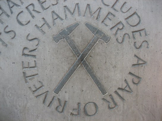
But the football club established for the works’ employees, Thames Ironworks FC, did survive and still does, under the name it adopted to allow it to hire professional players. And it was the management and supporters of that club who, many decades later, helped commission and fund the creation of this memorial. Fittingly, they get a special mention:

HammersBy my count that’s at least two lasting contributions West Ham United have made to the culture of the nation; the other being their popularisation of this beautiful song.

As for the memorial, the designer Jamie Troughton and engraver Richard Kindersley must take the main honours for realising West Ham’s dream and turning an idea into something so defiantly solid. The concrete panels were apparently so expensive that Kindersley and his helpers could not, or more accurately weren’t allowed to, make a single mistake. And they didn’t, even if it meant it took three weeks for the inscriptions to be completed.

Their collective effort is stunning and soaring. Its calligraphy whirls and shimmies around three flights of steps, not merely bringing but whipping and rocketing the past back to life.

My only regret is its location. It’s tucked away at the far end of the concourse, on the way to Canning Town bus station, and very easy to miss. I speak from experience: I only found it on my third visit. But Iif I’d been a bit more patient I probably would have worked out what to do – for example, ask someone where it was.

End of daysRather wonderfully, the very latest chapter in the evolution of London’s public transport – the magnificent Crossrail – has resulted in some of the Ironworks’ remains being uncovered. Slices of old London do have this habit of poking through into the here and now; at Canning Town one of them has achieved permanence at last.

The official history of the Jubilee line extension notes that the memorial drew a lot of local interest on its opening in 1999. It also reveals that former Archbishop of Canterbury and now full-time reactionary George Carey did the unveiling. He was born nearby, so his involvement was not entirely spurious.

I wonder if he ever passes this way nowadays, and if so what he makes of the memorial’s sparkling reams of inclusive, enlightened sentiments.

Pride

Met setA part of me likes the idea of living directly above an Underground station. There’s a cafe in Liverpool that I used to always enjoy visiting, in which you could sometimes feel the rumble of Merseyrail trains passing underneath. When I first saw the film Seven, I was mildly jealous of Mr and Mrs Brad Pitt getting to live in a flat that shook evocatively thanks to a nearby mass transit system. And how many times I’ve eyed those flats in Chiltern Court astride Baker Street station, envious of the residents, all of whom are naturally pursuing a lifestyle that is part Kenneth Williams, part John Betjeman.

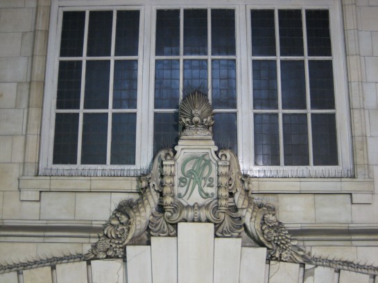
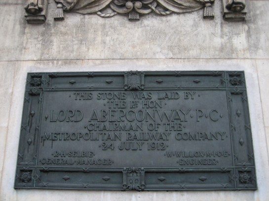
A different part of me knows all of this is fantasy and that living directly above the Underground is possibly the path to physical and emotional wreckage. But a third part of me (yes, I have many) wonders if the reality is somewhere in between, and that a place like Chiltern Court has to be lived in before it can be truly loved or loathed. It is the most elaborate of what are best described as the “trimmings” of Baker Street, all of which date from the remodelling of 1911-13, conceived to turn the place into a brand-encrusted hulk of the Metropolitan line, where getting on a train was but one of the riches on offer.

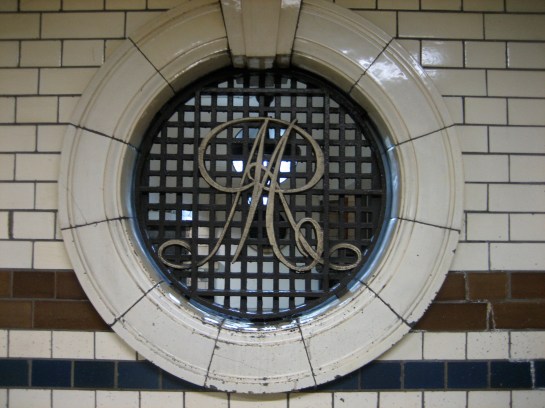
*Sigh* Chiltern Court might be beyond the reach (and budget) of most of us, but other more modest, less swaggering trimmings are not. Like the MR insignia embroided within the grilles over the porthole windows, and the WH Smiths & Son sign above what is now a ticket office. The tiles were given a sympathetic scrub-up in 1985, the same time the old platforms were so touchingly restored. The sign must have appeared something of a charming curio in the mid-80s, when WH Smiths was at the peak of its pocket money-absorbing powers. Nowadays, with the chain such an aesthetic calamity, the lettering is both enchanting and deeply depressing.

There’s a “Luncheon and Tearoom” sign that’s equally wistful, leading not to the tantalising prospect of a London Underground-manufactured hot beverage, the tea leaves allowed to drip through roundel-shaped strainers, but instead to absolutely nowhere at all. The entrance is bricked in, and now houses automatic ticket machines. Meanwhile biscuit-coloured arches and panels in the ceiling, timber handrails, iron balustrades and over-the-top 1912 timestamps add to this bran tub of post-Edwardian-era fancies:

It *met*ters to meI vowed to myself I would get through this entry without any reference to Sherlock Holmes, and it looks like I might have made it. The trimmings that adorn Baker Street share with their gastronomical namesake an ability to enhance something that is already of substance. We might not make it into the sumptuous kitchenettes of Chiltern Court, let alone dine in the long-vanished restaurant visited by Betjeman in 1972. But to push this desperate simile even further, these are trimmings that linger on the palate and even, if you’re in the mood, bring a lump to the throat. Alimentary, you might say.

Plaque in business