Archive

Piccadilly line

A right royal treatRoyal parks are ten-a-penny in London, and they’re all much of a muchness. Grass, basically. Maybe a monument. Someone pissing against a tree.

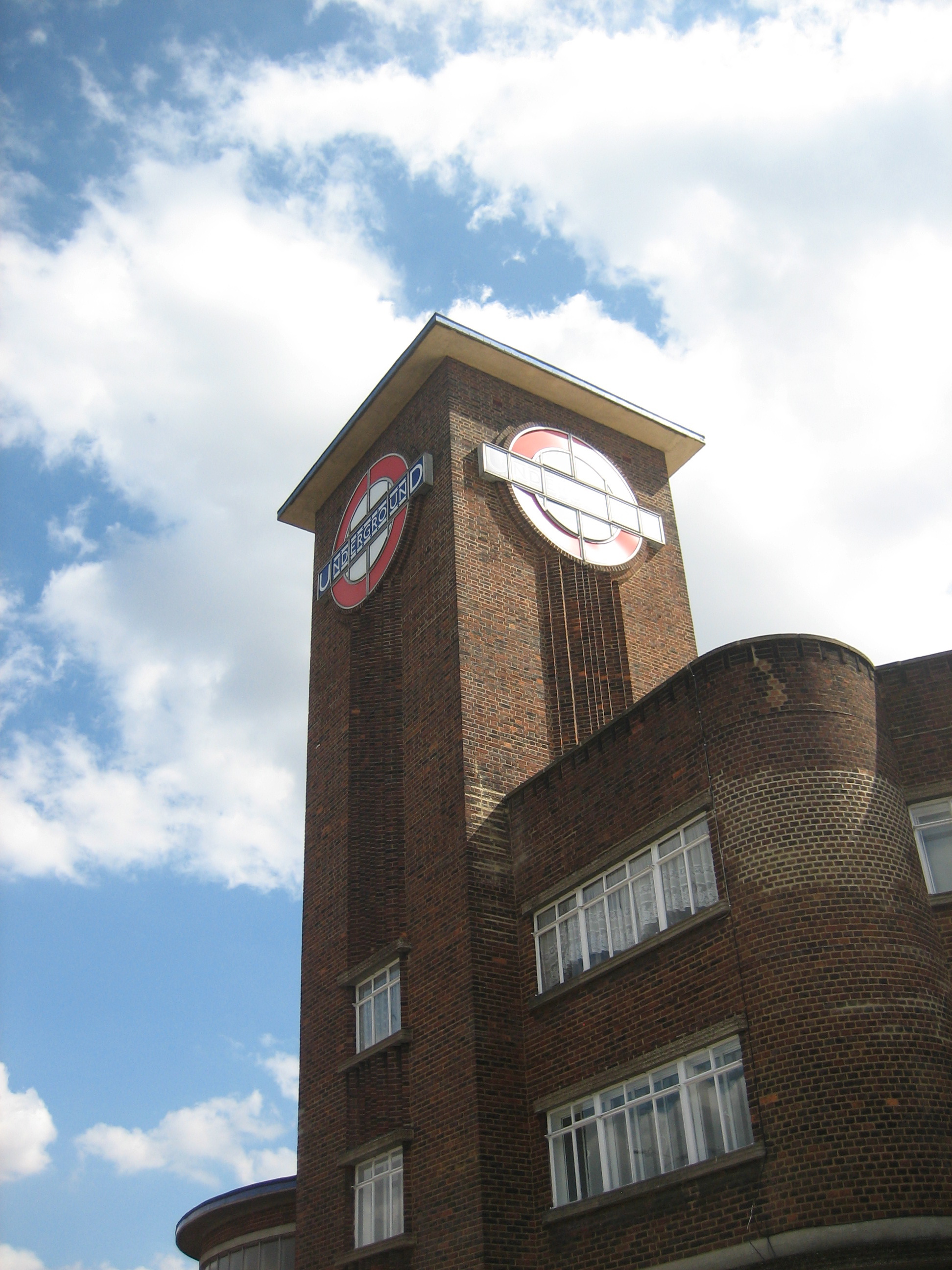
Park Royal, however, is one of a kind. And it outranks anything vaguely regal-sounding in the entire city – and that includes carriages, babies, those godawful face masks, and the Queen.

Its entrance is grander than any palace, more dazzling than any crown, more uplifting than any pageant, and more thrilling than the twitching of any uterus.

As far as I can tell there’s never been a fly-past, a million-strong crowd waiting outside, or Brian May standing on top playing the guitar.

I would happily stand on top playing the guitar, but I fear a repertoire that encompasses everything from Radio Song to the Marrow Song would prompt any passing million-strong crowd to subject me to a kind of Wicker Man-style immolation inside the tower.

Geometry-a-go-go
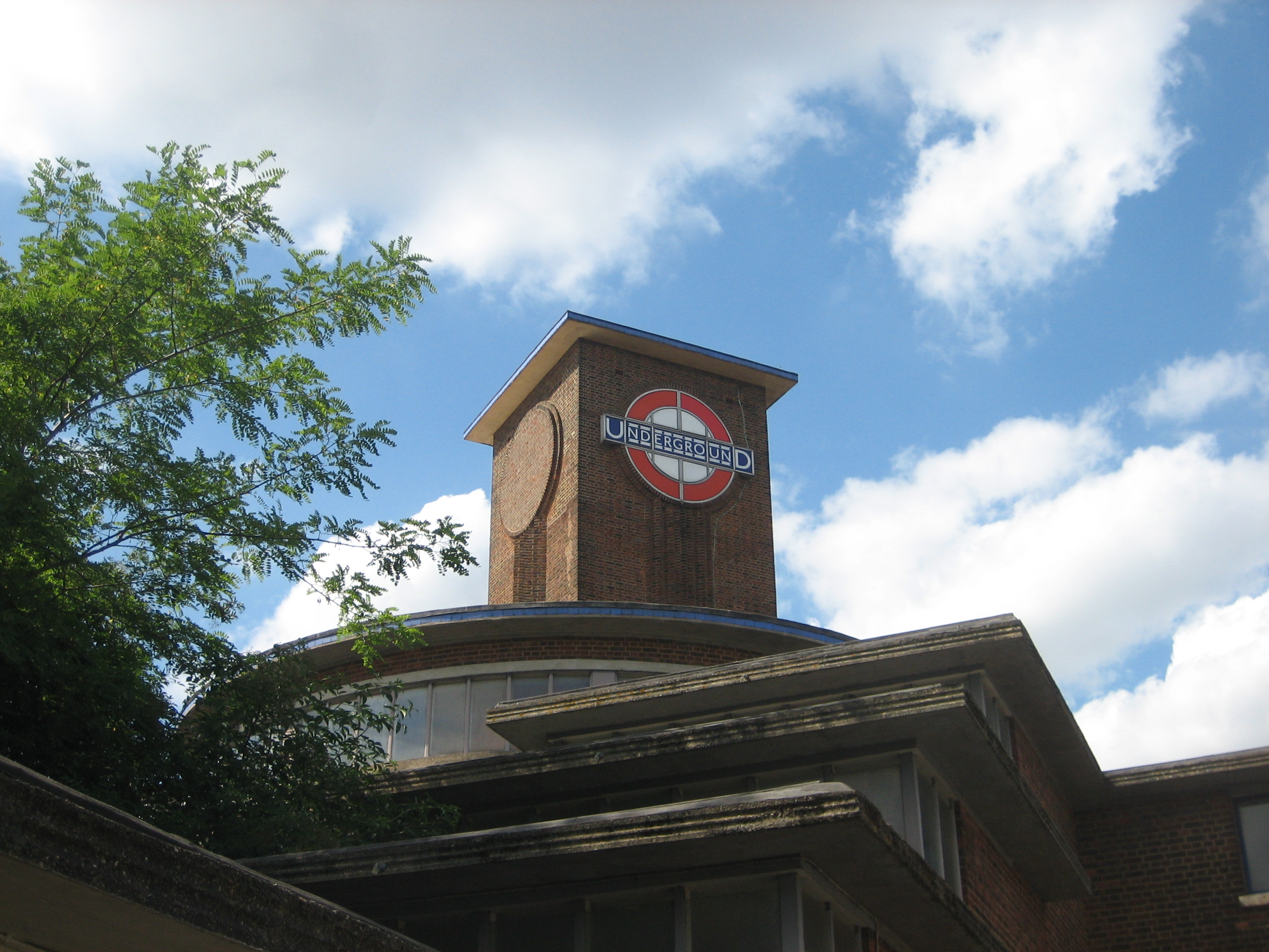
If you can have such a thing as a garland of geometry, this is it.

The station looks like the toy box of a five-year-old with a 55-year-old’s sensibilities. It shimmers and swirls with flair and derring-do, even though it is utterly immobile (but oh how I wish that circular platform revolved, like the old restaurant at the top of the BT Tower).

It’s not the work of Charles Holden, but rather Herbert Welch and Felix James Lander: a couple of architects Holden sub-let the work to in the mid-1930s, content they’d do the job in a “suitable” style. Which they did – effortlessly, and not with a little nerve.

If Holden wasn’t jealous, he should have been. Park Royal challenges (but doesn’t quite topple) the likes of Arnos Grove and Southgate for a place in Zone 1 of the Underground firmament.

Were I to ever become the benevolent dictator of Greater London, and I think there’s still time, this station might well be my seat of rule. It’s got the swagger, it’s got the class… and look, there’s even a tower in which to lock up anyone who opposes Crossrail or HS2*.

To the tower!*
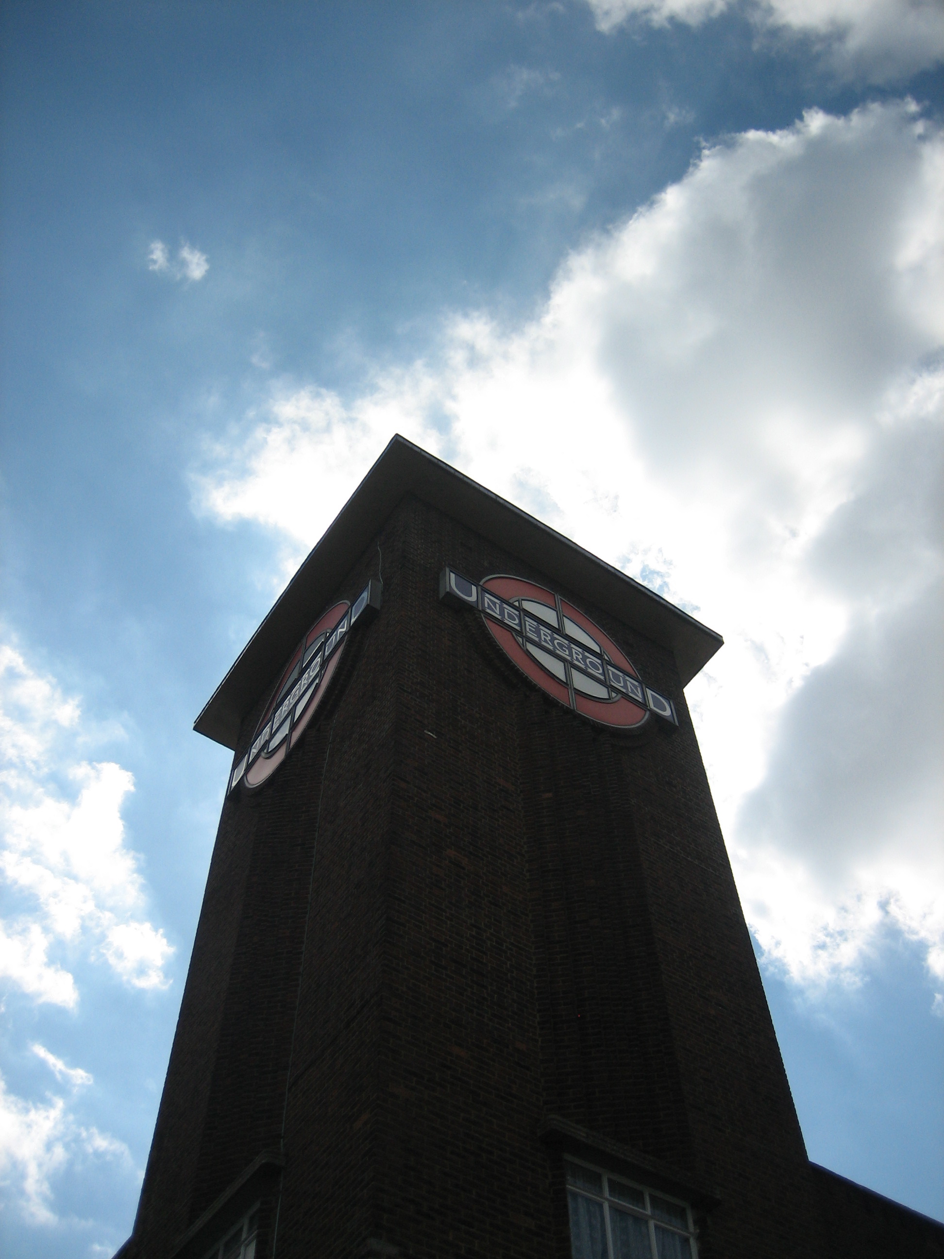
Only joking. I’d stand on top of the tower, look down on them, and giggle. Before playing another chorus of the Marrow Song.

Trumpeting the vertical“Like the architecture?” a Terminal 5 employee called out to me as I stood taking this photo. “Yes,” I replied, “absolutely.” “I hate it,” chipped in a passer-by, hurrying up an escalator. “That’s because you work here,” said the employee, firing me a knowing smile.

I felt a bit flattered. Not only had I been hailed by a member of staff who for once was not demanding I put away my camera or else chase me off the premises, I had also been made party to a bit of staff-room bitching. And I didn’t even work here. I had an “in”! And at an airport, a place where I usually feel thoroughly “out”!

To bond with a stranger over a slice of modern architecture is a rare treat. To do so at Heathrow Terminal 5, which trumpets its contemporary wares from every crevice, made me a bit dazed. Or to be accurate, even more dazed, because I’d felt a little out-of-sorts from the moment I’d arrived.

Terminal velocityDespite offering plenty of architecture to admire, this terminus-in-a-terminal stretches every sinew to make you not want to loiter.

Its glittering speck-free platforms and vast hushed walkways, not to mention its platoon of notices all urging you to move on and go somewhere else, conspire to make the spectator – as opposed to the traveller – feel rather uneasy.

This isn’t an environment conceived for contemplation. If you must wait, the atmosphere implies, do it sitting in a carriage, or up in the airport terminal itself. To stand still is to stand everyone else to attention.

Which is a shame, as the best way to appreciate the elegance of the station is to do just that. And not just stand still, but look up, for this is a majestic soaring construction that scoops light from the surface and deposits it dozens of metres below the ground, while simultaneously doing the same in reverse with people.

Going up…

Lift offArriving here after 45 minutes on the Underground is to emerge from a dark warren of horizontals into a rather eerie but enticing forest of verticals.

The station isn’t as magnificent a modern-day cathedral as some of those along the Jubilee line extension, such as Westminster and Canary Wharf. But it’s scale is just as persuasive as its design, it has a church-like enforced calm, plus there’s a curiosity value that repays – if you can manage it – a non-suspicious linger.

Especially when the Heathrow Express is just through the window:

Carriage clockedThis was the first time I had been anywhere near Heathrow for years – and the first time ever I had been to Terminal 5.

Along with not really knowing what to expect, I’d had to deal with the rising anxiety of setting foot in one of the world’s most scrutinised airports with absolutely no intention of getting on a plane or meeting people who had just got off one. Ripe for scrutiny, in other words.

Which is precisely what happened, though not in the form of an interrogation, more a jovial chat. Nonetheless after about 20 minutes I wanted to leave. I had a hankering for fresh air and the sight of a brick.

Besides, all those semiotics were doing my head in. Now there’s a phrase I haven’t needed to use since back at university.

Hatton patternFor a long time I was baffled by the opening line of the Beatles’ Back in the USSR. “Flew in from Miami Beach BOAC.” What did those letters mean? Were they some kind of code? A bit of 1960s polari?

I decided it was an in-joke of the era, a teasingly exotic hangover from a time of impenetrably trendy goings-on, but one that added a potent twist to what I still think is one of the most exciting opening 30 seconds to any song on any album ever.

Many years later I realised it was a reference to the British Overseas Airways Corporation. But this just made the song even better. Then later still I realised I’d been oblivious to a second salute to the BOAC, in an equally unexpected place:

Cross purposesIt is the old British Overseas Airways Corporation logo, and it is gorgeous.

Speedbird, to give it its thrillingly imagine-what-the-future-will-be-like name, used to be emblazoned all over aeroplanes until British Airways was privatised in the early 1980s (coincidentally, around the same time I would have first heard Back in the USSR).

Since then it’s been revised and adapted and generally messed around with so as to become virtually unrecognisable. Not that I’d ever be close enough to spot it, given my fear of flying. Indeed, even being at Hatton Cross, one stop along from the first of the Heathrow stations, gave me the jitters. Although this might have been more down to the questioning looks I was getting from waiting passengers.

You’re encouraged to change trains at Hatton Cross to get your desired connection to terminals 1, 2, 3, 4 or 5. As such the platforms play host to much anxious watch-checking and ticket-consulting. Maybe these bold and colourful streaks of futurism provide a welcome distraction. They can certainly calm the nerves of the most aerophobic of souls.

Planes: perfectly fine when turned into a two-tone mosaic on a pillar. Just don’t send me up inside one, or there’ll be more than a paper bag on my knee.

Hatton: Lust for Glory