Archive

Piccadilly line

This-a-way
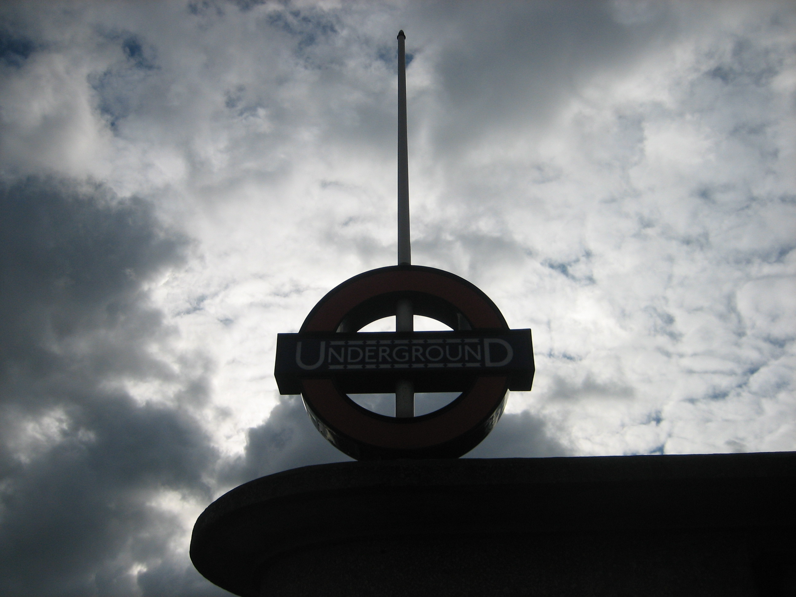
I’ve been a bit sniffy on this blog about the Underground stations designed by Leslie Green.

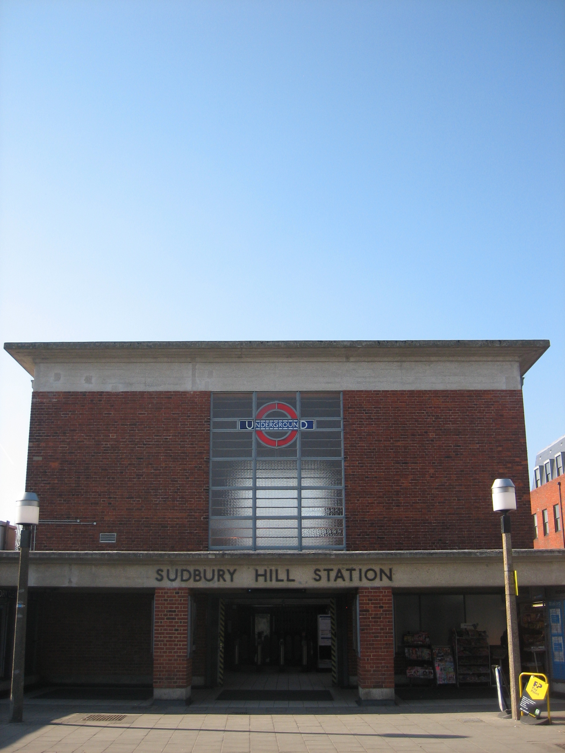
They’re the ones with the dark red exteriors made up of hundreds of glazed terracotta blocks. There are dozens of them around the city, and you’re bound to encounter a few of them on even the most fleeting of visits to London. Which is precisely why I have a bit of a problem with Green. To sum up what I’ve discussed before, if you’ve seen one of them, you don’t really need to bother with any others. The differences are superficial rather than significant, prompted by expediency rather than imagination.

Sometimes, however, a variety of riches can be found inside one of Green’s otherwise character-less creations.

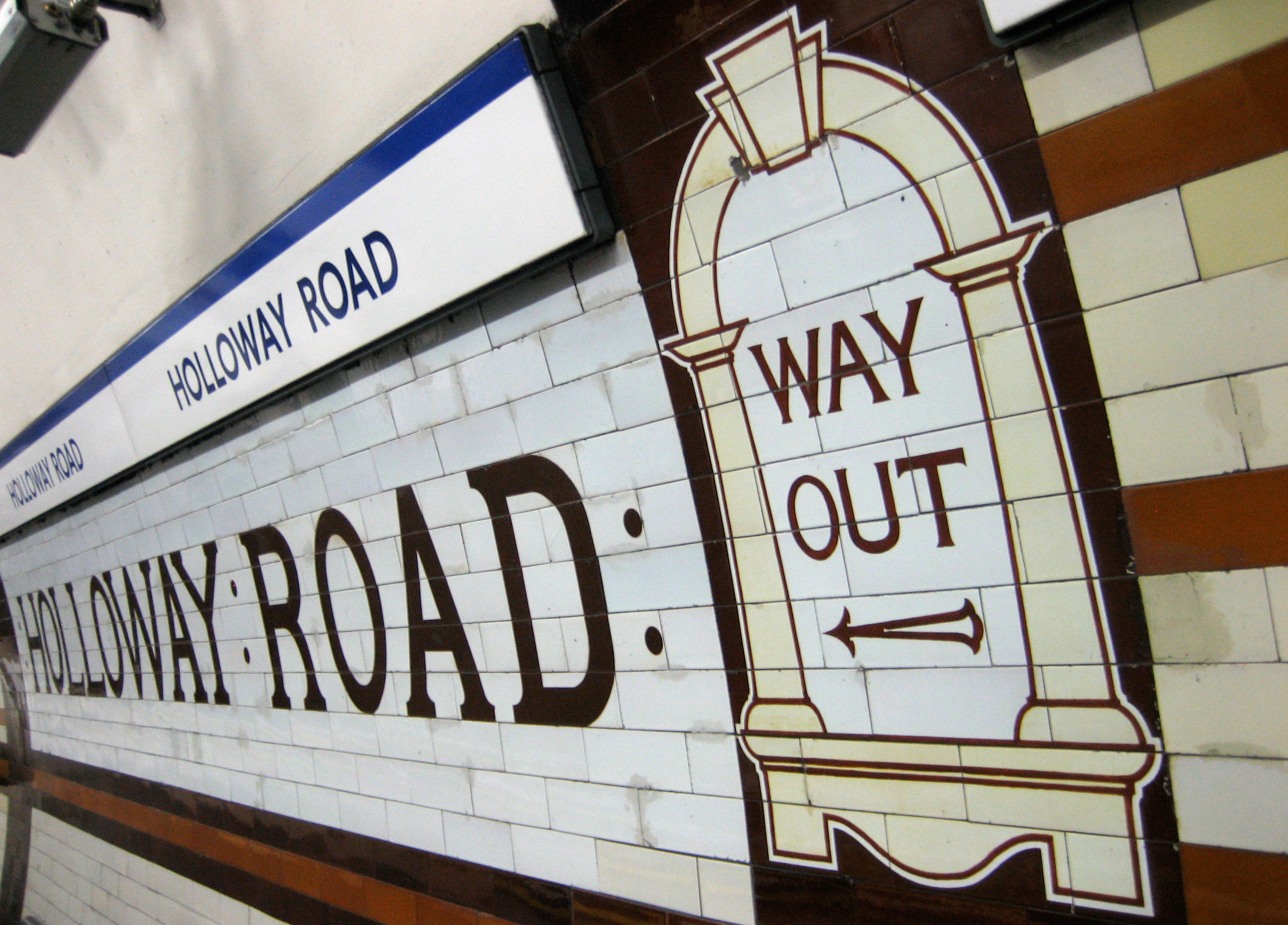
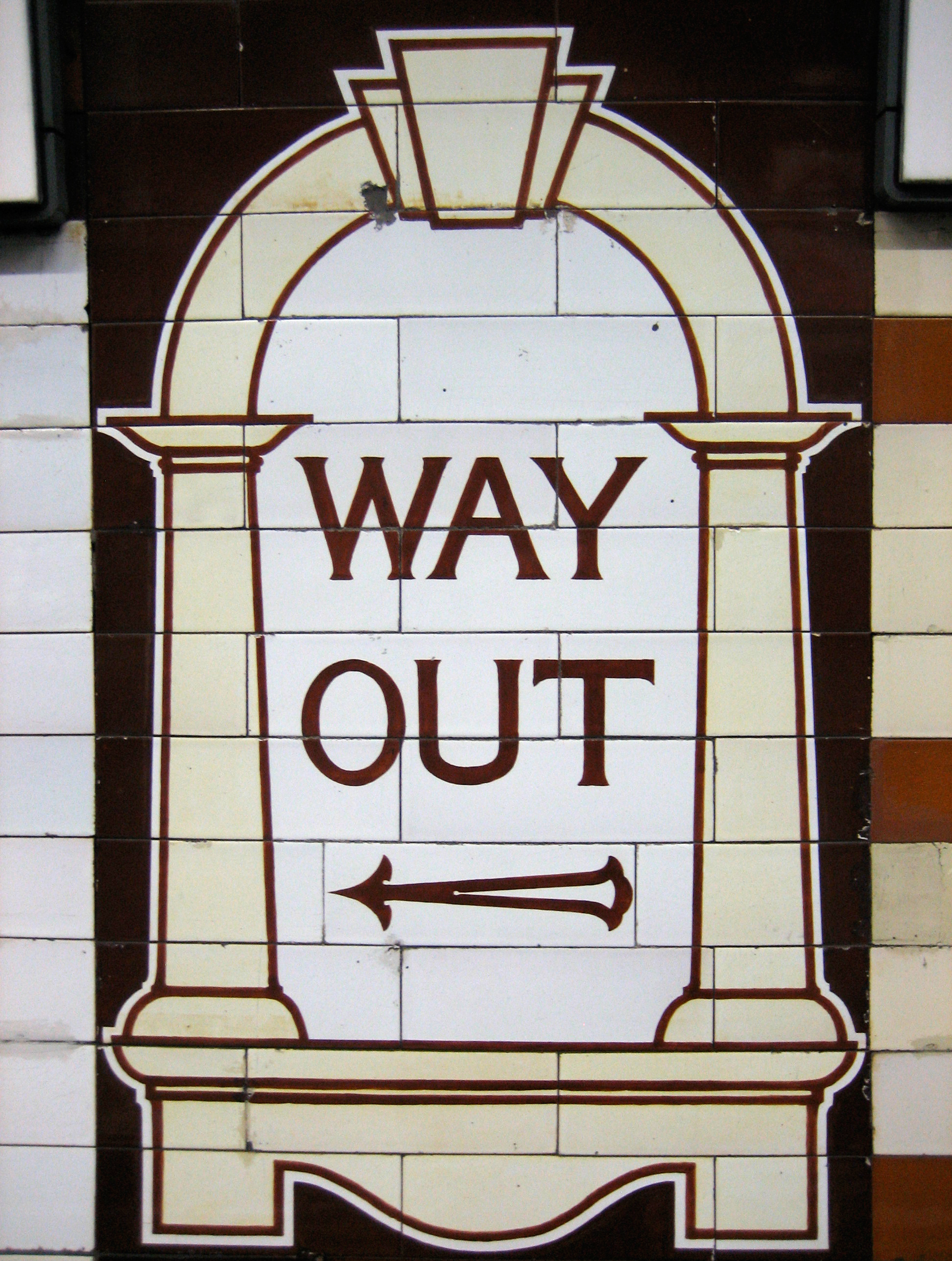
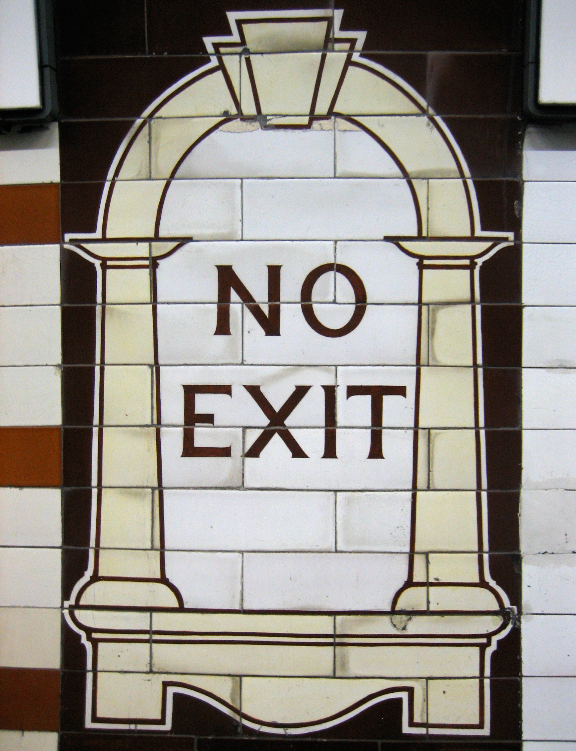
Holloway Road has a good collection of his signature work for the interior of an Underground station. Both platforms were given a long-overdue refurbishment in the late noughties, which certainly benefited the tiling. Green’s trademark ‘Way Out’ and ‘No Exit’ designs for the walls of the platforms look in a pretty good state, considering they were first put up in 1906:

Well, obviouslyBut for once, a Leslie Green station is more than the sum of its predictable, rudimentary parts.

As well as those familiar mock signs (based on his design for the ticket windows in the booking hall), Green sprinkles Holloway Road with a bit of glamour: more Cricklewood than Hollywood, as Ernie Wise would say, but still rather beguiling.

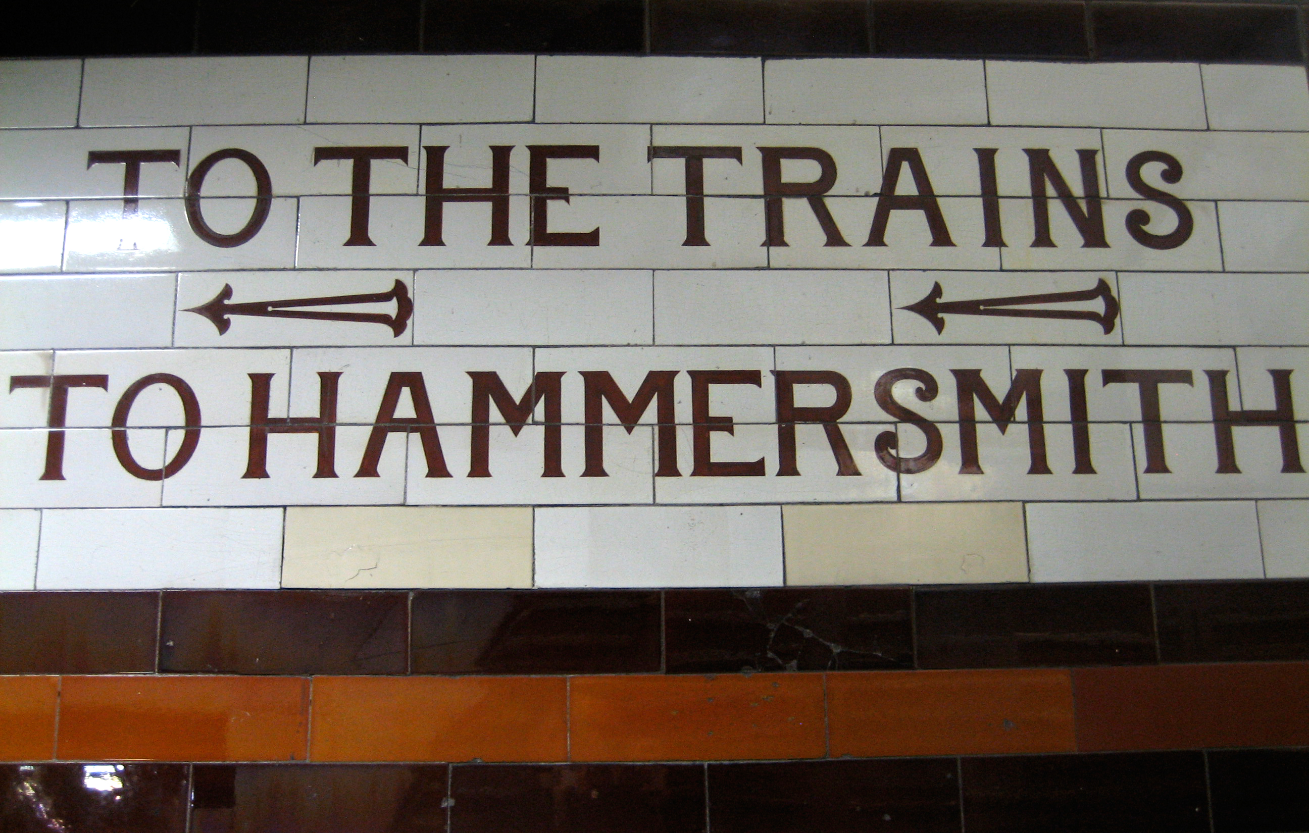
There are very swish ‘To The Trains’ signs in the little passageways between the adjacent platforms:

To the trains!
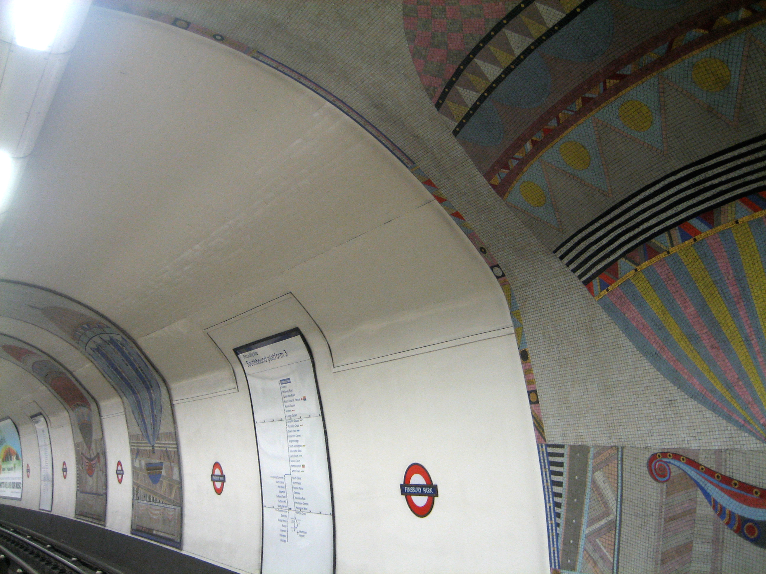
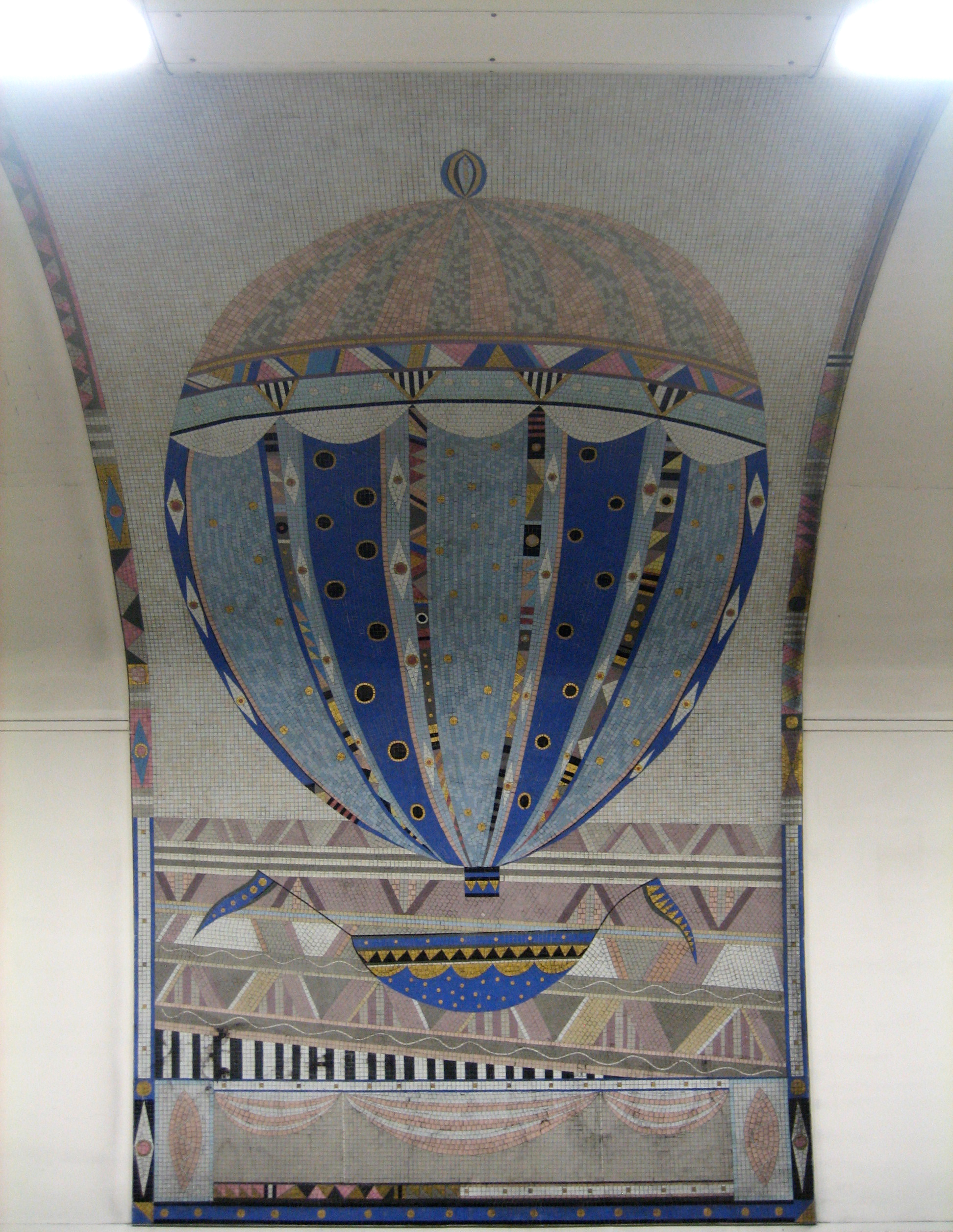
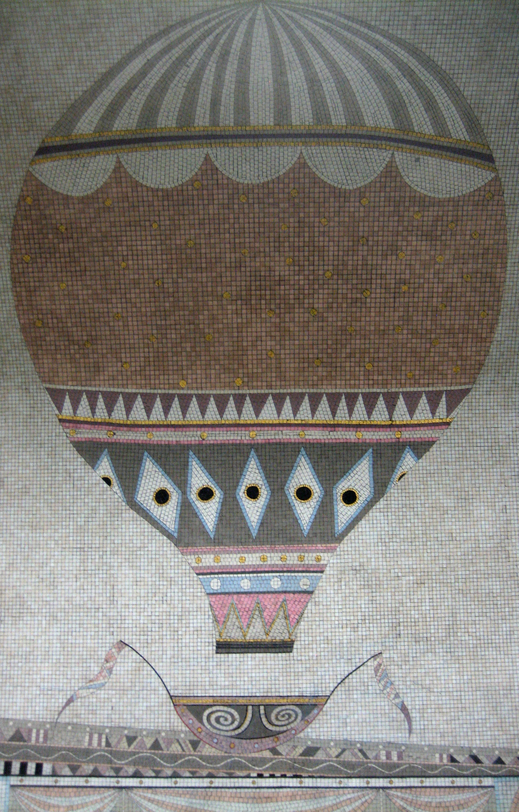
And there’s a much larger treat in the shape of the track-side wall of both platforms, which have been left completely free of advertising.

The effect is to highlight, dramatically and memorably, more of that instantly elegant original signage:

Bare necessities
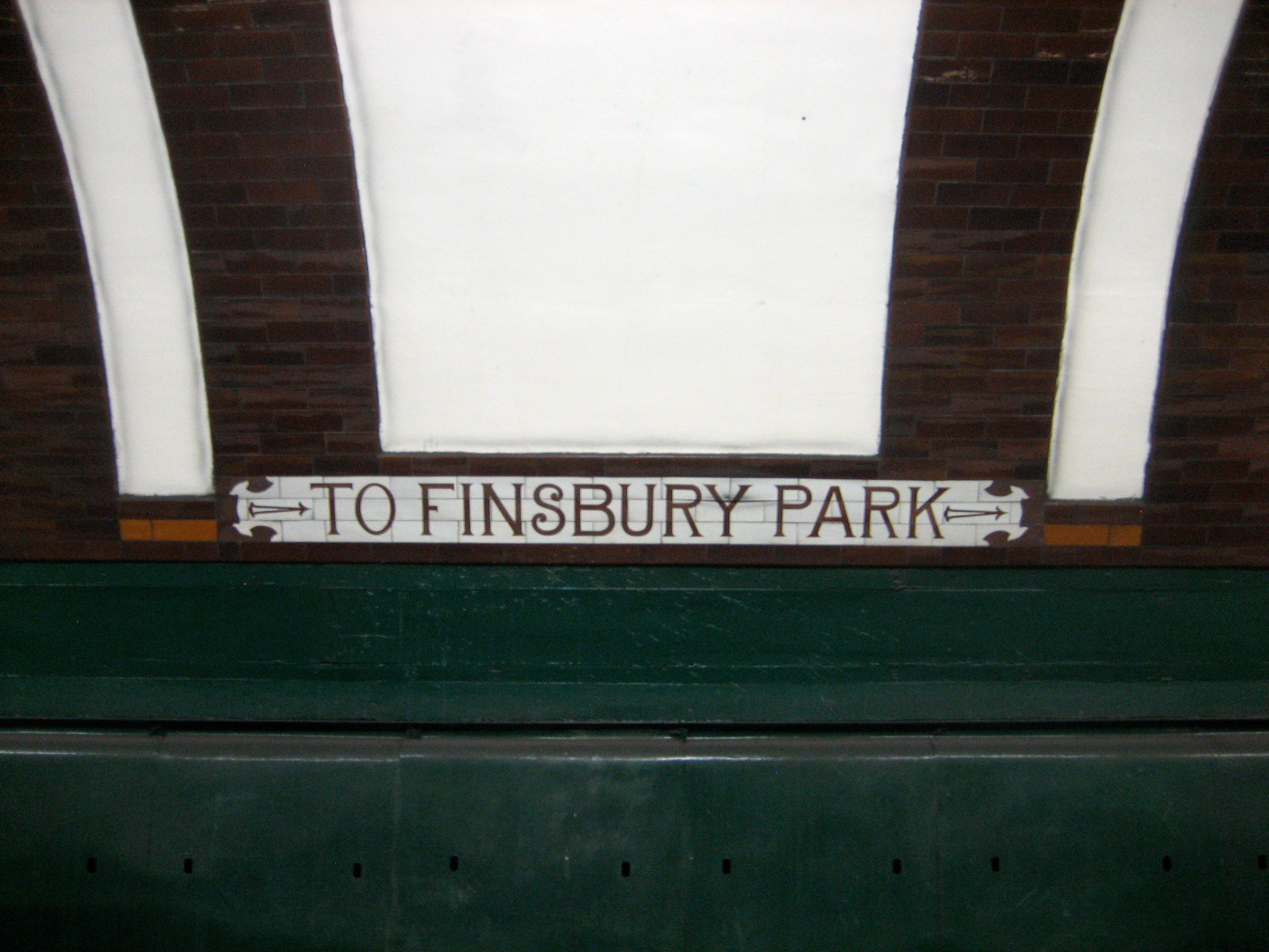
I’m not sure how many other places on the Underground can boast such a sparse, yet also so attractive a contrast. I know the effect is much the greater thanks to the majority of stations having these walls absolutely covered with adverts. But even taken by itself this is bold and, certainly for Green, unexpected.

Perhaps I’ve been a little too hard on the old bugalugs. Not a lot, mind. Just a little.

Holler: way!

Beauty, squaredWhen it comes to quadrilaterals, I’m with Huey Lewis and Principal Skinner.

Straight lines have come in for a bad press recently, what with their endorsement by Michael Gove, but applied with imagination rather than ideology they can still surprise and entertain. The right kind of right angle can let light pour forth into the most towering of interiors, or seduce the eye upwards through a staircase of cubic playfulness.

For proof of this kind of thing, you’ll struggle to find better examples than at Sudbury Hill station.

For Sudbury Hill is beauty, squared.

Climbing up on Sudbury HillNow that’s the kind of fabulous, multi-level edifice that’s just begging for a giant-sized Professor Yaffle to wander down, fussily but stoically*.

Sudbury Hill comes from the Charles Holden handbook of How To Design Stations Properly (subtitle: 150 Reasons You Should Pull Down Old Crappy Buildings In Order To Replace Them With Newer, Better Ones).

It opened in 1932, along with an increasing number of minds to the notion of architecture being a statement as much about the future as the past. It’s still in superb condition, although the inside of the booking hall no longer resembles quite so much of a Ken Adam film set.

The squares, and squares within squares, cut an elegant dash against the sky. In cheeky defiance of its base function, the station lifts rather than lowers both your gaze and your senses.

Lend me your (lin)earsThe buildings that surround the station, in fact the entire street on which it sits, can’t compete. Everywhere looks shabby, out-of-sorts and utterly humdrum. Sometimes humdrum can be enchanting, but not when it’s by accident rather than contrivance. Holden should really have been given permission to design the entire neighbourhood.

In fact, Holden should have basically been allowed to do up the whole of London. Imagine what that would have been like. A Gordon Murray-esque hand-tooled urban fantasy, but for real, in the flesh, for us to walk, ride and windmill through.

Charlie's angelHere is a box. A modernist box. Doled up, and ready to play.

But this box can hide a railway inside. Can you guess where it’s going today?

Silence is Holden*Professor Yaffle was always my favourite in Bagpuss. Don’t say you’re surprised.

Up, up and awayIn the March 2013 edition of Creative Review – an issue distinguished by some very notable contributors indeed – the artist Annabel Grey talks about the challenges she faced in realising her ambitious concept for the walls of the southbound Piccadilly line platform at Finsbury Park:

“It got very complicated and mathematical, as there’s an ellipse of a landscape running behind the balloons, and I realised that when you added the spaces between the trackside panels, the landscape would have been about 360 feet high!”

This side upMuch annotation of the tunnel wall ensued, which by the sound of it involved protractors, balls of string and those enormo-sized bits of chalk you now see only in possibly inaccurate recreations of Victorian classrooms.

Grey’s plan was to have the balloons ascend, drift then descend in sequence all the way along the platform – and it works, brilliantly. Starting at the far end, her six magnificent flying machines rise, glide then fall in a perfect union of trigonometry and transportation. It’s a wonderfully uplifting and elevating spectacle for so deep and otherwise lumpen an Underground station.

Up-diddle-up-upI wonder how many people actually a) notice them at all, and b) perceive of each balloon as being part of a bigger design, running the full length of a platform hardly anybody runs the full length of.

But I rather like the fact that the concept is there for you to spot. The balloons flatter you as they flutter past. Their mathematical caper is there to be solved by the witty, not sold to the unwitting. If you miss it, the secret is safe with those who have already resolved the puzzle.

Down-diddle-down-downAs an afterthought, I was intrigued to read that the designs date from what remains, in my head, a barren time for publicly-funded urban transport: the 1980s. Grey and her team were commissioned by London Transport in 1983. They were even allowed to buy up to £15,000 worth of gold mosaic, which represented just one of a whopping 52 different coloured tiles shipped in from Vincenza.

But then I remembered London Transport was still run by the GLC at that point, which itself was run by someone who used and still uses the Underground every day of his life*.

Happy landings*As opposed to riding a bicycle to and from work, thereby never having to meet, mingle with or let alone speak to anyone else.