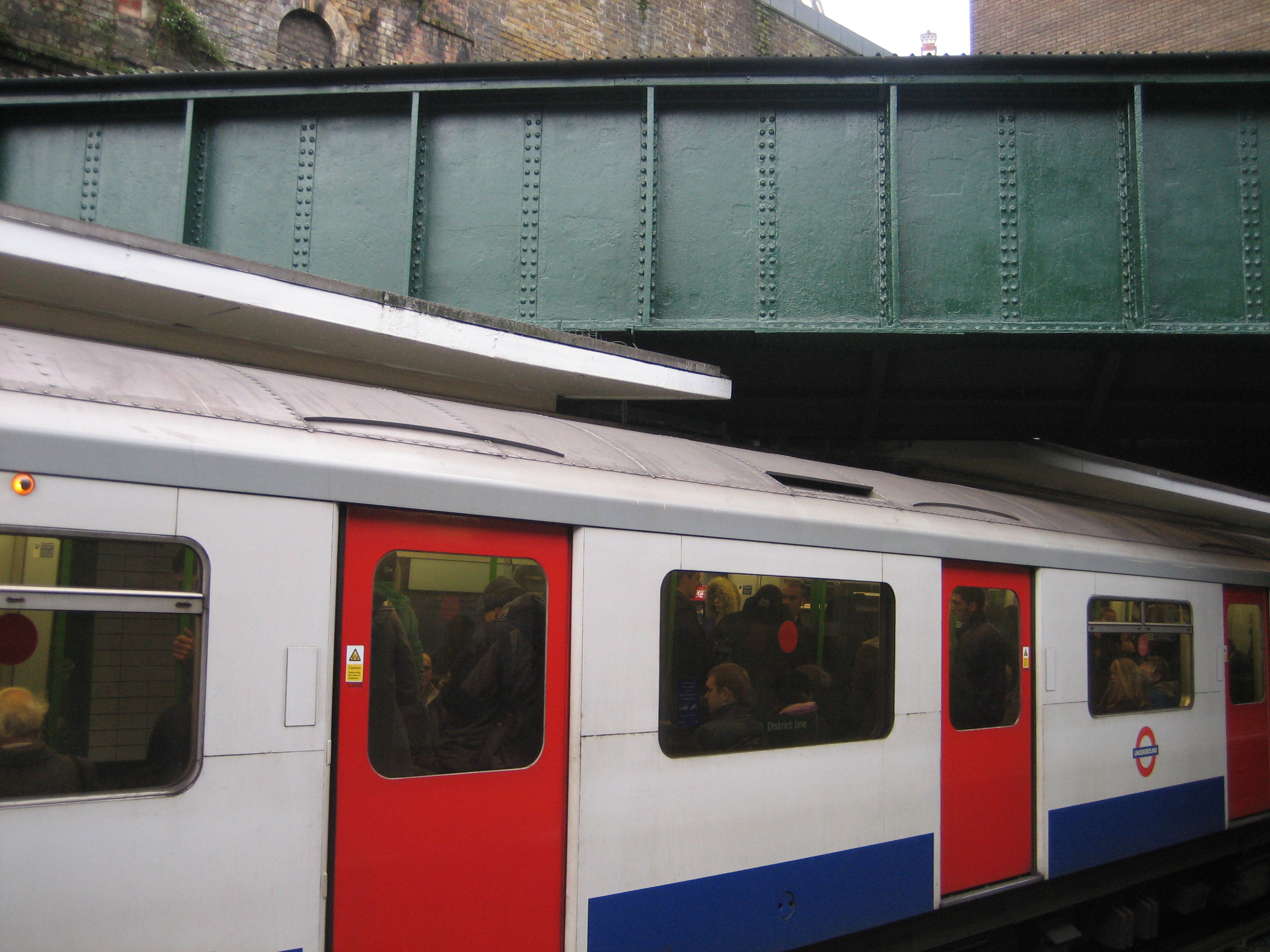
 This is possibly the most inelegant object I’ve featured on the blog so far. Steady those trembling nerves – it’s a giant metal tube!
Inside, however, is one of a famously elusive and vaguely bewitching brood: London’s lost rivers.
Sloane Square station was opened, rather sweetly, on Christmas Eve 1868. Inaugural passengers, perhaps in search of a last-minute festive goose or clementine, would have had good cause to wonder as to the identity of the iron vessel hung in a decidedly non-festive fashion above their heads.
But this was no unexceptional strut or inert girder. Contained within was what remained of the River Westbourne, whose contents were en route from Hampstead Heath to the Thames.
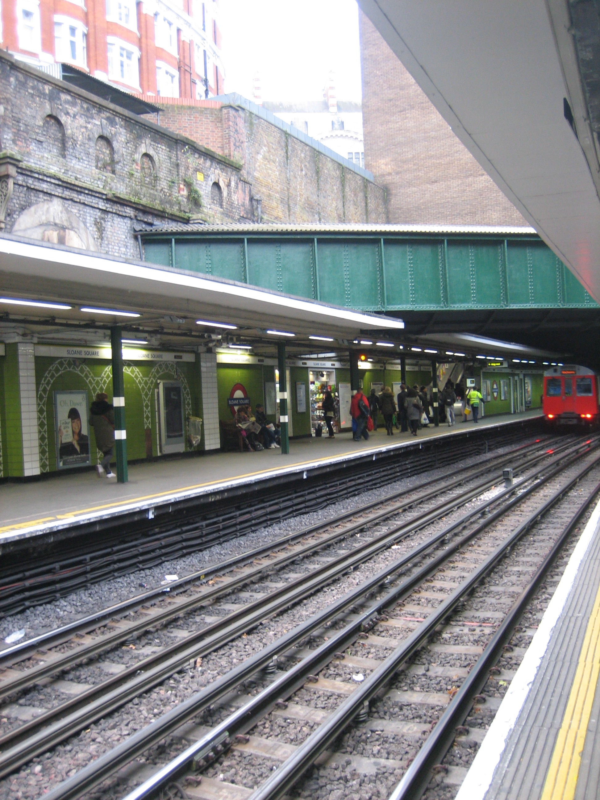 Knowledge of this particular waterway no doubt was and still is kept to a minimum. How much of the river still runs through the pipe is possibly of an equally small magnitude. But there it goes, trickling – or maybe pouring – over the heads of travellers, a minor but rather fascinating engineering marvel.
You can get a better idea of the route of the river (if not a clearer view of the pipe) by peering through some of the railings between the buildings that surround the station:
 I believe you used to be able to get a much clearer view from up here, before residents tired of a) the sight of trains b) the sight of people struggling to catch sight of trains c) the sight of anything except their own valuable homes. This is sad, because there are far more objectionable things in the Sloane Square neighbourhood than a grey conduit.
Such was the ingenuity of the Victorians, however, that a channel of water passing directly through the location of a proposed station became not a dilemma but an opportunity. And such was their fortitude that the opportunity survives to this day, inviting odd glances, sporadic frowns and the occasional knowing smile towards the taming of this ‘Bourne supremacy.
 Broadway")


