Archive

Zone 2

Which station makes sailors seasick?These aren’t unique to Turnham Green, but seem to be in much better condition here than elsewhere along the District line.

Should you be at all taken by the shape and the sheen of a good bench, moreover one that incorporates both a crisp slab of signage and half a dozen windows to boot, then the station least beloved by seasick sailors* is the place to be.

There’s a quiet, gentle beauty to such atypically multi-purpose public transport furniture.

Two things are going on here. One is an appreciation of form, and the other is an attention to detail. Each complements the other, and from their marriage emerges the sort of place I’d be happy to sit for half an hour or so, cocooned from other people and the elements, with only my thoughts and a good (but not great) book for company.

Attention has also been paid to how they look as part of the station as a whole.

See how the dashes of white on the columns supporting the roof line up perfectly with the white on either end of the benches:

A bench benchmark The colours in turn mirror those on the roof itself, which is a rather fine piece of architecture in its own right thanks to that intricate threading of wood and metal.

Either tucked up inside or facing them from an adjacent platform, you can’t help but feel these benches have benefited from having that extra bit of thought, even love, put into their construction.

And that feeling is what encourages you again and again to conclude that the Underground is a thing of greatness. For where else is the same care lavished upon somewhere to rest your legs as somewhere to carry millions of people under a giant river four times or 18 metres over a valley?

*An oldie, but a goldie.

Minute precisionI didn’t go looking for these. I found them by accident while searching for something else. As is always the case in such circumstances, their discovery was all the more delightful.

I spotted two of them, though there may be more. One is in the main hall of the Hammersmith station that serves the Piccadilly and District lines. Another is on the westbound District line platform.

I received more than the usual number of inquisitive, not to say menacing, looks from passers-by when taking photos of the clocks, especially the one in the entrance hall.

About faceFunny how, whenever I’m taking these kinds of photographs, a message is “suddenly” broadcast over the station’s public address system reminding passengers to report any “suspicious-looking behaviour”.

If it’s meant to be intimidatory, it works. I always put my camera away and beat a retreat.

By the big handThe clocks are, as the pictures hopefully suggest, completely charming. The colours of the two lines the station serves – Piccadilly (dark blue) and District (green) – form the outer ring, while the 12 hours of the day are denoted by the Underground map symbols for a station and an interchange. So simple, but so effective.

Why the hands of the clock are the colour of the Central line, which runs nowhere near Hammersmith, is another matter… although if it’s been done just to make the whole timepiece look nice, that’s fine with me.

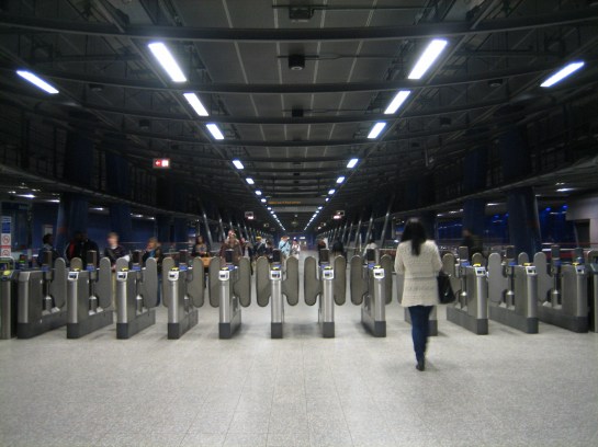
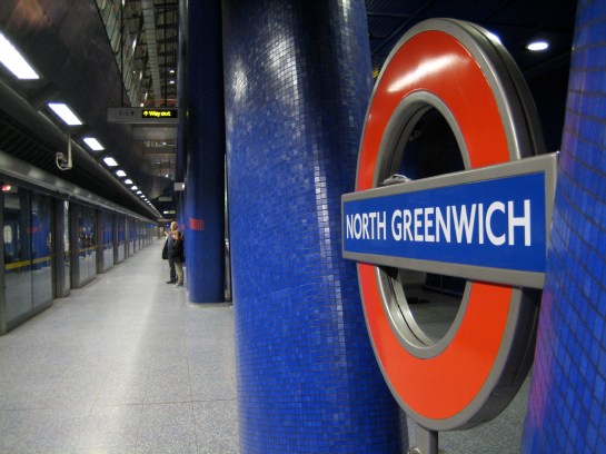
Time for a mean GreenwichJust when you think the Jubilee line has exhausted its potential to dazzle and entrance, you arrive at North Greenwich with its deep blue caverns and colossal illuminations and your breath is taken away all over again.

All points NorthThe size of the place alone is awe-inspiring. Only those without a soul would fail to get real tingles of excitement when descending into its vast, flickering chambers. Well, those without a soul or those on their way back from a lousy night at the O2 arena.

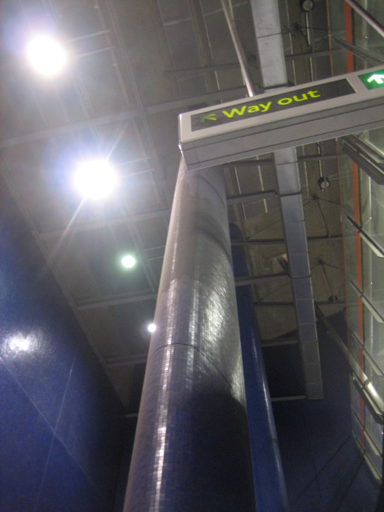
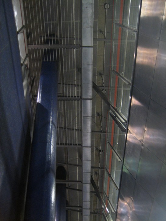
North Greenwich station sits in a trench 15 metres deep and over 200 metres long. Such dimensions merit, in fact demand, architecture conceived and realised on an epic scale. Which is exactly what happened:

Deep deep downThe batteries of imposing columns, covered with shimmering blue tiles, heighten (literally) your awareness of the ensemble of architecture. I’d wager it’s rare for your eye to be drawn upwards in an Underground station. That’s definitely not the case at North Greenwich.

Why the grand scale? To match the grand intentions of the neighbouring Millennium Dome, naturally, and to accommodate all those millions of people that were expected to flock through the station from around the country.

It didn’t quite work out like that. In fact, in terms of appearance, style and content, North Greenwich station totally outranked the Dome upon its opening in 1999.

And it still does today.

Blue is the colour