Face of surprise
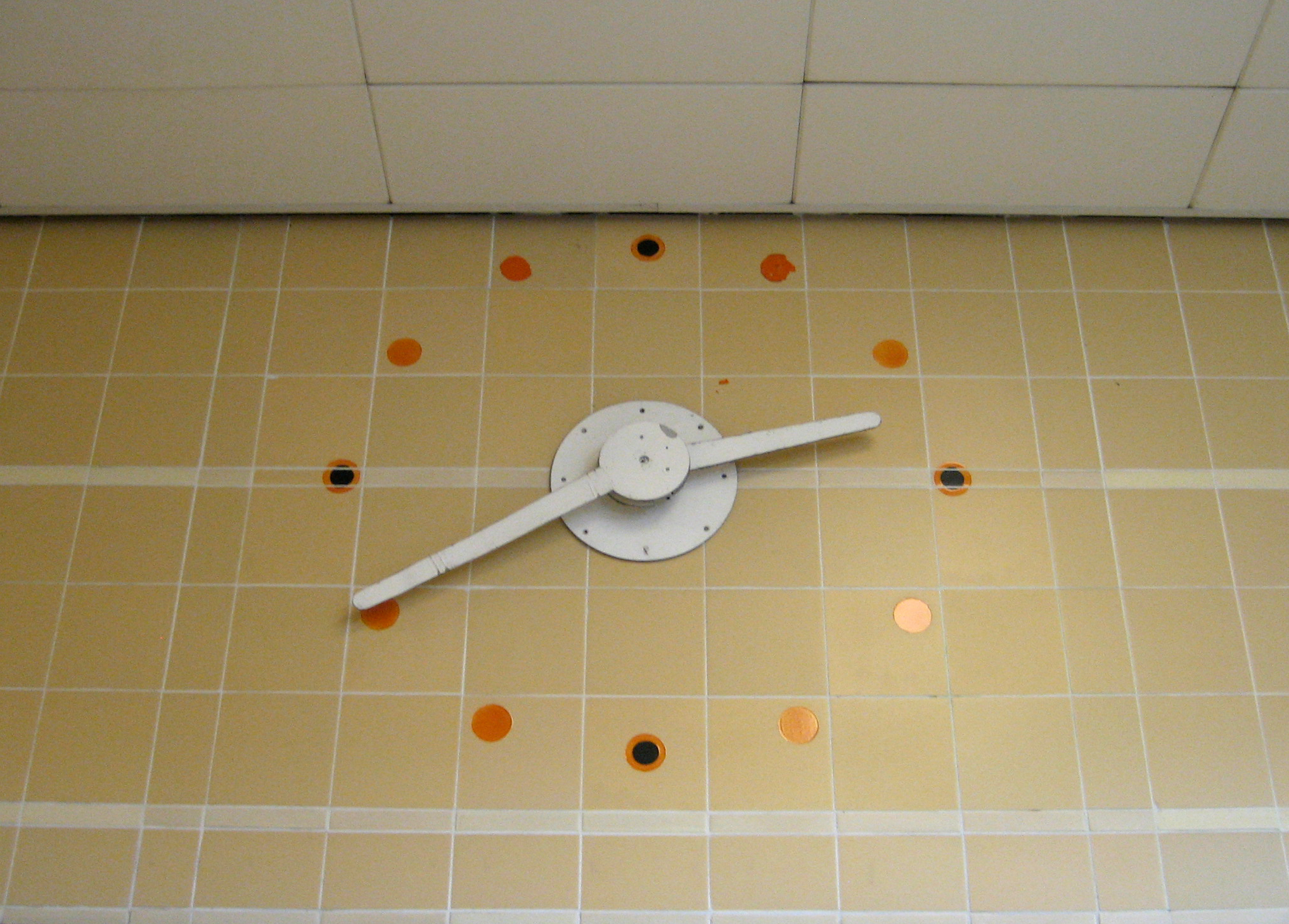
If I’d only waited a few more minutes. For then I could have trotted out the old “stands the clock at ten to three?” doggerel, and I’d have had a not-at-all-hoary-and-cliched opening remark all ready made.

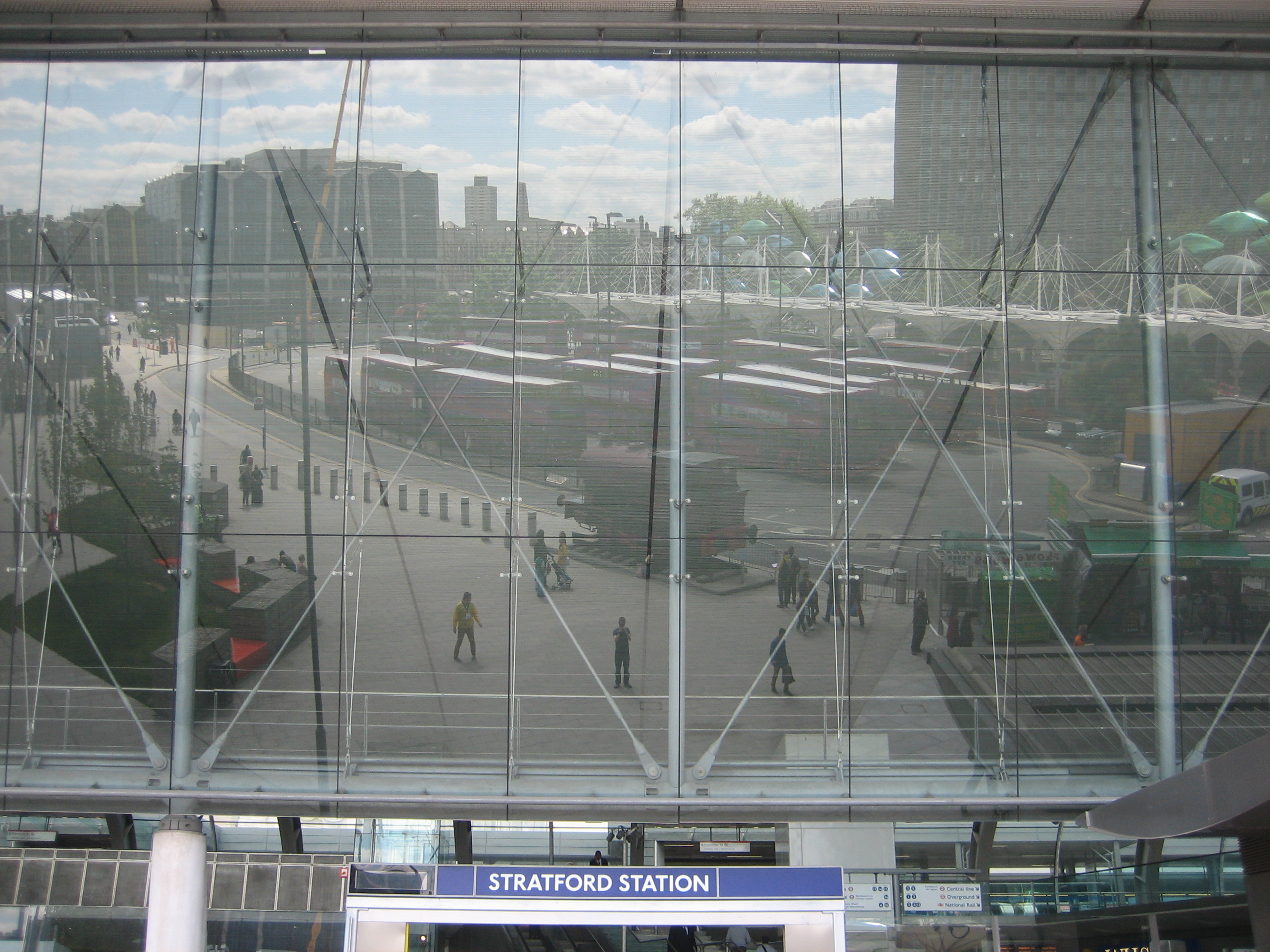
But no. I’d already loitered a little too long for comfort in the ticket hall of a station a little too empty of people to not draw too much attention to my endeavours. I had to grab what time I could – which, in this instance, was 2.40.

This way to LondonThe simplicity and the economy of the clock’s design is entrancing. There’s no room for superfluities like letters or – heaven forbid – numbers, because there’s no point.

As I’ve said before, a glance at a clock face is all most of us ever need (or have time for, ahem.) It follows that the essentials of a clock can, if done sensitively, become components of a broader statement, not merely of information but of style.

Those small circular daubs of colour: look at them, as John Betjeman would say. Do you see how they subtly echo the Underground roundel, in particular the ones positioned at each quarter-hour?

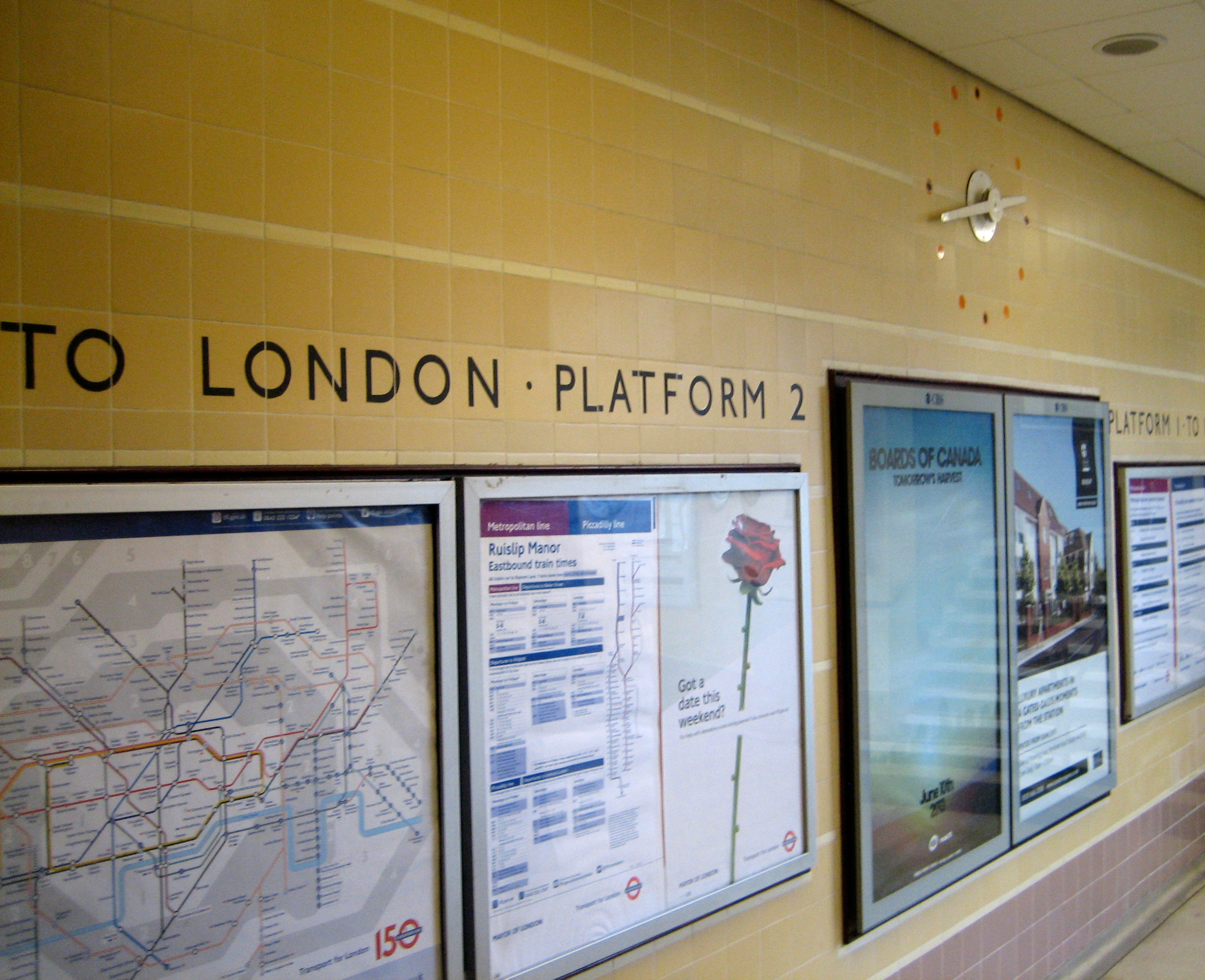
And that stencilled instruction “To London”: surely a reminder of how remote and isolated Ruislip still was when the station was rebuilt in the late 1930s?

Perhaps most striking of all is the colour. You don’t get this much cream in one dose in many Underground stations. There’s enough to rival the total tonnage of afternoon teas in Grantchester.

Which reminds me…

Warren's treatWarren’s Treat was the name of a novel I almost started writing in my 20s. I thought the title was terribly witty, likewise the idea that everyone in the book would be named after a London-based railway station.

Naturally, I now see that the whole concept was shockingly pretentious and am glad I didn’t have the time, or more correctly the commitment, to get round to doing anything about it. It would also have been a bit too close to this slice of audio horror for comfort.

A much more agreeable application of the station’s name can be found on the walls of the Victoria line platforms:

A maze in graceAlan Fletcher conceived the maze, he of the V&A logo, Penguin book covers, the BP petrol pump and just about every significant example of public British graphic design of the 1960s and 70s.

The “warren” is supposedly possible to navigate in around three minutes. But this does presuppose you have reason to be on the platform for around three minutes, which given the frequency of Victoria line trains isn’t always the case. It’s more suited for idling away gaps in the service, or if you find yourself stuck in the station waiting for a train further up or down the line to sort out a problem with its doors. (Or rather, sort out a passenger who’s created a problem with the doors, usually by TRYING TO ENTER THE CARRIAGE WHEN THEY’RE CLOSING.)

There’s also the additional hazard of someone deciding to sit down right in front of the maze. It’s a little unfortunate that the designs are embedded directly above benches. A woman sat down seconds after I took these photos, and I had to stop myself from scowling (yes, hard to believe).

Yet despite all this I think we can all agree it’s a far more successful manifestation of London transport wordplay than a book with characters such as Rick Mansworth, Colin Dale, the Scottish tearway Cal E. Donian, and the eccentric preacher Canon Bury.

Do not sit here

Stratford upon havenOK, it’s not a proper Underground station. In fact, Underground trains make up barely a third of what passes through its walls.

But the present incarnation of Stratford would not exist were it not for the extension of the Jubilee line in the 1990s, and that’s enough of a reason to admit it here.

You want more reasons? Why, in the words of the poster for Thunderball: look up, look down – and look out! Stratford does it everywhere!

Watching you watching meThat’s yours truly in the centre, trying to capture some of what Ian Fleming would call the “gunmetal splendour” of this beast of a building.

Chris Wilkinson and Jim Eyre started with a few dashes on a pencil sketch of the roof in 1994 and ended up delivering a resplendent full stop to the Jubilee line in 1999. Or maybe semi-colon is a more apt punctuation point, given Stratford’s purpose as part-terminus, part-gateway to everywhere from mainland Europe to Westfield shopping centre.

In keeping with Thunderball’s tag-line, an exclamation mark would just as well suffice. For this is at heart a confoundedly beautiful place, defying the tangle of lines and tumult of passengers that threaten discord, and instead offering a sort of harmonious, lyrical melee.

It’s all down, or rather up, to the roof.

The roof provides the scope for that dazzling glass facade, reflecting not just you but seemingly half of Stratford and a decent chunk of the sky. It allows for the kind of jutting architectural flourishes featured in the first photo. And its interior curves help to soften an atmosphere that’s already been made to feel as open and airy as is possible in the 20th busiest station in the UK:

The great curveThe multi-level layout plus the enormous mezzanine allow anyone predisposed to milling or moping to get up close to the roof, but also to gaze on people below.

I found that during London 2012 those views down on to the station floor afforded just as much of a spectacle than anything going on inside the Olympic Park. But then watching something working by design, as opposed to luck, chance and accident, is always more preferable. Especially if you’re a non-sportsman.

Parallel linesFrom whatever angle, even when all you’re looking at are angles, Stratford station roof is the hat perched jauntily sideways on the head of the Underground.

You can see for miles. You can also see four miles’ of people. But either is fine.

Look out!

Full stop