88. The exterior of Bounds Green
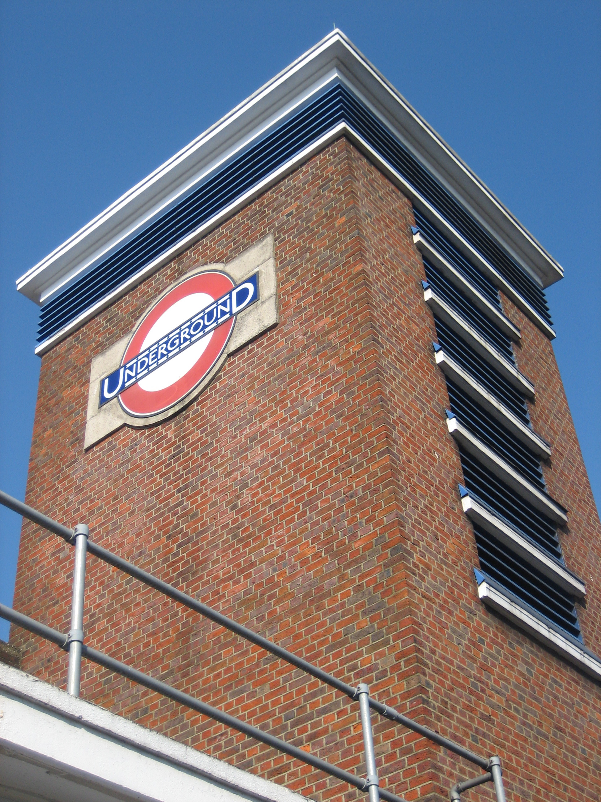 Well now. Here’s a pleasing, solid slice of modernism. It looks in fine fettle, and deservedly so. Bounds Green is another valuable emissary from that otherwise value-strapped decade, the 1930s. If ever you need a tangible reminder of why the second world war was worth fighting, take a trip up the north end of the Piccadilly line.
But while Bounds Green station is an uplifting sensory dispatch from a distinctly downbeat era, and is all the greater for being so, the present day has not been kind. And here’s my problem. Should I be at all bothered about what is taking place at the fringes of this and so many other stunning outposts of the Underground? You’ll see what I mean if I repeat the shot above, but widen the view a little.
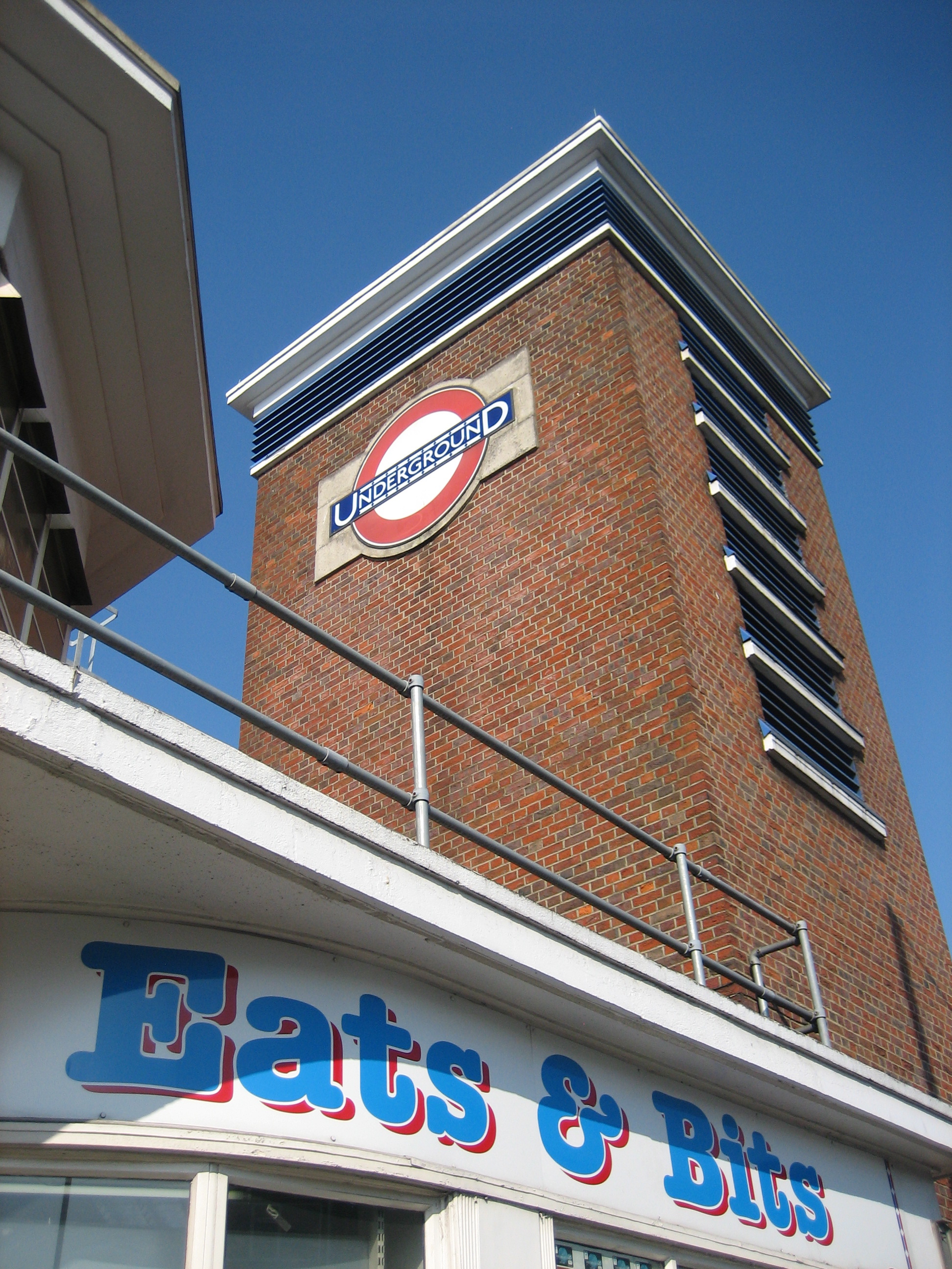 Gaaaah! It’s not just seeing the word “bits” in the name of shop that depresses me (though only up to a point; the smutty part of me will always associate the word with Kenneth Connor in Carry on Behind who, in response to Elke Sommer announcing “When I love a man, I give him everything, I give it all”, sighs: “But I don’t want it all. I just want a bit!“).
No, it’s also the font. What a horrible, horrible font. I despair at the inelegant, unimaginative lettering. I bridle at the use of blue on red. And I recoil at the way the ampersand flops and flails about.
To be fair, I’d feel this way on seeing such a font adorning any building. But at the foot of such a gold standard of 20th century style and design is heartbreaking.
Or is it? Should I not treat it as part of the station at all? Or somehow see it yet “not” see it, in a kind of doublethink, as satirised by George Orwell (another valuable emissary from the 1930s)?
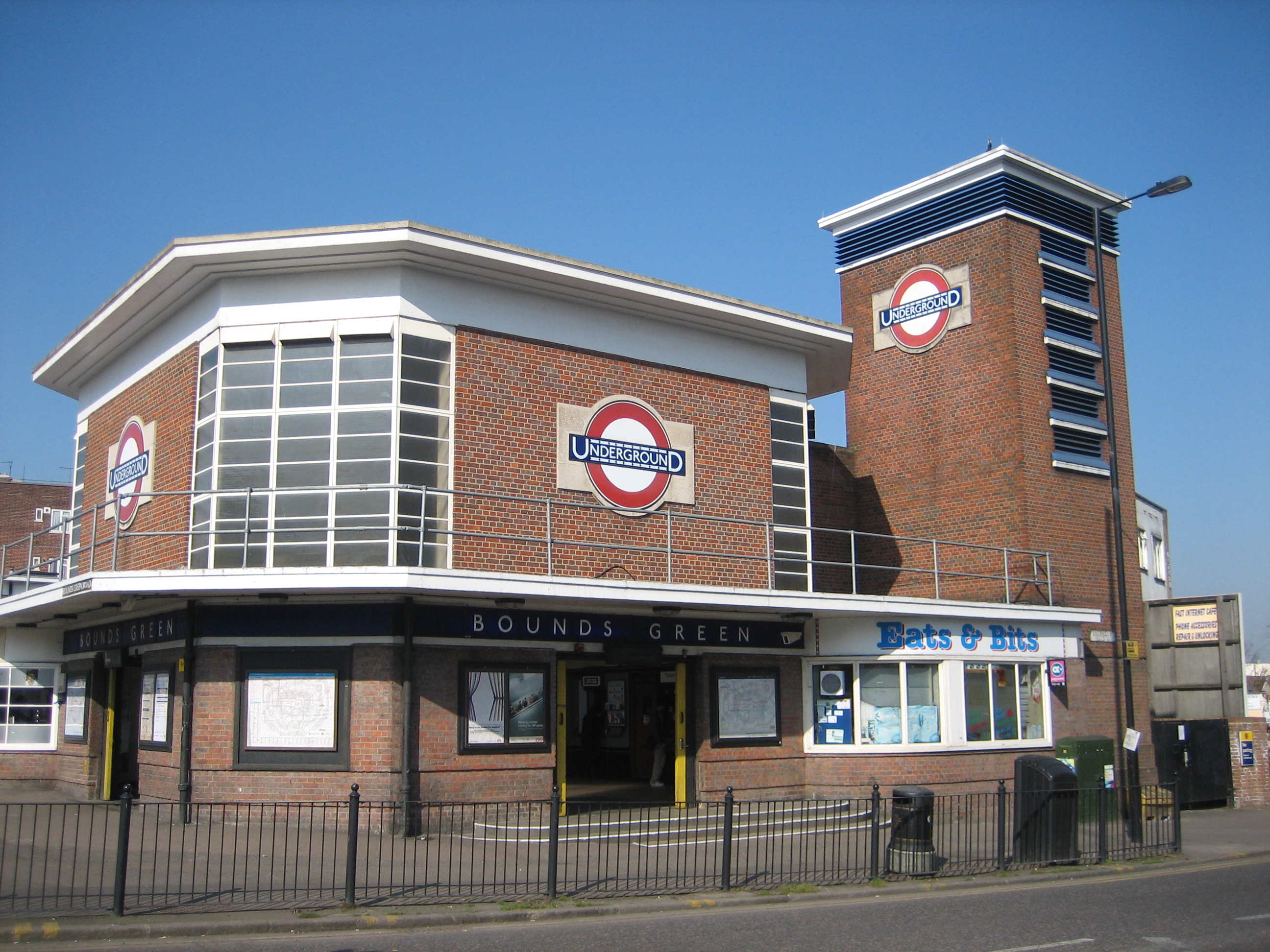 The Underground portions of Bounds Green, both inside and out, are splendid. I say that without reservation.
I just can’t quite get that other font out of my mind, like a bit of grit in my eye. It needles me.
What chance us clubbing together and buying the lease, purely in order to replace that weeping sore of a sign?

You’re absolutely right to be annoyed. If this were say, Burlington Arcade, you wouldn’t be allowed to erect a giant neon sign or one of those awful laser printed photo signs kebab shops favour. This is a wonderful, classy building with a strong design aesthetic. Eats & Bits should be made to have a sign that matches the elegance of Bounds Green. Simple. Pretty. Classy. I don’t believe that a single person has shopped there because the sign drew them in, so what do they care? This is heinous. It must be stopped.
Can’t believe that the rental value of the shop will go down just because TFL impose a font for the signage. McDonalds or KFC might complain about the effect on their brand though there are precedents for them altering it slightly. However, “Eats and Bits” can have no complaint.
I don’t like it either, but what do you replace it with that still says “Hang on, there’s something here that’s not part of the Underground, It’s our shop, please come and buy something, even if you’re not catching a train.”?
The parade of shops opposite Southgate station has sort of compromise, where shops have a New Johnston title, but are still allowed their nasty laser-printed sign beneath:

I quite like it. Maybe the sunshine in the picture is distracting me, but it makes me think of Western Super Mare pier.
I’ve been past and in/out of Bounds Green many times but have never really been bothered by the shop sign.
However the addition that I really don’t like and is a lot easier to change, is the cheap looking scaffolding-type railing around the roof. Arnos Grove got one a few years ago too, seems a bit pointless even for the odd occasion that someone’s working on the roof