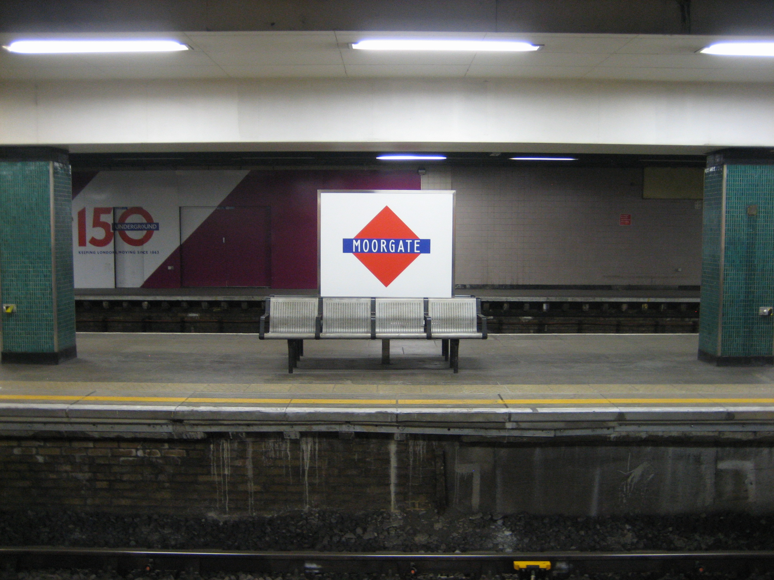
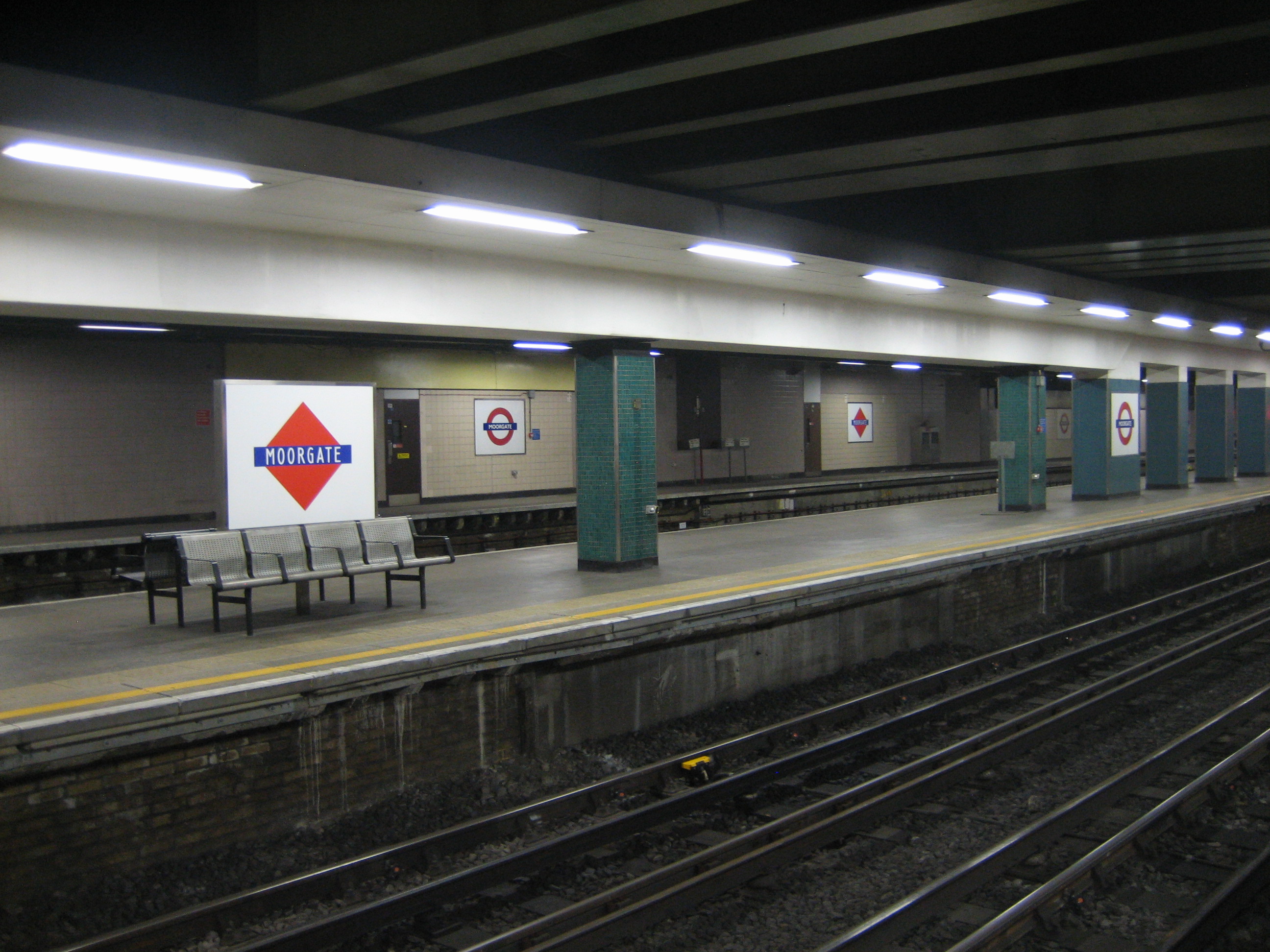
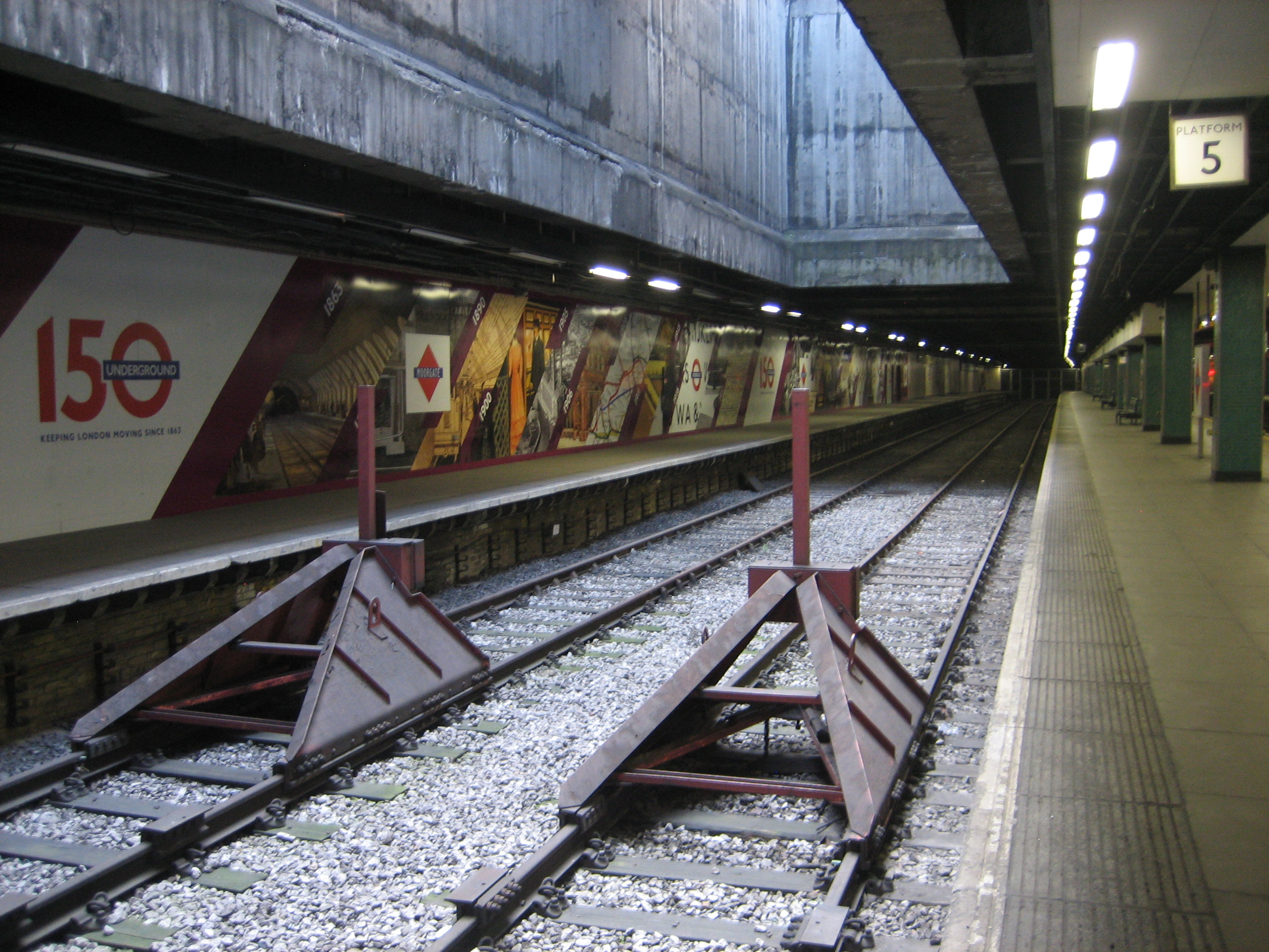
122. The platforms at Moorgate
 Now here’s a warning from history.
If nothing else, these platform signs at Moorgate are a testy reminder of the perils of a rebrand. The red diamond, had it been given the chance, might have persisted long enough to become stoically tolerated, then grudgingly accepted, then maybe even loved.
But it was doomed, and all thanks to bad timing. The diamond came too late. The roundel had already been conceived. Red discs were arcing out majestically across London when the Metropolitan line, as stubborn as ever, decided to launch its own logo. And worse, it was a logo similar enough to the roundel to make the Met’s behaviour look incredibly petty.
Which of course it was. Mere pettiness never stopped the Met doing anything. But as an exercise in brand awareness, let alone one of design aesthetics, it was amusingly hopeless.
 The signs* make Moorgate station a wonderfully eerie if slightly creepy place. For they appear on platforms no longer used by trains, save the occasional service that needs to terminate here.
Yet the platforms don’t look abandoned. Far from it. They feel clean, attended, cared-for. It’s almost as if they were in constant use. But by whom?
There are no security barriers. The platforms are teasingly, tantalisingly, open to anyone. I doubt you’d be able to stroll very far before being stopped… but the temptation is there. As is the potential for misunderstanding. I saw one family start to walk along them, before realising their mistake. I kind of wish they’d have carried on, just to see what happened.
 I realise I like these platforms for the wrong reasons – there’s very little logic in loving something that is useless – but they don’t quite sit abandoned in splendid isolation.
Platforms five and six (above) might be completely cut off for trains (they used to be the terminus for Thameslink services) but they’ve taken on a new life as a sort of promotional space-cum-display area. At the time of writing they’re hosting a rather nice mural celebrating the Underground’s 150th anniversary. I hope there are plans for other displays in the future.
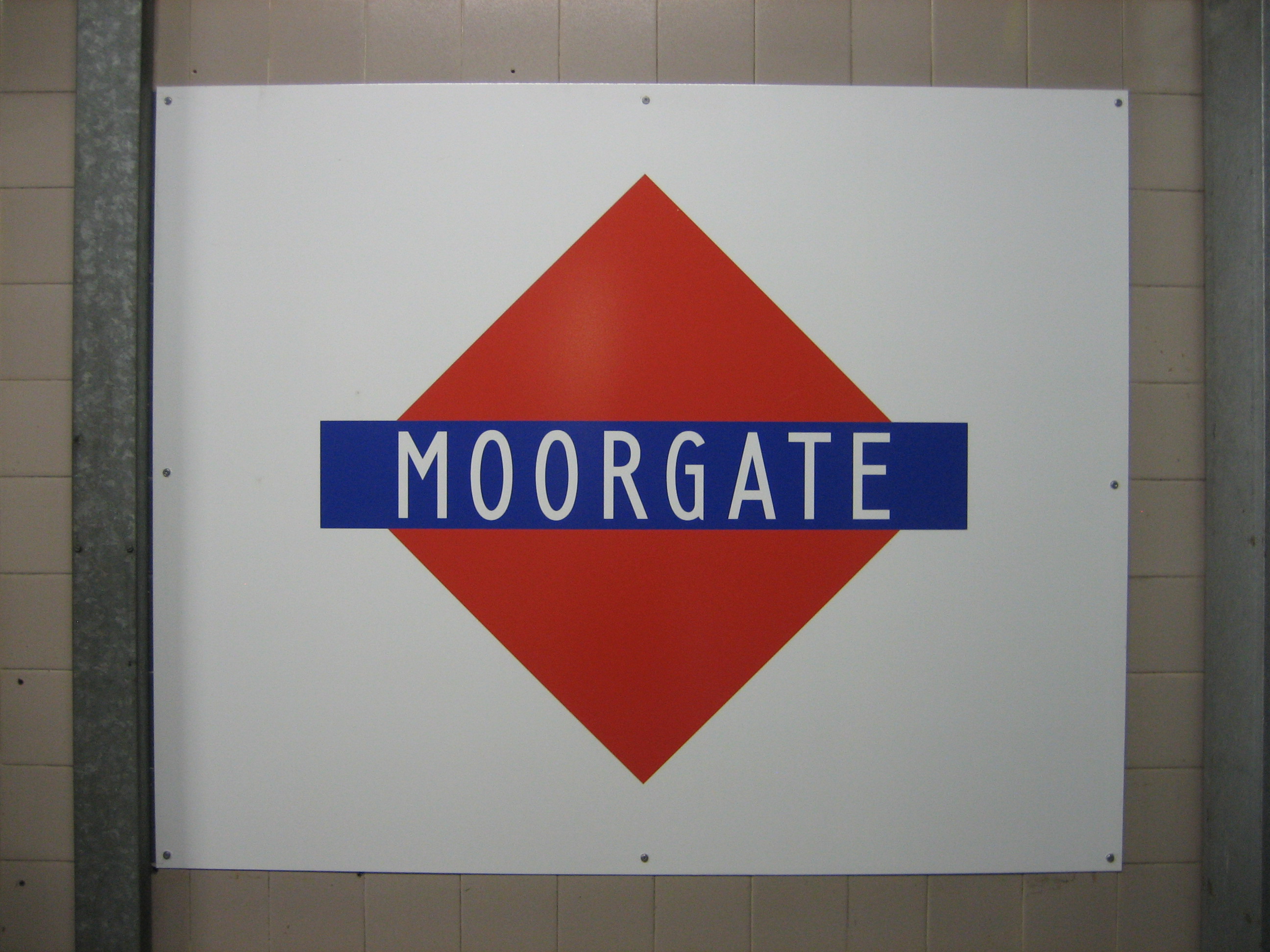
Platforms three and four are where you’ll find the diamond signs, casting their spiky glare. And both these and the mural are clearly visible from the Circle, Metropolitan and Hammersmith & City trains that call at platforms one and two. So rather than the old bits of Moorgate getting hidden from view and left to rot, they’ve become a “new” feature of the station: a partially-palatable slice of the past for digestion both now and into the future.
And there’s much to digest. But I’ll think I’ll pass on those diamonds. They’re just not my type(face).
 *Cheers to Andrew (in the comments below) for noting that the signs were reintroduced for the 150th anniversary. Will they, along with the mural, survive beyond 2013?

Actually platforms three and four get used almost every day! They are often used when trains need to be terminated early and there are a couple of scheduled uses.
The diamonds are, of course, a recent edition, installed for the 150 celebrations. They give a mysterious feel to the station though.
Thanks for the clarification, Andrew. I wasn’t sure how many trains actually used platforms three and four. If they do get used that often, it’d help explain why they look relatively clean and tidy!
The hole in the ceiling above the platforms is to let out the smoke of the original steam trains that terminated at the station.
Interesting. I pass through Moorgate twice a day and have never seen platform 4 in use. Something to look out for, I guess. I rather like the old-timey “diamondels” as a change of scenery if nothing else, and also wonder whether they’ll last beyond the end of the year.
They use platform 3 more, but you’ll sometimes see 4 in use. Indeed I’ve seen trains terminate on 4 when 3 has been empty! Never understood why. On rare occassions I’ve been there and found both full. But most of the time they’re deserted – very eerie when coupled with the empty 5 and 6.
The diamond station signs go back to the days of when the Metropolitan Railway and the District Railway were private operations. The diamond was the Metropolitan’s and the bullseye (or roundel as they’re called now. It became the network symbol when the rail companies were amalgamated and then the final bullseye with red, white and blue with nationalisation and London Transport.) was the District’s. Because both companies shared responsibility for what became the Circle Line, which was then called the Inner Circle, it helped you to know who’s station you were starting from or ending. It also gave you an idea of how much your fare would be, if you started from one company’s station in the Inner Circle to the other’s out of it, or vice-versa.
There’s what might just be a subtle reference to the Met’s diamond in modern Underground typography.
Most outward-facing “UNDERGROUND” roundels at station entrances have the initial and final letters significantly larger than the others, with the “NDERGROUN” both underlined and overlined. But the underlining and overlining is done letter-by-letter, so there are breaks in the lines. (Because the letters are almost the same width, you might at first think that someone has chosen to use regularly-spaced dashed lines rather than solid ones, but that is not the case. The dashes for the E are noticeably shorter than those for the O, for instance. While it’s not on a roundel, the Clapham Common sign makes this particularly obvious.)
However, the dashes are a surprising shape. They are not rectangular, nor do they have semicircular ends. They are notched so it looks as if the lines had originally been solid, but had been broken where required using a cookie-cutter in the shape of a Metropolitan diamond. It’s probably a coincidence, but I’d like to think that an ex-Met designer was making a tiny push-back against the complete victory of the roundel.
As with all things Underground, there are of course exceptions. The Arsenal mosaic does actually just use dashed lines (with eleven dashes rather than the expected nine, and, bizarrely, with the end ones shorter than the others). And that at Maida Vale uses rectangular dashes, with no notches.