Archive

Architecture

Beauty, squaredWhen it comes to quadrilaterals, I’m with Huey Lewis and Principal Skinner.

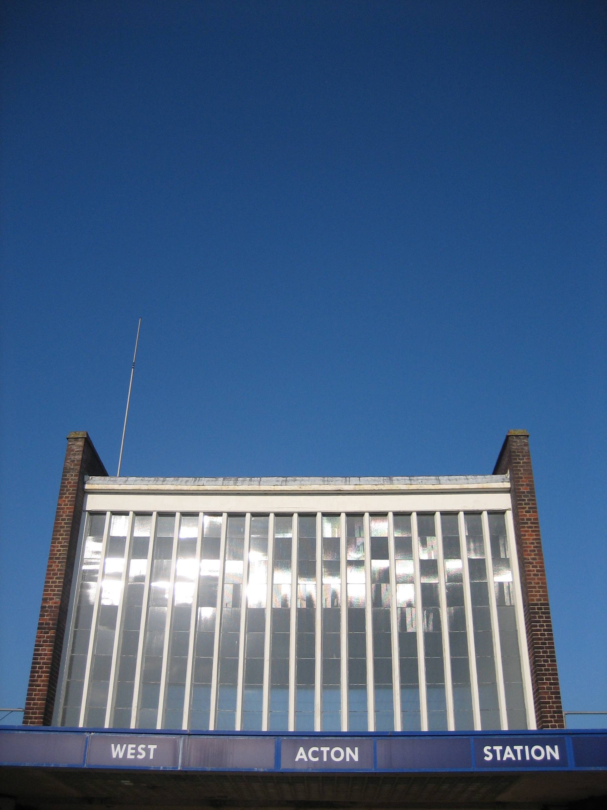
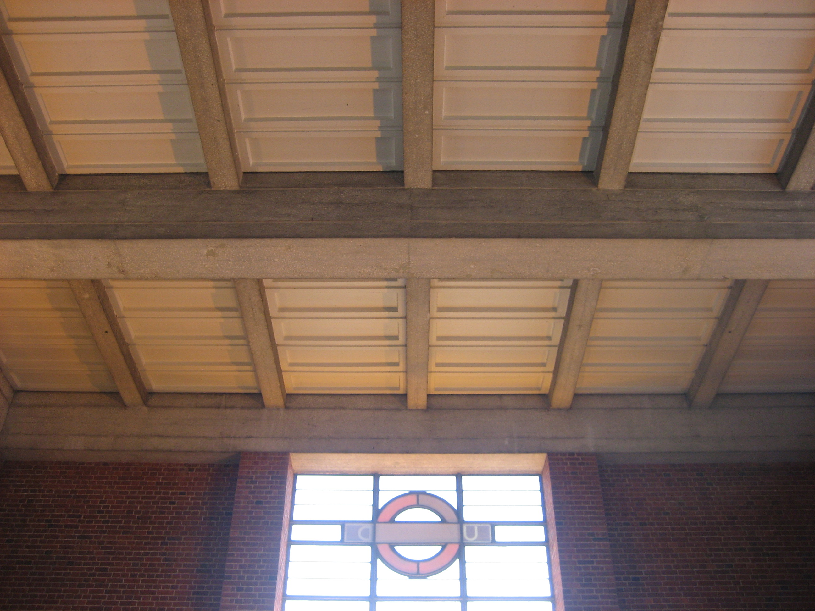
Straight lines have come in for a bad press recently, what with their endorsement by Michael Gove, but applied with imagination rather than ideology they can still surprise and entertain. The right kind of right angle can let light pour forth into the most towering of interiors, or seduce the eye upwards through a staircase of cubic playfulness.

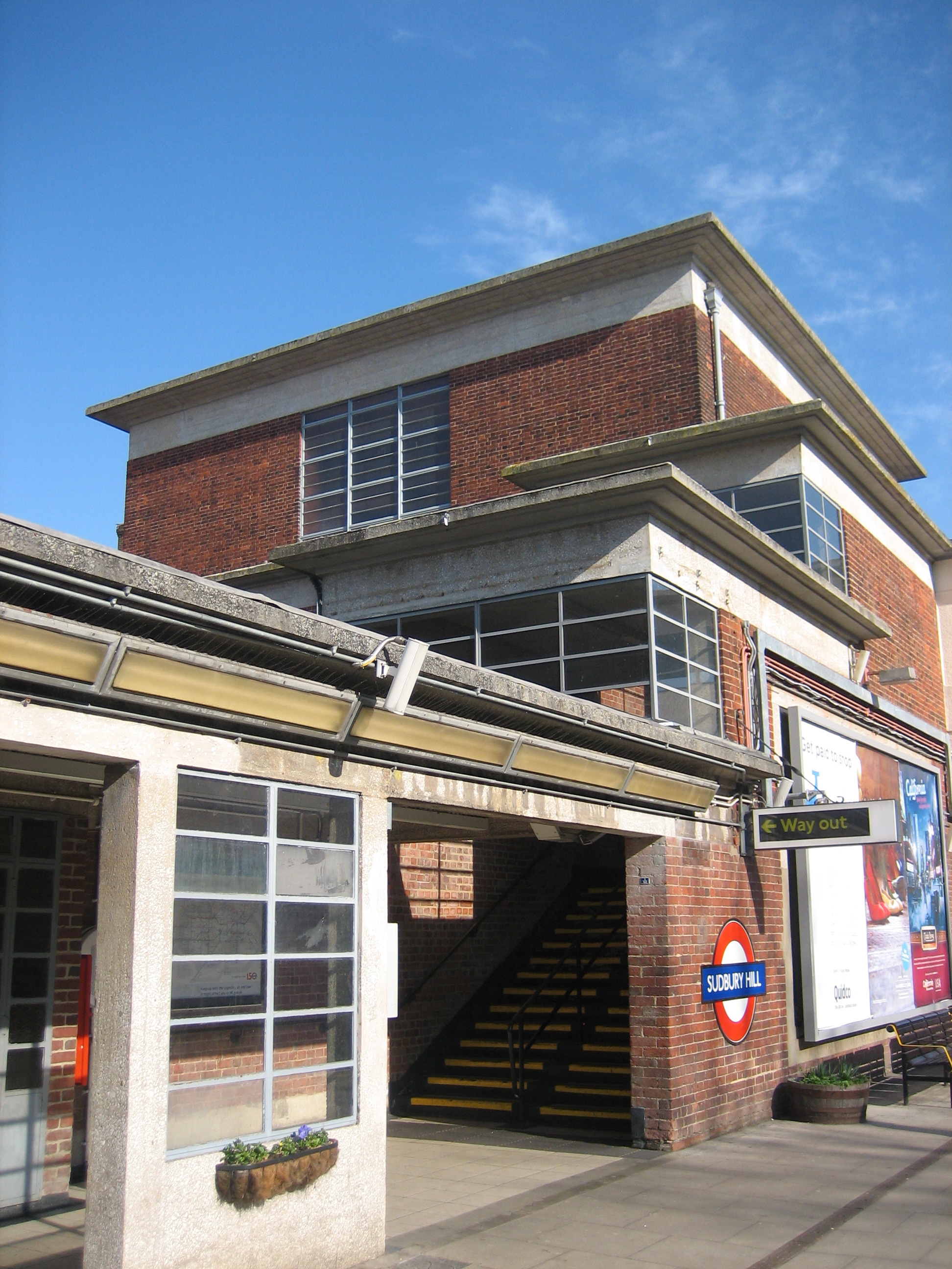
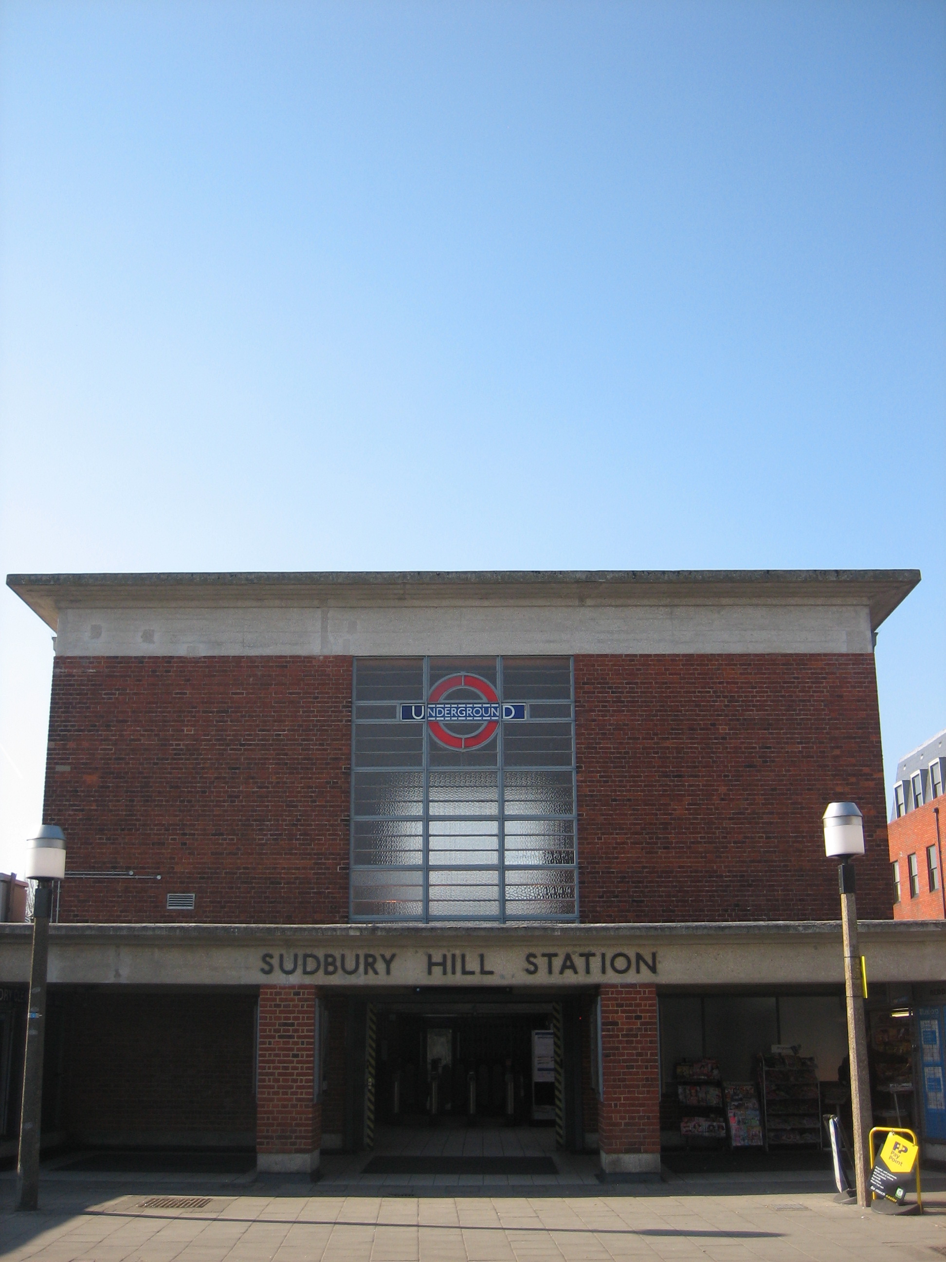
For proof of this kind of thing, you’ll struggle to find better examples than at Sudbury Hill station.

For Sudbury Hill is beauty, squared.

Climbing up on Sudbury HillNow that’s the kind of fabulous, multi-level edifice that’s just begging for a giant-sized Professor Yaffle to wander down, fussily but stoically*.

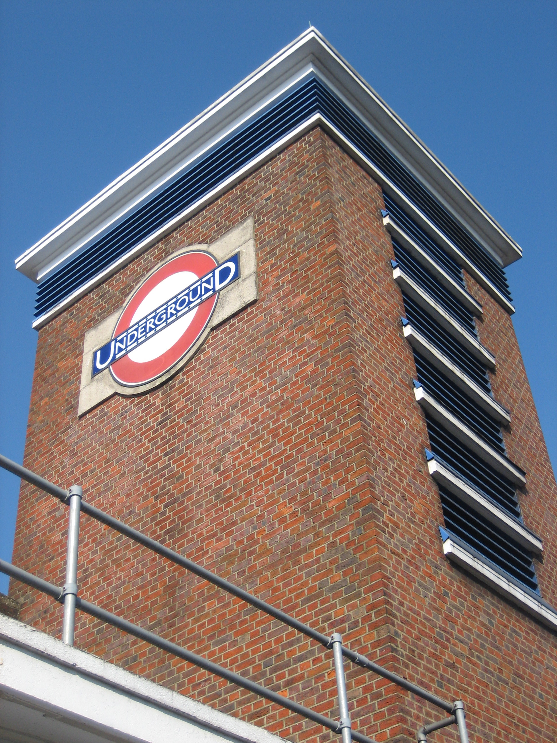
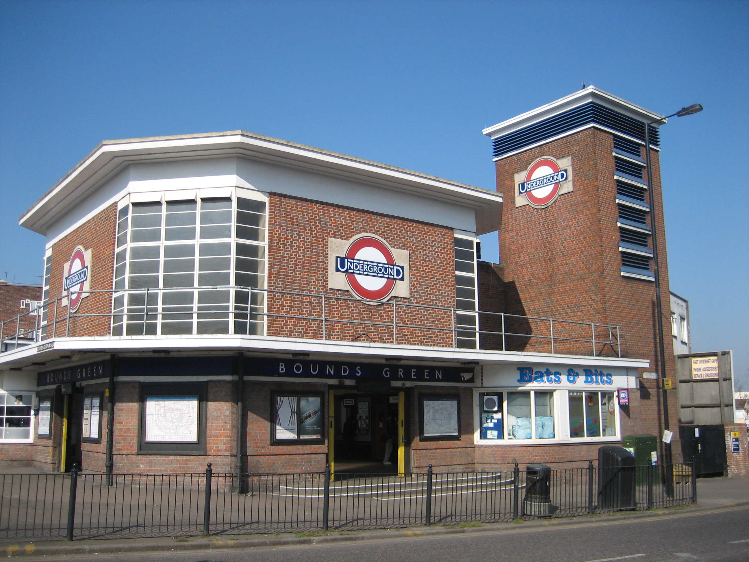
Sudbury Hill comes from the Charles Holden handbook of How To Design Stations Properly (subtitle: 150 Reasons You Should Pull Down Old Crappy Buildings In Order To Replace Them With Newer, Better Ones).

It opened in 1932, along with an increasing number of minds to the notion of architecture being a statement as much about the future as the past. It’s still in superb condition, although the inside of the booking hall no longer resembles quite so much of a Ken Adam film set.

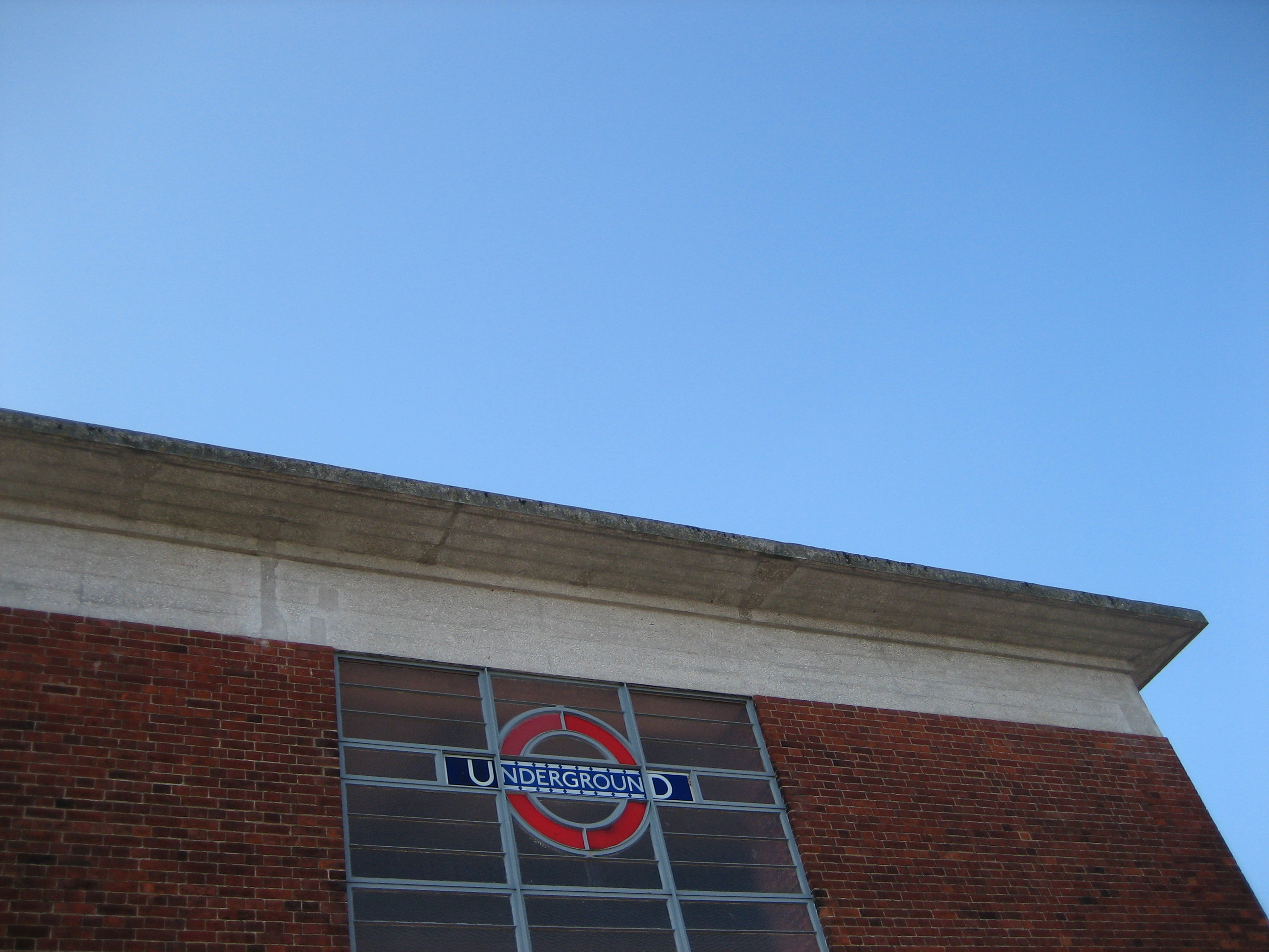
The squares, and squares within squares, cut an elegant dash against the sky. In cheeky defiance of its base function, the station lifts rather than lowers both your gaze and your senses.

Lend me your (lin)earsThe buildings that surround the station, in fact the entire street on which it sits, can’t compete. Everywhere looks shabby, out-of-sorts and utterly humdrum. Sometimes humdrum can be enchanting, but not when it’s by accident rather than contrivance. Holden should really have been given permission to design the entire neighbourhood.

In fact, Holden should have basically been allowed to do up the whole of London. Imagine what that would have been like. A Gordon Murray-esque hand-tooled urban fantasy, but for real, in the flesh, for us to walk, ride and windmill through.

Charlie's angelHere is a box. A modernist box. Doled up, and ready to play.

But this box can hide a railway inside. Can you guess where it’s going today?

Silence is Holden*Professor Yaffle was always my favourite in Bagpuss. Don’t say you’re surprised.

Acton artIf there’s one theme above all else that’s come to define this blog, it’s light. The way it bounces through, curves round, dives deep and sidles into the Underground’s heart. The lengths some architects and engineers have gone to coax it into places far from the open air. The magical results achieved by manipulating its power and magnifying its potential.

Light runs counter to almost every association prompted by the word “Underground”. Yet it is responsible for some of the greatest sensations you can experience on the network, both deliberate and by chance. The ticket hall at West Acton would look impressive even without direct sunlight nudging through its neatly-aligned panes. But catch it when the rays are in just the right position, and the effect is glorious – both inside and out:

Go, WestThe elevated windows allow light to pass through in either direction, including on to the platforms which sit behind and below the hall. It’s a simple trick, but with profound consequences: it gives passengers waiting for or getting off trains the added bonus of being bathed in sunshine that might otherwise be obscured by buildings. And if there’s one thing you don’t want on a platform at an Underground station that’s above ground, it’s gloom.

We’ve the Great Western Railway to thank for this, and everything else to be cherished about West Acton, including its eccentric crook-shaped wooden benches and enamel signage. Brian Lewis designed its current incarnation, completed in 1940: a (literal) beacon of light in those dark days.

It’s now Grade II-listed. The inside of the ticket hall isn’t in quite as fine a state as its gleaming exterior. But a slice of sunlight sometimes adds soul to even the shabbiest of rooms.

Goodness, What Radiance!

Bound for gloryWell now. Here’s a pleasing, solid slice of modernism. It looks in fine fettle, and deservedly so. Bounds Green is another valuable emissary from that otherwise value-strapped decade, the 1930s. If ever you need a tangible reminder of why the second world war was worth fighting, take a trip up the north end of the Piccadilly line.

But while Bounds Green station is an uplifting sensory dispatch from a distinctly downbeat era, and is all the greater for being so, the present day has not been kind. And here’s my problem. Should I be at all bothered about what is taking place at the fringes of this and so many other stunning outposts of the Underground? You’ll see what I mean if I repeat the shot above, but widen the view a little.

A "Bit" of botherGaaaah! It’s not just seeing the word “bits” in the name of shop that depresses me (though only up to a point; the smutty part of me will always associate the word with Kenneth Connor in Carry on Behind who, in response to Elke Sommer announcing “When I love a man, I give him everything, I give it all”, sighs: “But I don’t want it all. I just want a bit!“).

No, it’s also the font. What a horrible, horrible font. I despair at the inelegant, unimaginative lettering.  I bridle at the use of blue on red. And I recoil at the way the ampersand flops and flails about.

To be fair, I’d feel this way on seeing such a font adorning any building. But at the foot of such a gold standard of 20th century style and design is heartbreaking.

Or is it? Should I not treat it as part of the station at all? Or somehow see it yet “not” see it, in a kind of doublethink, as satirised by George Orwell (another valuable emissary from the 1930s)?

Everything's gone GreenThe Underground portions of Bounds Green, both inside and out, are splendid. I say that without reservation.

I just can’t quite get that other font out of my mind, like a bit of grit in my eye. It needles me.

What chance us clubbing together and buying the lease, purely in order to replace that weeping sore of a sign?