Archive

Numbers 76-100

Bound for glory
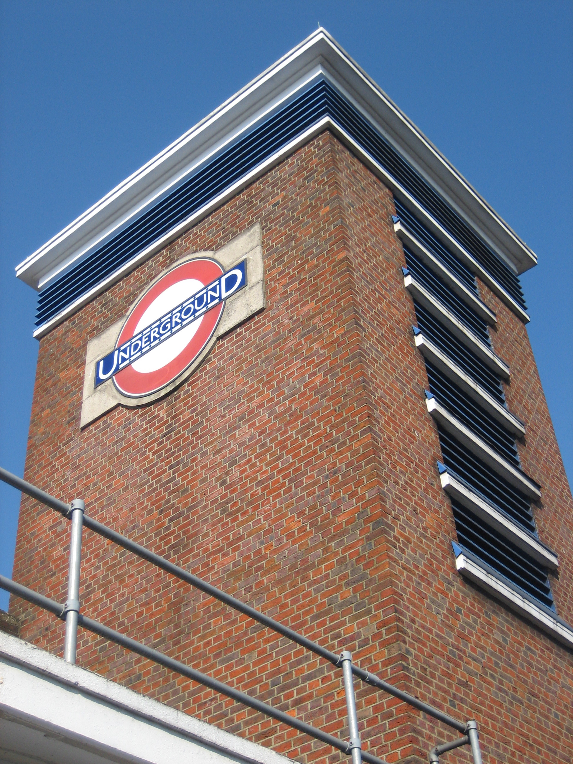
Well now. Here’s a pleasing, solid slice of modernism. It looks in fine fettle, and deservedly so. Bounds Green is another valuable emissary from that otherwise value-strapped decade, the 1930s. If ever you need a tangible reminder of why the second world war was worth fighting, take a trip up the north end of the Piccadilly line.

But while Bounds Green station is an uplifting sensory dispatch from a distinctly downbeat era, and is all the greater for being so, the present day has not been kind. And here’s my problem. Should I be at all bothered about what is taking place at the fringes of this and so many other stunning outposts of the Underground? You’ll see what I mean if I repeat the shot above, but widen the view a little.

A "Bit" of bother
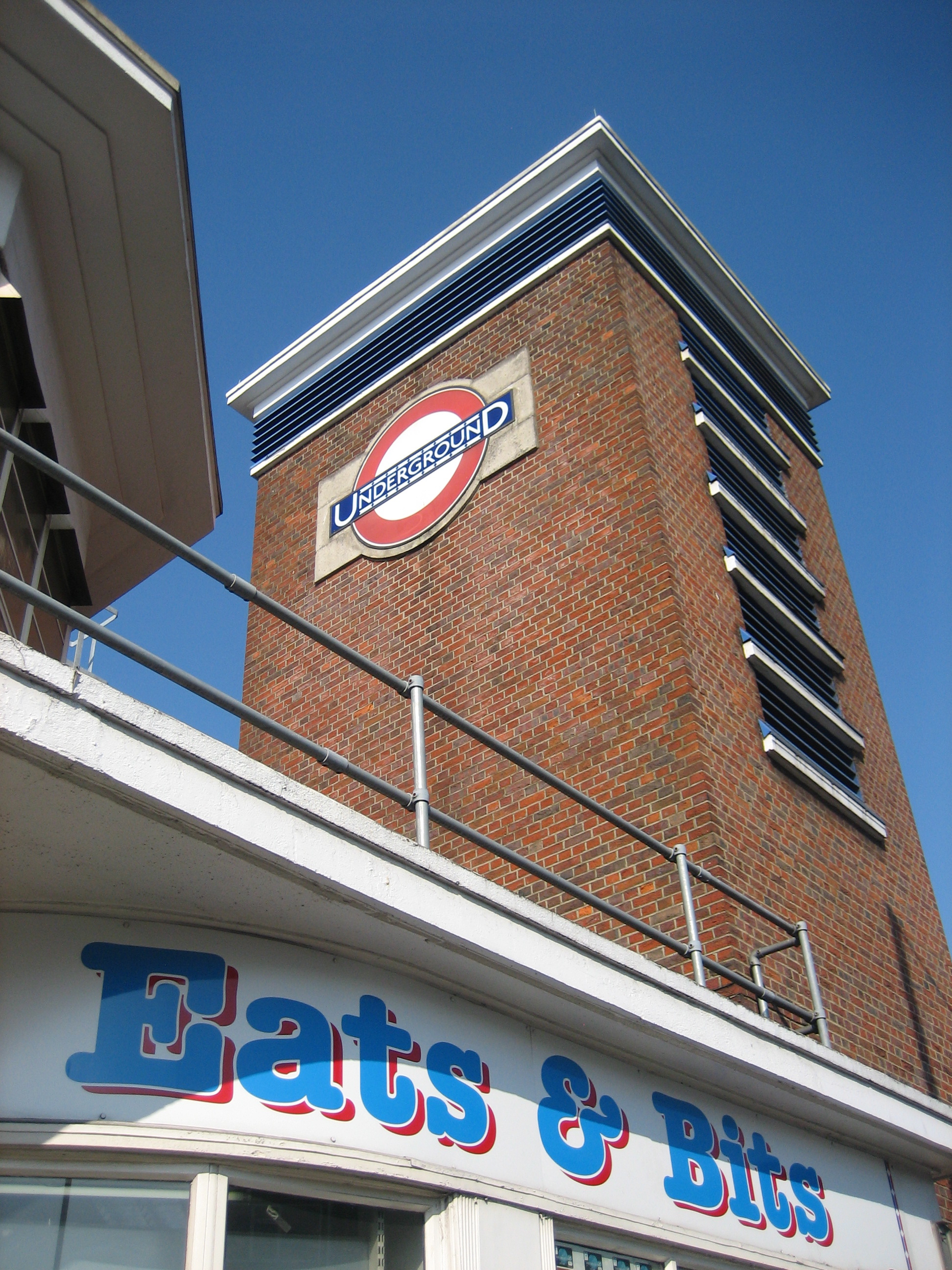
Gaaaah! It’s not just seeing the word “bits” in the name of shop that depresses me (though only up to a point; the smutty part of me will always associate the word with Kenneth Connor in Carry on Behind who, in response to Elke Sommer announcing “When I love a man, I give him everything, I give it all”, sighs: “But I don’t want it all. I just want a bit!“).

No, it’s also the font. What a horrible, horrible font. I despair at the inelegant, unimaginative lettering.  I bridle at the use of blue on red. And I recoil at the way the ampersand flops and flails about.

To be fair, I’d feel this way on seeing such a font adorning any building. But at the foot of such a gold standard of 20th century style and design is heartbreaking.

Or is it? Should I not treat it as part of the station at all? Or somehow see it yet “not” see it, in a kind of doublethink, as satirised by George Orwell (another valuable emissary from the 1930s)?

Everything's gone Green
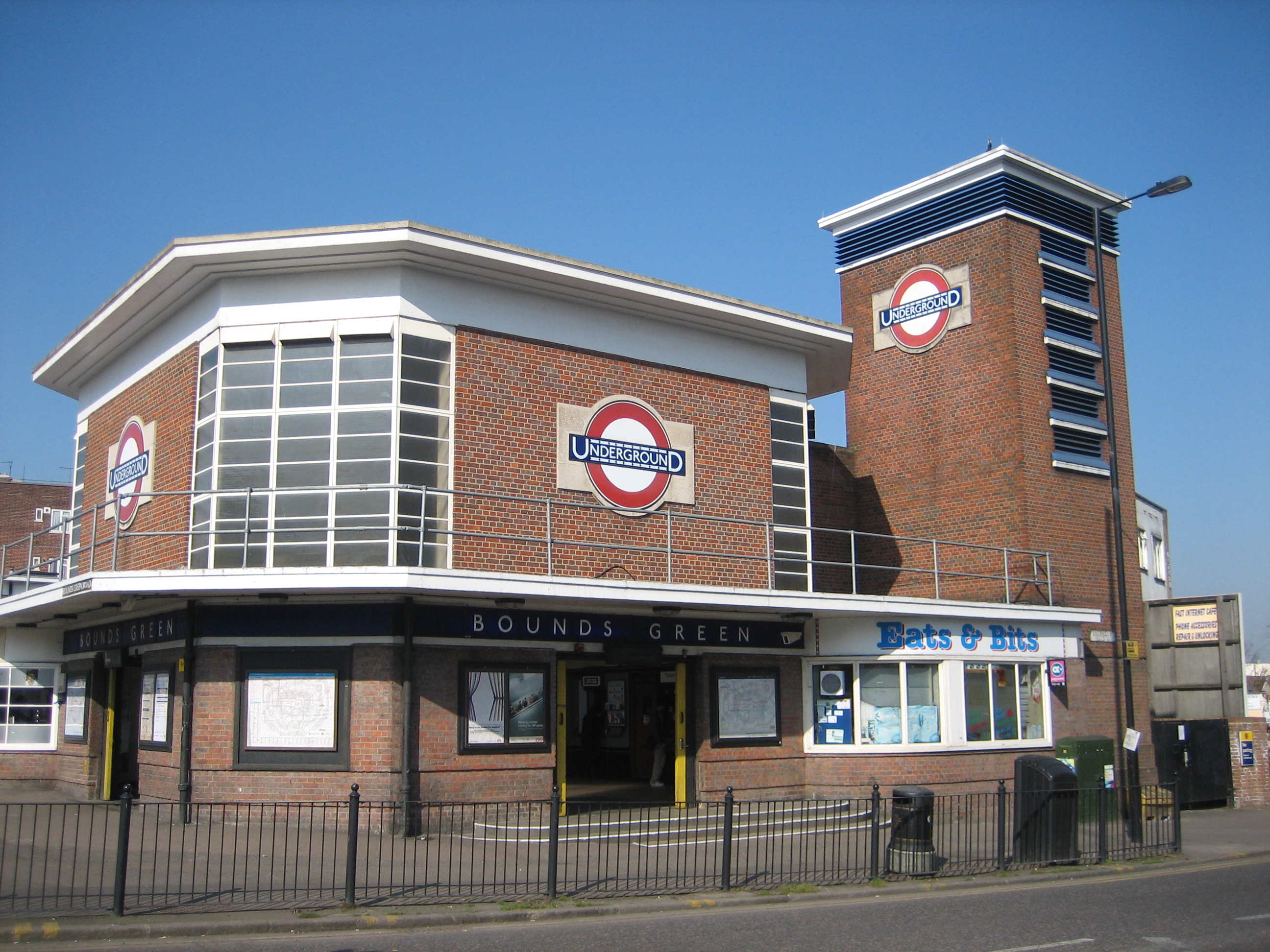
The Underground portions of Bounds Green, both inside and out, are splendid. I say that without reservation.

I just can’t quite get that other font out of my mind, like a bit of grit in my eye. It needles me.

What chance us clubbing together and buying the lease, purely in order to replace that weeping sore of a sign?

Much ReveredMuch of the first incarnation of the Underground, like that of Doctor Who, was enthusiastically wiped from existence by subsequent generations of management bigwigs.

In both cases, I’m not especially sorry. Those traces that survive of either institution reveal a rather overbearing, eccentric style that’s also massively fusty and profoundly inelegant. Only the stuff that lurked slightly out-of-sight was really that good.

Fortunately, unlike Doctor Who, bits of the first incarnation of the Underground don’t keep turning up in someone’s attic or in Zimbabwe.

High Street Kensington was first thrown up in 1868 as an enormous pile of pretension. Victorian railway architecture can be maddeningly inconsistent. How could they get the likes of King’s Cross and St Pancras so right, but something like this so wrong?

Thankfully it didn’t survive, regenerating in the first decade of the 20th century to become… a shopping arcade. But wait, because just above the entrance to the station, up in the ceiling, are some attractive motifs commemorating the change. Both the Metropolitan (pictured above) and District railways are honoured:

Definitely ReveredAlong with the year of the renovation:

It was a very good yearAnything like this, with the right dosage of peculiarity and charm to catch people’s eye and make them stop and stare, is a good thing. The motifs add a bit of substance to the otherwise wispy atmosphere of the arcade. If even one person has cause to ponder for a moment on the meaning of MR, DR or the significance of 1906, a job of work has been done.

As for the station looking bigger on the inside than the outside… hasn’t the Underground always had plenty of time for relative dimensions in space?

High's treat

Commuter rage: it's been going on for centuriesDavid Gentleman’s designs for the walls of the Northern line platforms at Charing Cross, aside from suggesting that commuter rage dates back almost eight centuries, are a triumph from start to finish. And that’s a very long triumph, stretching as they do from one end of the platform to the other, and starring a cast of hundreds encompassing peasantry to pageantry, with the occasional pick-up en route:

Are you going my way?Are you going his way?

Strictly speaking, the murals retell the story of the construction of the eponymous cross, built in 13th century on the order of King Edward I as one of a number in memory of his wife Eleanor of Castile.

But if you fancy a more figurative interpretation, the designs reflect anybody and everybody who travels on the Underground. The range of character types is so broad it’s almost always possible to find one that, if not directly resembling yourself, at least reflects something of your mood:

We've all been thereAs we go about our toil, so does Gentleman’s ensemble, from the most humble to the most holy.

You may only grab a blur of images as your train rushes in, pauses then hurries off. Or you may have time to spy a face or feature that stays with you, in turn capturing a moment out of your day and elevating what can feel a mundane business – getting from A to B – into something a bit magical:

Gentleman nails it Close-up, you realise it’s not just human beings that benefit from the artist’s bracing, characterful style:

Symbolism a-go-goI reckon this is the murals’ greatest strength: the vivid personality of its subjects. These are historic events drawn in a very contemporary way. The scenes don’t seem rarefied, done for abstract contemplation. They’ve been leavened with a universal humanity.

Admittedly the amalgamation of unwelcome if necessary everyday ephemera sometimes looks, literally, rubbish:

A bit (of) rubbishBut then you also get this, the Northern line roundel, popping up in wonderfully unlikely situations:

Manna from heavenFrankly, who wouldn’t want to worship such a divine manifestation?

The murals are one of the few things London Transport got right in the 1970s. They date from when Charing Cross was reworked as the terminus of the newly-extended (and newly-named) Jubilee line, and when all the messy jostling of stations separately called Trafalgar Square, Strand and Embankment got tidied up.

It can’t have been easy persuading the LT suits of the merits of such an aesthetic investment. But then, as the murals show, we all have our crosses to bear.

B-b-b-b-build