Archive

Zone 1

Capital effort
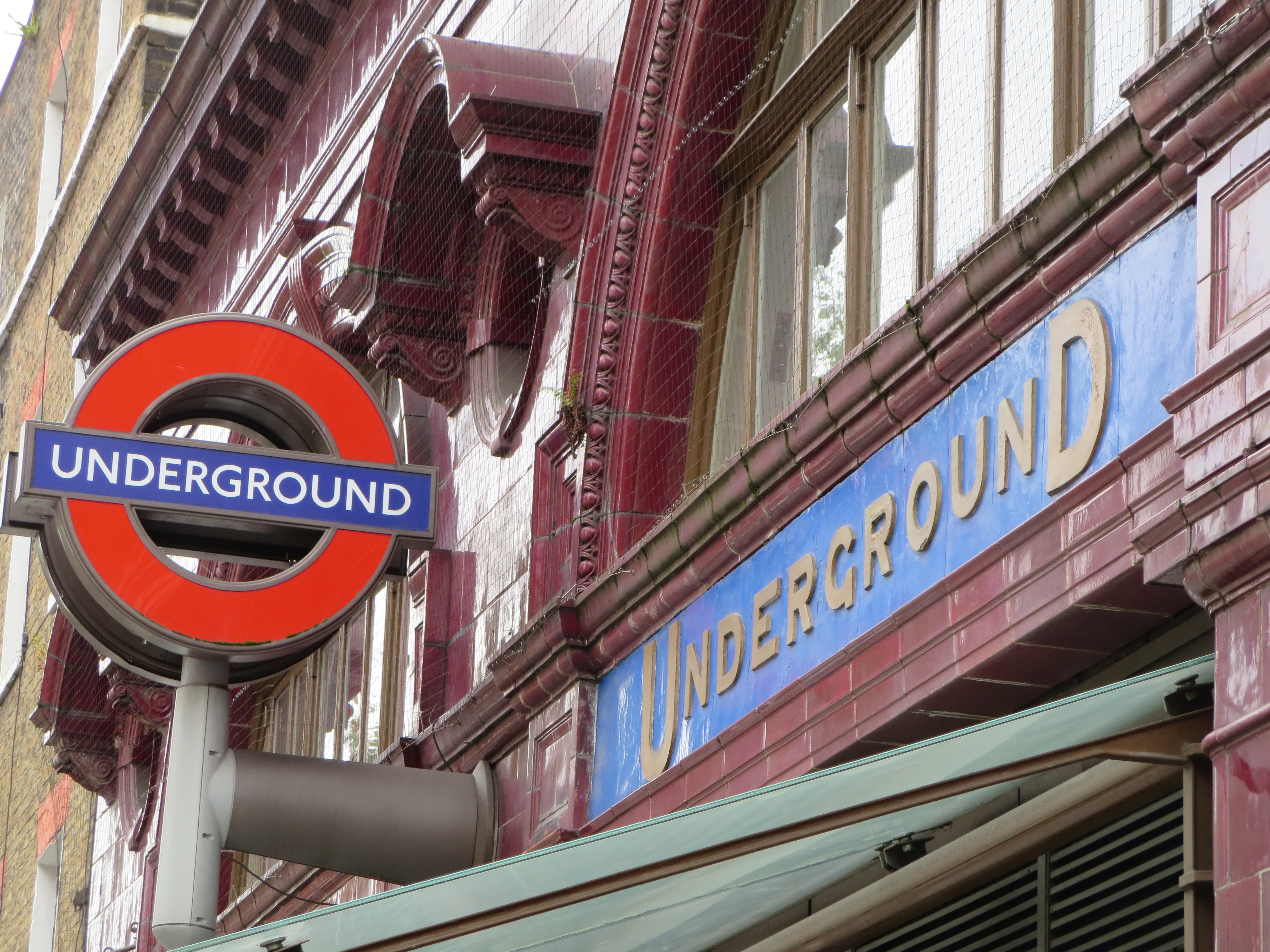
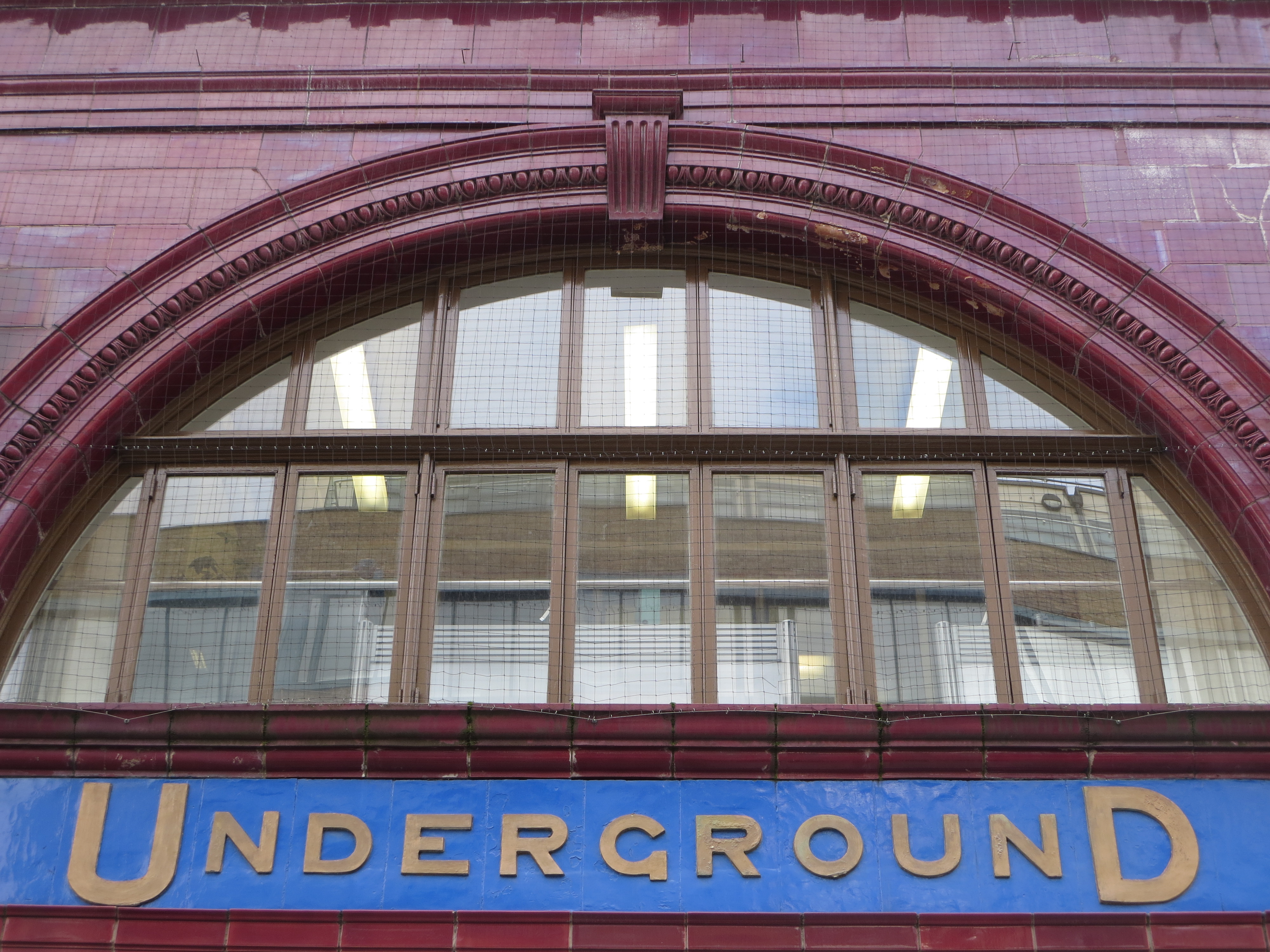
There are several of these sprinkled around London, but the one at Russell Square is particularly well-preserved and prominent. Embedded in Leslie Green’s stubbornly perfunctory and visually peakish facade, the logo radiates freshness and imagination like sunlight sneaking through a crack in the Berlin Wall. An interloper from the drawing board of a visionary rather than a functionary, it can’t help but catch and retain the eye.

What is it that makes, that made, this logo so potent, so intriguing?

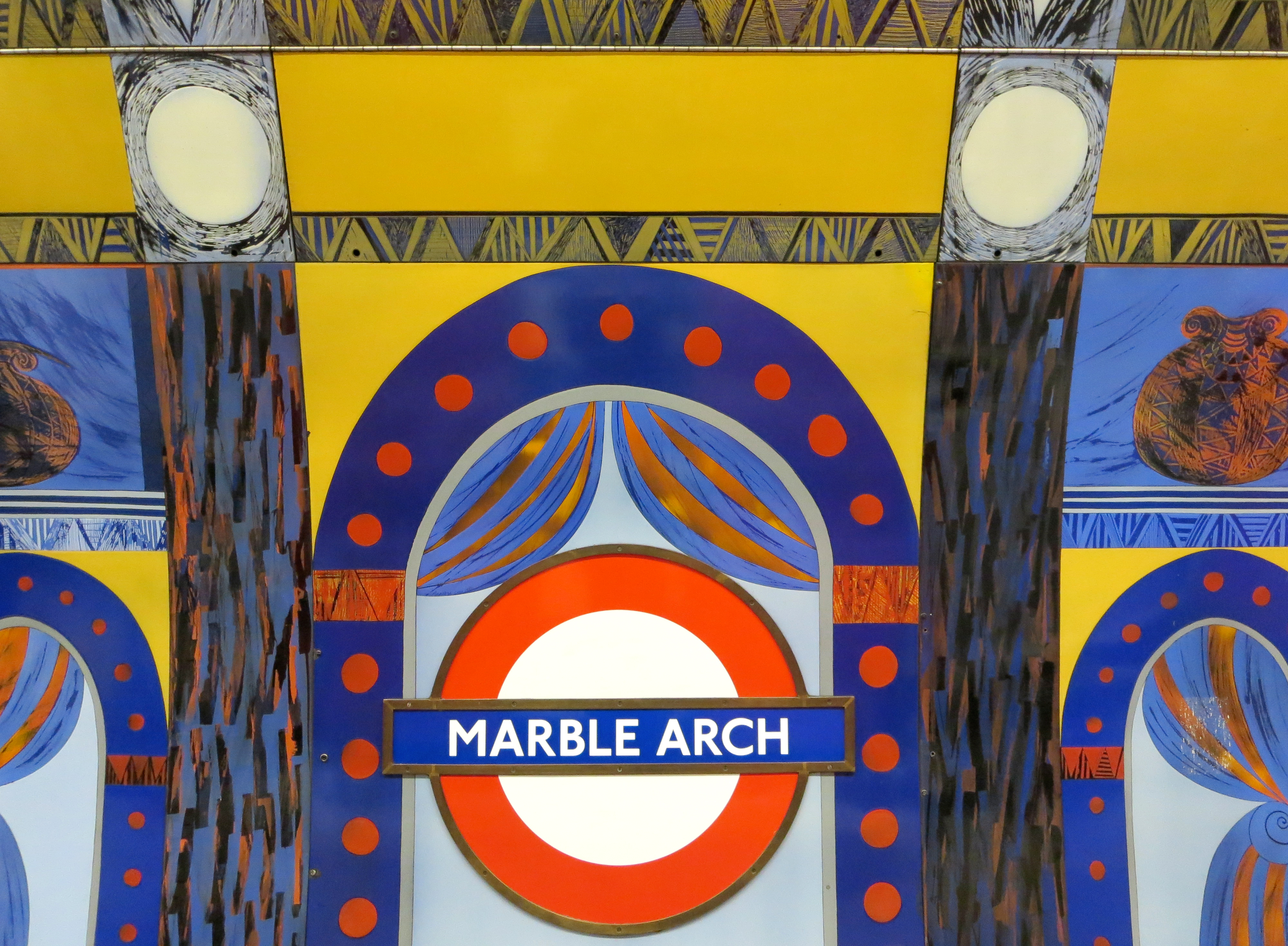
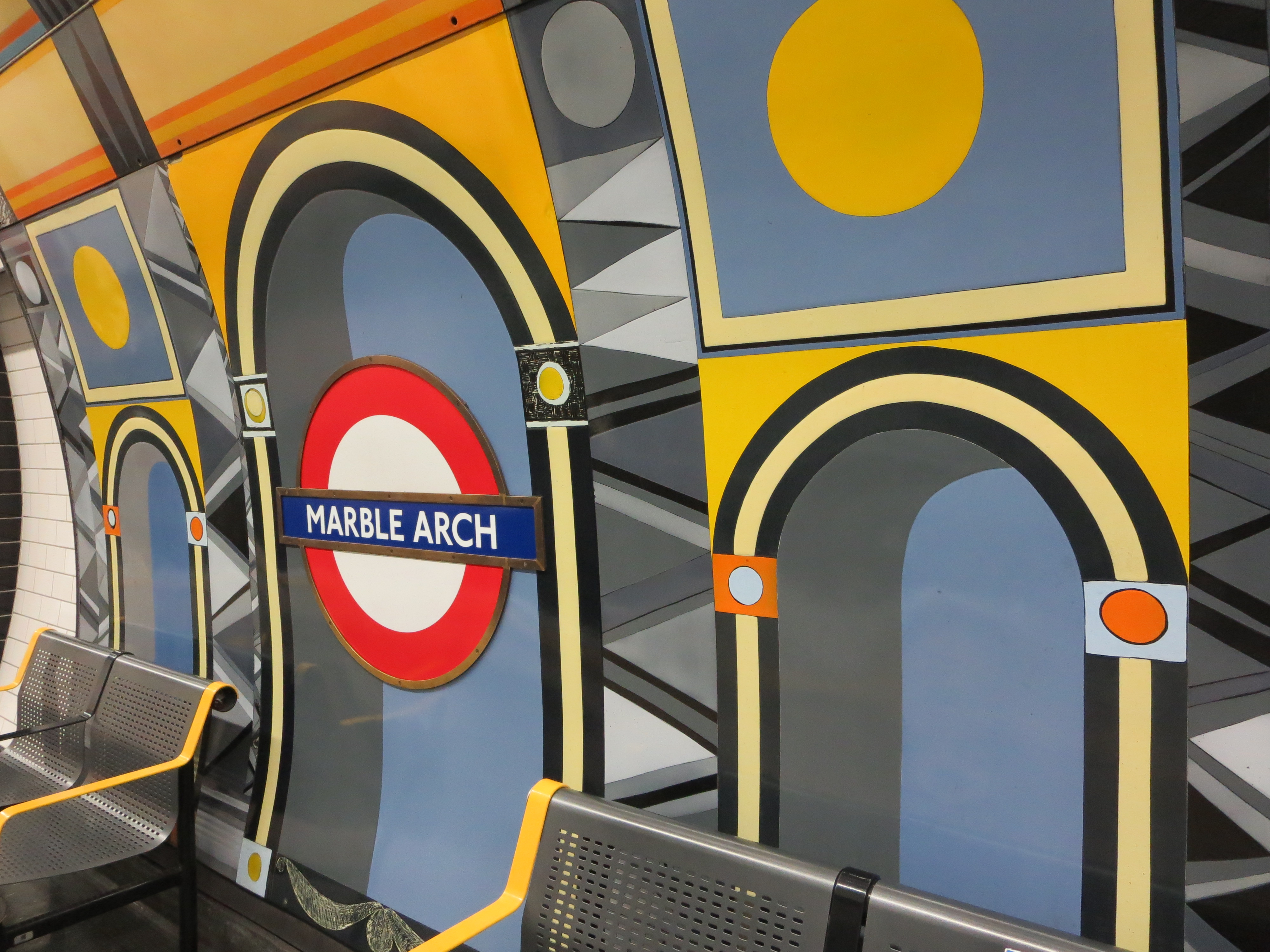
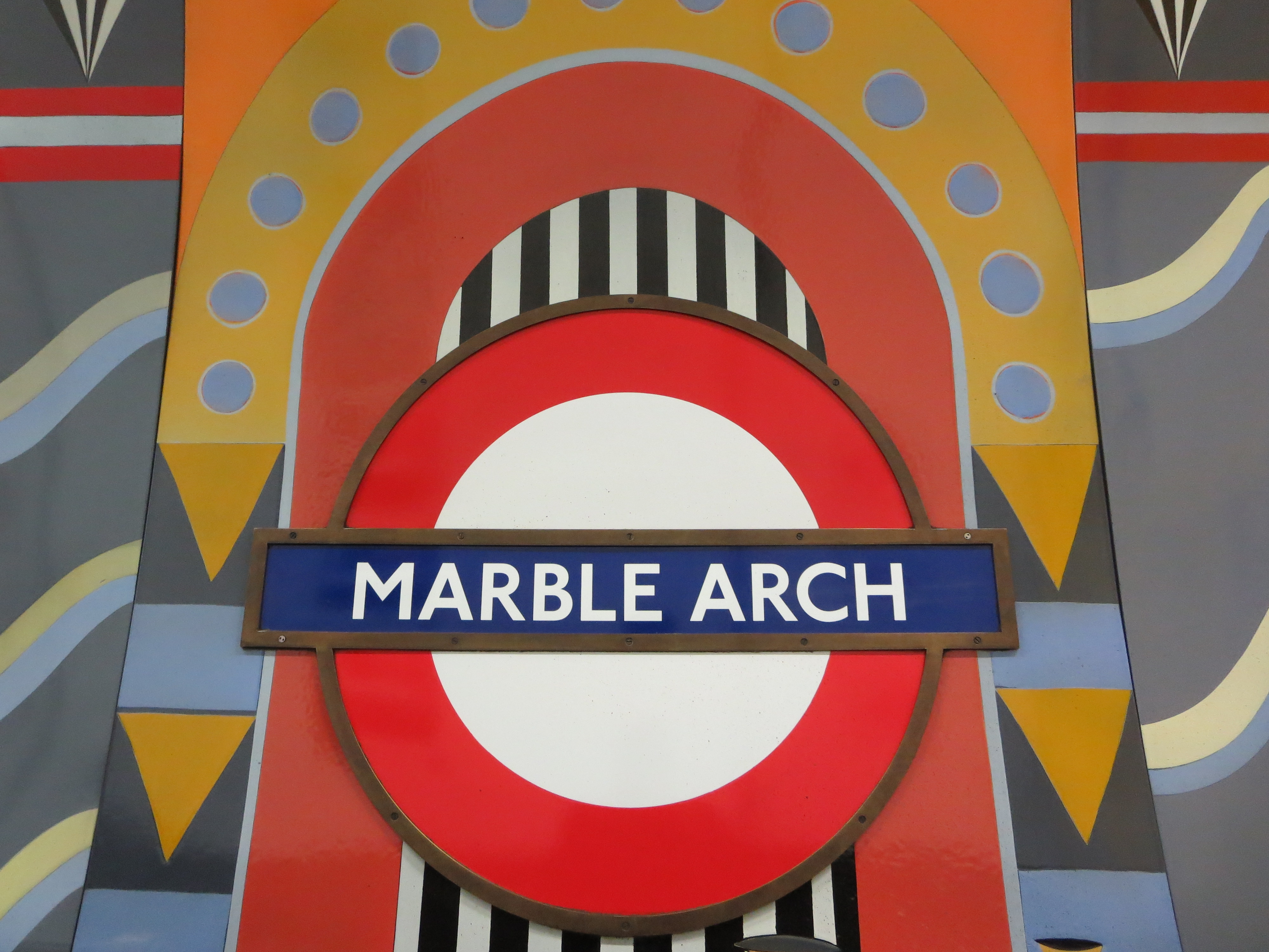
Its antiquity, for starters. It has a quality of being ancient, of hailing from the far distant past. Yet it’s hard to tell from how far back it belongs. This gives it a flavour of mystery as well as heritage. Could it be before or after the war? And which war? Is it even the 20th century?

There’s also something a bit exotic about it. It’s a typeface that doesn’t feel instinctively native to the UK. Where has it come from? Where has it gone to? It’s not passed into the common lexicon. You won’t find it adorning anything new – or anything relatively new either.

But above all, it’s enormously alluring. This is a typeface to fall in love with. It knows it’s attractive, but lets you know in a coy rather than charmless fashion, which just makes it all the more irresistible. Forget having your name in lights. How about having your name in these particular sans-serif capitals?

It’s also a typeface to fall in love under.  A first swoon beneath this kind of sign? There’s little that could be more provincially sentimental.

Facts, rather than fancy, reveal that as with most exotica, the logo blazed brightly for a period, then fell out of favour sharply. Thankfully it gave way not to something worse, but something even better. Father and son eye each other warily outside Russell Square, positioned at right angles in a way that flatters neither. But then neither belongs next to the other. It’s like putting two Dr Whos in the same show and expecting double the fun.

Facts also reveal that the typeface does indeed date from before the war – but the first world war, not the second, and therefore more of a veteran than its slightly futurist style suggests. It’s as old as 1908, the year the Underground got tired of the 20th century breathing down its neck and decided it needed a trademark. But the network ended up not only conceiving its own logo but its own emotion. For here was where the romance of the Underground first spluttered into existence – a romance that continues to this day.

Jousting typefaces

Park lifeI’m pretty confident this is, and will remain, the youngest thing to appear in my 150.

It’s so new, in fact, that it wasn’t even complete when I began this blog.

Finishing touches were not added to the redeveloped entrance to Green Park station until a few days before the start of London 2012. I know this for sure, as I walked through it every morning on my way to work.

Those were the best of times, with jovial publicity kiosks, swaggering zil lanes and a thousand magenta signs everywhere you turned. Green Park was one of the Underground interchanges that had been decreed a top hot spot, or possibly a hot top spot, and which was therefore to be avoided if possible throughout the Games. But this turned out to be an exaggeration, or perhaps more accurately a bit of preemptive back-covering. For Green Park station never once seized up, shut down or bowed out during the whole of London 2012.

Its glittering makeover had been concluded with the kind of timing of which Chris Hoy would be proud.

Any Portland in a stormYou cannot go wrong with Portland stone. I’ve yet to encounter any building that does not benefit from a coat of the stuff. I’d probably draw the line at a branch of Burger King, but then I’ve already drawn so many lines at Burger King I doubt I’d be able to even see through them for a glimpse of any  cladding.

Green Park’s brand new cloak of Portland was turned over to the sculptor John Maine, who created a stunning tapestry of asymmetrical shapes that feel like they are gliding serenely around the whole exterior of the station.

Sea for yourselfThe passing resemblance to fossils is deliberate. The sculptures go by the collective name Sea Strata, and are intended to both call attention to the material in which they have been created, and to the natural world represented by the location with which the station shares its name. I think the artist succeeds more with the former than the latter, but then I’m a sucker for a bit of infrastructure that wears its heart on its sleeve. Especially Portland sleeves.

There are very few Underground stations that seem to want you to touch its walls. Here, the hundreds of undulating patterns and textures positively invite a bit of hands-on exploration. I’ve never seen so many crannies on public view.

What you’ll find inside them is another matter – usually rotting leaf matter, if experience is anything to go by. But at least the sculptures are being noticed. I can’t imagine they competed well against the somewhat more over-stated offerings of London 2012. Now that’s all over, however, the faux fossils can go on doing what real fossils always do best. Existing.

A row of crannies

Arch encounterUnderground stations within Zone 1 sometimes feel like they’re trying to over-compensate for being among the busiest locations in London. Platform art doesn’t so much speak as scream at passengers, demanding rather than asking to be noticed. The more crowded the venue, the less subtle the design.

The Jubilee line platforms at Bond Street are a good example. Giant gift-wrapped boxes line the walls, bludgeoning you about the head with their garish colours. If you fancy being attacked by a metaphor while waiting for a train, this is the place to go.

Leicester Square is another offender. Think of all the possibilities for decorating the interior of a station that is associated [adopts Nicholas Parsons voice] not just here in the UK but around the world with the magic and allure of the silver screen: celluloid icons, perhaps, or recreations of famous scenes, locations, even title sequences. Step on to its platforms, however, and all you see are a load of perforations meant to look like the edges of film strips. It’s like going to the cinema expecting to see Billy Liar only to find yourself watching Liar Liar.

If you must saddle a station with some kind of visual play on words, at least try and do it with a bit of flair. Like here:

Marble marvelsThe coloured panels were created by Annabel Grey, who was also responsible for the glorious mosaics at Finsbury Park.

Here she worked with huge chunks of vitreous enamel, which were then attached to steel sheets and bolted to the walls. There are 17 in total, each 12ft by 10ft, and they took nearly two years to complete.

This shouldn’t sound surprising when you learn every bit of the artwork was hand-sprayed. Each pattern was etched when the paint was dry, then fired and cooled before the next pattern could be added. I wonder how long it took to do those film strips.

What a Grey dayI also wonder how well these fillips of colour fare against the desultory concerns of a million people on the move.

I’m glad they continue to survive. They hail from the 1980s, a period that only the tasteless like to brand “the decade that taste forgot”. Yes, they may at times remind you of the coat worn by Colin Baker in Doctor Who. But unlike that costume, and indeed that entire era in the show’s history, these designs have subtlety. And it’s a subtlety that encourages both inspection and introspection: the watchwords of the Underground.

Like a circle in a spiral