No, you're not going to get any arse jokes hereI don’t know much about football, but I know what I like. And that’s a new rule that means goalposts get moved an inch wider apart for every minute of extra time until someone scores. Oh, and teams should be able to bring an additional person on to the pitch, again for each minute of extra time. Basically I’d like to see pitches with ginormo-sized goals and about 50 players. Perhaps this music could be played at the same time.

You think these suggestions would make a mockery of the beautiful game? It’s SURELY no more of a joke than having players [finger-pointing rant alert!] earn more in an hour than I do in a year, or something like that. Sigh.

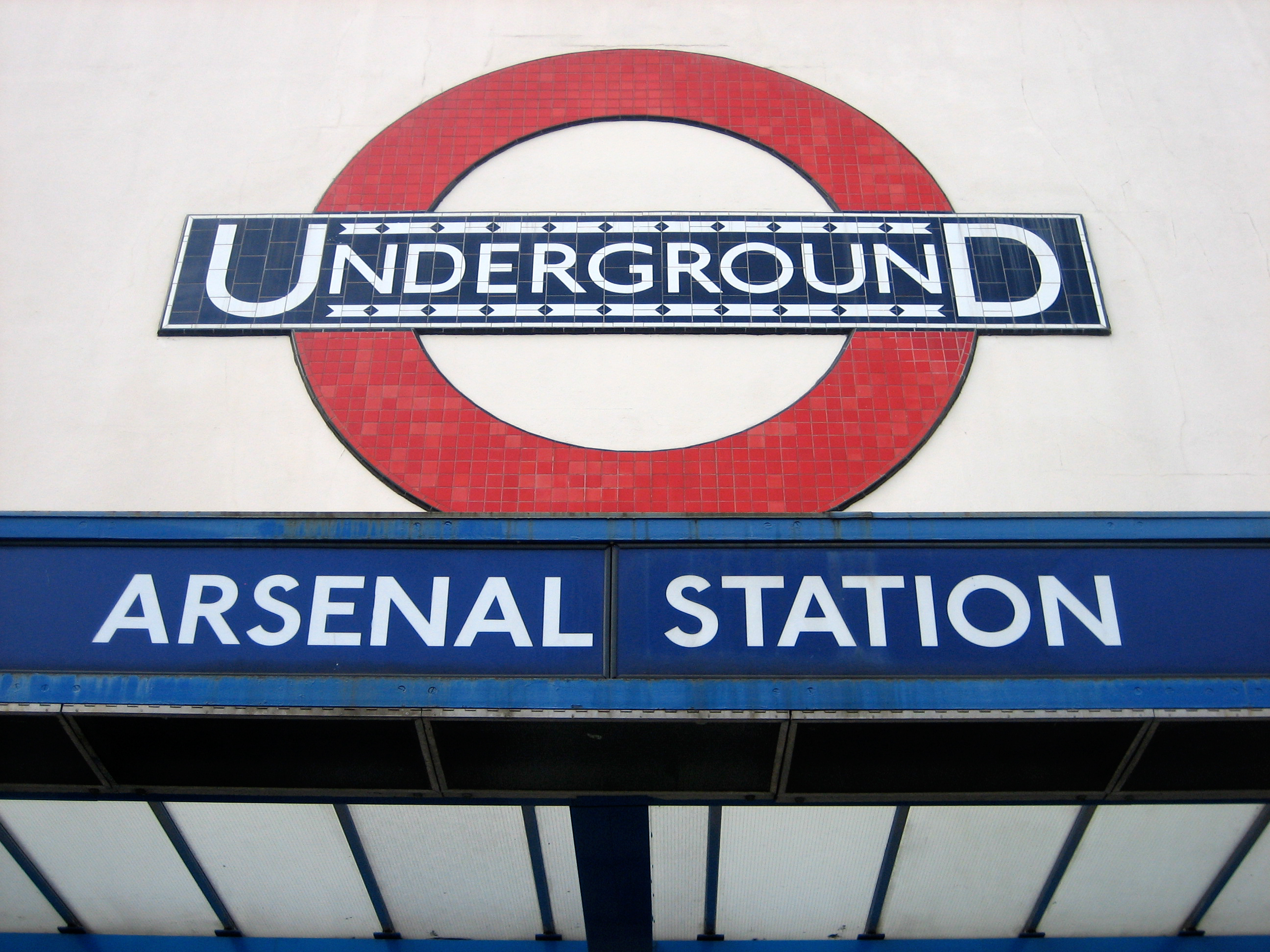
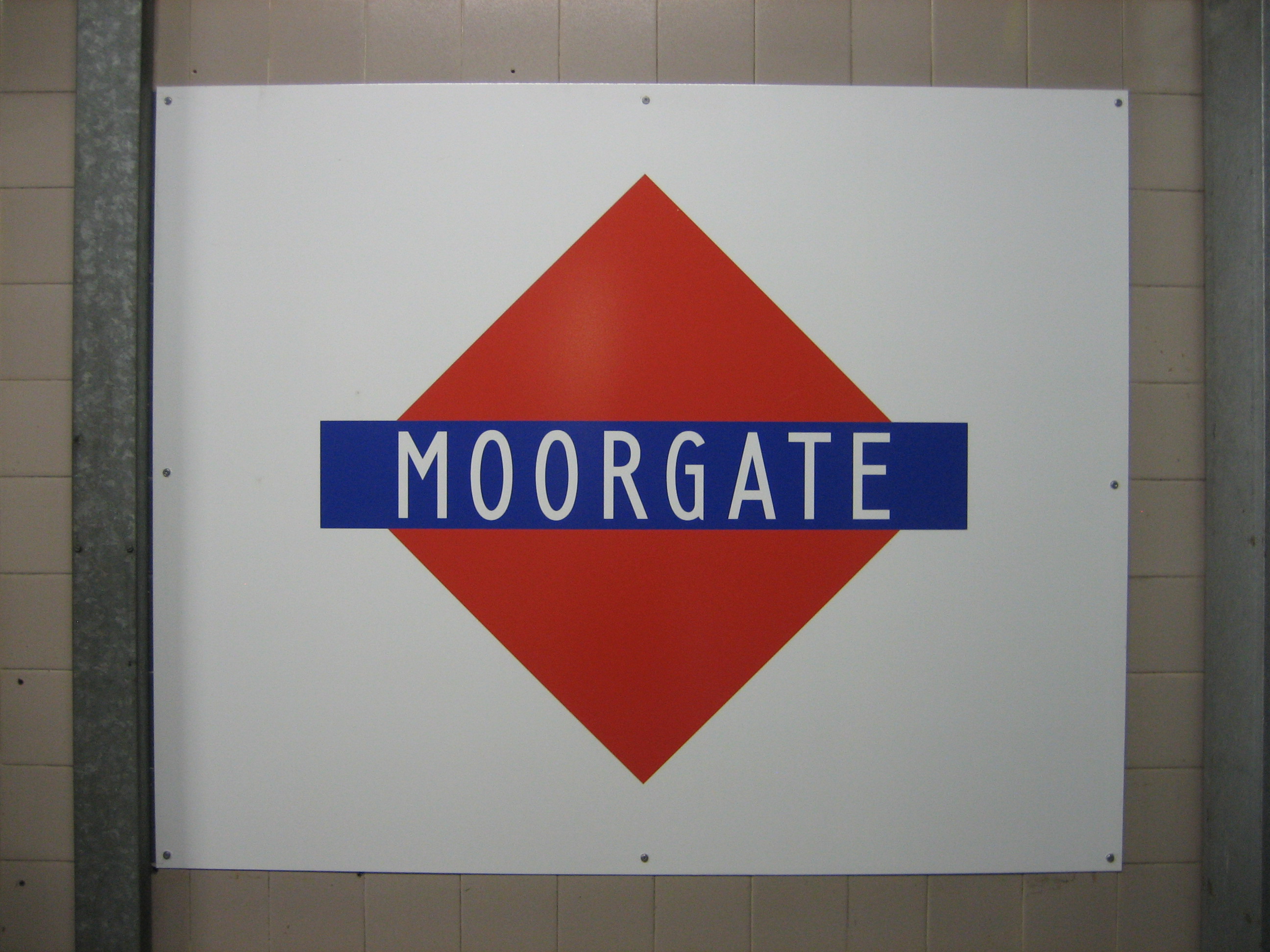
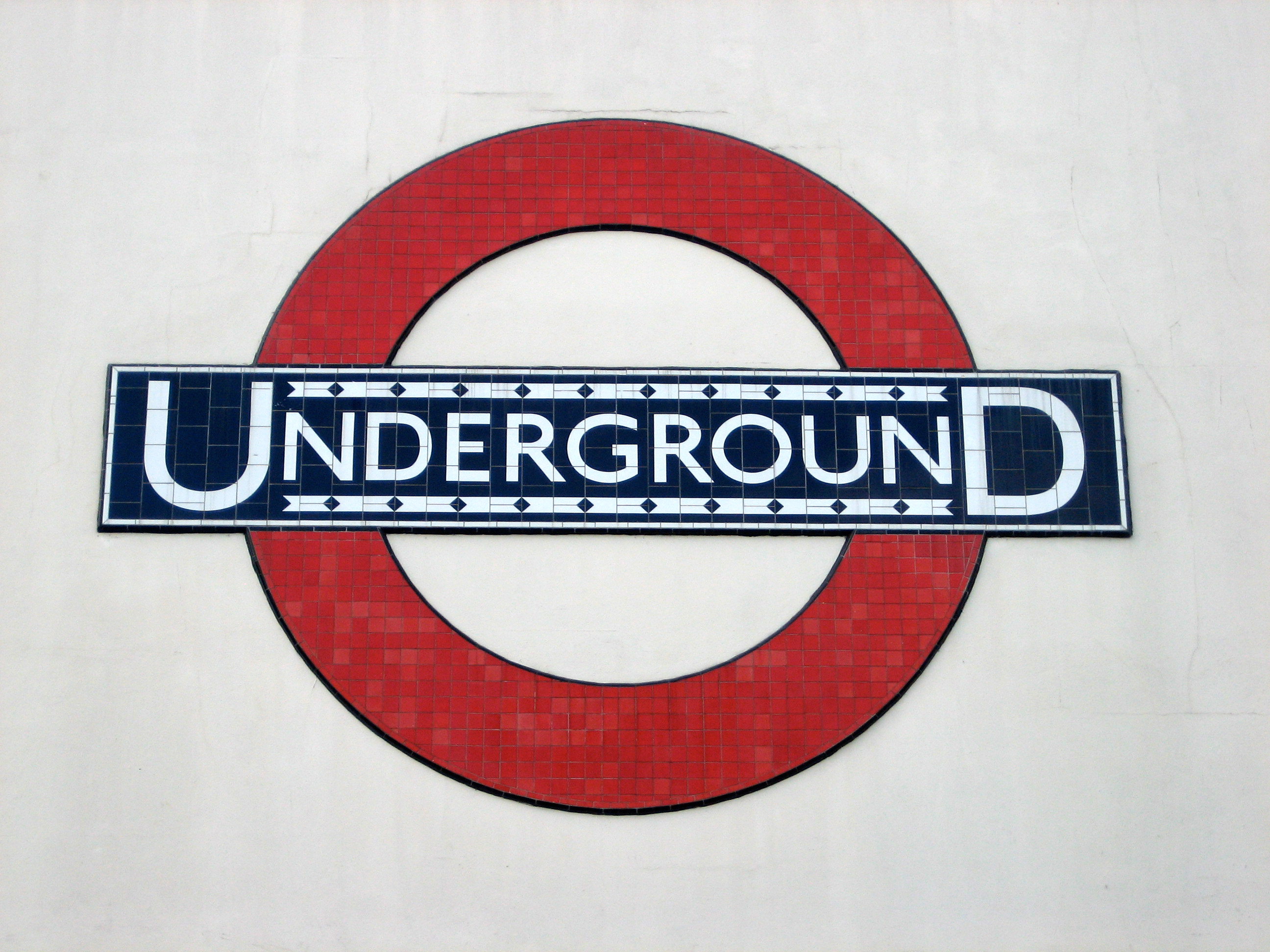
Anyway, what I really really like about football is there’s an Underground station that shares its name with one of the most famous clubs in the country, and which has a staggeringly beautiful roundel mosaic above its entrance:

Your arse an' all
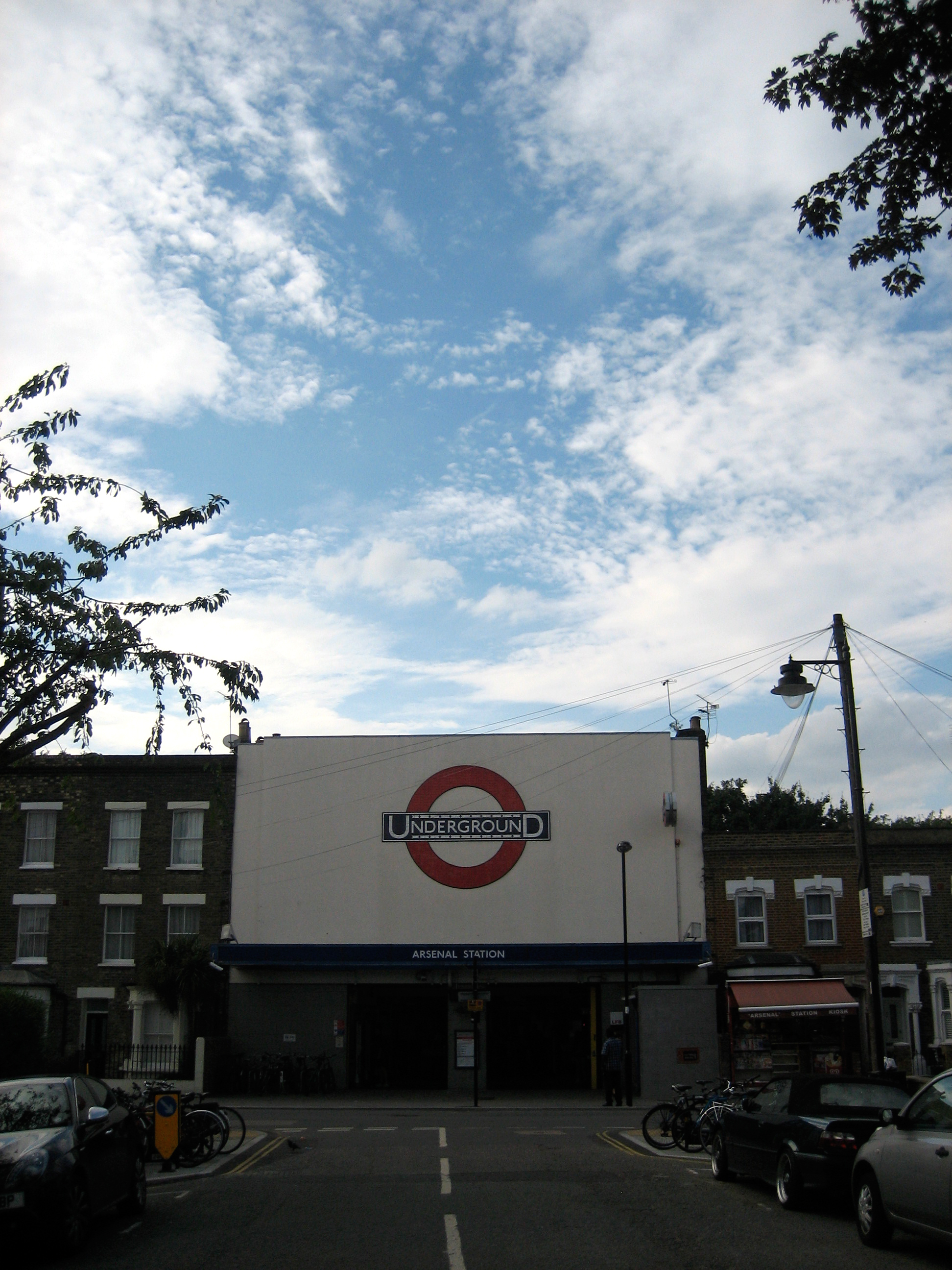
It’s almost too good to be stuck on the wall of a station in a quiet suburban street along which crowds of people pass at best only once a week.

In fact, it is too good to be stuck here. It deserves to be seen by as many folk as possible, and that’s never going to happen in Highbury, even if the eponymous club became the best in the world on the same day Morrissey decided to move in next door.

The scale of the mosaic would seem perverse and its craftsmanship ostentatious were it not so sense-bubblingly beautiful. It was put up during the glory years of the 1930s (and yes, it’s not often you see that combination of words arranged in that particular sequence). It gains even more points for having replaced yet another of the uber-ubiquitous ox-blood tiled exteriors, of which there are still ox-bloody too many.

If movable goalposts and ever-expanding teams aren’t on the agenda of the next Football Association AGM, can I suggest a works outing to Arsenal station? It’s the closest they’ll get to seeing any true artistry this season.

Join our club

Diamond lightsNow here’s a warning from history.

If nothing else, these platform signs at Moorgate are a testy reminder of the perils of a rebrand. The red diamond, had it been given the chance, might have persisted long enough to become stoically tolerated, then grudgingly accepted, then maybe even loved.

But it was doomed, and all thanks to bad timing. The diamond came too late. The roundel had already been conceived. Red discs were arcing out majestically across London when the Metropolitan line, as stubborn as ever, decided to launch its own logo. And worse, it was a logo similar enough to the roundel to make the Met’s behaviour look incredibly petty.

Which of course it was. Mere pettiness never stopped the Met doing anything. But as an exercise in brand awareness, let alone one of design aesthetics, it was amusingly hopeless.

Enjoy the silenceThe signs* make Moorgate station a wonderfully eerie if slightly creepy place. For they appear on platforms no longer used by trains, save the occasional service that needs to terminate here.

Yet the platforms don’t look abandoned. Far from it. They feel clean, attended, cared-for. It’s almost as if they were in constant use. But by whom?

There are no security barriers. The platforms are teasingly, tantalisingly, open to anyone. I doubt you’d be able to stroll very far before being stopped… but the temptation is there. As is the potential for misunderstanding. I saw one family start to walk along them, before realising their mistake. I kind of wish they’d have carried on, just to see what happened.

End of the lineI realise I like these platforms for the wrong reasons – there’s very little logic in loving something that is useless – but they don’t quite sit abandoned in splendid isolation.

Platforms five and six (above) might be completely cut off for trains (they used to be the terminus for Thameslink services) but they’ve taken on a new life as a sort of promotional space-cum-display area. At the time of writing they’re hosting a rather nice mural celebrating the Underground’s 150th anniversary. I hope there are plans for other displays in the future.

Platforms three and four are where you’ll find the diamond signs, casting their spiky glare. And both these and the mural are clearly visible from the Circle, Metropolitan and Hammersmith & City trains that call at platforms one and two. So rather than the old bits of Moorgate getting hidden from view and left to rot, they’ve become a “new” feature of the station: a partially-palatable slice of the past for digestion both now and into the future.

And there’s much to digest. But I’ll think I’ll pass on those diamonds. They’re just not my type(face).

Not my kind of type(face)*Cheers to Andrew (in the comments below) for noting that the signs were reintroduced for the 150th anniversary. Will they, along with the mural, survive beyond 2013?

Dome of the braveI’ll be honest: I’m not really a fan of domes.

They are fussy and pompous, and have a tendency to look comical, if not downright silly. If I see a row of them on a skyline, I immediately get suspicious. Who’s had the final say here, I ask myself: a sermon or a slide rule?

Seeing a dome in a non-religious location tends to make me even more uneasy. The sacred and the secular are fine side-by-side, but on top of each other? There’s a necessary world of difference between swearing inside a church, which I’ve done happily several times, and swearing in the face of an archbishop, which I’d never do*.

It’s a relief, therefore, to have at least one example in London of a dome serving no purpose whatsoever but still managing to not look entirely out of place. And it’s even better to have that dome atop an Underground station:

My kind of place of worshipYes, it’s a gigantic anachronism. But there used to be a flock of these daft things, dotted all along the southern extension of the Northern line like elderly clergy in a tardy religious procession. I’m not sorry that only one survives. This dome gains merit because of its solitary status.

Architecturally it looks utterly absurd, and I’ve argued on this blog several times that just because something is old does not mean it is a) good or b) not worth destroying.

But Kennington station is an exception, because the dome isn’t actively idiosyncratic. It’s irrelevance isn’t aggressive. Instead it’s a passive period piece, reassuringly demoted in stature to a more lowly rank behind the 1920s makeover (yes, those are Charles Holden’s fingerprints on the entrance).

It’s also something of apt tribute to the first-ever deep-level Underground line, which opened here as the City and South London Railway in 1890. Bluster, folly and ingenuity got that line built – and all three are present in the dome.

T. Phillips Figgis was the man responsible for the design. I’m instinctively wary of anyone who feels the need to reduce their first name to an initial. What have they got to hide? But if Mr T’s work at Kennington is commendable more for its robustness than its style, perhaps a dome with no real function is fitting for a man with no real identity.

*Though I’d make an exception for certain Catholic cardinals.