Like most things, I think it dates back to when I was a child.

On a still, cold night, I would lie in my bed with all the windows open and strain to hear the sound of mainline trains heading through the station on the other side of town.

Sometimes I was unlucky and would fall, eventually, into an disgruntled sleep. But on occasions I would catch the faint two-tone cooing of a horn, calling from several miles away, but as clear and bewitching as the hooting of an owl in our back garden. And I would drift off, somehow calmer and more carefree, as if reassured that somewhere someone was making sure the world was still going about its business.

Since then, the sound of a train drawing attention to itself with a horn, whistle or any other manually-operated contraption, has always won favours with my heart. It must be to do with the way it humanises what is superficially rather an inhuman, unthinking, uncaring contraption. A train is a beast of a thing. A train that can make musical noises is a beauty.

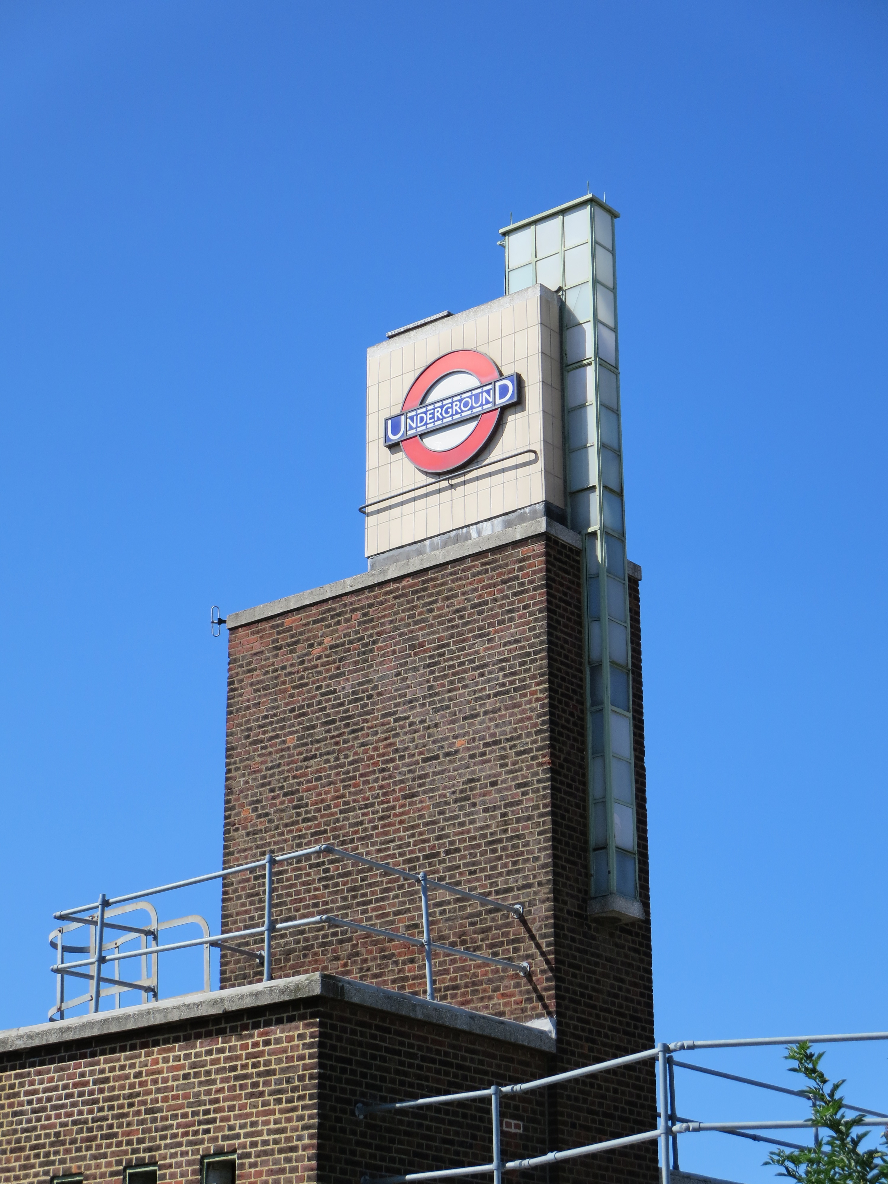
On the Underground, the whistle plays dependable descant to the ever-modulating harmonies of the network. While the grumbling and clanking and hissing and howling forms a kind of desolate ostinato, sailing above it all comes this plaintive clarion call. It’s both nostalgic and necessary. For besides triggering memories of past times, be they half-asleep bedroom epiphanies or half-awake cinematic escapades, the whistle helps give the Underground one of its greatest endearments: its soul.

Good Manor(s)There’s a bit of sibling rivalry up the western end of the Piccadilly line. I wouldn’t go so far as to describe it as a “who’s biggest” competition, even though I’ve just done so. But there’s definitely some pseudo-grandstanding going on. It’s quite possibly pseudist as well, for when you’ve not one but two tumescences prodding the sky a few streets apart in the same London borough, it’s tape measures at dawn.

I can’t find details of just how tall the tower at Boston Manor stands in comparison to its brother down the road at Osterley. Judging purely by photos, Osterley edges it. But that’s largely because of the pole that sits on top of the spike that sits on top of the tower. It’s absolutely shameless. Though if you’re going for elevation as well as style, there’s no point in going off half-cock.

Boston stumpBoth stations were designed by Stanley Heaps from briefings by Charles Holden.

How fortuitous for a lazy blogger that two of the greatest architects to have worked on the Underground had such pun-friendly surnames. But you won’t find me beholden to heaping such linguistic fancies into what is already an over-ripe textual stew. Their efforts, as always, speak for themselves – or rather, sing for themselves, because Boston Manor is what happens when buildings croon.

The music you can hear is that of the 1930s: of soft, sad ballads; of frantic shape-throwing and frugging; of get-us-away-from-here toe-tappers; and of stoical, cheek-to-cheek farewells.

Boston Manor at night was used for one of the images for the Royal Mail’s set of commemorative stamps marking the Underground’s 150th anniversary. It was a superb choice, but not just for the station’s enchanting design and sophisticated character. This is architecture that radiates a mood as well as a movement; one of weary arrivals, of buoyant departures, of lonely vigils and late-night thoughts.

And yes, it does all those things even in brilliant sunshine.

Anyone up for a tea party?

That's the story of, that's the glory of love

Arch encounterUnderground stations within Zone 1 sometimes feel like they’re trying to over-compensate for being among the busiest locations in London. Platform art doesn’t so much speak as scream at passengers, demanding rather than asking to be noticed. The more crowded the venue, the less subtle the design.

The Jubilee line platforms at Bond Street are a good example. Giant gift-wrapped boxes line the walls, bludgeoning you about the head with their garish colours. If you fancy being attacked by a metaphor while waiting for a train, this is the place to go.

Leicester Square is another offender. Think of all the possibilities for decorating the interior of a station that is associated [adopts Nicholas Parsons voice] not just here in the UK but around the world with the magic and allure of the silver screen: celluloid icons, perhaps, or recreations of famous scenes, locations, even title sequences. Step on to its platforms, however, and all you see are a load of perforations meant to look like the edges of film strips. It’s like going to the cinema expecting to see Billy Liar only to find yourself watching Liar Liar.

If you must saddle a station with some kind of visual play on words, at least try and do it with a bit of flair. Like here:

Marble marvelsThe coloured panels were created by Annabel Grey, who was also responsible for the glorious mosaics at Finsbury Park.

Here she worked with huge chunks of vitreous enamel, which were then attached to steel sheets and bolted to the walls. There are 17 in total, each 12ft by 10ft, and they took nearly two years to complete.

This shouldn’t sound surprising when you learn every bit of the artwork was hand-sprayed. Each pattern was etched when the paint was dry, then fired and cooled before the next pattern could be added. I wonder how long it took to do those film strips.

What a Grey dayI also wonder how well these fillips of colour fare against the desultory concerns of a million people on the move.

I’m glad they continue to survive. They hail from the 1980s, a period that only the tasteless like to brand “the decade that taste forgot”. Yes, they may at times remind you of the coat worn by Colin Baker in Doctor Who. But unlike that costume, and indeed that entire era in the show’s history, these designs have subtlety. And it’s a subtlety that encourages both inspection and introspection: the watchwords of the Underground.

Like a circle in a spiral