Archive

Objects

Shedding followers
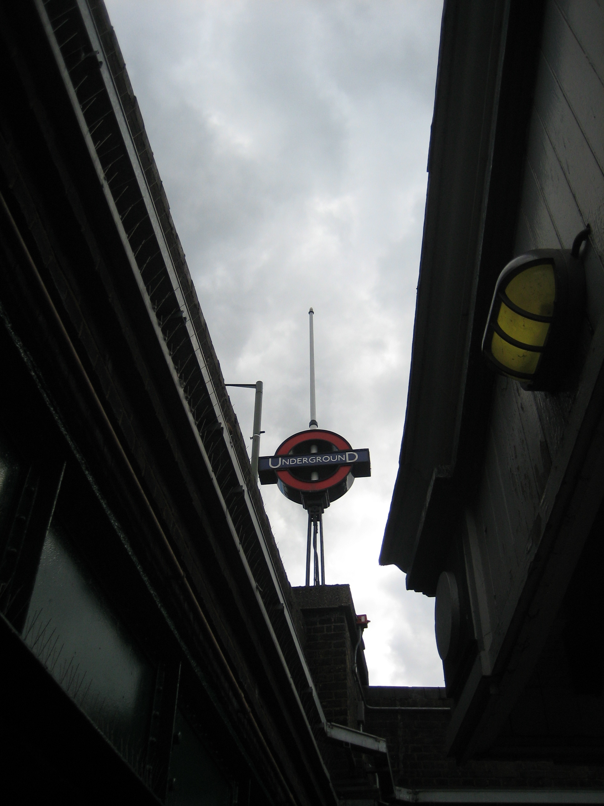
Just north of Queen’s Park station on the Bakerloo line, you experience something I’m pretty sure you can’t do anywhere else on the Underground.

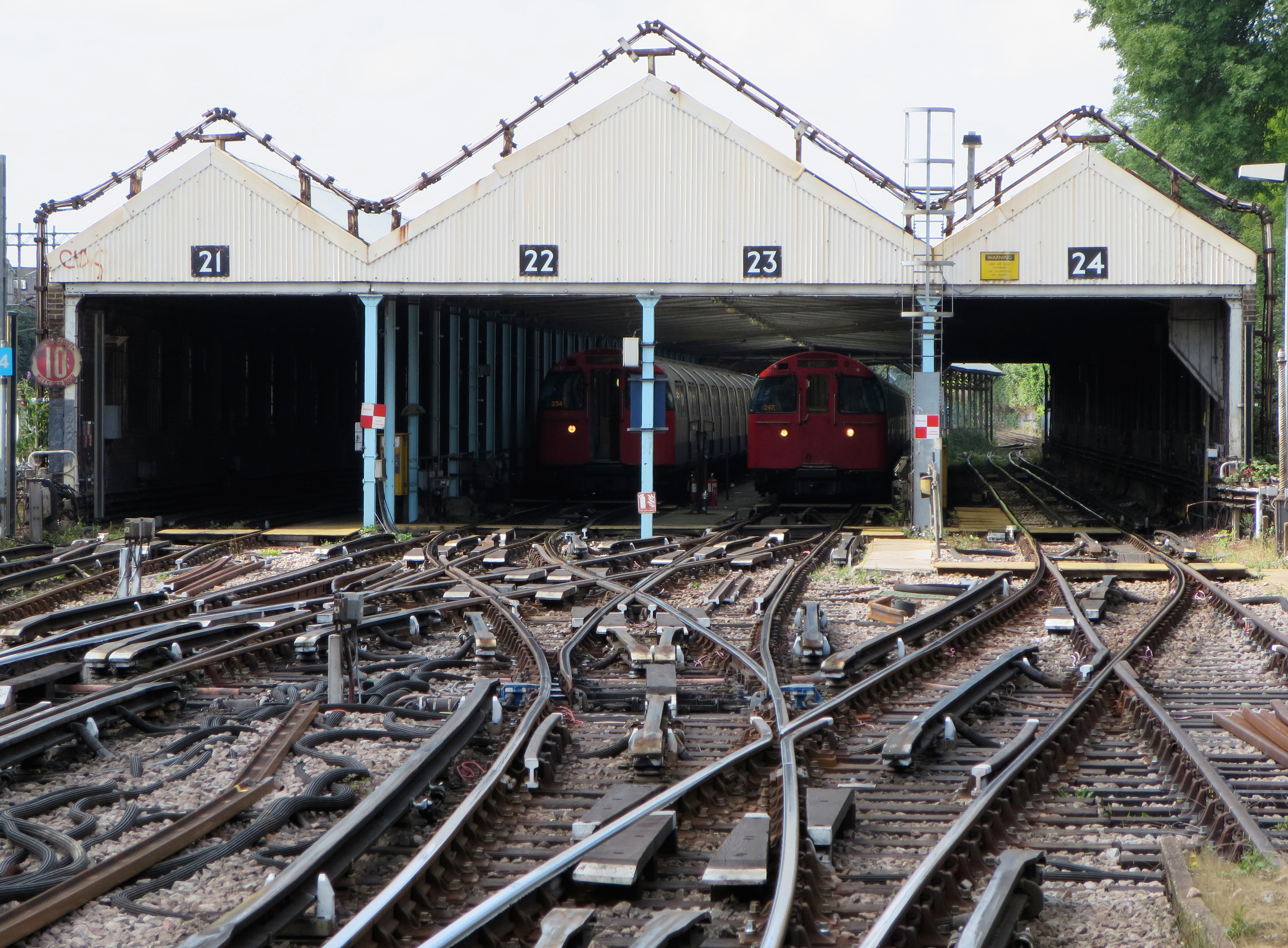
You get to pass through a carriage shed.

That might not sound particularly tremulous, and I grant you it’s not on a par with the kind of sensory overload you endure on a ghost train or enjoy on a seaside tram. But it shares the same novelty value. And if you’re in the mood, there’s a tingle of excitement to be had from peeping inside somewhere it feels you’re not meant to go.

She said, there's something in the train shedIf you’re heading north, you trundle through entrance 21, past a very old (but still perfectly legible) 10 MILES AN HOUR warning sign. Once you’re inside, look out of the right-hand windows and you’ll probably see a couple of trains sitting in berths 22 and 23, not really doing much. You’ll possibly spend a minute or so doing the same, before your train is given a green signal to carry on up the line to Kensal Green: nemesis of all connoisseurs of The London Game.

If you’re heading south you’ll probably come through number 24. Whichever track you end up on, however, the effect is the same: a moment of anxiety as you conclude you’re sitting in a train that’s been sent to the sidings, followed by a longer moment of embarrassment when you realise your mistake.

Two little ducks
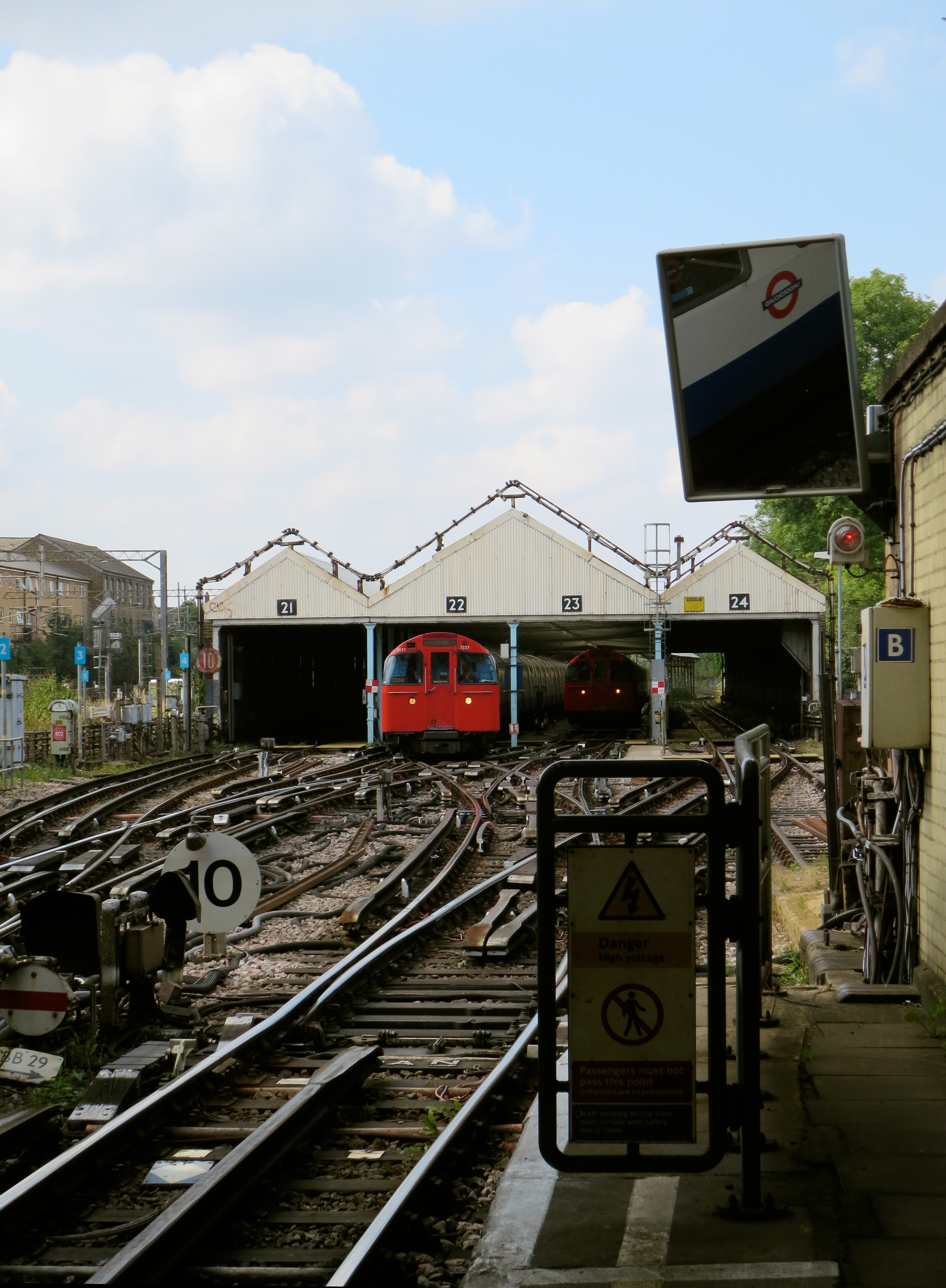
When you pass through the shed, I wonder under whose jurisdiction you fall. I can imagine there are issues over “conveyance”, with unions and management holding urgent negotiations to agree terms of safe passage. I hope there are “lucky” entrances, and that superstitions have built up around particular numbers. In bingo lingo, would you prefer two little ducks or a knock on the door?

For shed followers, you probably can’t beat arguing about something like this. For shedding followers, you certainly can’t beat writing about something like this.

Diamond lightsNow here’s a warning from history.

If nothing else, these platform signs at Moorgate are a testy reminder of the perils of a rebrand. The red diamond, had it been given the chance, might have persisted long enough to become stoically tolerated, then grudgingly accepted, then maybe even loved.

But it was doomed, and all thanks to bad timing. The diamond came too late. The roundel had already been conceived. Red discs were arcing out majestically across London when the Metropolitan line, as stubborn as ever, decided to launch its own logo. And worse, it was a logo similar enough to the roundel to make the Met’s behaviour look incredibly petty.

Which of course it was. Mere pettiness never stopped the Met doing anything. But as an exercise in brand awareness, let alone one of design aesthetics, it was amusingly hopeless.

Enjoy the silenceThe signs* make Moorgate station a wonderfully eerie if slightly creepy place. For they appear on platforms no longer used by trains, save the occasional service that needs to terminate here.

Yet the platforms don’t look abandoned. Far from it. They feel clean, attended, cared-for. It’s almost as if they were in constant use. But by whom?

There are no security barriers. The platforms are teasingly, tantalisingly, open to anyone. I doubt you’d be able to stroll very far before being stopped… but the temptation is there. As is the potential for misunderstanding. I saw one family start to walk along them, before realising their mistake. I kind of wish they’d have carried on, just to see what happened.

End of the lineI realise I like these platforms for the wrong reasons – there’s very little logic in loving something that is useless – but they don’t quite sit abandoned in splendid isolation.

Platforms five and six (above) might be completely cut off for trains (they used to be the terminus for Thameslink services) but they’ve taken on a new life as a sort of promotional space-cum-display area. At the time of writing they’re hosting a rather nice mural celebrating the Underground’s 150th anniversary. I hope there are plans for other displays in the future.

Platforms three and four are where you’ll find the diamond signs, casting their spiky glare. And both these and the mural are clearly visible from the Circle, Metropolitan and Hammersmith & City trains that call at platforms one and two. So rather than the old bits of Moorgate getting hidden from view and left to rot, they’ve become a “new” feature of the station: a partially-palatable slice of the past for digestion both now and into the future.

And there’s much to digest. But I’ll think I’ll pass on those diamonds. They’re just not my type(face).

Not my kind of type(face)*Cheers to Andrew (in the comments below) for noting that the signs were reintroduced for the 150th anniversary. Will they, along with the mural, survive beyond 2013?

Oak, hey!There’s no burned oak at Burnt Oak. There’s not much to the station either, which is a squat pavilion a bit like Brent Cross and Hendon Central, only not as noble or elegant. What there is, however, is a roundel on a pole.

That might not sound much, but believe me, when you’re standing outside Burnt Oak station with 95% of your vision choked up with tat, grot and litter, it’s a revelation.

Even the design of the pole is appealing. It’s vaguely Eiffel-esque, with the struts climbing upwards in a pleasingly ordered fashion, tapering inwards towards the centre of a satisfyingly chunky roundel. The very top looks a bit like a flagpole, but how you’d raise anything up it is a mystery. Although given the whole structure already raises the spirits, I’d argue no further kinds of elevation are necessary.

There’s an added treat when you’re down on the platforms. A gap in the bridges overhead reveals a glimpse of the pole, which from this angle looks even more commanding.

It almost makes up for the station’s gratingly archaic name. There’s really no call for words ending “rnt” nowadays.

Up the pole